
Asahi Super Dry – A Masterclass in Beer Packaging Design
The aluminum beer can is one of the most competitive design canvases in the world. In a Japanese convenience store, dozens of beer cans compete for attention in a single refrigerator case — and Asahi Super Dry consistently wins the shelf. How? Through a remarkably disciplined approach to can design that balances brand consistency with product variation.
At Gropicture, we have Asahi beer can images available for free download — covering the original Super Dry, Dry Black, Alcohol Free, seasonal limited editions, and sports collaborations. In this Packaging Picks feature, we break down how Asahi designs its cans to communicate different product attributes while keeping the brand instantly recognizable.
The Core Canvas: Silver, Black, Red
Every Asahi Super Dry can starts from the same three-color foundation: silver, black, and red. This is the brand’s visual DNA. Silver represents the “dry” crispness and the aluminum material itself. Black provides typographic contrast and authority. Red adds energy and appetite appeal — the color most strongly associated with food and beverage across cultures.
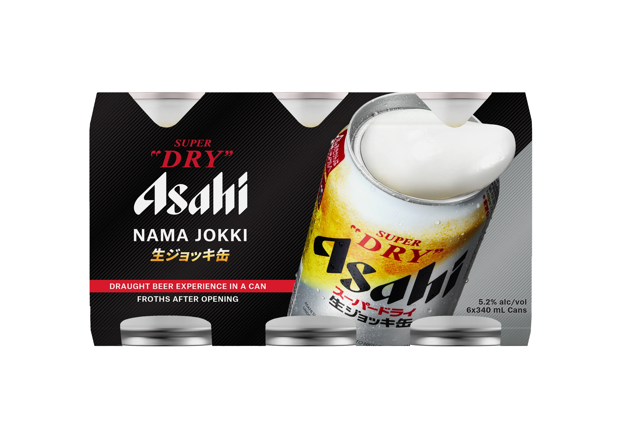
What makes this palette so effective on a can? The aluminum surface itself is silver — the brand leverages the material rather than covering it. This creates a metallic sheen that no printed label can replicate. The black and red typography sits on top of the reflective silver, making the can shimmer under convenience store lighting. This is packaging design that works with the material, not against it.
The Variation System: Same Brand, Different Cans
Asahi doesn’t sell just one beer. The Super Dry line includes the original, Dry Black, Alcohol Free, Zero Sugar, seasonal limited editions, and sports collaborations. Each variant needs its own can design while remaining unmistakably Asahi. The solution: shift color proportions within the established palette.
The Original: Silver and Red
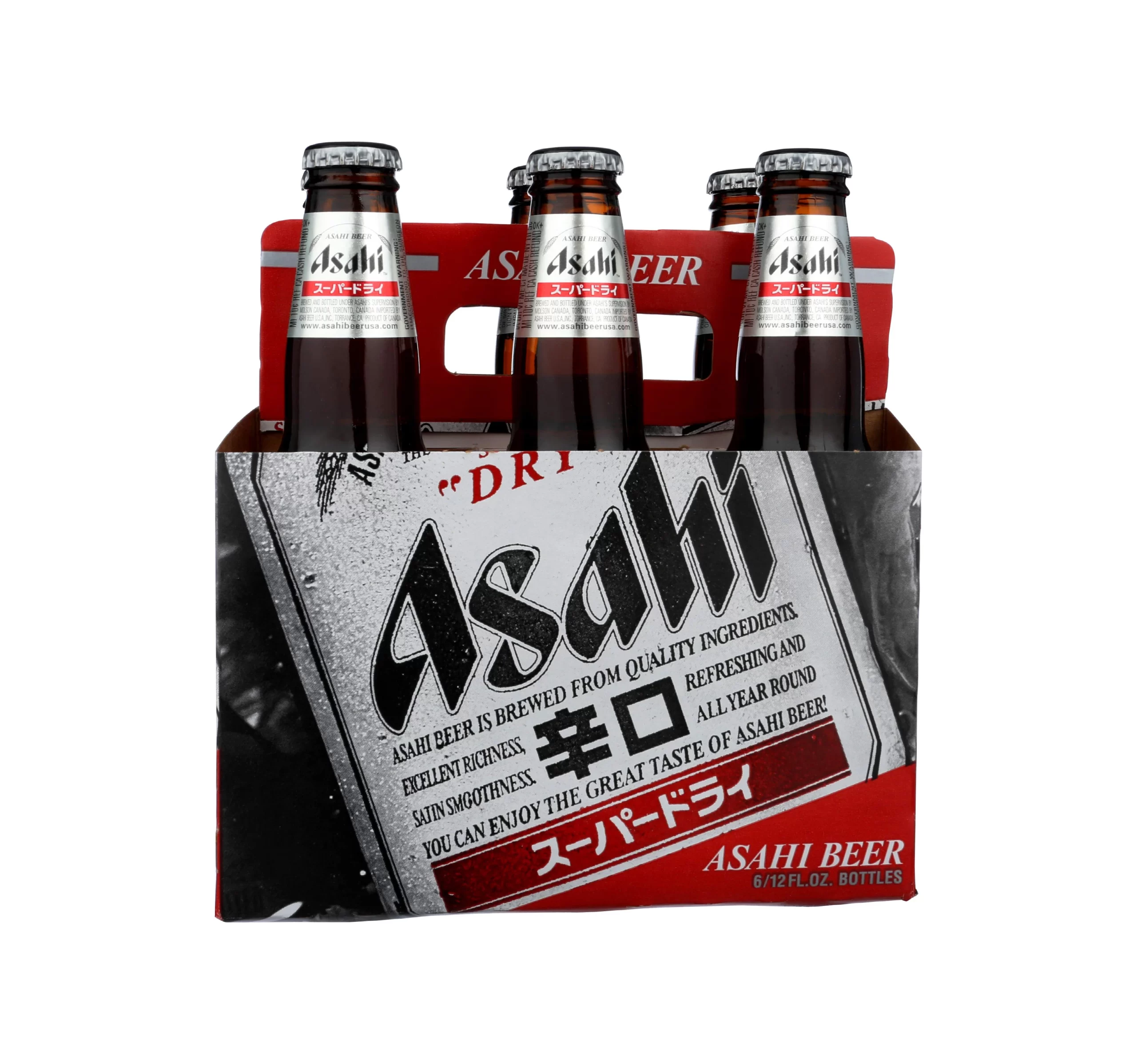
The flagship Asahi Super Dry can — silver base, red and black typography — is the anchor design that every other variant references. If you removed the silver base or the red accent, the product would no longer read as “Super Dry.” This is the design that built the brand’s visual equity over decades.
The Dark Variant: Dry Black
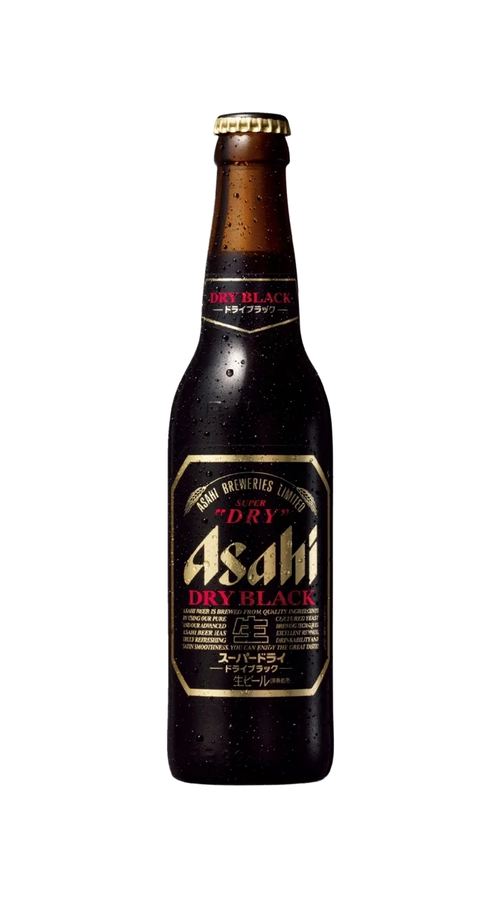
Asahi Dry Black shifts to a dark brown and gold palette. The deep, almost black background signals a richer, more full-bodied flavor — the visual opposite of the original’s bright silver. Gold accents add a touch of premium warmth that distinguishes Dry Black from a standard “dark beer.” This is color psychology at work: darker cans promise bolder taste.
The Premium: Black and Gold
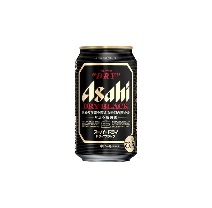
When Asahi wants to signal premium quality, the can shifts to a black base with gold accents. Black immediately communicates sophistication — it says “this is special.” The gold trim adds luxury that positions the product above standard Super Dry. Notice how the brand name remains the same; only the color treatment changes.
The Heritage: Amber and Silver
Some Asahi cans use warm amber tones — the actual color of beer. This is deeply intuitive: the packaging shows you what’s inside before you open it. Amber conveys warmth, tradition, and craftsmanship, positioning the beer as a product with history rather than a modern industrial beverage.
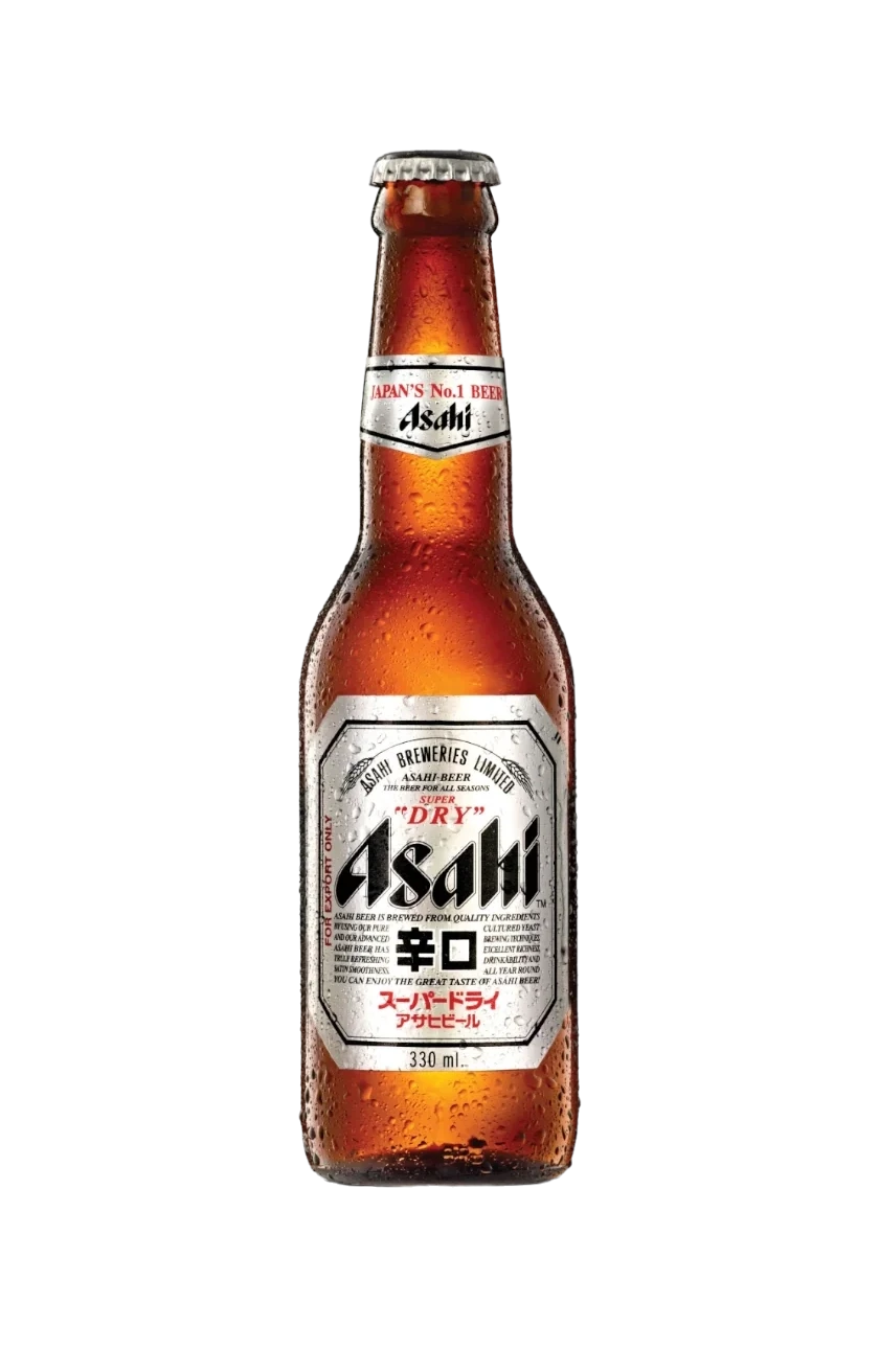
The Alcohol Free: Silver and Blue
Asahi Super Dry 0.000% — the alcohol-free variant — shifts to a cooler palette. Blue communicates refreshment, cleanliness, and health-consciousness. It’s the color of water and ice, making it the natural choice for a product positioned as lighter and less intense. The “0.000%” typography dominates, leaving no confusion about what this product is.
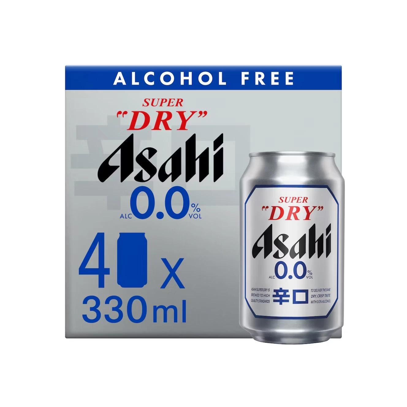
The Sporty: Blue and White
The blue-white sporty variant takes the alcohol-free direction further, using a cleaner, more athletic color scheme. This design feels like a sports drink rather than a beer — which is exactly the point. It targets consumers who want the Asahi brand experience without the alcohol, positioned around active lifestyles.
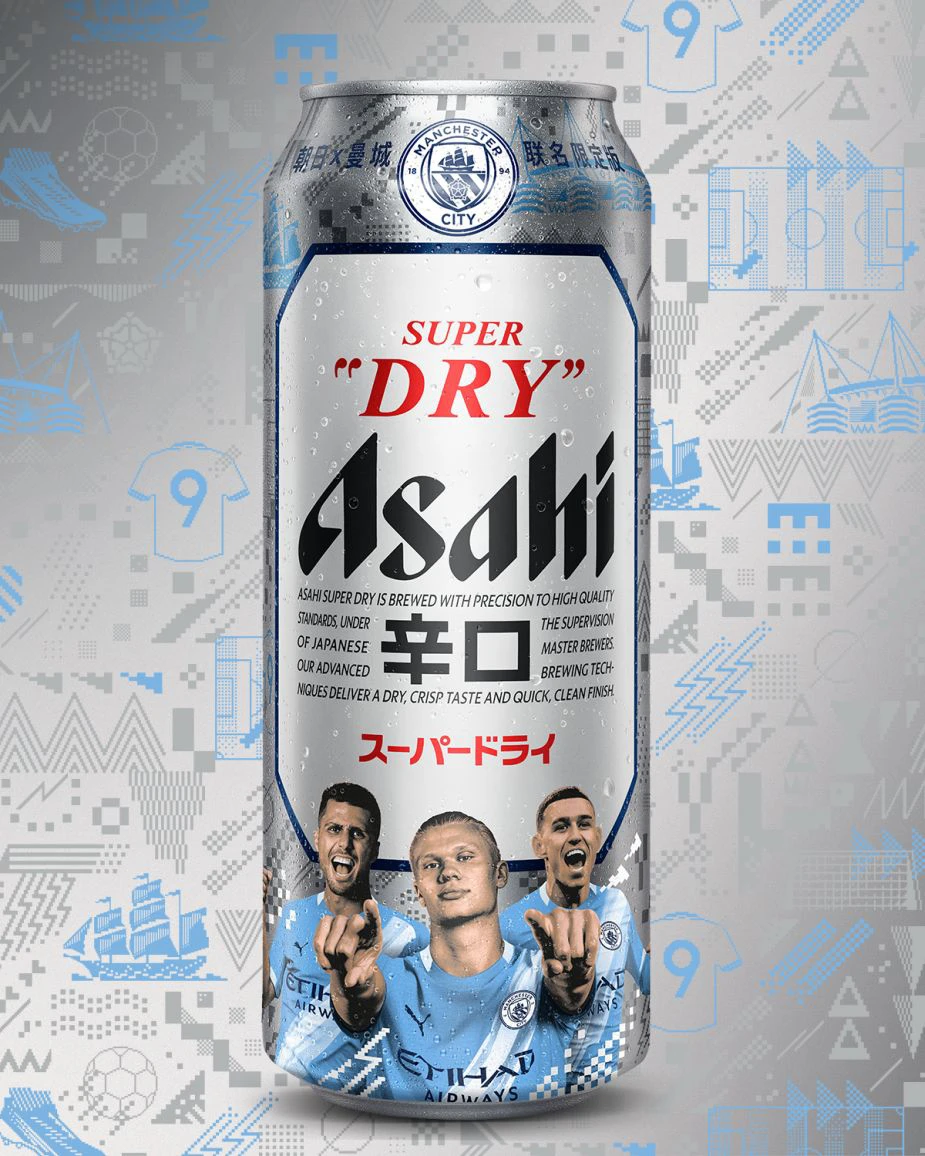
Limited Editions and Collaborations
Limited edition cans give Asahi room to experiment without permanently changing the core brand identity. These designs push the visual language into bold new territory — but the Asahi name and star logo always anchor the design.
The Futuristic: Neon Blue on Silver
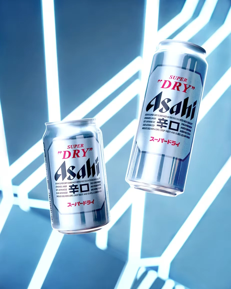
The neon blue accent on the silver base demonstrates how far the brand can push while remaining Asahi. The silver surface is still there. The brand name still dominates. But the neon glow says “this is special — collect it before it’s gone.” Limited edition cans create news value and social media buzz that standard packaging never could.
The Sports Collab: Rugby World Cup
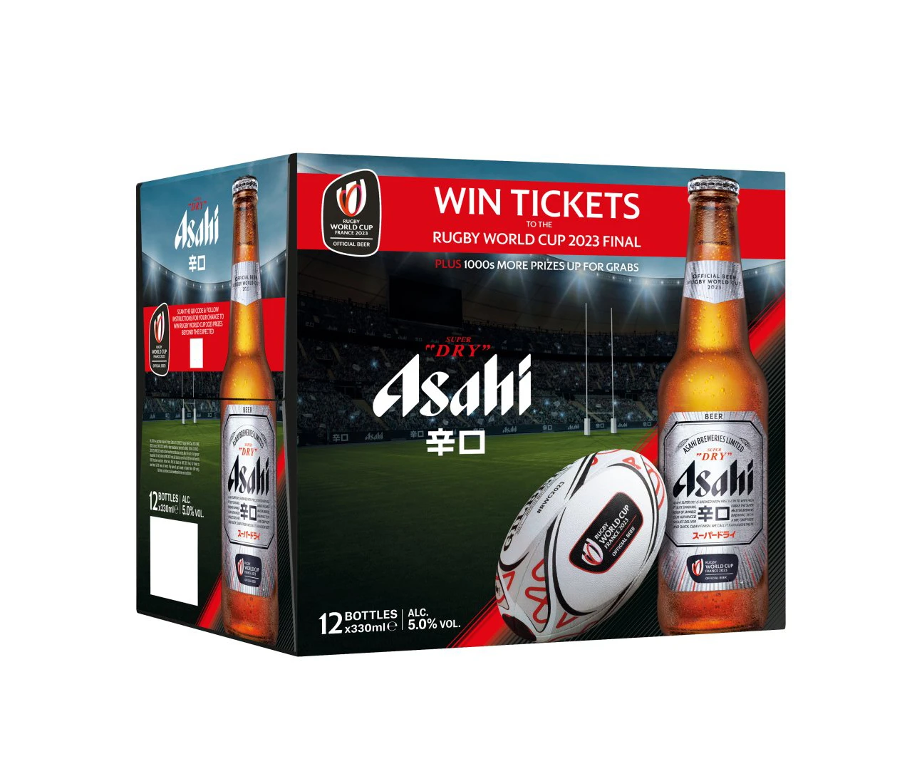
Sports collaboration cans like this Rugby World Cup edition show how event branding integrates with product branding. The red base amplifies the energy of the sport while the Asahi identity remains front and center. For designers, this is a lesson in brand hierarchy during collaborations: your brand leads, the event supports.
What Asahi Teaches Us About Beer Can Design
1. The Material Is Part of the Design
Asahi doesn’t cover the aluminum — it uses the silver surface as a design element. The metallic sheen becomes part of the brand identity. When designing cans, always consider how the base material interacts with your printed graphics.
2. Own Your Color Palette
Asahi owns silver-black-red. Heineken owns green. Coca-Cola owns red. When you use the same color palette consistently across every can, consumers eventually associate those colors with your brand alone. Color ownership is one of the most powerful assets a beverage brand can build.
3. Use Color Shifts to Signal Product Differences
Asahi doesn’t redesign its cans from scratch for each variant. It shifts color proportions: more black for premium, more blue for alcohol-free, more gold for heritage. This is far more efficient than creating entirely new visual systems — and it maintains brand recognition across the entire line.
4. Limited Editions Build Excitement
By releasing seasonal and collaboration cans, Asahi creates collectibility and news value. Consumers who normally ignore a beer display notice a new can design. Use limited editions to generate buzz without permanently changing your core identity.
5. Negative Space Is Premium
The most premium Asahi cans use the most negative space. Clean silver or black surfaces with minimal typography communicate confidence — the brand doesn’t need to shout. Premium packaging always uses more empty space than budget packaging.
Explore the Full Asahi Can Collection
Browse all 60+ Asahi packaging images and download them for free:
- Asahi Packaging Collection
- Packaging Design — broader packaging collection
- Food & Beverage Photography — product photography