
Canvas Stories — William Morris: The Man Who Made Nature a Pattern
William Morris didn’t just design wallpaper — he started a revolution. In Victorian England, when factories churned out garish, mechanical patterns, Morris looked to medieval tapestries, Persian gardens, and English hedgerows for inspiration. The result was a body of work so timeless that his patterns still adorn walls, fabrics, and stationery more than 125 years after his death.
At Gropicture, we have William Morris patterns available for free download — from crimson peonies to golden lilies, navy blue trellises to sage green arabesques. In this Canvas Stories feature, we’ll explore who Morris was, what makes his designs so enduring, and how you can use these patterns in your own creative projects.
Who Was William Morris?
William Morris (1834–1896) was an English textile designer, poet, novelist, translator, and social activist. He was the leading figure of the Arts and Crafts Movement, a design philosophy that emerged in mid-19th century Britain as a reaction against the industrial revolution’s mass-produced, soulless goods.
Morris believed that beauty should be woven into everyday life — that the wallpaper in your dining room, the fabric on your chair, the tiles around your fireplace could all be genuine works of art. He founded Morris & Co. in 1861, and the company’s designs became synonymous with lush, naturalistic patterns that celebrated the English countryside.
What set Morris apart from his contemporaries was his insistence on craftsmanship. He learned to dye his own fabrics using natural indigo and madder root. He mastered the ancient technique of woodblock printing. He studied medieval manuscripts to understand how plants were depicted before photography changed our visual vocabulary. This obsessive attention to process gave his work a depth and richness that machine-made patterns could never replicate.
The Design Philosophy: “Truth to Nature”
Morris’s guiding principle was “truth to nature” — the idea that patterns should be inspired by real plants, observed in real gardens, not invented from imagination. He grew the flowers he depicted in his own garden at Kelmscott Manor in Oxfordshire. Before drawing a peony, he studied how its petals curled. Before designing a vine pattern, he traced how ivy actually climbed a wall.
But Morris was not a realist painter. He stylized and flattened his subjects, turning three-dimensional plants into two-dimensional repeating patterns. This tension — between botanical accuracy and decorative abstraction — is what makes his work so distinctive. The plants are recognizable but never photographic. They feel alive but also timeless, like medieval tapestries or illuminated manuscripts.
The Color Palette of William Morris
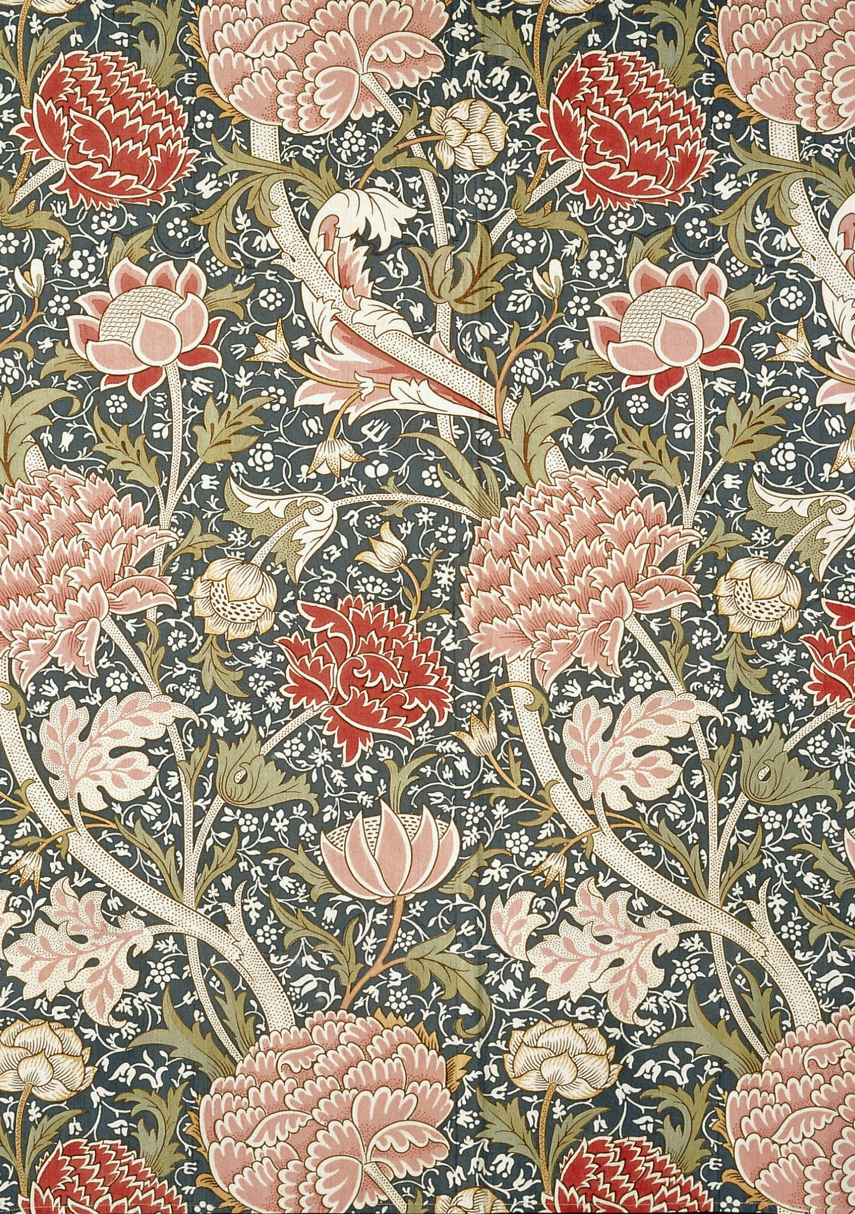
One of the most immediately recognizable aspects of Morris’s work is his color sense. He worked primarily with natural dyes, which produced deeper, more complex hues than the aniline dyes that dominated Victorian manufacturing. His palette included:
- Sage green — the backbone of Morris’s leaves and vines, softer and more organic than modern kelly green
- Deep crimson and burgundy — used for peonies, roses, and anemones, echoing the richness of medieval velvet
- Navy and indigo blue — deep, mineral backgrounds that make warm-colored flowers pop
- Muted gold — used for highlights and accent flowers, evoking the patina of aged tapestries
- Cream and ivory — warm, aged-white backgrounds that give his patterns a sense of heritage
Signature Motifs: The Language of Morris Patterns
The Vine and Trellis
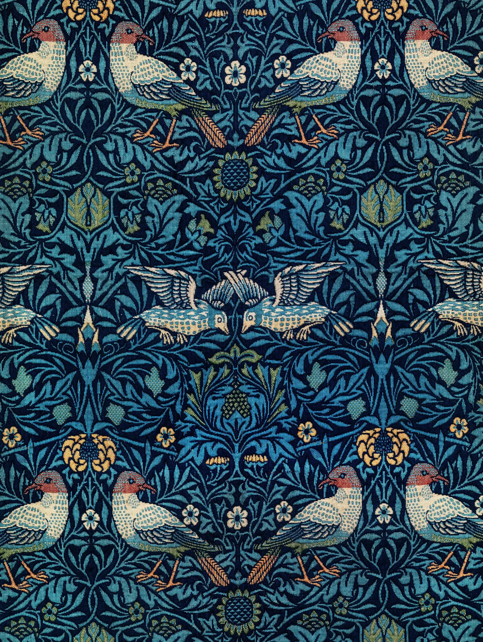
The most ubiquitous Morris motif is the intertwining vine — a sinuous, serpentine stem that weaves through the composition, carrying leaves, flowers, and sometimes birds. The vine creates movement and rhythm, guiding the eye across the repeating pattern. This is Morris at his most architectural: the vine is the skeleton, the structure that holds everything together.
The Peony
Peonies appear in dozens of Morris designs — sometimes as the dominant flower, sometimes as a supporting element. Morris loved the peony’s full, ruffled form, which allowed him to create dramatic focal points within the repeating pattern. In Chinese art, the peony symbolizes wealth and honor; Morris may have been drawn to it for its decorative exuberance alone.
The Lily
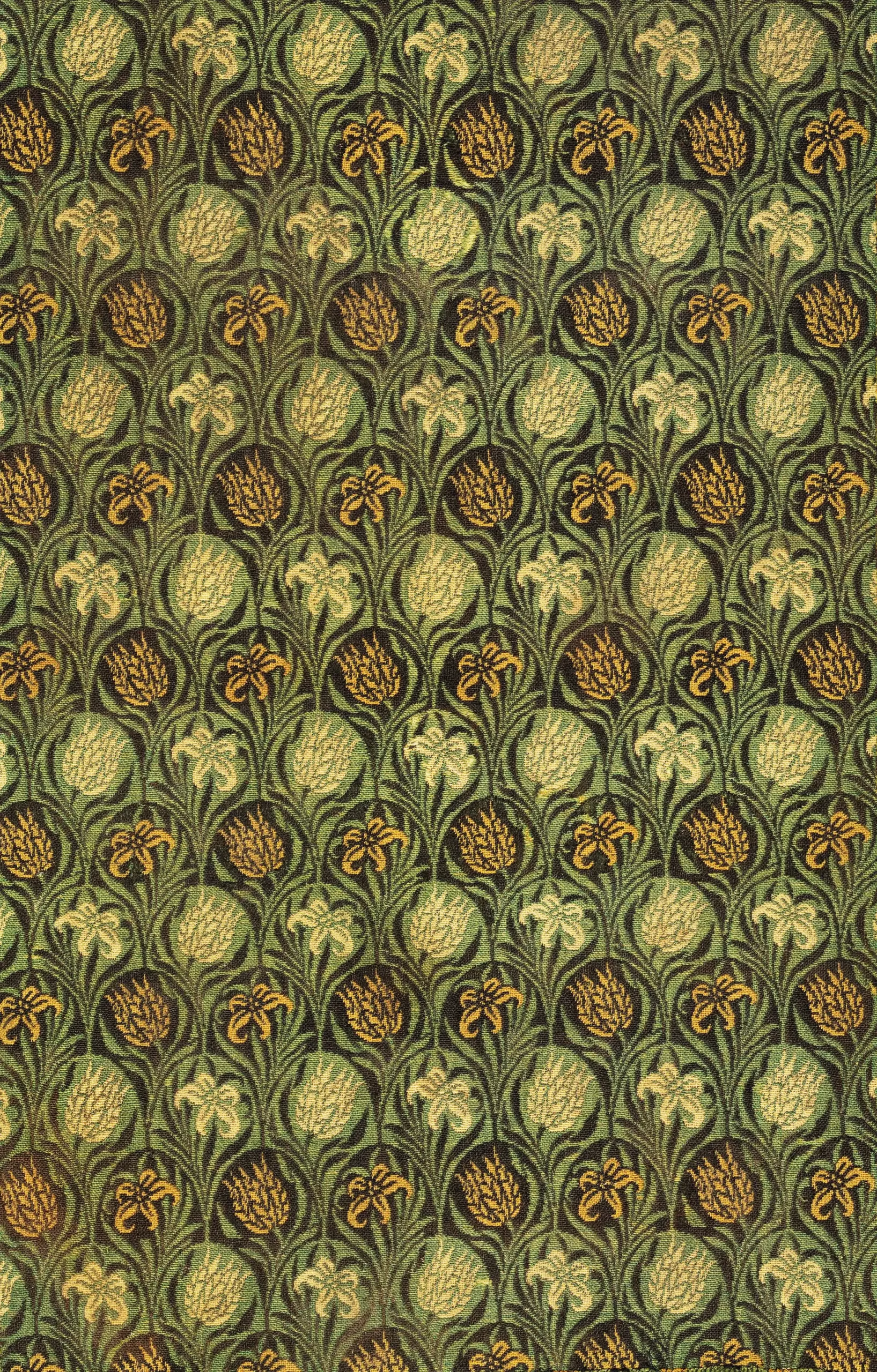
Lilies gave Morris the opportunity to play with elegant, elongated forms — tall trumpets andarching stems that contrast beautifully with the rounder shapes of peonies and roses. The gold lily on sage green is one of the most sophisticated Morris color combinations.
The Sunflower
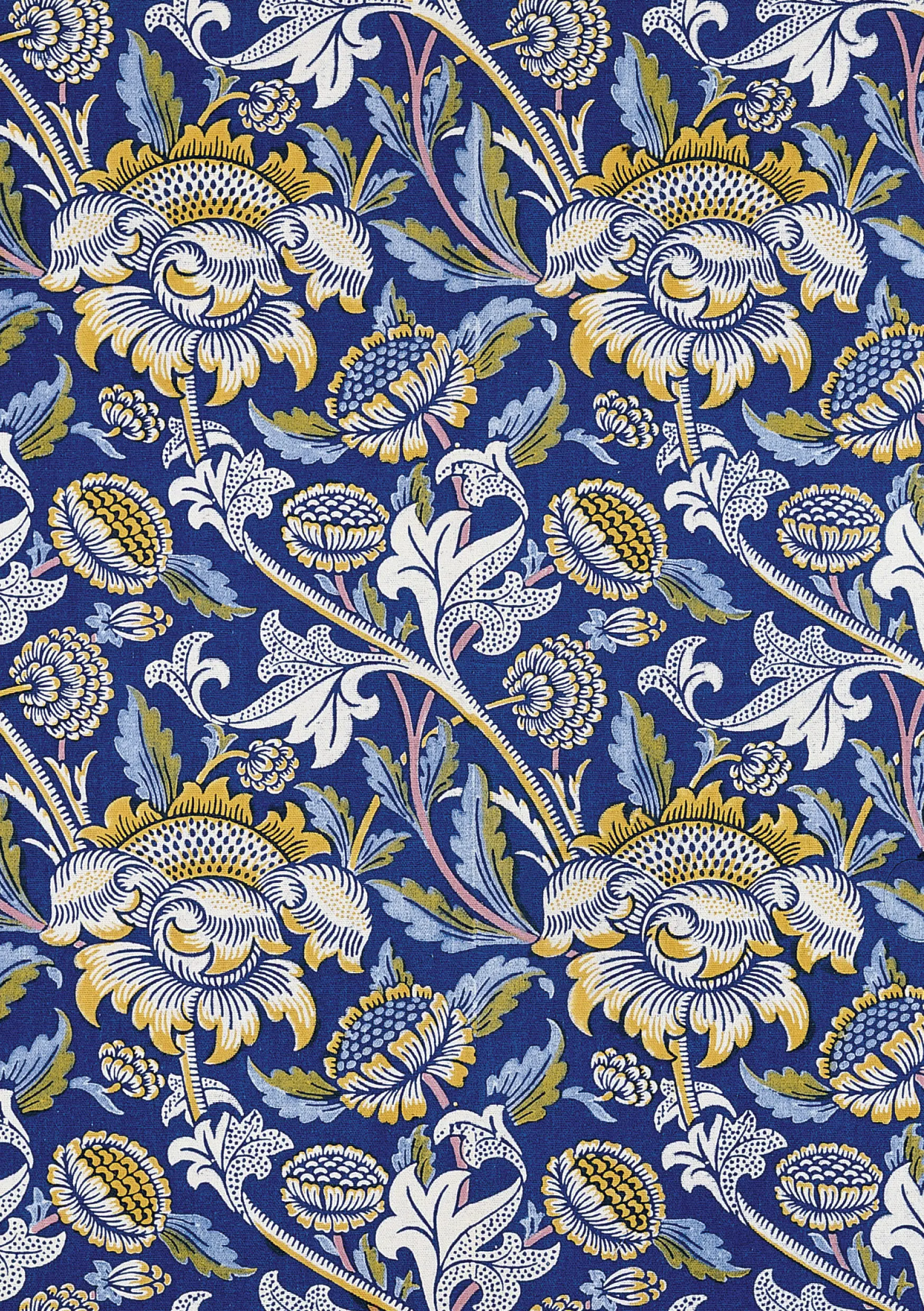
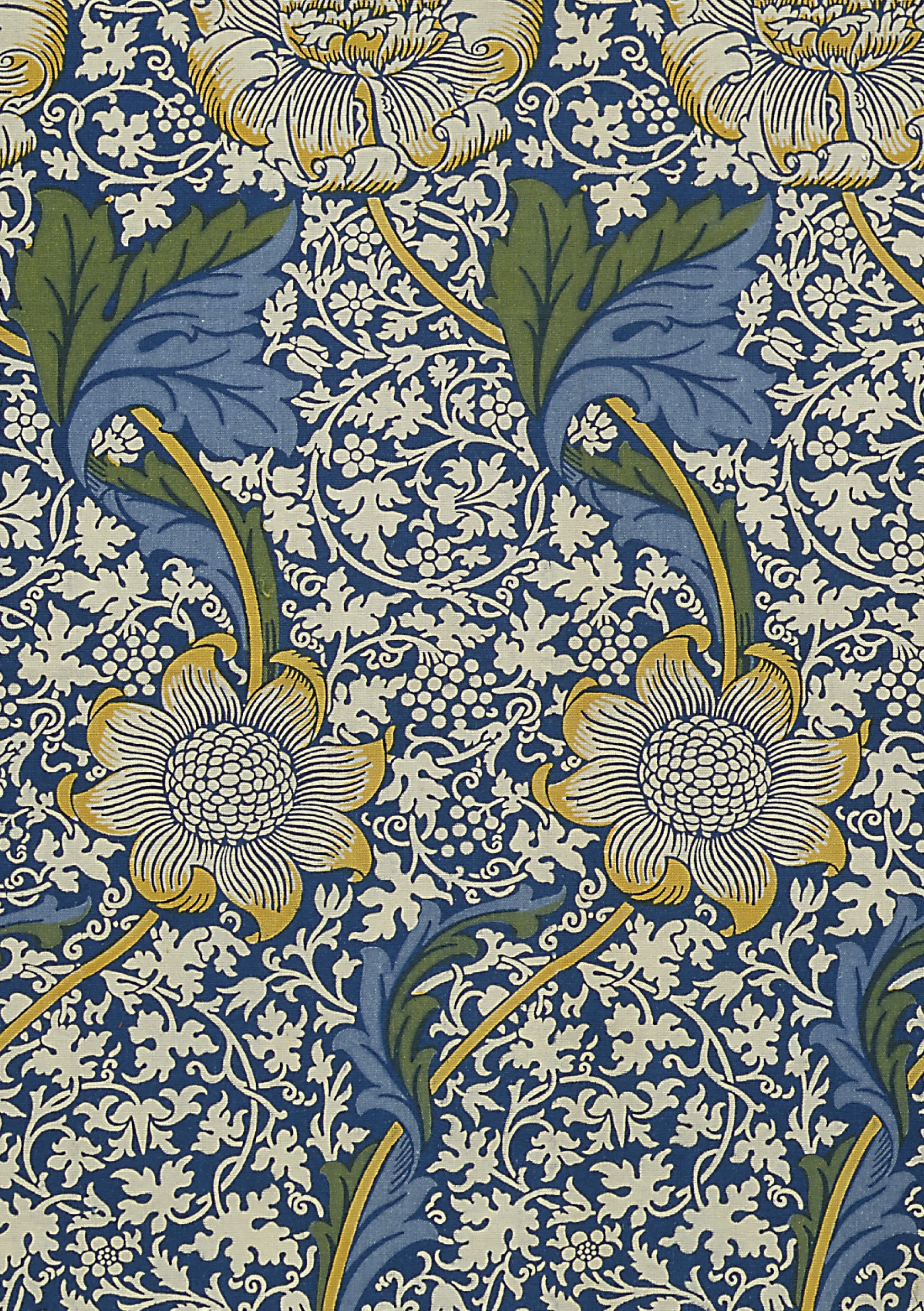
Sunflowers brought a bold, graphic element to Morris’s patterns — their geometric seed centers and radiating petals create a striking contrast with the organic flowing vines. The yellow sunflower on navy blue is one of the most dramatic combinations in the Morris canon.
The Rose
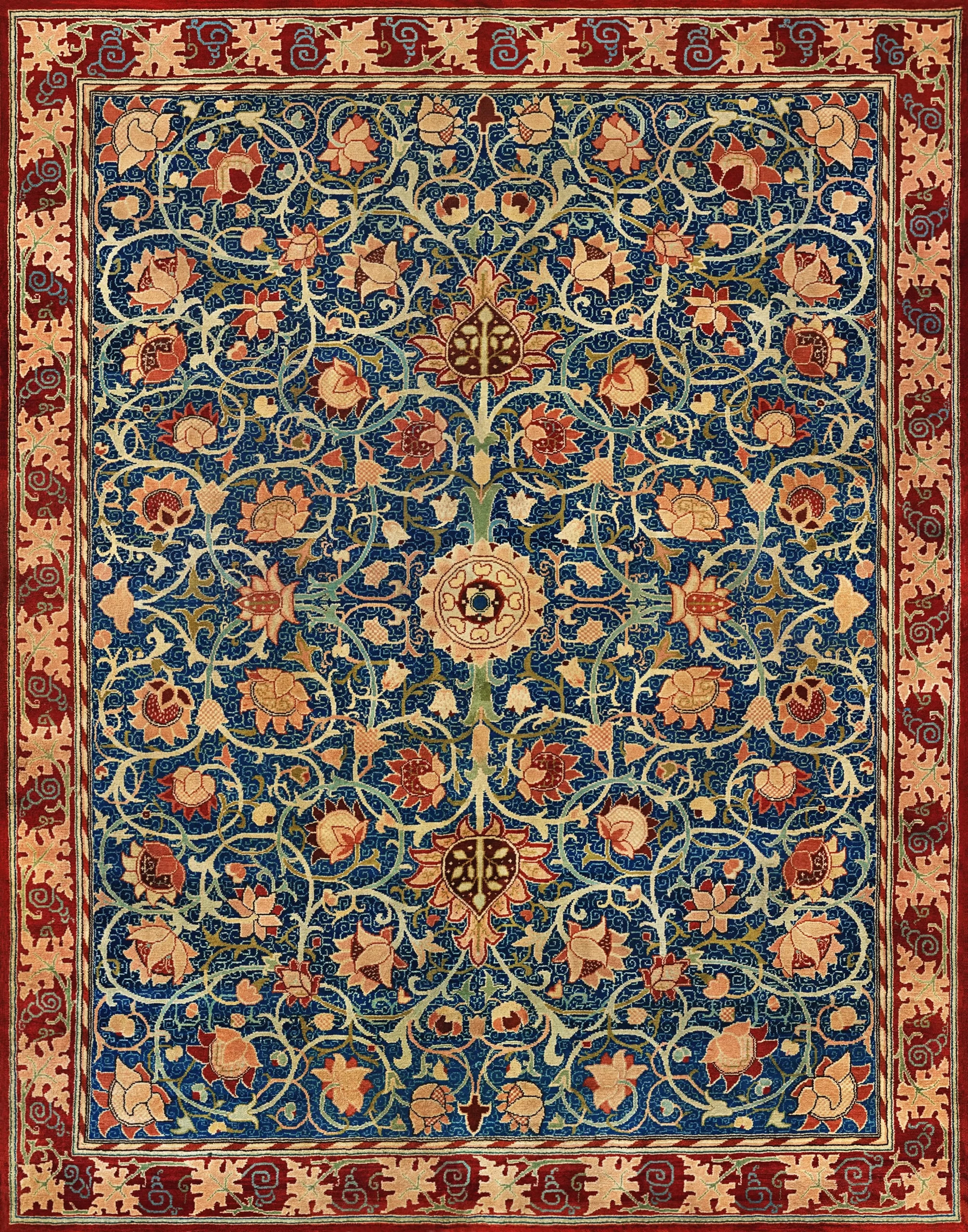
No designer has used the rose more inventively than Morris. His roses are never single, isolated blooms — they cluster along vines, peek through trellises, and intertwine with thorny stems. The crimson rose on navy is a masterwork of warm-on-cool contrast.
The Anemone
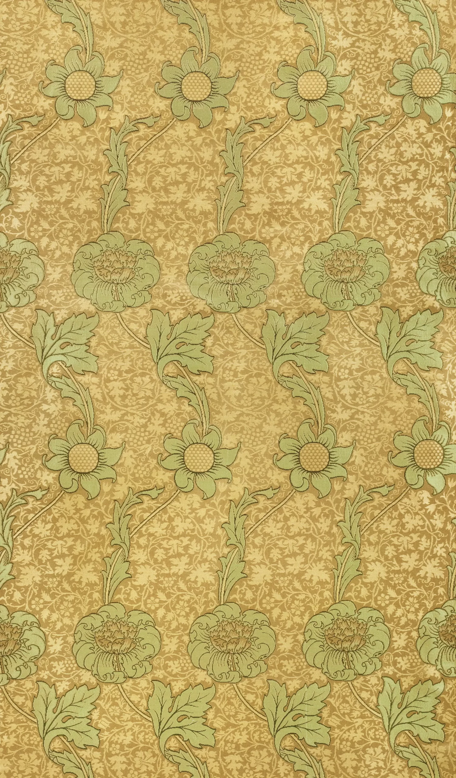
Anemones — with their dark centers and simple, open petals — provided Morris with a more understated, melancholic flower. They appear in some of his most subtle and sophisticated designs, particularly against sage green and gold backgrounds.
The Arabesque Influence
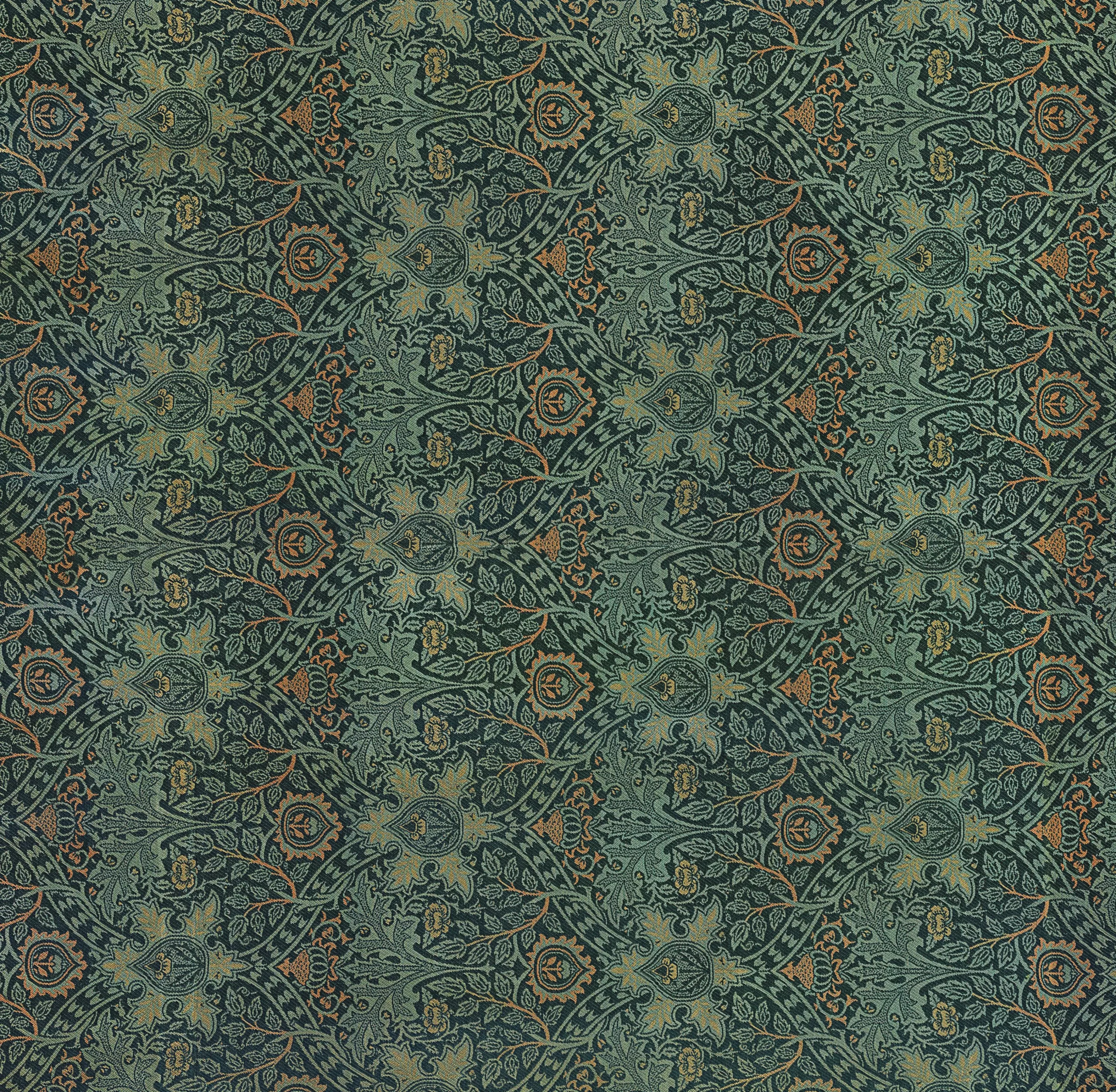
While Morris’s flowers are distinctly English, his compositional structure owes much to Islamic and Persian art. The arabesque — the technique of creating interwoven, rhythmic patterns of scrolling lines — was a fundamental organizing principle in his work. Morris collected Persian carpets and studied Islamic pattern books. He understood that the beauty of a repeating pattern comes not from individual elements but from the spaces between them — the rhythm of the negative space.
How to Use William Morris Patterns Today
Morris’s designs are not museum pieces — they’re practical creative resources. Here are some ways designers, crafters, and hobbyists use the William Morris patterns in our collection:
Interior Design
Morris patterns remain popular for wallpaper, upholstery, and curtains. A single Morris accent wall can transform a room, adding depth, warmth, and a sense of history. Interior designers often pair Morris patterns with solid-colored furniture to let the pattern breathe.
Textile and Fashion Design
The repeating nature of Morris patterns makes them ideal for fabric printing. Designers use them as reference for creating their own floral prints, or adapt the color palettes for contemporary fashion collections. The sage-and-crimson combination is particularly on-trend.
Stationery and Packaging
Morris patterns lend instant elegance to wedding invitations, greeting cards, gift wrap, and luxury packaging. The dense, decorative quality says “crafted” and “heritage” — exactly the message premium brands want to communicate.
Digital Design Reference
Web and graphic designers study Morris’s work to understand color harmony, pattern rhythm, and floral stylization. His approach to negative space and repeat structures remains relevant for modern surface design.
Why William Morris Still Matters
In an era of minimalist, tech-driven design, Morris’s lush maximalism feels like a counterpoint — a reminder that beauty can be abundant, layered, and unapologetically decorative. His philosophy that everyday objects should be beautiful, his commitment to craftsmanship, and his reverence for nature all resonate strongly with contemporary movements toward slow design, sustainability, and mindful making.
Morris once wrote: “Have nothing in your house that you do not know to be useful, or believe to be beautiful.” His patterns are both — they decorate walls and fabrics while also telling a story about the relationship between humans and the natural world.
Explore the Full Collection
Browse all William Morris patterns and download them for free:
- William Morris Patterns Collection — designs
- Floral Patterns — broader flower pattern collection
- Wallpaper Designs — decorative wall covering patterns