
Eleonore Pelluau: Whimsical Character Illustrations and the Art of Charming Design
Some illustrators build an entire world out of a single glance. The characters of Eleonore Pelluau do exactly that: enormous sparkling eyes, hair in every color of the rainbow, and smiles that seem to invite you into the frame. Her portfolio — a generous mix of personal projects, fan art, seasonal greetings, and commissioned portraits — has become a favorite reference for anyone who loves charming, storybook-style character illustration.
This article walks through her signature style, shows how fan art sharpens character-design instincts, and breaks down the practical lessons designers can borrow — whether you illustrate for children’s books, stickers, prints, or your own creative projects. Every image below links to its full-resolution page as design reference.
A Recognizable Signature: Big Eyes, Soft Lines, Saturated Color
The first thing anyone notices in a Pelluau illustration is the eyes. They are oversized, glossy, and loaded with personality — often the single largest shape on the page. Around them, everything else stays soft: rounded chibi proportions, smooth painterly linework, and cheeks dotted with blush. It is a formula rooted in kawaii aesthetics and classic children’s book art, executed with remarkable consistency.
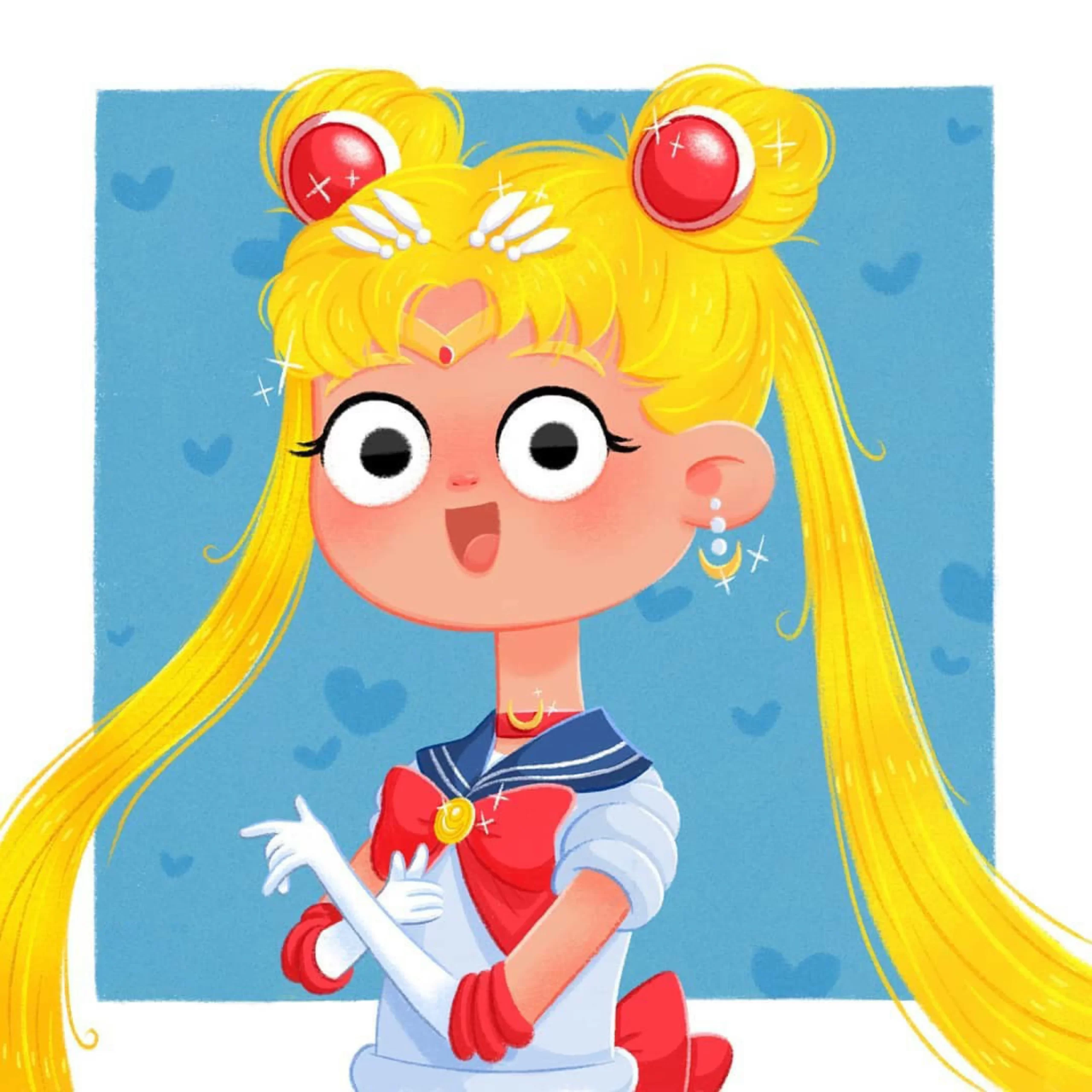
Her take on Sailor Moon shows the approach in its purest form. The iconic odango hairstyle, red bows, and tiara are all there, but the proportions have shifted decisively toward cute: a large head, a compact body, and an open, excited smile. The background is a flat pastel blue scattered with faint hearts — just enough pattern to feel festive without competing with the character.
That background strategy repeats across the whole body of work: a single saturated color field, occasionally textured with stars, hearts, snowflakes, or feathers, acting as a frame for the figure. It is a smart workflow decision — the character stays the hero, and the flat color gives each piece a poster-like punch that reads beautifully at thumbnail size.
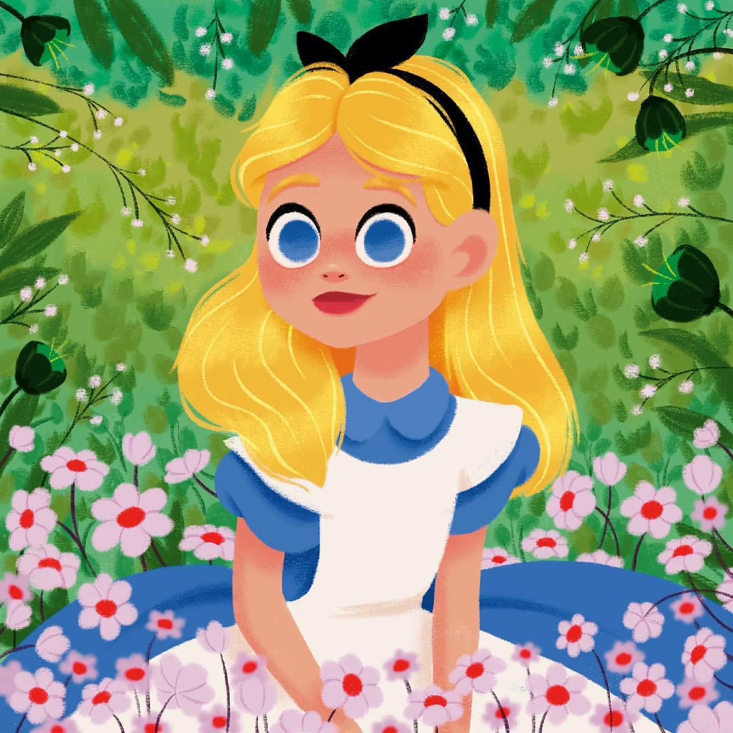
When she wants more depth, the backgrounds bloom into scenes — like this Alice in Wonderland piece, where a lush fantasy garden of layered greens, pinks, and blues surrounds the curious blonde heroine. Note how the eye is still drawn straight to Alice’s face: the flowers are rendered softer and looser than the figure, a classic depth-by-detail trick every illustrator should steal.
Fan Art as a Character-Design Laboratory
A large share of Pelluau’s collection is fan art — Sailor Moon, Alice, Rapunzel, Maleficent, Totoro, Harry Potter characters, and more. For a working illustrator, fan art is not just a love letter to favorite stories; it is a rigorous design exercise with built-in constraints. The challenge: how do you make a world-famous character instantly recognizable while filtering it through your own style?
The answer lies in identity through minimal cues. One green striped tie says Slytherin. One pair of curved black horns says Maleficent. One pink umbrella and a leaf on the head says Totoro. Everything else — proportions, palette, mood — belongs to the illustrator.
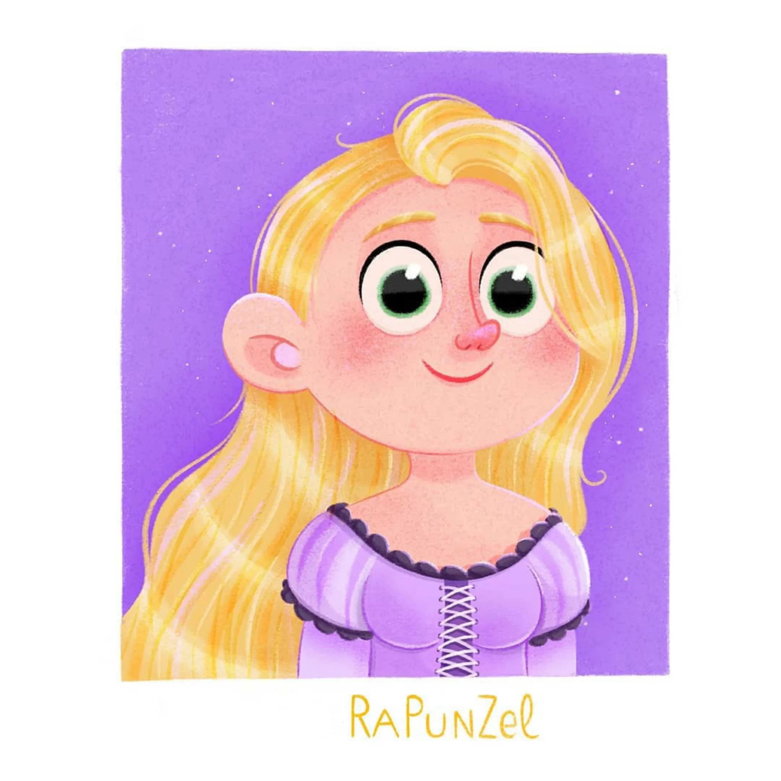
The Rapunzel portrait distills the fairy tale to its essence: impossibly long blonde hair, a lavender lace-trimmed dress, and a dreamy purple sky freckled with stars. Nothing else is needed — no tower, no prince, no lanterns. It is a lesson in how few elements a strong character concept actually requires.
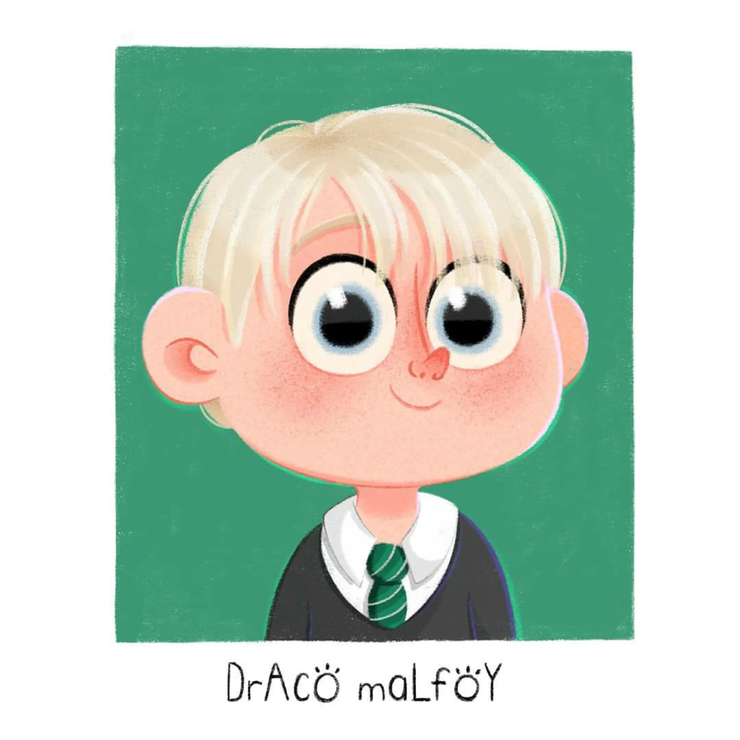
Her chibi Draco Malfoy pushes the idea further. The haughty Slytherin antagonist is reimagined as a soft-cheeked, wide-eyed boy — the recognizable cues (platinum hair, green tie, black sweater) carried over intact, the personality completely re-tuned. Playing with tone against an established character is one of the fastest ways to learn how shape language and expression control a viewer’s emotional response.
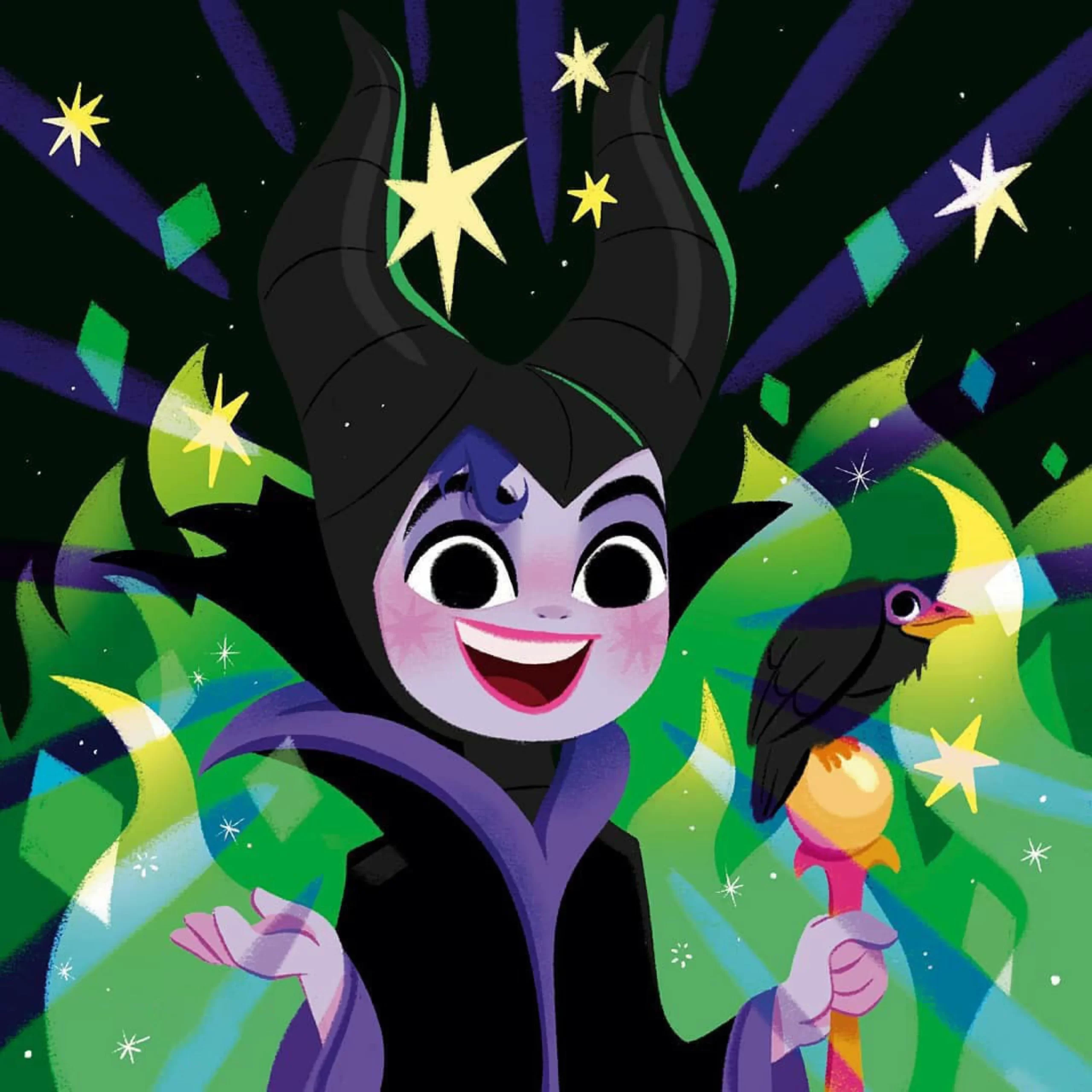
The Maleficent piece is the boldest tone-shift of all: Disney’s mistress of evil, smiling warmly against a burst of purple rays, yellow stars, and floating geometric shards, with her raven perched on a candy-colored staff. Villain iconography meets birthday-card energy — proof that a palette swap plus an open smile can flip a character’s entire emotional register.
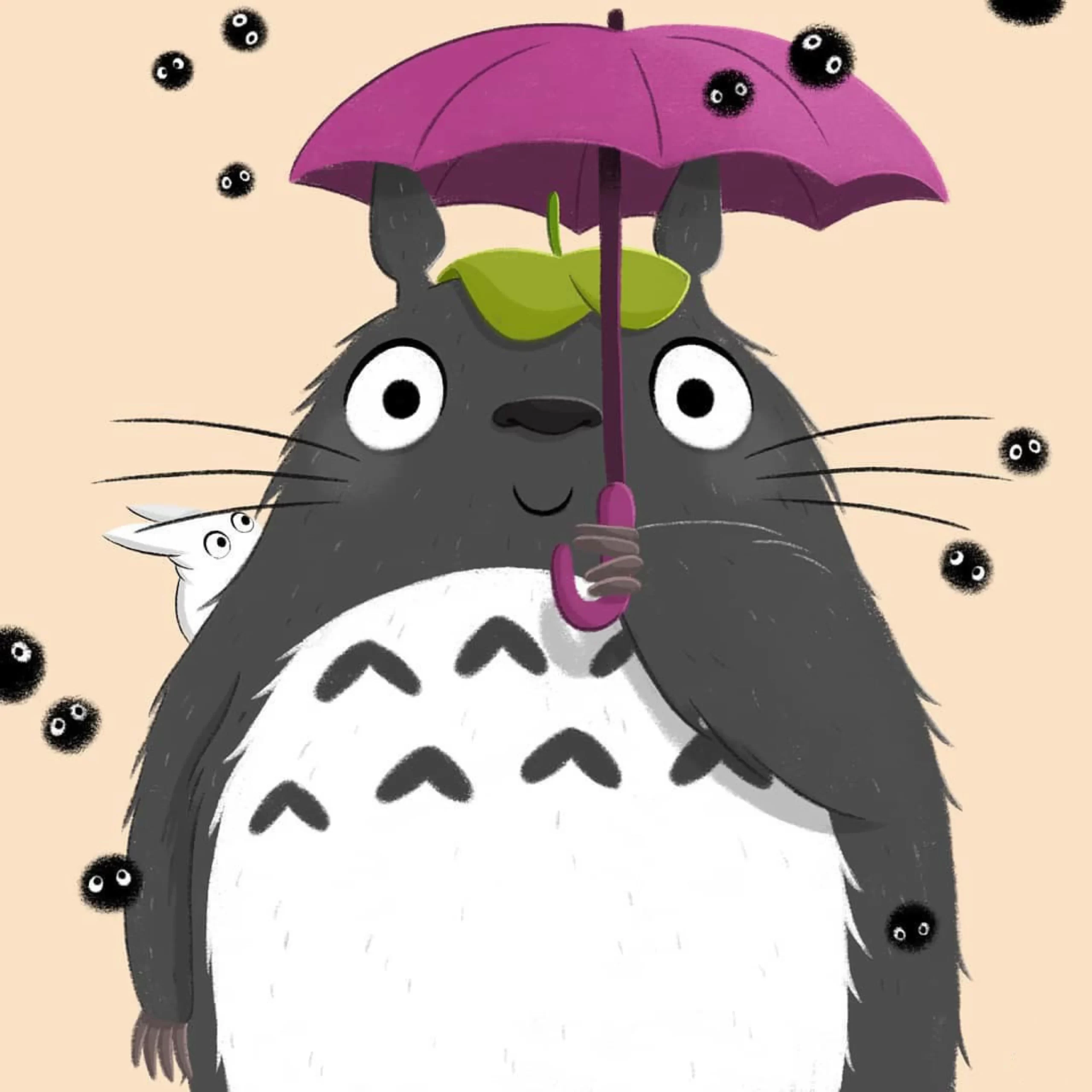
And then there is Totoro — gray, fuzzy, and gentle as ever, holding his bright pink umbrella with a leaf perched on his head while soot sprites drift through the warm beige air. Adapting Studio Ghibli’s soft, tactile worlds into a cuter proportion system without losing their coziness takes real control of texture and value.
Original Characters and Small Worlds
Fan art may open the door, but original characters are where an illustrator’s own storytelling voice emerges. Pelluau’s originals lean hard into fantasy: mermaids, witches, fairies, and monsters, all rendered with the same glossy eyes and candy palettes — yet each piece adds a new storytelling layer.
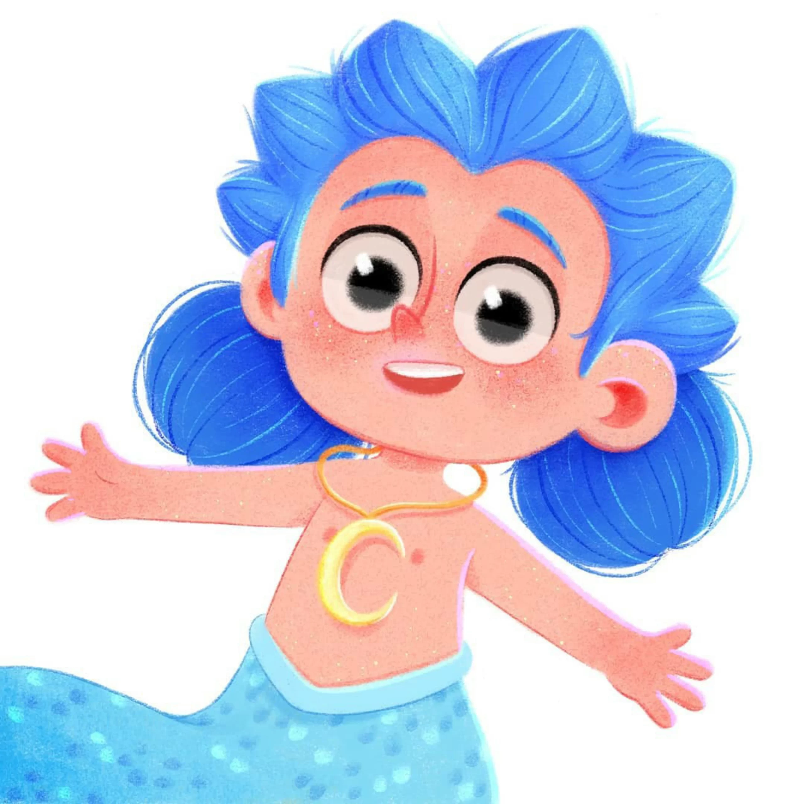
The blue-haired mermaid demonstrates dynamic posing: arms flung wide, body twisting mid-swim, spiky hair full of movement. Where the fan portraits stand still and greet the viewer, the original characters dance. That contrast is worth studying — static poses build approachability; motion builds energy. Knowing when to use each is the difference between a portrait and a story.
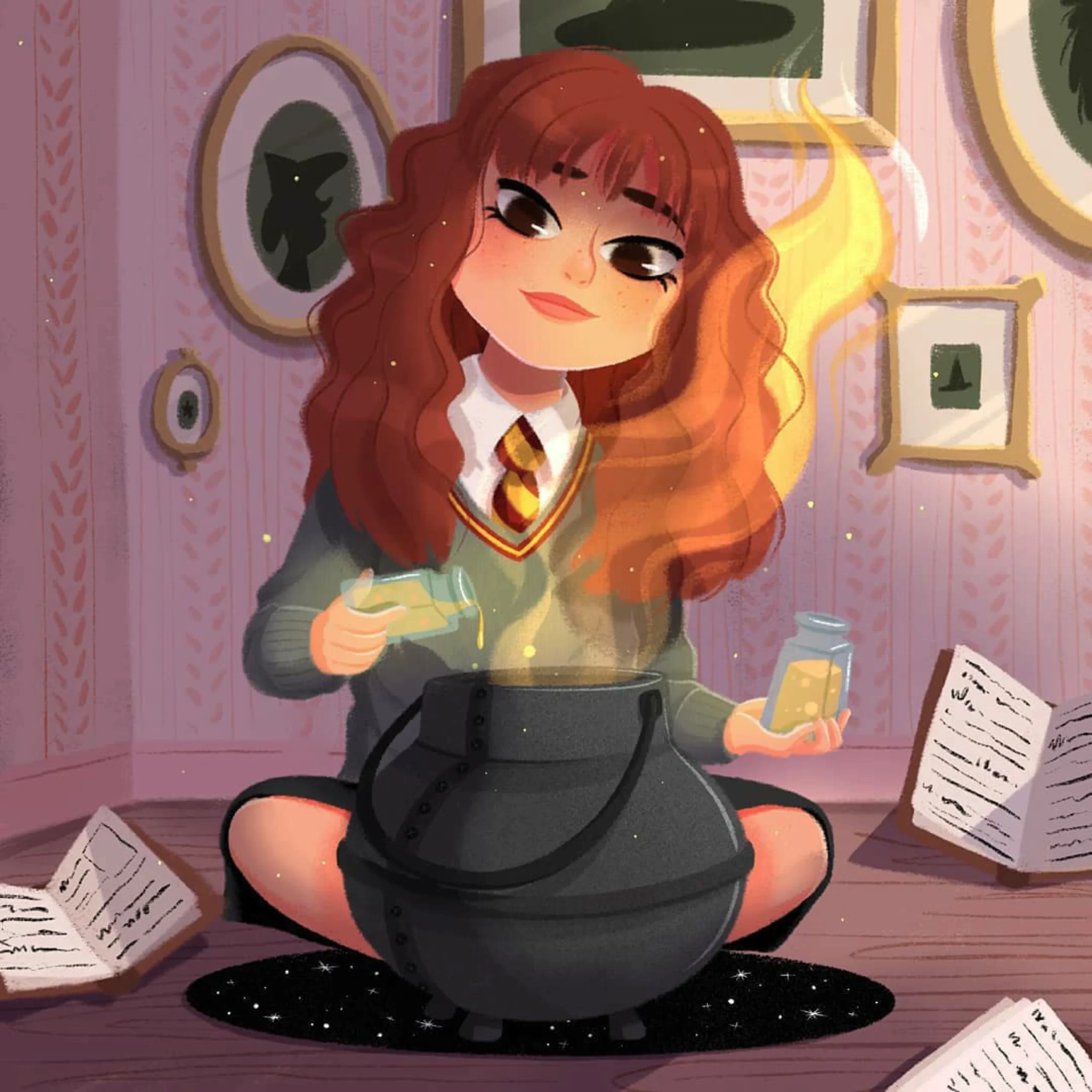
The potion-brewing witch is arguably the richest composition in the collection: a cross-legged girl pouring glowing liquid into a dark cauldron, surrounded by open spellbooks, framed wall art, leaf-patterned wallpaper, and a star-scattered rug. Every prop adds narrative — you can almost read her afternoon in the room. Aspiring children’s book illustrators should study how little it takes to imply a whole life: three or four well-chosen objects beat an empty room or a busy crowd.
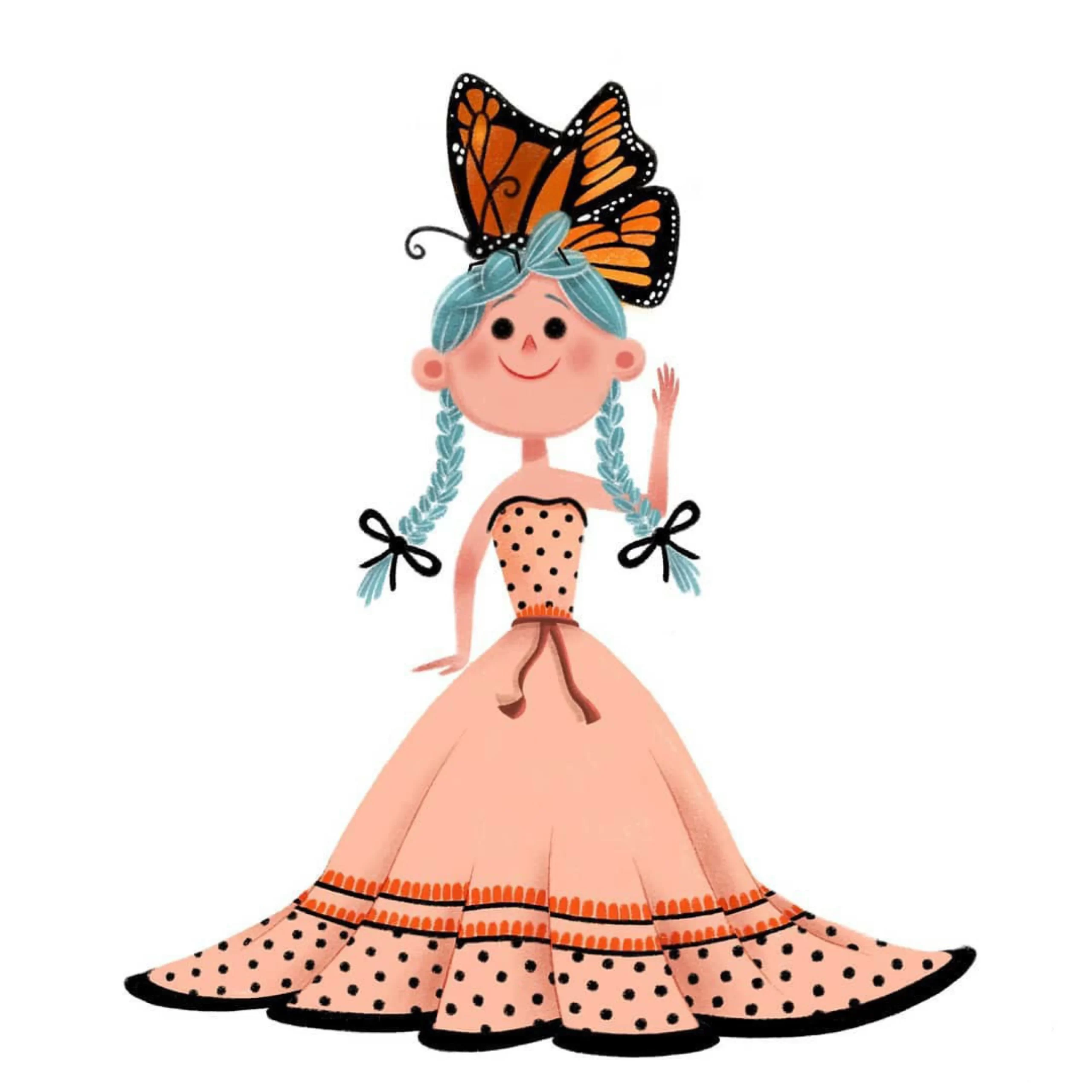
Color pairing is another quiet strength. The butterfly girl combines pale turquoise braids with a peach polka-dot gown and a monarch butterfly crown — a three-color scheme (teal, peach, orange) that feels effortless but is clearly deliberate. Restricting each character to two or three accent colors keeps designs memorable and reproducible across stickers, prints, and products.
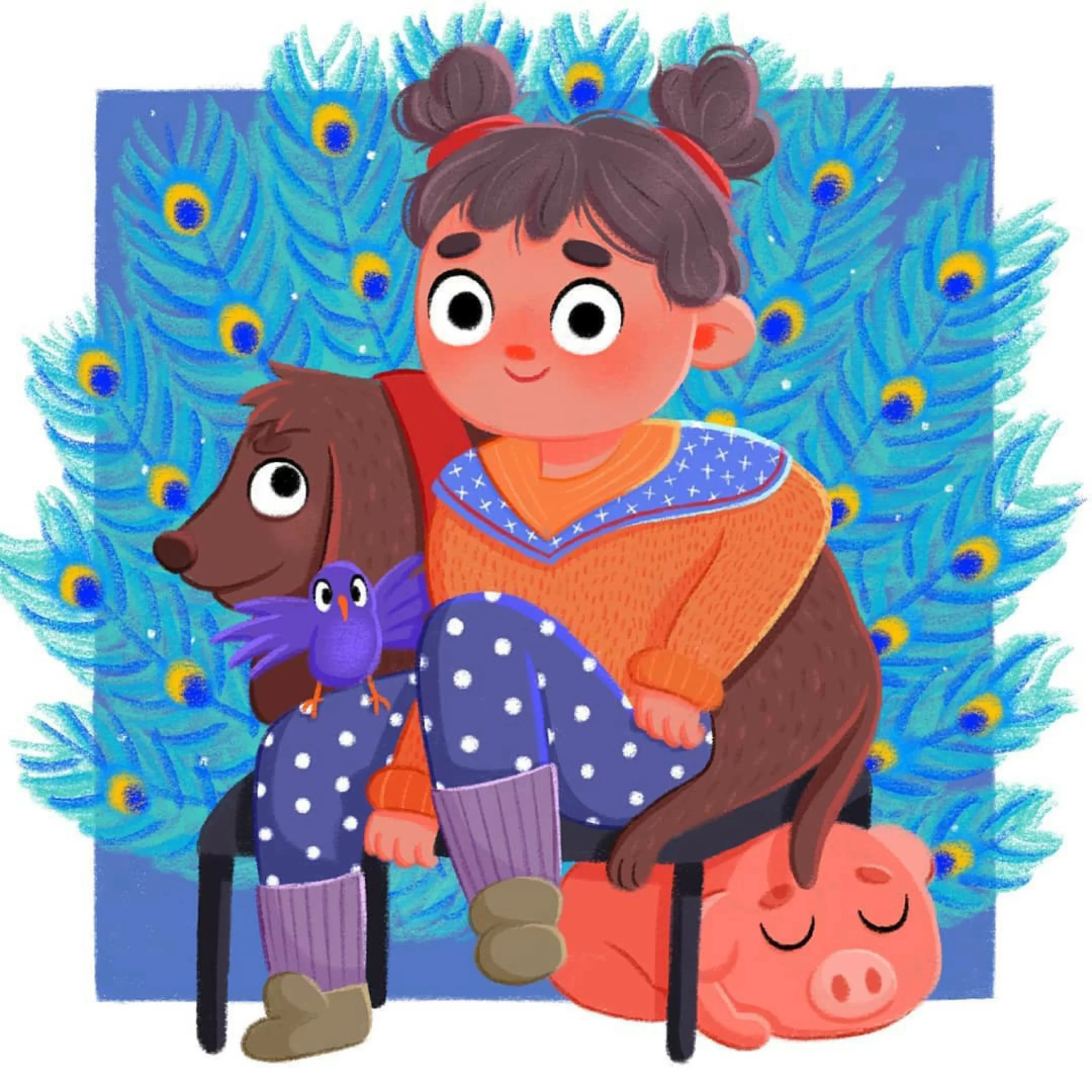
The peacock-feather portrait shows a different kind of world-building: a girl and her companions — a dachshund, a purple bird, and a sleeping pig — seated against an electric-blue wall of stylized peacock feathers. Pattern as environment. It is the same trick surface-pattern designers use, applied to character illustration, and it turns a simple sitting pose into an ornamental poster.
Seasonal Greetings and Portrait Commissions
Alongside the fantasy pieces sits a steady stream of seasonal and commissioned work — Christmas sweaters, New Year greetings, Valentine portraits. Commercially, this is the bread and butter of a working illustrator, and it has its own skill set: motif vocabulary and color conventions.
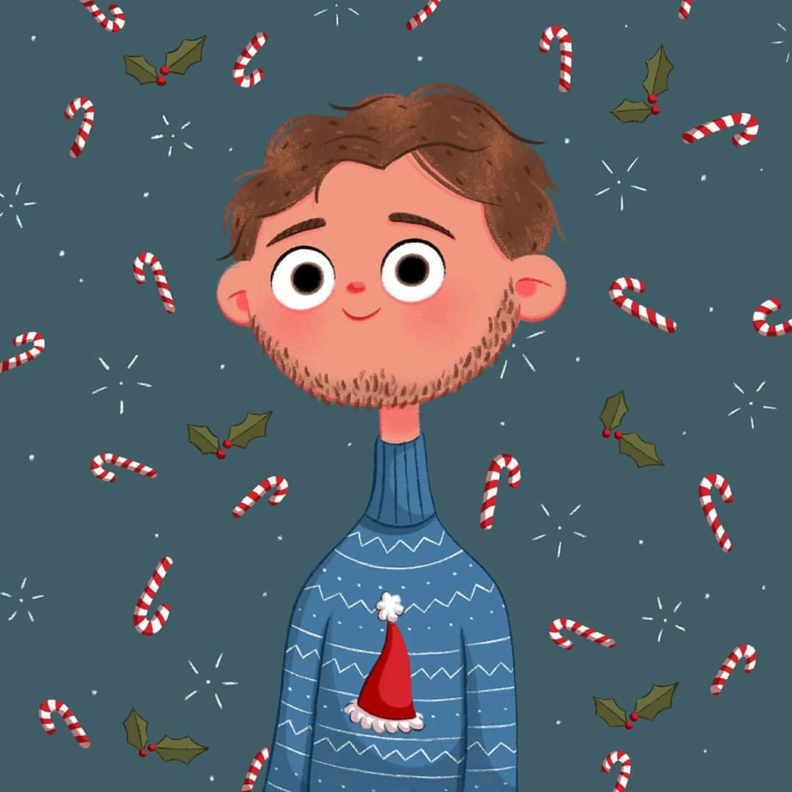
The Christmas portrait ticks every box of the holiday visual language — red-and-white candy canes, holly with berries, a mini Santa hat, snowflake sparkles on a deep teal ground — without tipping into clutter. Each seasonal motif gets its own breathing space around the figure. When you illustrate holiday cards or shop banners, spacing your motifs is what separates festive from noisy.

The vintage straw-hat portrait points at another recurring interest: period fashion. A wide-brimmed hat stacked with poppies, daisies, and a dramatic black feather; a high-collared blouse with a tied bow; soft gray-green curls — the whole piece reads like a page from a storybook set a century ago. Costume history is a bottomless idea bank for character illustrators, and even a single era-appropriate accessory can anchor a character in time.
Five Lessons to Borrow for Your Own Characters
Whether you design characters for picture books, greetings cards, stickers, or brand mascots, Pelluau’s working habits translate directly:
- Let the eyes carry the emotion. Oversized, glossy eyes are an instant empathy hook — but the same principle scales down: whatever size you draw, give the eyes the most careful rendering on the face.
- Frame with flat color. One saturated background tone, optionally patterned with stars or hearts, makes figures pop and unifies a series — ideal for portfolios and product lines.
- Identify characters through minimal cues. A tie, a horn, an umbrella. If your design needs a paragraph of explanation, it needs another pass of simplification.
- Build rooms, not voids. Three or four storytelling props — books, a rug, a cauldron — give a character a life without crowding the frame.
- Lock a small palette. Two or three accent colors per character keeps designs cohesive across poses, products, and seasons.
Browse the full collection through the topics below, open any illustration at full size as design reference, and see how these principles hold across hundreds of characters — princesses, witches, monsters, and everything in between.
Explore More
- Eleonore Pelluau — the complete character illustration collection
- Character Design — more character studies and references
- Fantasy Art — witches, mermaids, and enchanted worlds
- Mermaid — underwater fantasy characters
- Harry Potter — wizarding world fan art