
Free Fonts: Inter, DIN Pro & Smiley Sans — Font Finds Vol. 1
Every project eventually comes back to the same question: which typeface? The right font sets the tone before a single word is read — engineered and trustworthy, friendly and approachable, or sharp and fashion-forward. And the best news for designers on any budget is that some of the most useful typefaces in the world cost nothing.
This roundup features five free font downloads available on Gropicture right now: Inter, DIN Pro, Smiley Sans, Sephora, and Newtown — a working toolkit that covers user interfaces, signage and packaging, bilingual headlines, fashion branding, and friendly editorial text. Each section explains what the typeface looks like, where it shines, and links straight to the free download page.
Inter: The Interface Typeface That Conquered the Web
If you have used GitHub, Figma, or roughly half the startups launched in the last five years, you have already read Inter. Designed by Rasmus Andersson as an open-source typeface purpose-built for computer screens, Inter has become the default choice for user-interface design — and it is free for personal and commercial use.
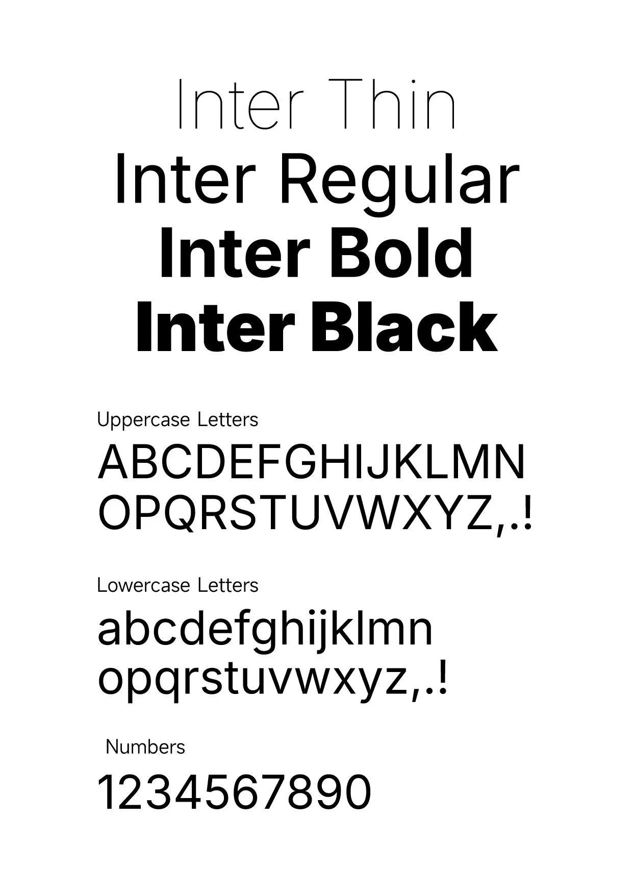
The family runs from Thin to Black, with a tall x-height and open counters that keep text crisp at small sizes — exactly the properties screen typography demands. Letterforms are clean and slightly geometric, but with enough human warmth that long paragraphs never feel clinical.
Use it for: apps, websites, dashboards, product UI, and any design system that needs one dependable sans to do everything. If you can only download one font from this list, make it Inter.
DIN Pro: German Engineering in Letterform
Few typefaces carry a story like DIN. Its ancestor, DIN 1451, was drawn in the 1930s for German technical documentation and road signage under the Deutsches Institut für Normung — the German standards institute. The lettering had one job: absolute legibility, produced at any sign shop, at any size. That engineering pedigree made DIN the unofficial typeface of industry, logistics, and tech branding for decades.
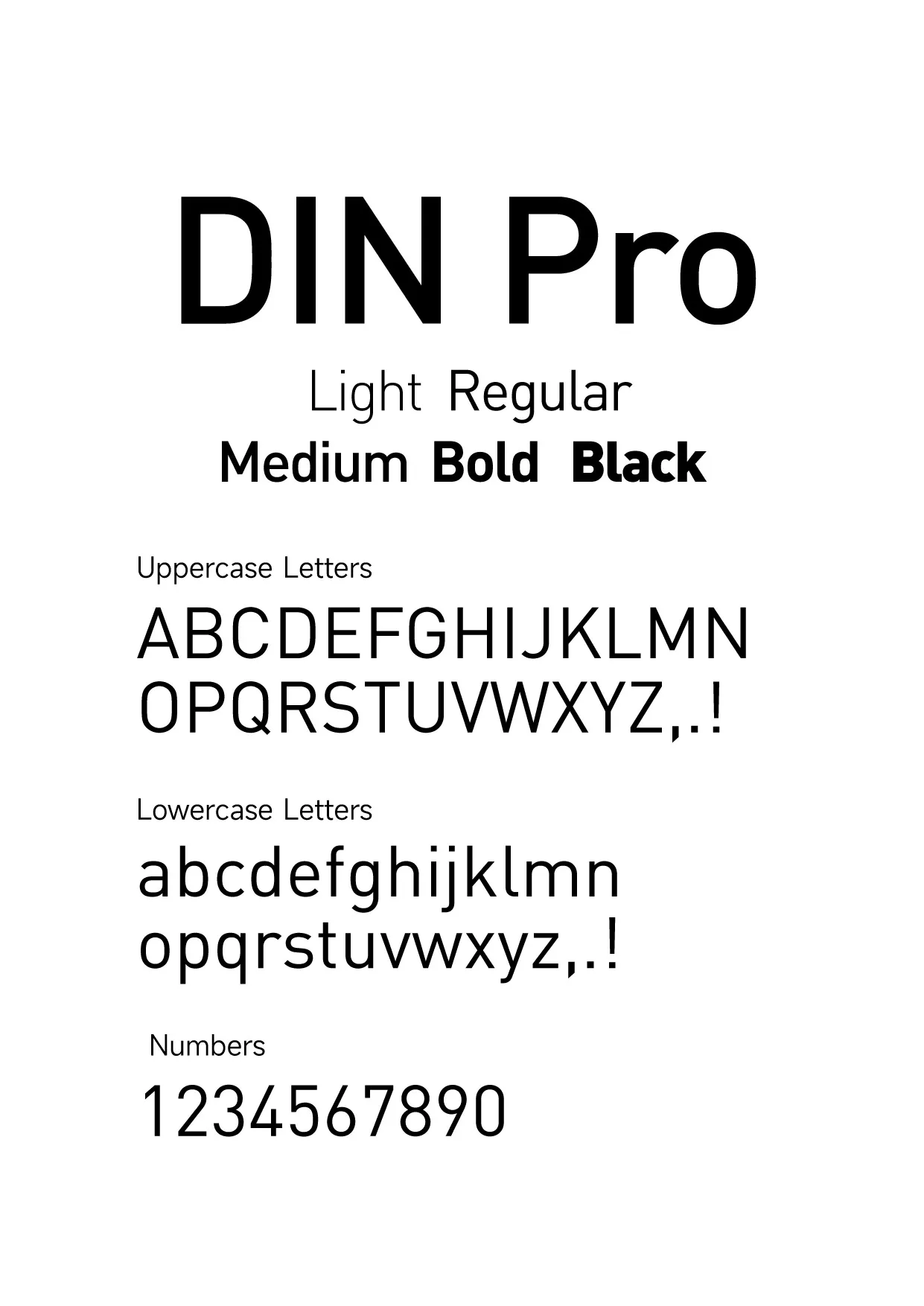
DIN Pro extends that utilitarian skeleton into a full professional family — Light, Regular, Medium, Bold, and Black — with straight-sided, monolinear letterforms that read as precise and honest. There is no decoration anywhere: every curve exists for clarity, which is precisely why the font looks so authoritative.
Use it for: packaging, wayfinding, technical documents, industrial and sports branding, safety signage, and any layout that should feel engineered rather than decorated.
Smiley Sans Oblique: The Energetic Headline Font for Chinese and Latin
Smiley Sans — 得意黑 in Chinese — is the outlier of this list and one of the most exciting free releases of recent years: an open-source typeface built for bilingual design. Its defining move is the forward slant: every letterform and character leans into the reader, giving headlines momentum even when standing still.
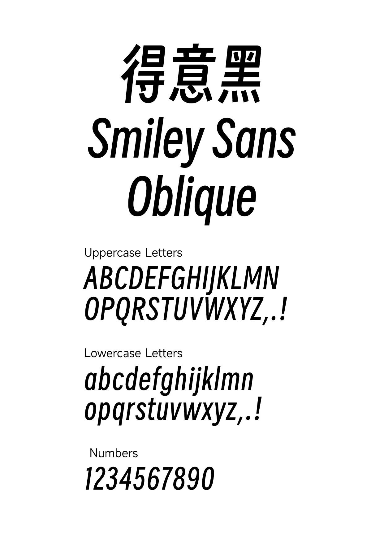
The design is condensed and boldly weighted, so it packs real presence into narrow layouts — poster titles, banner text, product hero copy. Because Chinese characters and Latin letters share the same slant, weight, and rhythm, mixed-language designs finally look intentional rather than patched together. That single advantage explains why it spread quickly through Chinese web and poster design.
Use it for: posters, event banners, social-media headlines, e-commerce hero sections, and any project mixing Chinese and English that needs speed and attitude.
Sephora: Geometric Sans with Beauty-Counter Polish
The Sephora wordmark — that stark, confident lettering on every black-and-white beauty box — has become a reference point for modern retail branding. This typeface follows the same recipe: a geometric sans-serif with squared, structured contours and a sleek, high-fashion finish, available in Regular, Bold, and Italic.
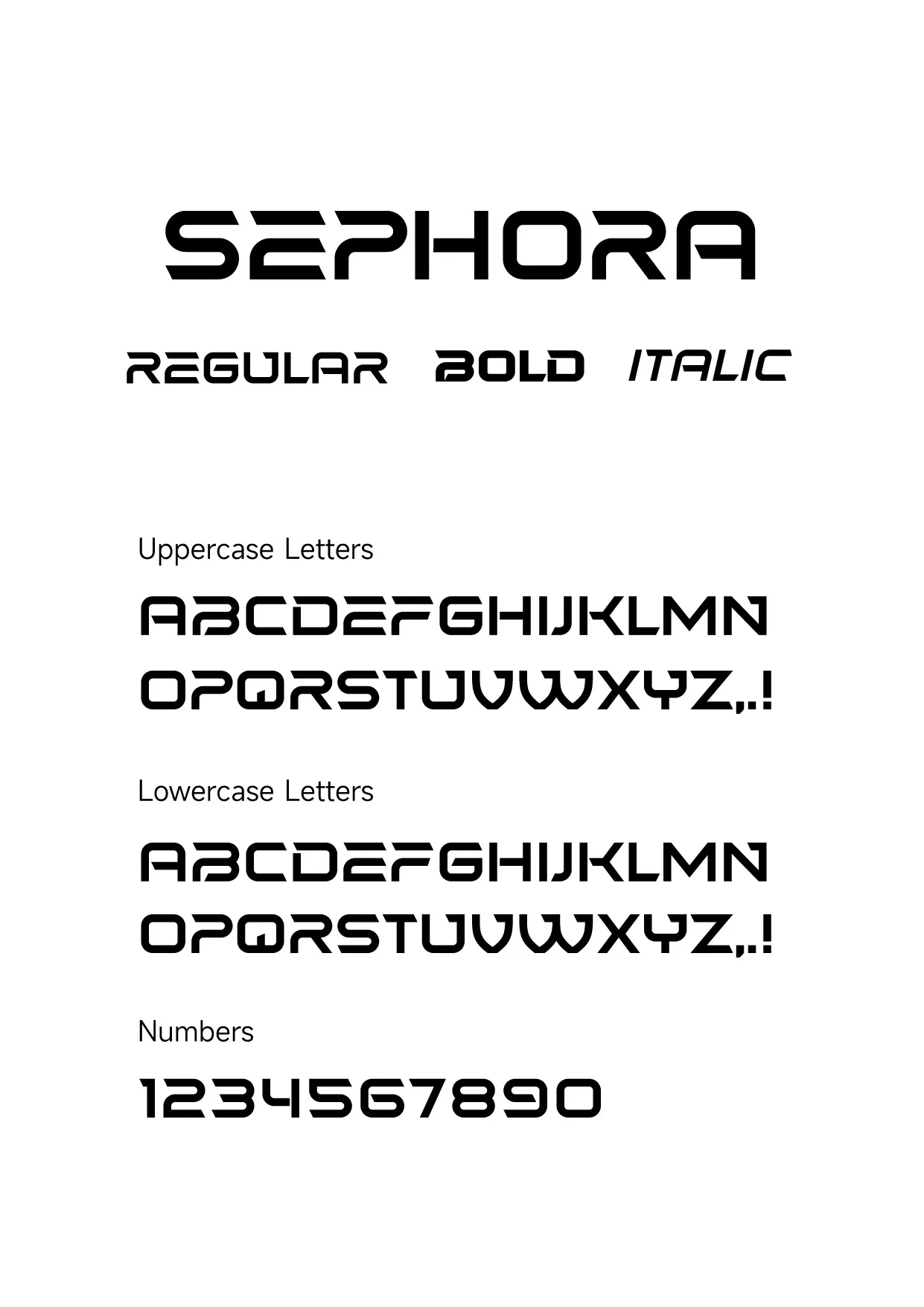
What makes this style work is restraint: wide, even capitals, minimal stroke contrast, and corners that stay crisp at both large and small sizes. It signals premium without a single flourish — the typography equivalent of a clean boutique interior.
Use it for: cosmetics and fashion branding, lookbooks, packaging mockups, luxury retail layouts, and minimal logo explorations.
Newtown: The Friendly Modern Sans
Not every project needs the authority of DIN or the polish of Sephora. Newtown rounds out this toolkit as the approachable one: a modern sans-serif with rounded terminals and open, even letterforms that feel warm without turning childish.
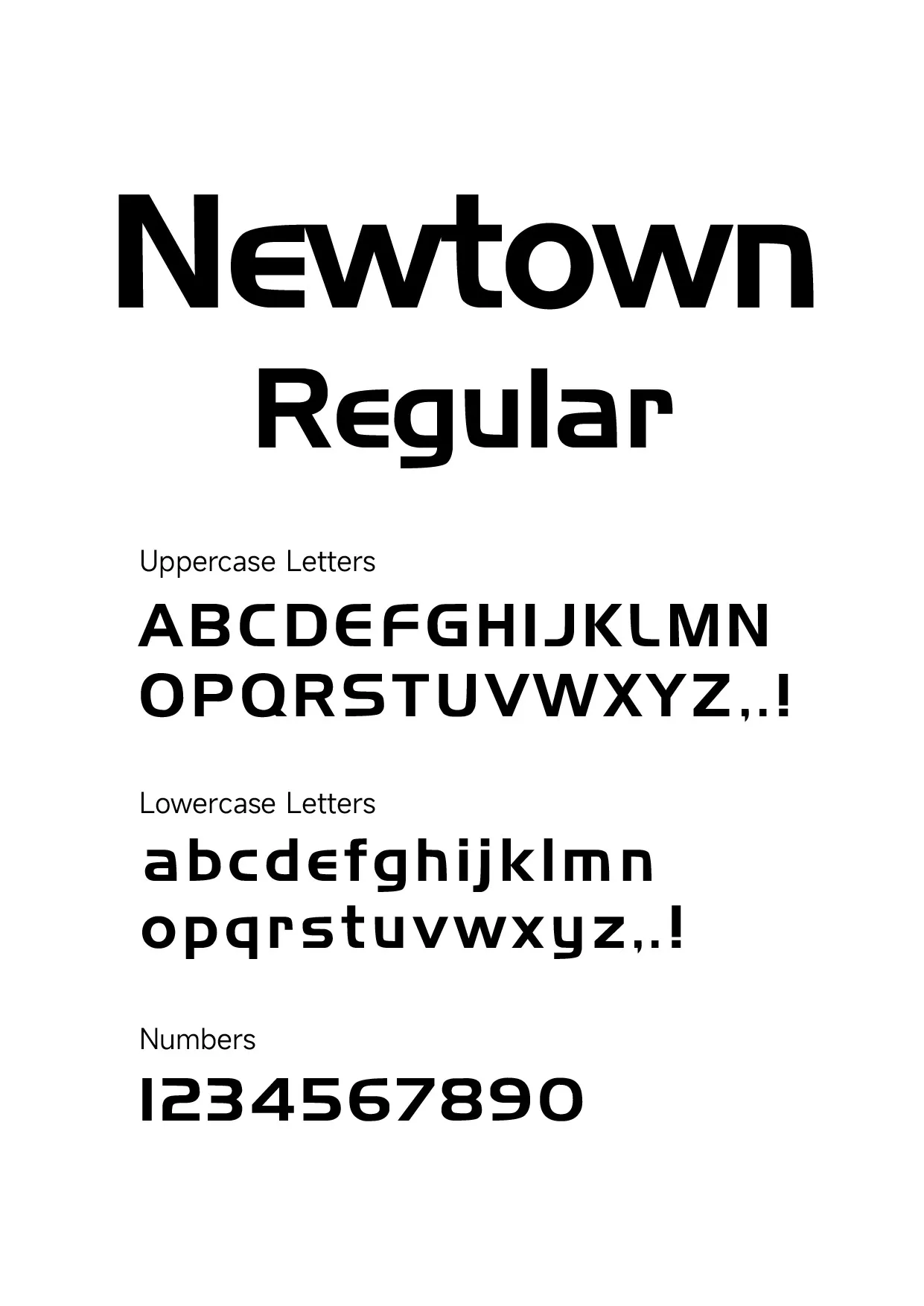
The curves do the work: softened corners on the capitals, circular bowls, and a steady rhythm that stays readable in paragraphs yet still carries personality in headlines. It is the kind of typeface that makes a brand feel like a person rather than an institution.
Use it for: lifestyle branding, blog and editorial design, wellness and food packaging, children’s publishing, and friendly UI voice.
How to Choose Between Them
- Digital product or website? Start with Inter — screen-optimized, huge family, zero licensing risk.
- Packaging, signage, or technical branding? DIN Pro brings engineered credibility.
- Chinese and English together, or bold promo headlines? Smiley Sans Oblique solves both in one typeface.
- Beauty, fashion, or premium retail? The Sephora-style geometric sans delivers boutique polish.
- Warm, human editorial voice? Newtown keeps it friendly.
All five specimens are available as design reference on their pages — grab the ones that fit your next brief.
Explore More
- Inter Font — free download
- DIN Pro Font — free download
- Smiley Sans Oblique Font — free download
- Sephora Font — free download
- Newtown Font — free download
- Font Download — the full free font collection