
Free Paper Textures: Essential Design Assets for Every Creative Project
Every designer has a folder of paper textures. It’s the most quietly essential asset in digital design — the background that makes flat screens feel tactile, the overlay that adds instant warmth to sterile layouts, the surface that grounds typography in physical reality. A great paper texture costs nothing to apply and transforms everything it touches.
This week’s free collection features paper textures across every major category — cream and kraft, handmade washi and parchment, vintage surfaces and modern grain. All are available for free download and ready to use in branding, packaging, web design, stationery, and social media graphics. Below, we explore what makes each texture type unique and how to choose the right one for your project.
Why Paper Textures Matter in Digital Design
Screens are flat, smooth, and cold. Paper is textured, irregular, and warm. When you place digital content — typography, logos, illustrations — on a paper texture, something psychological happens: the viewer’s brain registers physicality. The design feels printed, crafted, real.
This is why paper textures appear everywhere in professional design:
- Brand identity — business cards and stationery mockups need believable paper surfaces
- Packaging design — kraft and recycled textures communicate eco-friendly values instantly
- Web design — subtle paper grain backgrounds add warmth without distracting from content
- Wedding and event stationery — handmade and parchment textures signal craft and luxury
- Editorial and book design — vintage paper surfaces evoke heritage and timelessness
- Social media graphics — textured backgrounds stand out against the flatness of the feed
The Texture Categories: A Field Guide
Cream and Off-White: The Universal Base
Cream paper textures are the workhorses of design. Warmer than pure white, softer than beige, they provide a neutral base that flatters almost any content — dark typography, colorful illustrations, product photography. Cream reads as “quality paper stock” without calling attention to itself.
Best for: Wedding stationery, elegant branding, portfolio backgrounds, minimal web design.
Vintage Paper: Time Travel in a Texture
Vintage paper textures carry age — subtle staining, faded edges, the warm darkening that paper acquires over decades. These textures instantly communicate history, heritage, and authenticity. A logo placed on vintage paper looks like it has existed for a century.
Best for: Heritage brands, coffee and craft products, book covers, antique-style posters, whiskey and spirits labels.
Kraft Paper: Honest and Eco-Friendly
Brown kraft paper — the color of cardboard boxes and grocery bags — has become the visual shorthand for sustainability and honest materials. Its rough fiber, visible speckles, and warm brown tone make products feel handmade and environmentally responsible.
Best for: Eco-packaging, organic food brands, craft breweries, handmade product labels, rustic wedding decor.
Recycled and Speckled: Visible Sustainability
Recycled paper textures take kraft’s eco-message further with visible flecks and fibers — the visual evidence of repurposed material. The speckled surface adds organic noise that pure digital colors can never replicate.
Best for: Environmental organizations, natural cosmetics, zero-waste brands, artisan food packaging.
Handmade Washi: Japanese Craft Tradition
Washi — traditional Japanese paper made from mulberry fibers — has a distinctive long-fiber texture that is instantly recognizable. The organic web of fibers creates depth and movement, making every square inch unique. Washi textures bring Eastern craft aesthetics and quiet luxury.
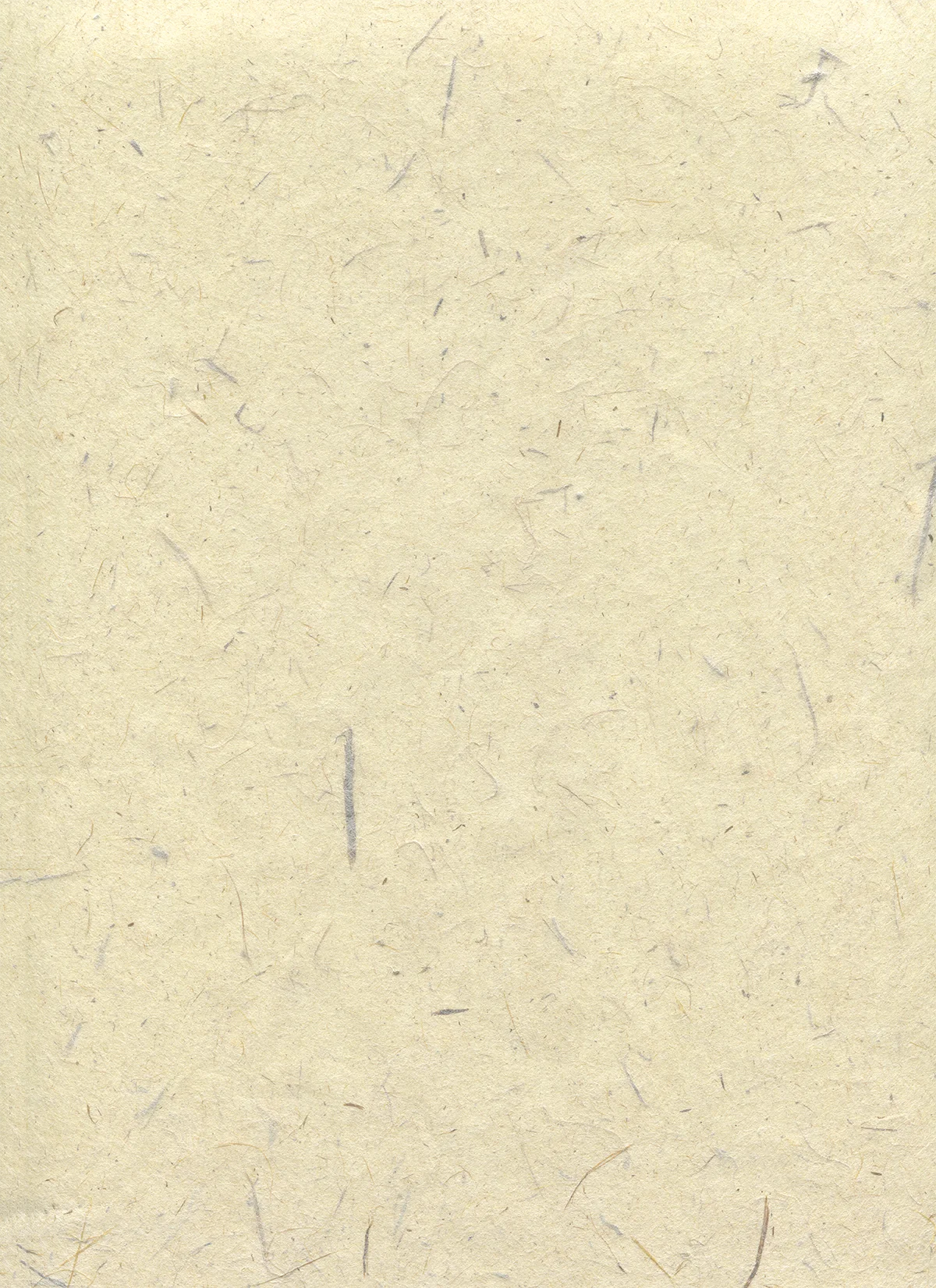
Best for: Zen and wellness brands, tea and ceremonial products, high-end stationery, Japanese-inspired design.
Parchment: Medieval Luxury
Parchment — the processed animal skin used for medieval manuscripts — has a smooth yet organic surface with subtle mottling. It reads as ancient, ceremonial, and precious. Parchment textures evoke libraries, certificates, and documents of importance.
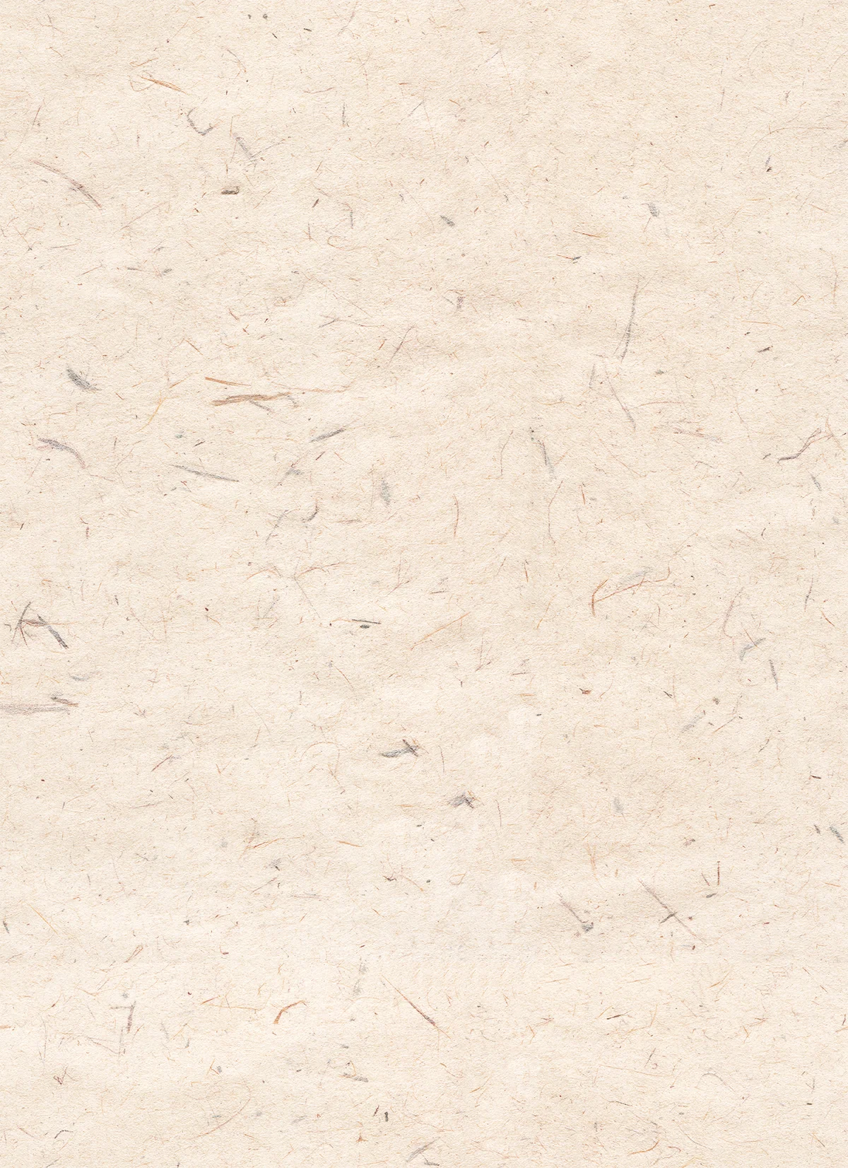
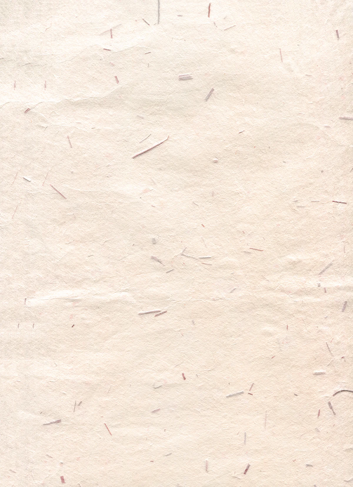
Best for: Certificates and diplomas, luxury invitations, wine and spirits labels, historical branding, law firms.
Distressed and Brushed: Controlled Chaos
Distressed paper textures introduce intentional imperfection — brush strokes, scrapes, worn patches, uneven color. These textures add energy and edge to designs that would otherwise feel too polished. The crimson distressed texture below shows how a single bold color plus surface damage creates instant attitude.
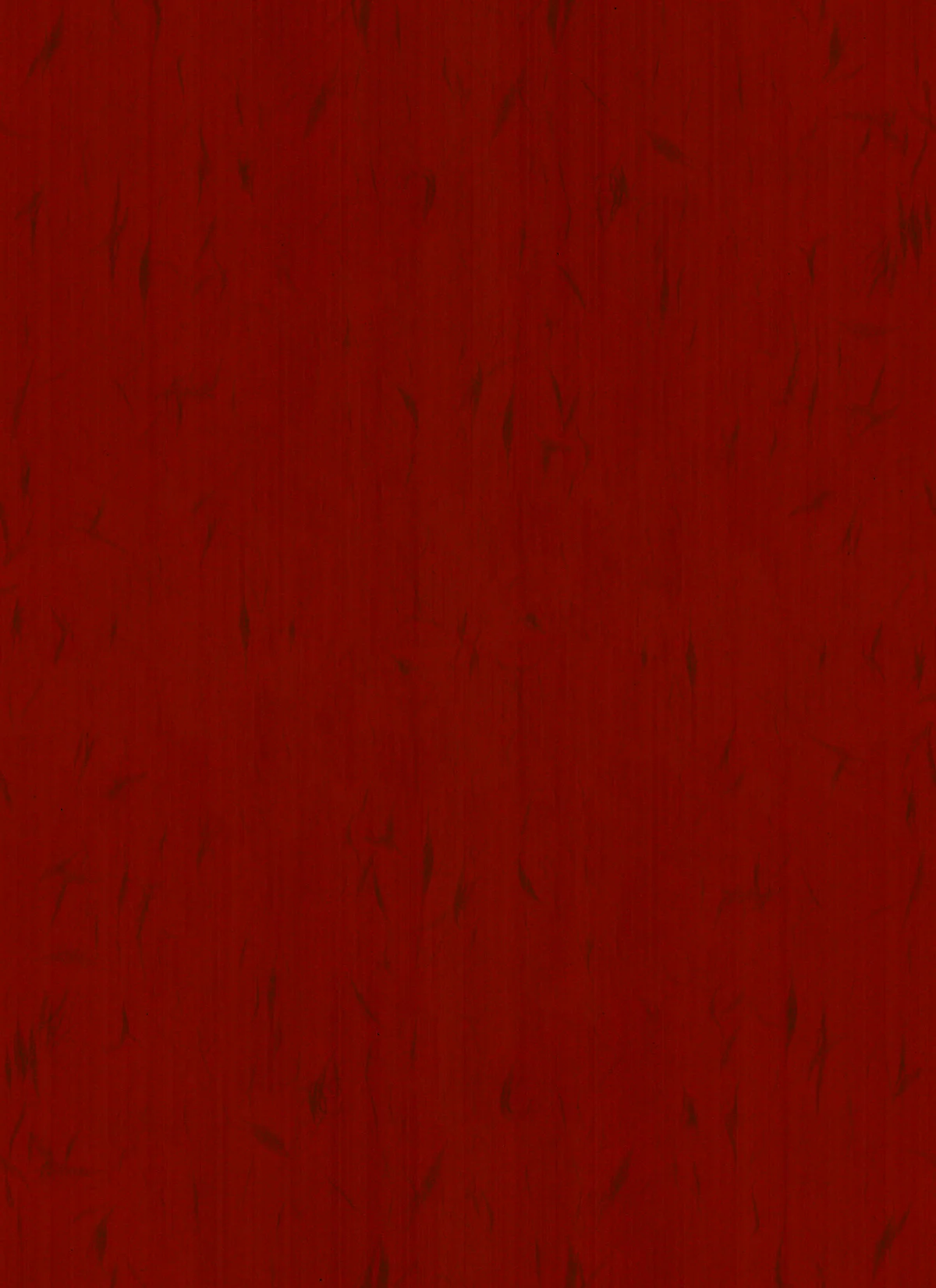
Best for: Music and entertainment branding, streetwear, concert posters, edgy editorial design.
Navy and Deep Colors: Dramatic Foundations
Dark paper textures — navy, charcoal, deep burgundy — create dramatic foundations for light or metallic content. White typography on navy grain reads as nautical, academic, or luxurious depending on the accompanying elements.
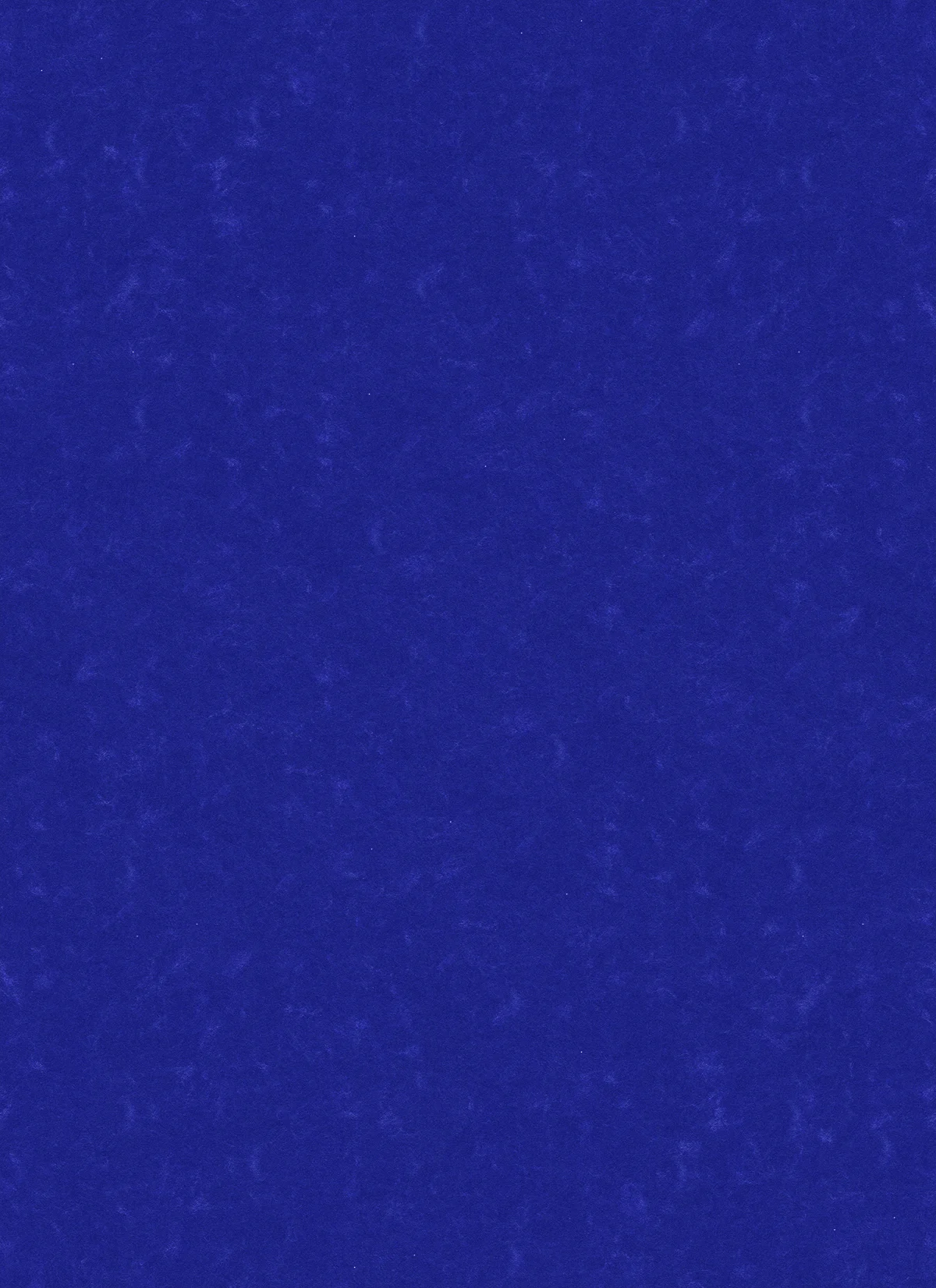
Best for: Premium menswear, spirits and craft beverages, academic institutions, night-time economy brands.
Pastels: Soft Modern Surfaces
Pastel paper textures — lavender, pink, pale blue, sage — combine the warmth of texture with contemporary soft color. They’re the bridge between the analog feel of paper and the modern palette of wellness and lifestyle brands.
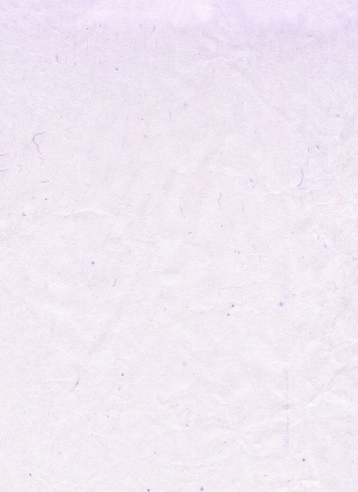
Best for: Wellness and beauty brands, baby products, spring campaigns, feminine lifestyle branding.
How to Use Paper Textures: Practical Techniques
As a Background
The simplest use: place your texture as the bottom layer of your design, then build typography and imagery on top. Adjust the texture’s brightness so it supports — not competes with — your content. A good rule: content should have at least 4.5:1 contrast ratio against the textured background.
As an Overlay with Blend Modes
Place the texture above your design layer and experiment with blend modes. Multiply darkens with the texture’s grain. Overlay adds contrast and texture simultaneously. Soft Light applies the gentlest texture effect. Reduce opacity to 20-40% for subtle results.
As a Masking Element
Use the texture’s luminance to control visibility: apply it as a layer mask on photographs or illustrations to create eroded, printed-looking edges. This technique makes digital artwork appear vintage-printed.
As a Brand System Component
Choose one signature texture and apply it consistently across all brand touchpoints — website background, social templates, packaging mockups, presentation decks. The texture becomes as recognizable as the logo and color palette.
Choosing the Right Texture: Quick Reference
- Project feels too digital and cold? → Add cream or grainy white texture
- Brand needs heritage and trust? → Use vintage or parchment
- Product is eco-friendly? → Kraft or recycled speckled
- Design needs edge and energy? → Distressed or brushed
- Aiming for quiet luxury? → Handmade washi or parchment
- Targeting wellness audiences? → Pastel textures in soft tones
Explore the Full Paper Texture Collection
This article features 10 selections from a much larger library. Browse all paper textures for free download:
- Paper Texture Collection — the full library of free paper textures
- Texture — broader surface texture reference gallery