Heineken Packaging Design Collection – 20+ Inspiring Beer Packaging Examples
When it comes to iconic beer brands, Heineken stands out as one of the most recognizable names in the world. Known for its distinctive green bottle, red star, and clean typography, Heineken has mastered the art of consistent packaging design while still keeping things fresh and appealing.
In this article, we’ve curated a selection of Heineken’s best packaging designs, from their classic bottles to sleek cans and premium gift boxes. This collection is perfect for designers, marketers, and packaging enthusiasts looking for beer packaging inspiration.
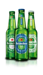
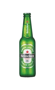
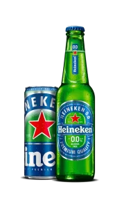
1. The Iconic Green Bottle
The classic green glass bottle with the bold red star and white label is the heart of Heineken’s brand identity. Its shape and proportions are instantly recognizable on any bar shelf. The label design uses a clean serif typeface and minimal elements, emphasizing quality and tradition.
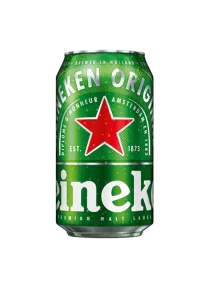
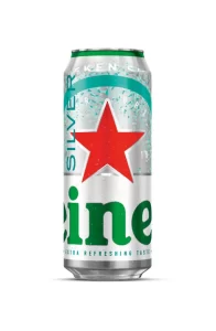
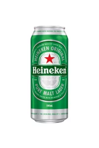
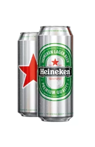
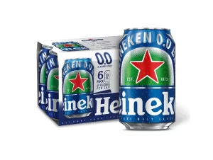
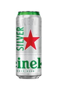
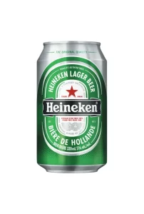
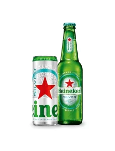
2. Sleek Silver & Green Beer Cans
Heineken’s cans bring the same visual language to a more portable format. The metallic green background combined with the silver highlights creates a modern and refreshing look. The typography and red star remain consistent, reinforcing brand recognition across all packaging formats.
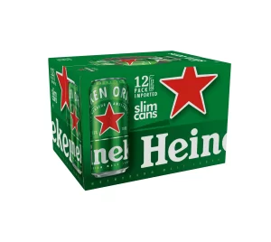
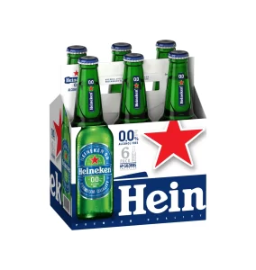
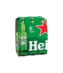
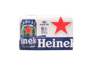
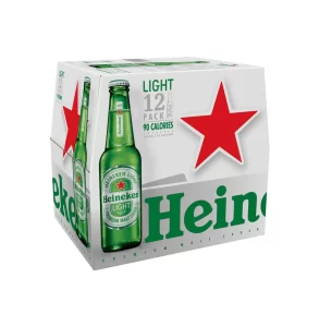
3. Mini Bottles and Party Packs
Heineken offers mini-sized bottles and multipacks that are perfect for parties. The design of these packs maintains the same green-and-red color scheme but uses clever arrangement and bold typography to make the packaging stand out on store shelves.
4. Premium Gift Boxes
For special occasions, Heineken produces elegant gift boxes that include bottles and branded glasses. These boxes often feature minimalist layouts, subtle embossing, and premium textures, making them ideal as festive gifts while elevating the brand’s image.
5. Sustainability-Focused Packaging
In recent years, Heineken has introduced eco-friendly packaging solutions by reducing plastic use and introducing recyclable paper wraps for multipacks. This not only supports sustainability but also keeps the packaging design clean and contemporary.
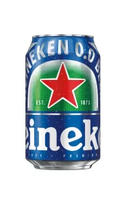
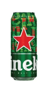
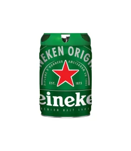
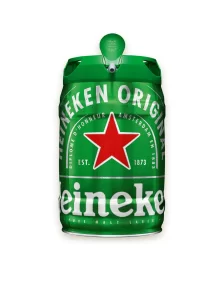
6. Seasonal Packaging Variations
Heineken occasionally updates its bottle labels or can designs with seasonal elements—such as subtle graphic patterns or celebratory messages—while still keeping the core brand identity intact. These variations help the brand stay fresh and relevant without losing recognition.
Key Takeaways for Designers
Consistency is power: Heineken maintains a strict visual identity, which strengthens its brand recognition.
Color matters: The signature green is synonymous with Heineken, proving the importance of a unique brand color.
Details make the difference: Clean typography, balanced layouts, and subtle textures keep the packaging premium yet approachable.
Explore our curated gallery of Heineken packaging design images.
Click here to view high-quality resources.
https://gropicture.com/topics/heineken/