
La Belle Iloise Packaging: Color, Illustration, and the Art of Food Tin Design
Some of the best packaging design in the world isn’t found in luxury boutiques — it’s found in French supermarkets, on tins of sardines. La Belle Iloise, a family-owned cannery from Quiberon, Brittany, has spent nearly a century turning food tins into an art form. Their secret? Three tools, used with absolute consistency: color as a navigation system, illustration as storytelling, and typography as brand signature. Every flavor variation gets its own color palette, its own hand-drawn illustrations, its own personality — yet the entire range is unmistakably one brand.
This is a brand that proves you don’t need minimalist white space or gold foil to create premium food tin design. You need conviction, color, and a story. Let’s break down how La Belle Iloise uses color, illustration, and design craft to make canned sardines feel like collectible art.
Brand Heritage: A Century of Sardines from Brittany
Founded in 1920 by Georges Hilliet in the small coastal town of Quiberon, La Belle Iloise began as a traditional sardine cannery on Brittany’s wild Atlantic coast. For over 100 years, the company has remained family-owned, now in its third generation. While most food brands modernize their packaging to chase trends, La Belle Iloise did the opposite — they leaned into their heritage, turning old-fashioned illustrated tins into a design language that feels both nostalgic and contemporary.
The brand name itself references Belle-Ile-en-Mer, the largest of Brittany’s islands, visible from the Quiberon coast. This geographic identity — rugged Breton coastlines, Atlantic fishing heritage, maritime tradition — is embedded in every design decision they make.
Color as a Navigation System
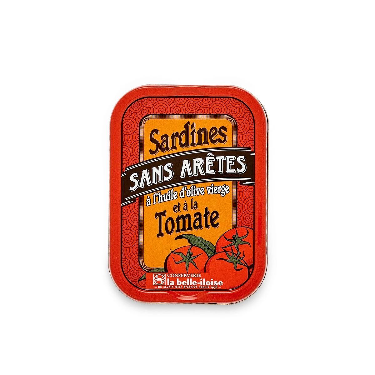
The most remarkable aspect of La Belle Iloise’s packaging is how they use color. Each product variant is assigned a dominant background color that signals its flavor profile at a glance:
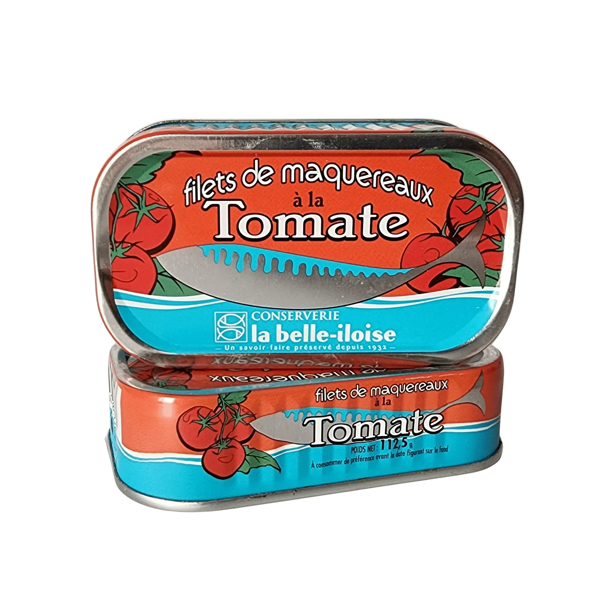
- Bright red — tomato-based sardines, signaling richness and Mediterranean warmth
- Sunny yellow — olive-based and Provencal varieties, evoking Mediterranean sunshine
- Vibrant blue — lemon and herb sardines, suggesting freshness and citrus
- Deep purple — oriental spiced sardines, communicating exotic warmth
- Teal and gold — mackerel rillettes, signaling premium indulgence
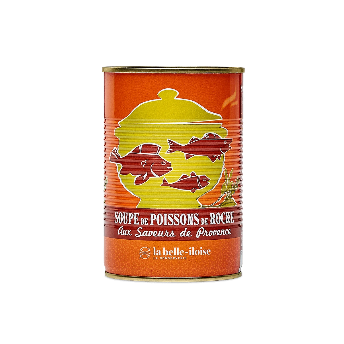
- Orange gradient — Provencal fish soup, suggesting warmth and comfort
This is not random color assignment. The colors create an intuitive navigation system — a customer standing in front of a shelf of 30+ variants can instantly identify the flavor family they want. It’s the same principle Apple uses for iPhone colors or Fiskars uses for scissors: color becomes the primary organizing principle.
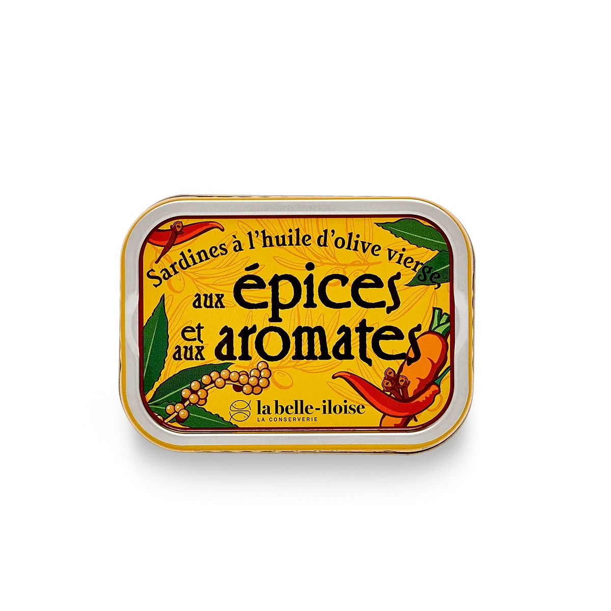
Illustration Style: Ingredients as Art
Where most food packaging uses photography, La Belle Iloise commits entirely to hand-drawn illustrations. Each tin features illustrated ingredients — tomatoes, olives, lemons, peppercorns, chili peppers, fish — rendered in a playful, slightly retro graphic style. The illustrations are not hyperrealistic; they’re stylized, cheerful, and full of personality.
This is a critical design choice. Photography would make these tins feel like supermarket commodities. Illustration makes them feel artisanal, crafted, and collectible. The hand-drawn quality communicates something a photo cannot: that someone designed this tin with care. It’s the same logic behind craft beer labels and artisanal chocolate wrappers.
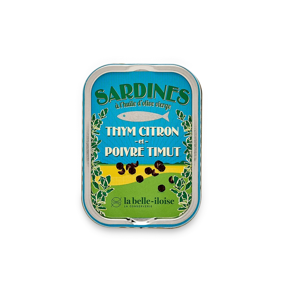
Notice the blue tin above: the fish is illustrated swimming among lemon slices and peppercorns, framed by a leafy green border. The illustration doesn’t just decorate — it tells you exactly what’s inside and what it will taste like. This is packaging that works as visual communication, not just as a container.
The Hot Fish Martin Series: Playful Sub-Branding
Among La Belle Iloise’s most distinctive creations is the Hot Fish Martin series — a line of spicy sardines in habanero sauce. These tins break from the brand’s gentle maritime aesthetic into something loud, hot, and unapologetically fun. The red and yellow flame design, the cartoon fish, the “Force 9/12” spice meter — it’s packaging that looks more like a craft hot sauce label than a sardine tin.
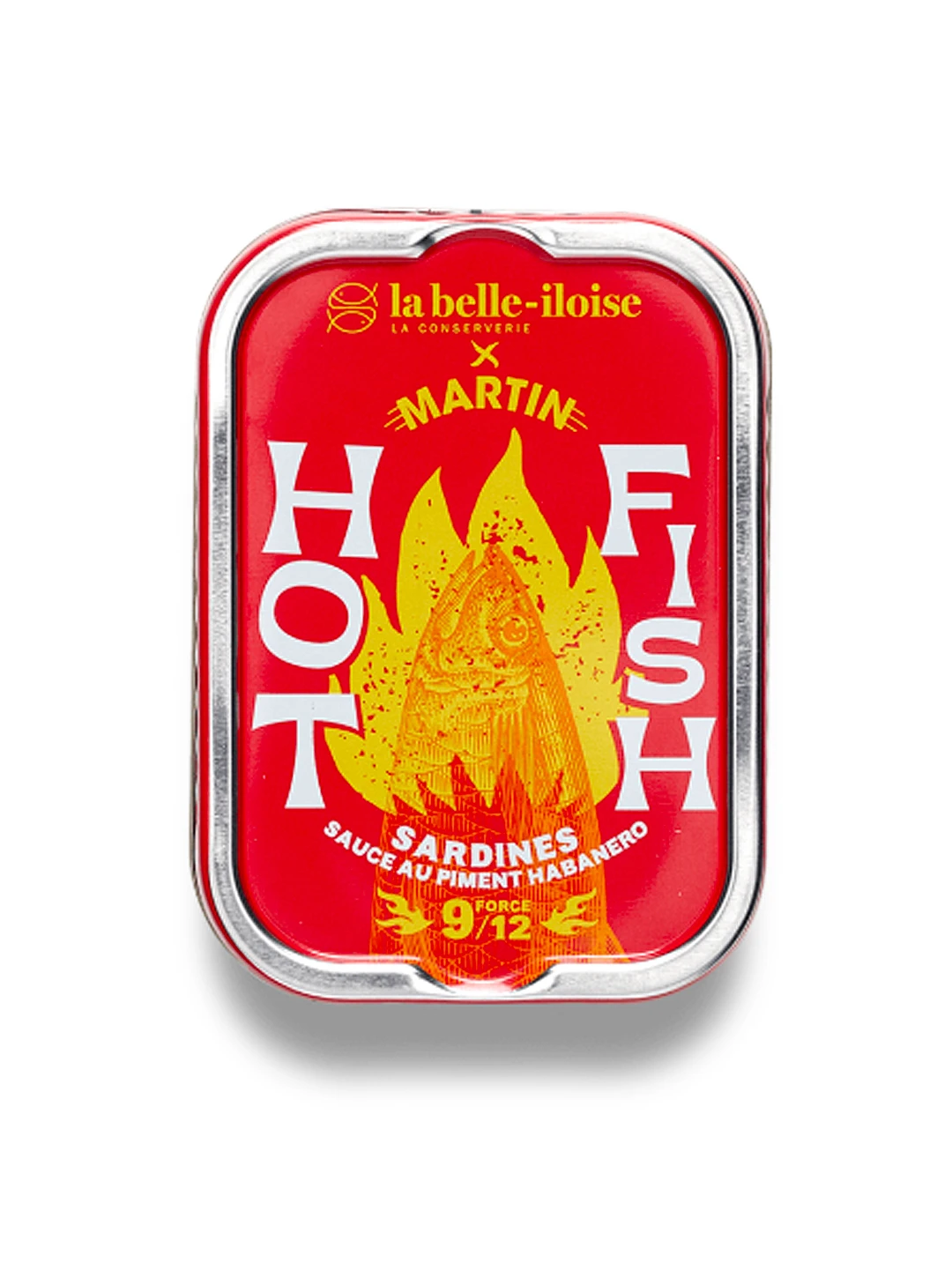
What’s brilliant about the Hot Fish sub-brand is that it maintains the parent brand’s typography and logo treatment while completely changing the mood. The brand identity stays consistent — you still recognize it as La Belle Iloise — but the tone shifts from “gentle Breton tradition” to “dangerous and delicious.” This is advanced brand architecture: one identity, multiple personalities.
Cross-Cultural Packaging: The Same Brand, Different Markets
La Belle Iloise exports worldwide, and their packaging adapts to local markets while maintaining the core visual identity. Many of the export tins feature multilingual text — French, German, Finnish, English — but the illustration system and color logic remain unchanged. The designs transcend language barriers precisely because they rely on color and illustration rather than text-heavy layouts.
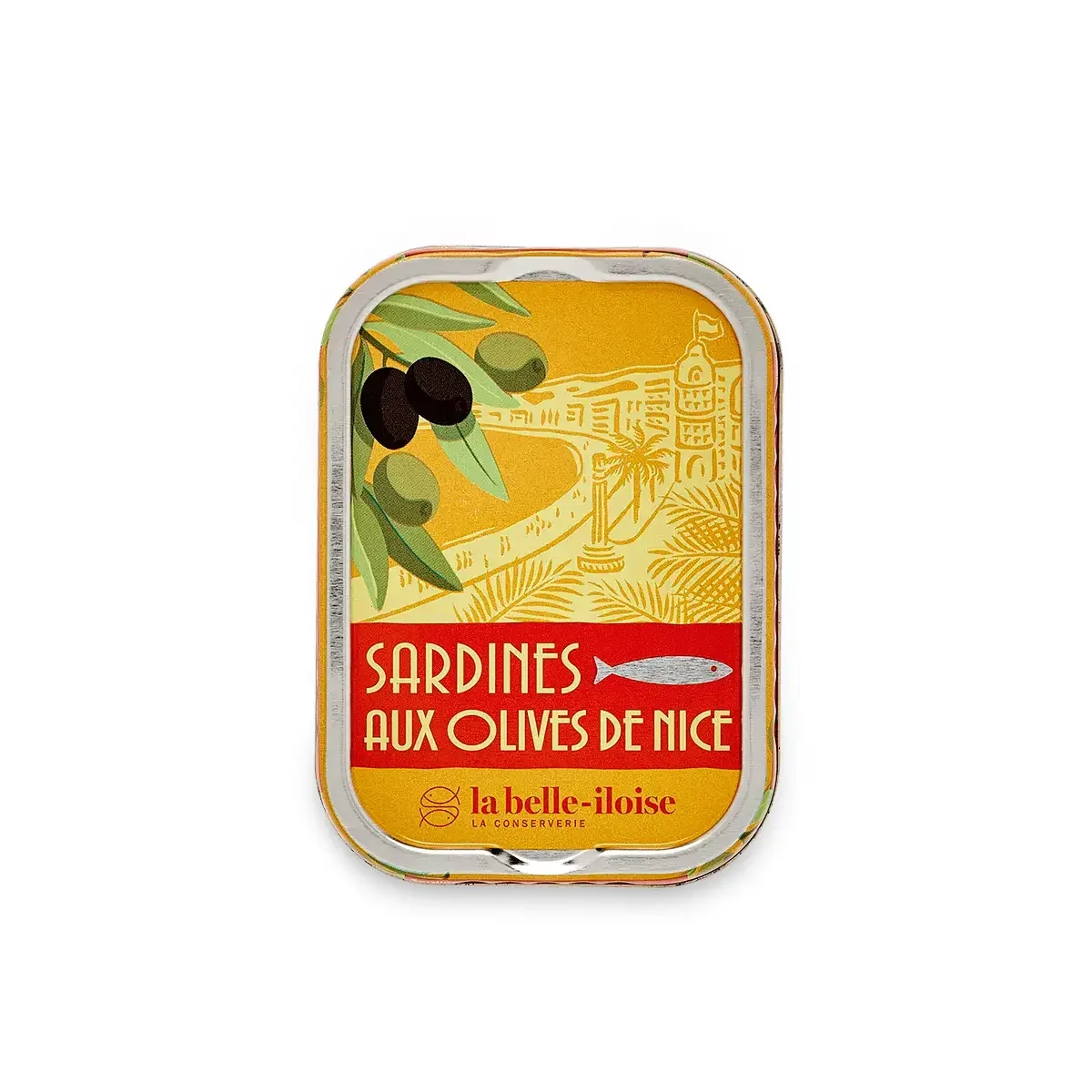
The “Sardines aux Olives de Nice” tin above shows the export packaging approach: a sunny yellow background, red mid-band for the product name, olives illustrated on one side, and a charming line drawing of the Nice coastline on the other. The packaging tells you the flavor (olives) and the origin (Nice) through illustration alone — no translation needed.
Premium Variants: Rillettes and Spreads
When La Belle Iloise expanded beyond whole sardines into mackerel rillettes and spreads, they adapted their design language to signal a different tier. The rillettes packaging uses deeper, more sophisticated color palettes — teal with gold, navy with silver — while maintaining the illustrated ingredient approach. The result feels like a premium offering without abandoning the playful spirit of the core sardine line.
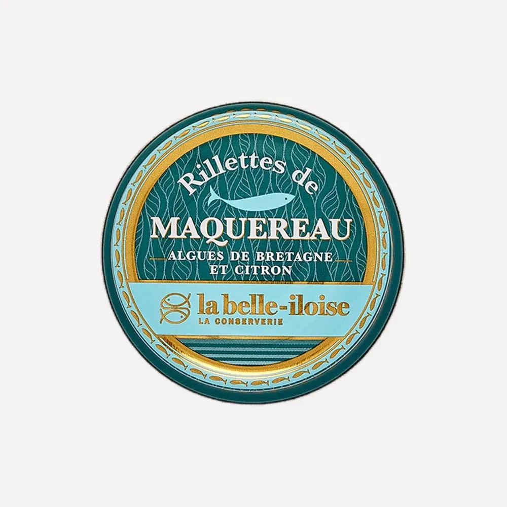
The teal-and-gold rillettes tin above demonstrates how a color shift can reposition a product. Same brand, same illustration philosophy — but the deep teal background and gold fish motifs communicate “premium spread for a dinner party” rather than “everyday lunch sardine.” This is packaging tier differentiation done right.
Oriental Spiced: When a Brand Goes Bold
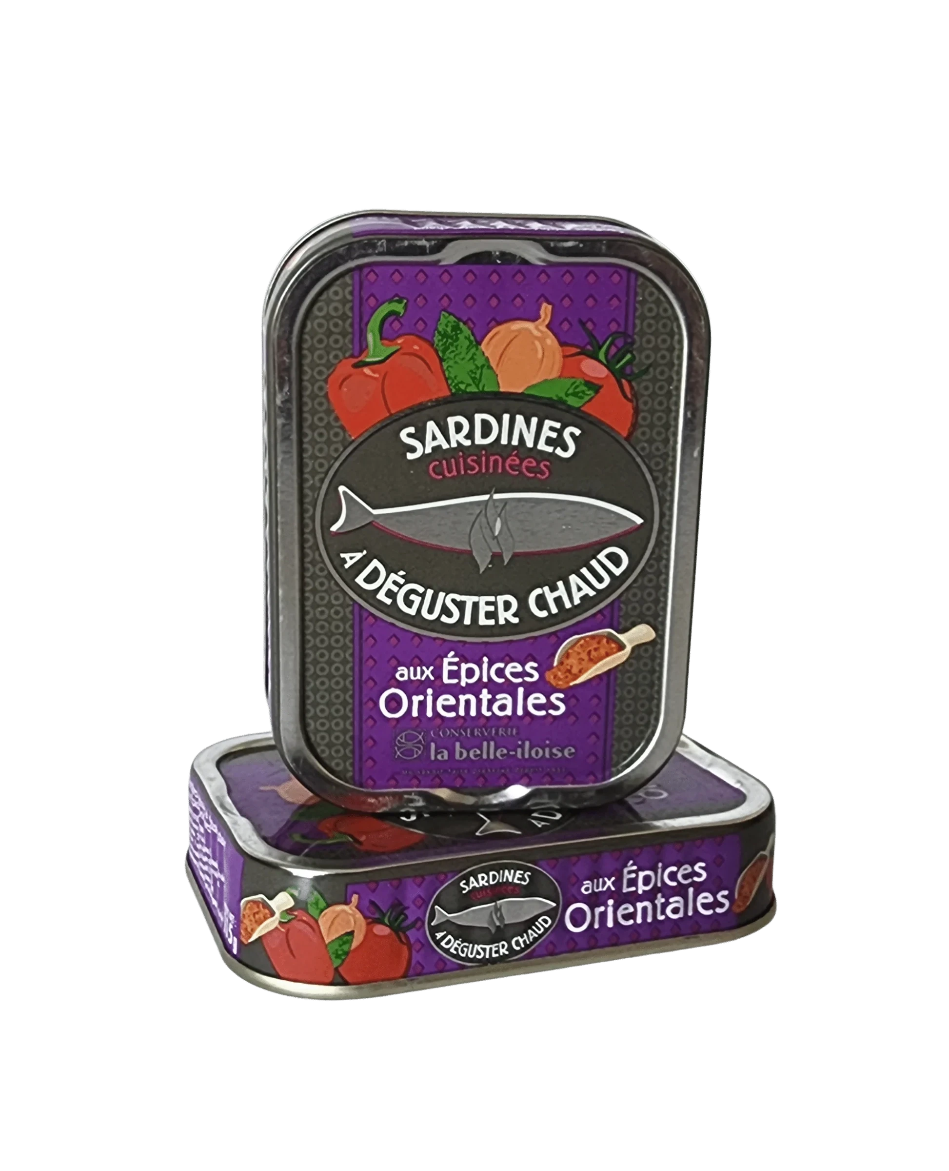
One of the most striking tins in the collection is the “Sardines aux Epices Orientales” — sardines cooked with Middle Eastern spices. La Belle Iloise chose a deep purple background for this variant, a color rarely seen in seafood packaging. The result is dramatic, exotic, and instantly memorable. It signals that this isn’t your grandmother’s plain sardine — it’s a culinary adventure.
Typography: Retro French with Modern Clarity
La Belle Iloise’s typography walks a precise line between retro charm and modern readability. The product names — “Sardines,” “Filets de Maquereaux,” “Rillettes” — use bold, slightly condensed sans-serif fonts with a hand-painted quality. The brand name “la belle-iloise” appears in a smaller, more elegant treatment, always positioned consistently across the range. Flavor descriptions use lighter weights, creating clear hierarchy.
The type is always in the local language (French for domestic, multilingual for export), but the visual structure remains identical: product name largest, flavor description secondary, brand name tertiary. This consistency makes the entire range feel like a unified system, not a random assortment.
Provencal Fish Soup: Regional Storytelling Through Design
The fish soup variants take a different illustrative approach — instead of showing individual ingredients, they depict a cooking scene. The “Soupe de Poissons de Roche aux Saveurs de Provence” tin uses a warm orange gradient with an illustrated pot full of fish, directly referencing the cooking process. It’s storytelling packaging: you see the soup being made before you even open the tin.
What Designers Can Learn from La Belle Iloise
La Belle Iloise’s packaging offers several lessons that apply far beyond canned fish:
- Color is your strongest organizing tool. When you have a large product range, assign each variant a dominant color. Customers navigate by color faster than by reading text.
- Illustration beats photography for artisanal positioning. Hand-drawn illustrations communicate craftsmanship and care in ways that photos cannot. They also age better — a well-designed illustration looks timeless decades later.
- Consistency creates collectibility. La Belle Iloise tins are collected and displayed because they form a visually coherent set. When every product follows the same structural template with different colors and illustrations, the range becomes more than the sum of its parts.
- Sub-brands can shift tone without losing identity. The Hot Fish series proves you can be playful and premium under the same parent brand — just keep the core typography and logo treatment consistent.
- Regional identity is a design asset. La Belle Iloise’s Breton heritage isn’t just a marketing claim — it’s embedded in the maritime illustrations, the coastal references, the French typography. Authentic regional identity creates differentiation that competitors can’t copy.
Explore La Belle Iloise Packaging Designs
Browse La Belle Iloise packaging designs for design reference:
- La Belle Iloise — the full collection of canned fish and seafood packaging designs
- Packaging Design — broader packaging design reference gallery