
Logo Insights — Luxury Fashion Logos: 5 Design Formulas of Timeless Brands
Strip away the campaigns, the flagship stores, and the runway music, and a luxury fashion house is left with one asset it can never re-shoot or re-style: its logo. Browse a collection of 142 luxury fashion logos side by side and a pattern emerges — despite 150 years of fashion history, the industry really only uses five logo formulas. Every house, from Paris to Milan, picked one and refined it for decades.
Here is each formula, how it works, and when designers should reach for it — illustrated with vector logo references from the Gropicture collection.
Formula 1: The Monogram — Initials as Jewelry
When a founder’s name is long and elegant, luxury brands compress it. Louis Vuitton interlocks an L and a V into a single geometric mark; Gucci mirrors two G’s face to face inside a circle; Fendi stacks two F’s back to back. The monogram turns a name into a compact jewel — small enough for a zipper pull, a buckle, or a hot-stamp on leather.
The monogram’s superpower is that it doubles as a pattern. Tile the LV across coated canvas and the logo becomes the fabric itself — the brand is visible from across a room without a single word being read. Gucci’s mark shows the same trick in color: the interlocking double-G emblem sits above a green-red-green stripe, and together they read as Gucci even at thumbnail size.
Formula 2: The Emblem — Myth and Heraldry
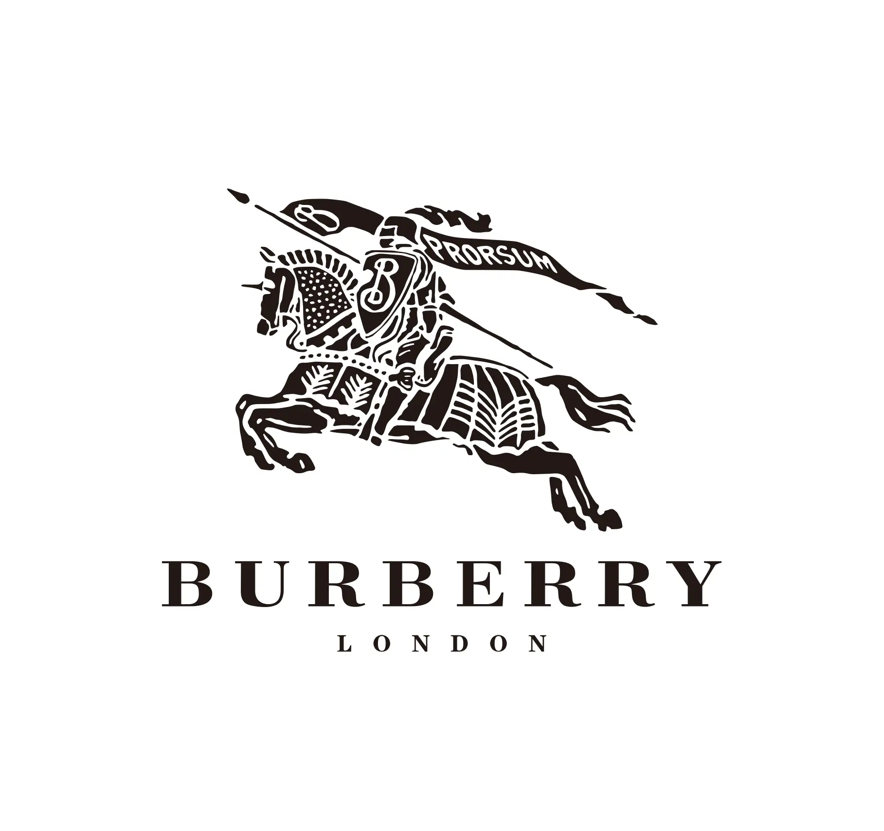
Some houses skip letters entirely and commission a picture. Versace’s Medusa head — framed by a Greek key meander border — is the most theatrical example: a mythological figure whose gaze, the story goes, you cannot look away from. Burberry takes the opposite cultural register with an English knight on horseback, complete with lance and banner, beneath BURBERRY LONDON in roman capitals.
Emblems borrow the visual language of heraldry, coins, and classical art — languages older than any fashion house. That is precisely the point: the mark implies lineage. Emblems are also the hardest luxury marks to imitate, because they are illustration, not typography. A wordmark can be retyped; a Medusa must be redrawn.
Formula 3: The Serif Wordmark — Spelled in Stone
The third formula simply spells the name — but in letterforms that feel engraved. Chanel, Dior, and Hermès all set their names in spaced capitals with classical proportions. The serifs and the generous letter-spacing do the quiet work: they reference inscriptions on buildings, book covers, and foundation stones. The message is permanence. This is not a brand that will look different next season.
Notice what the serif wordmark does not do: it does not shout, gradient, or glow. In luxury, restraint is the loudest signal of all — a lesson that scales down perfectly for boutique and artisan brands.
Formula 4: The Signature — The Founder’s Hand
The rarest formula is the most human: the founder’s own handwriting. Salvatore Ferragamo’s cursive signature — fluid, personal, with the natural thick-and-thin of a real pen — turns a shoemaker’s name into a guarantee. Where a monogram feels engineered and a wordmark feels institutional, a signature feels signed: somebody made this.
Signatures work hardest for craft categories — fragrance, leather goods, couture — where the promise is a person’s taste and skill. The catch: they demand impeccable spacing and consistency at every size, from embossing dies to perfume flacons.
Formula 5: The Modern Sans — Quiet Luxury
The newest formula belongs to brands that either modernized or never had heritage to advertise. Saint Laurent famously retired its interlocking YSL monogram for clean all-caps sans-serif. Céline’s current wordmark drops even the accent. Balenciaga sets its name in tightly tracked capitals, and newer houses like Jacquemus were simply born this way — a young brand with no heritage to advertise chooses the typography of now.
Even monogram houses keep one of these on file. Louis Vuitton’s clean sans-serif wordmark exists for every moment the interlocking LV would be too loud — hot-foil on a monogram-free leather line, editorial layouts, architectural signage. The lesson: quiet is not the absence of design; it is design with the volume turned all the way down.
5 Lessons for Designers
1. Pick the Formula by What You Already Have
Strong initials become a monogram. A founder story or myth becomes an emblem. A long, musical name earns a serif wordmark or a signature. A modern positioning gets the sans. The formula follows the asset — never the reverse.
2. Design the Mark as a Pattern, Not Just a Symbol
Luxury logos live on canvas, hardware, and jacquard more than on business cards. If a mark cannot tile, repeat, or shrink onto a zipper, it will underperform in fashion contexts.
3. Serif Sells Time, Sans Sells Now
Classical letterforms borrow credibility from inscriptions and book covers; modern sans borrows energy from editorial and streetwear. Decide which currency the brand needs to spend.
4. Own a System, Not a Single Mark
Versace runs the Medusa and a serif wordmark. Louis Vuitton runs a monogram and a sans wordmark. The strongest houses treat the logo as a family of marks, each tuned to a different volume level.
5. Quiet Requires Obsessive Craft
A plain wordmark survives on spacing, weight, and proportion alone — there is nowhere to hide. Céline’s accent-free caps only feel effortless because the tracking is perfect.
Explore the Luxury Logo Collection
Browse luxury fashion logos as vector references:
- Luxury Fashion Logos — the full collection of 142 house marks
- Fashion Brand Logos — broader fashion identity archive
- Logo Design — general logo design references