
Packaging Picks — Asahi Super Dry: A Masterclass in Beer Packaging Design
The aluminum beer can is one of the most competitive design canvases in the world. In a Japanese convenience store, dozens of beer cans compete for attention in a single refrigerator case — and Asahi Super Dry consistently wins the shelf. How? Through a remarkably disciplined approach to packaging design that balances brand consistency with product variation.
In this Packaging Picks feature, we tour the Asahi Super Dry packaging system as a design reference — the original silver can, the Dry Black and Dry Crystal variants, the 0.0 alcohol-free family, the multipacks and cases, and the sports collaborations that show how far the template can flex.
The Core Canvas: Silver, Black, Red
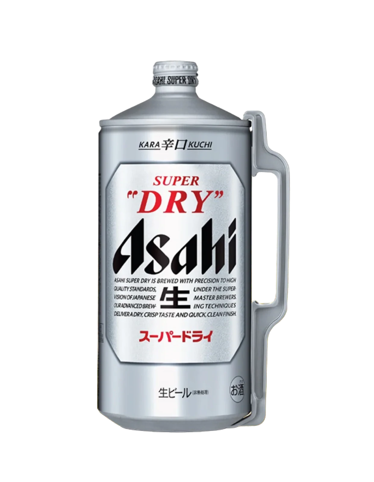
The Asahi Super Dry identity is built on an unusual restraint for beer packaging: a silver canvas, minimal black typography, and a single red accent in the Atsumi sun/star mark. The classic brown glass bottle carries the same silver label, so the design reads identically whether you’re holding a can or a bottle. At the top of the range, the large growler-style bottle stretches the same face onto a handled format that turns the supermarket beer into something closer to a draft experience at home.
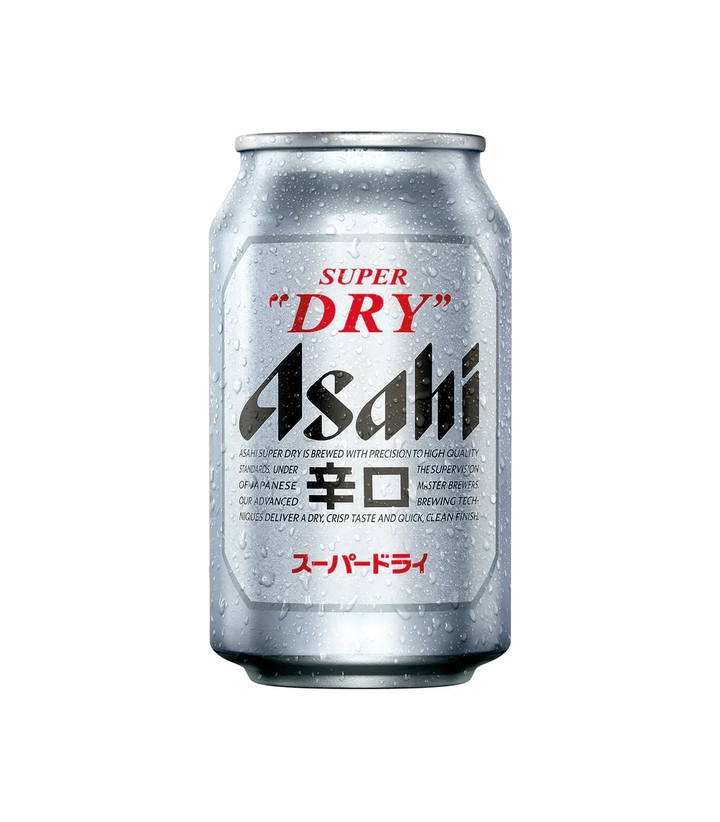
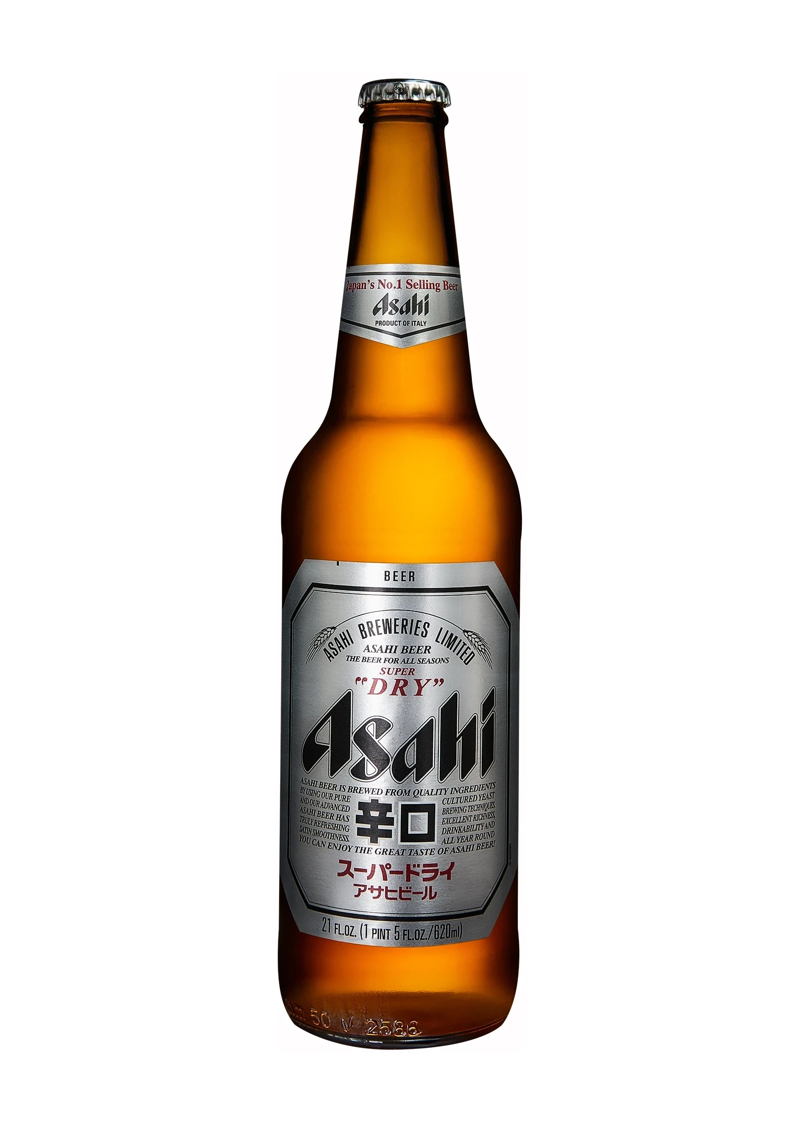
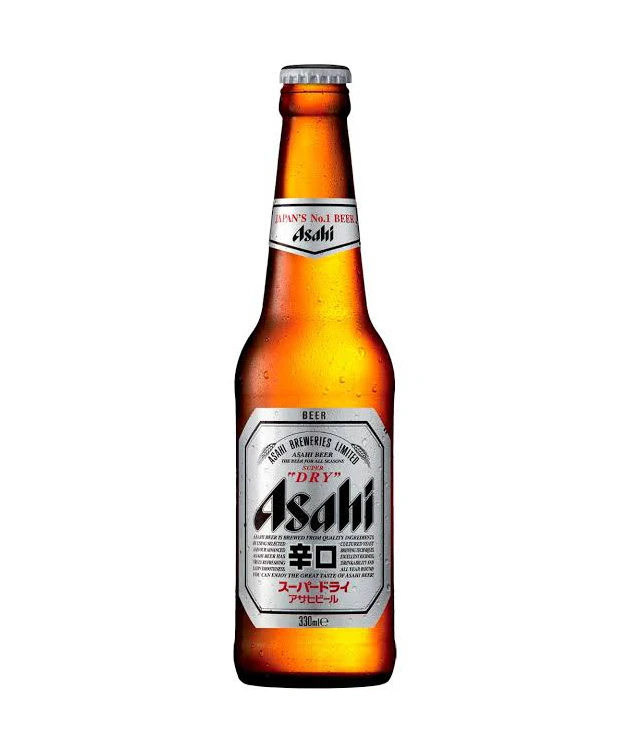
Note the Karakuchi bottle above: “karakuchi” (dry) is written into the brand’s own name, and the label keeps the same silver discipline — the dryness claim is made by the product, not by louder graphics.
The Variation System: Same Brand, Different Drinks
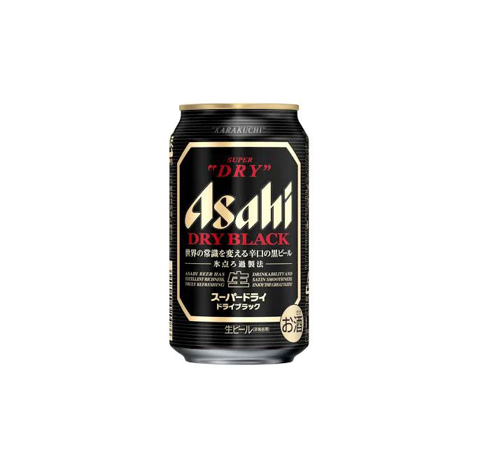
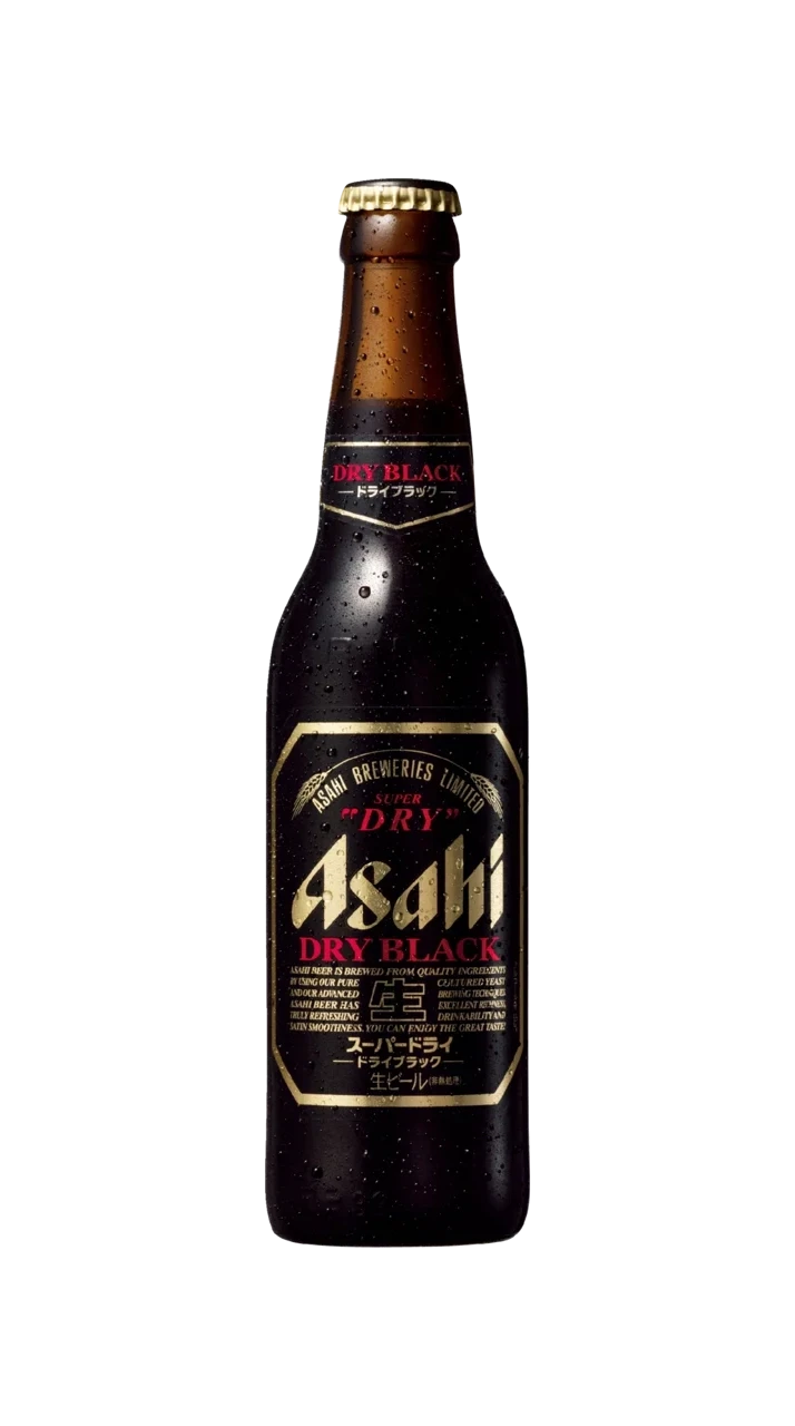
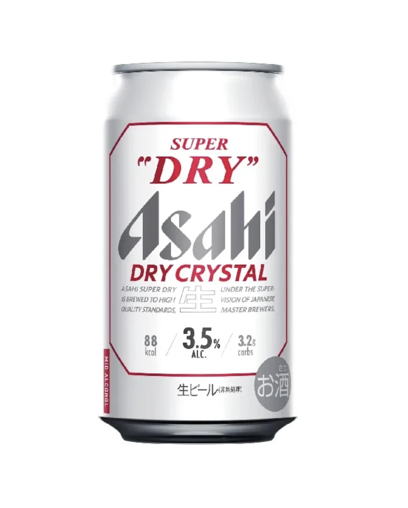
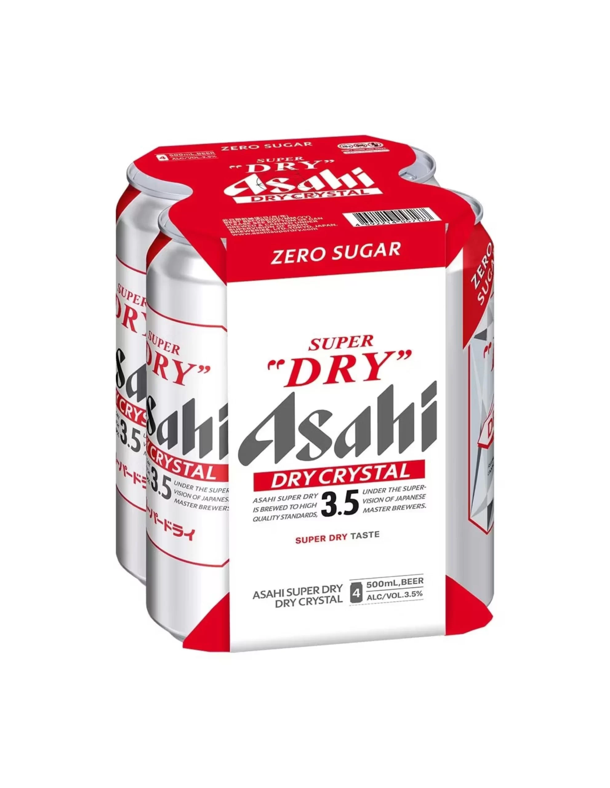
Asahi’s variants prove that a brand can shift color codes without losing its skeleton. The Dry Black line swaps silver for a black canvas with gold accents — instantly signalling a richer, darker brew in both can and bottle formats. The Dry Crystal line keeps the silver base but lightens the mood for its lower-ABV positioning, and the four-pack shows how the same can face repeats inside a carrier.
Asahi 0.0: The Alcohol-Free Family
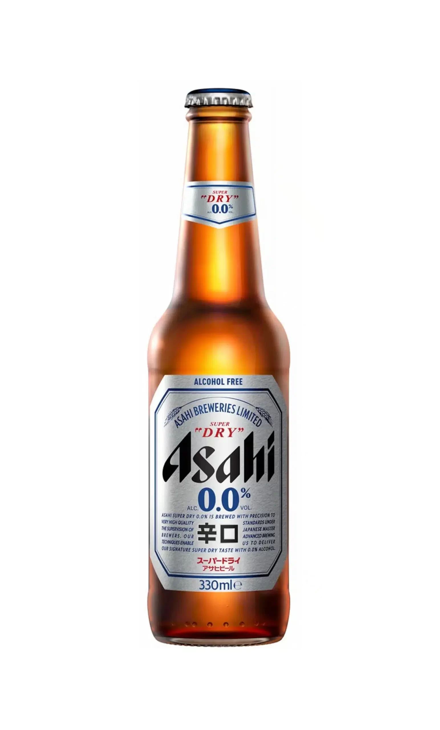
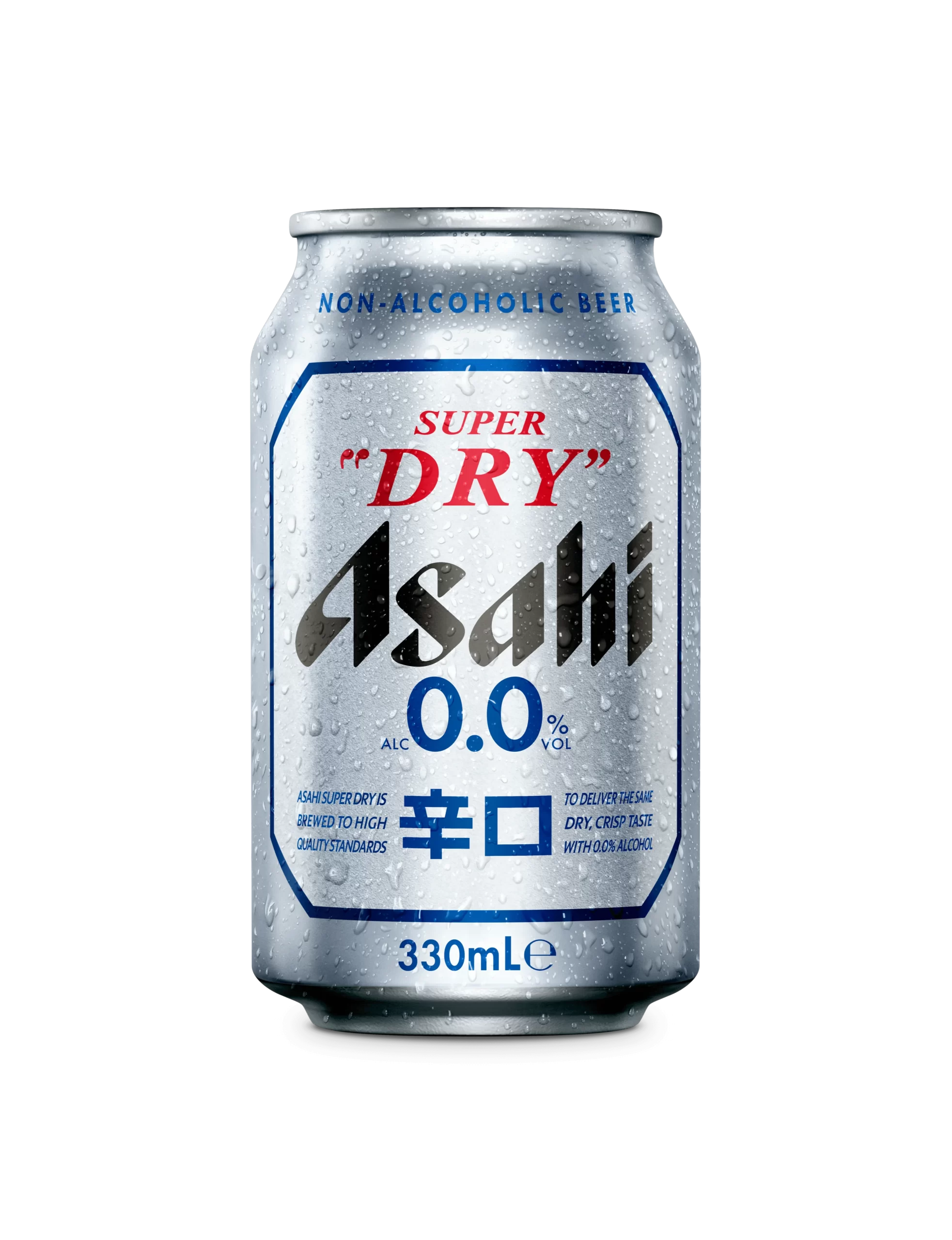
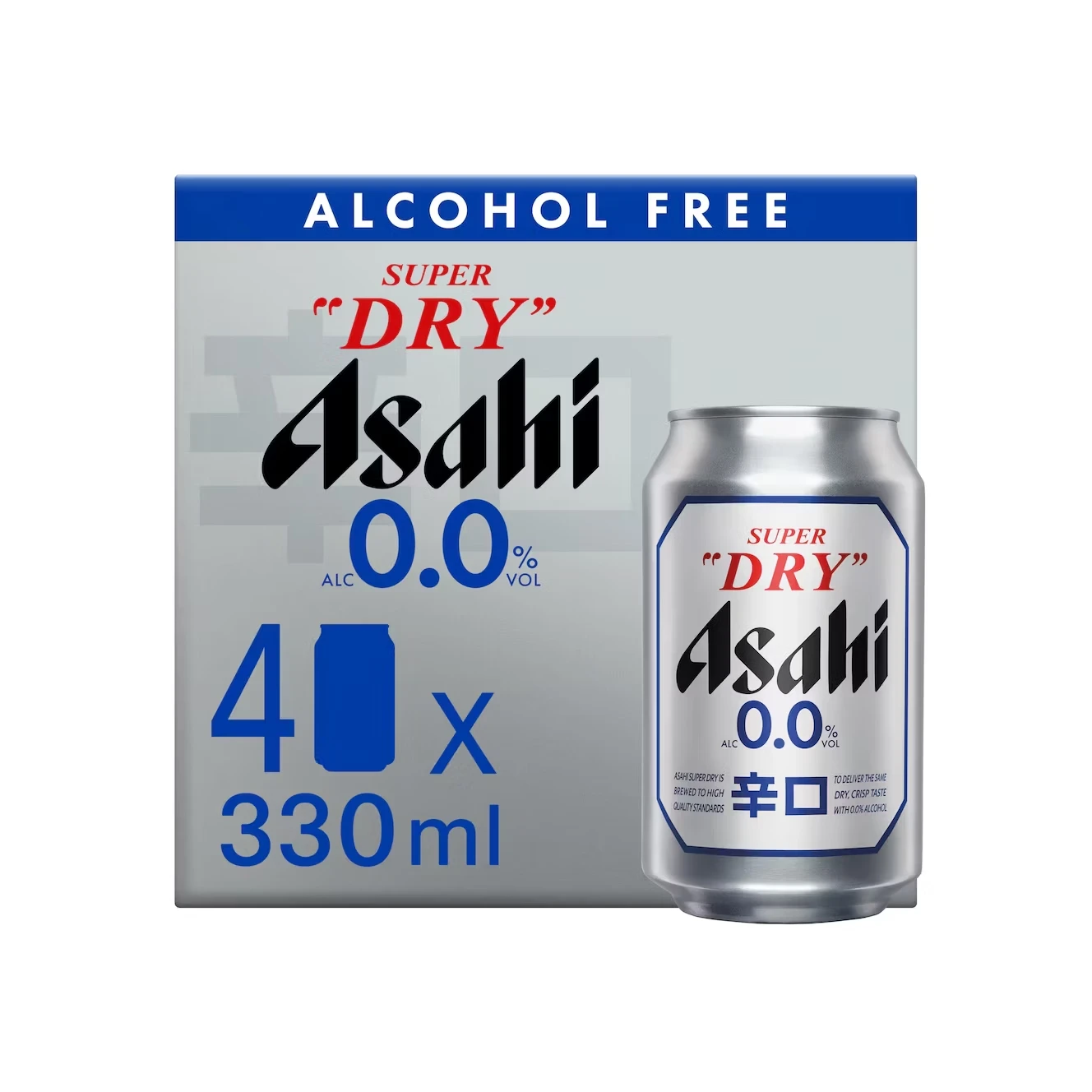
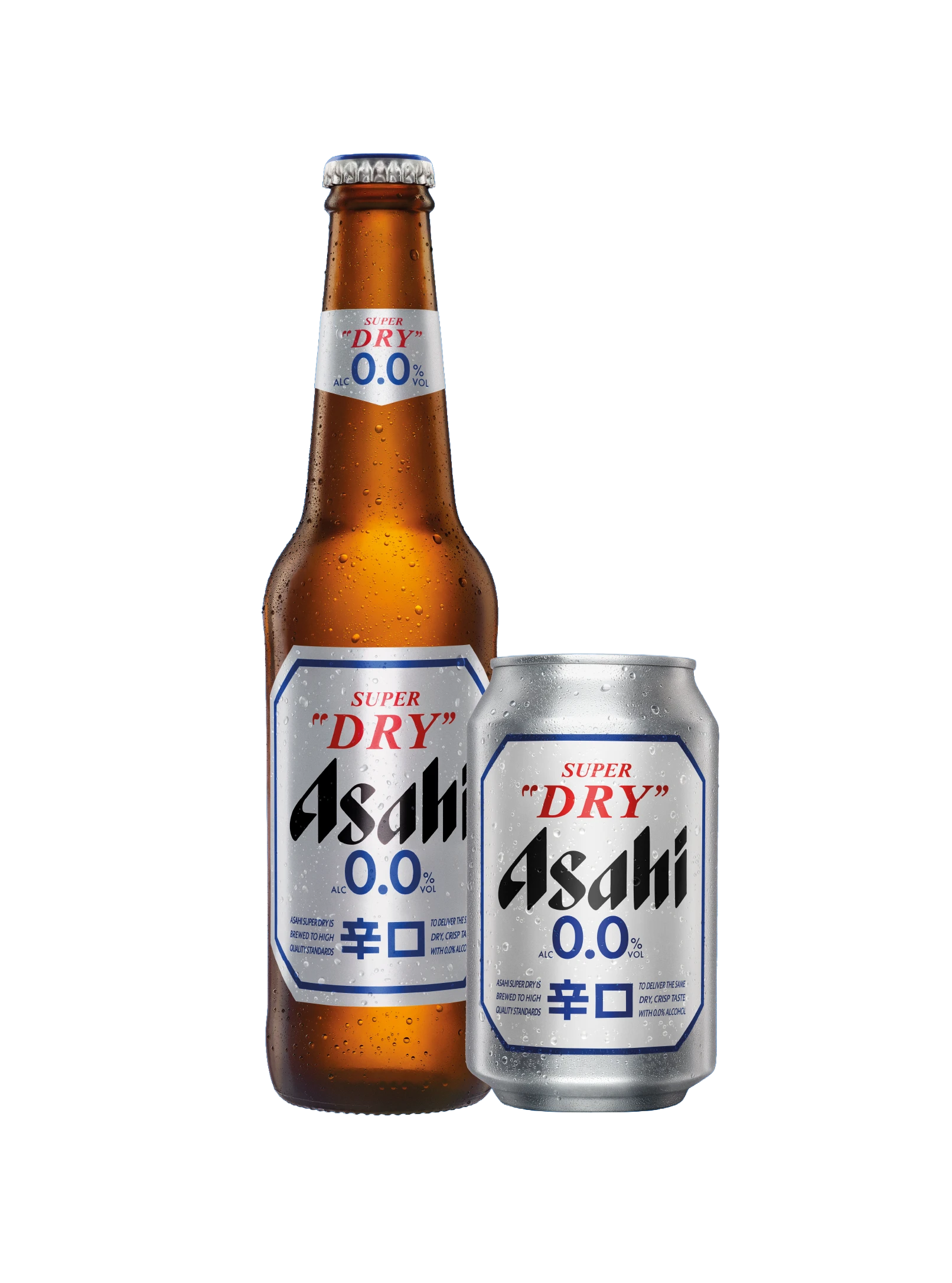
Like every major brewer, Asahi has built a complete alcohol-free parallel universe — and like Heineken’s blue 0.0, it is color-coded for instant shelf separation. The 0.0 bottle and chilled can lean into cool blue-and-silver tones that read as refreshment rather than abstinence, and the family extends right through four-packs, six-packs and bottle cases. It’s a full-format mirror of the core range: whatever the occasion, there’s a 0.0 package for it.
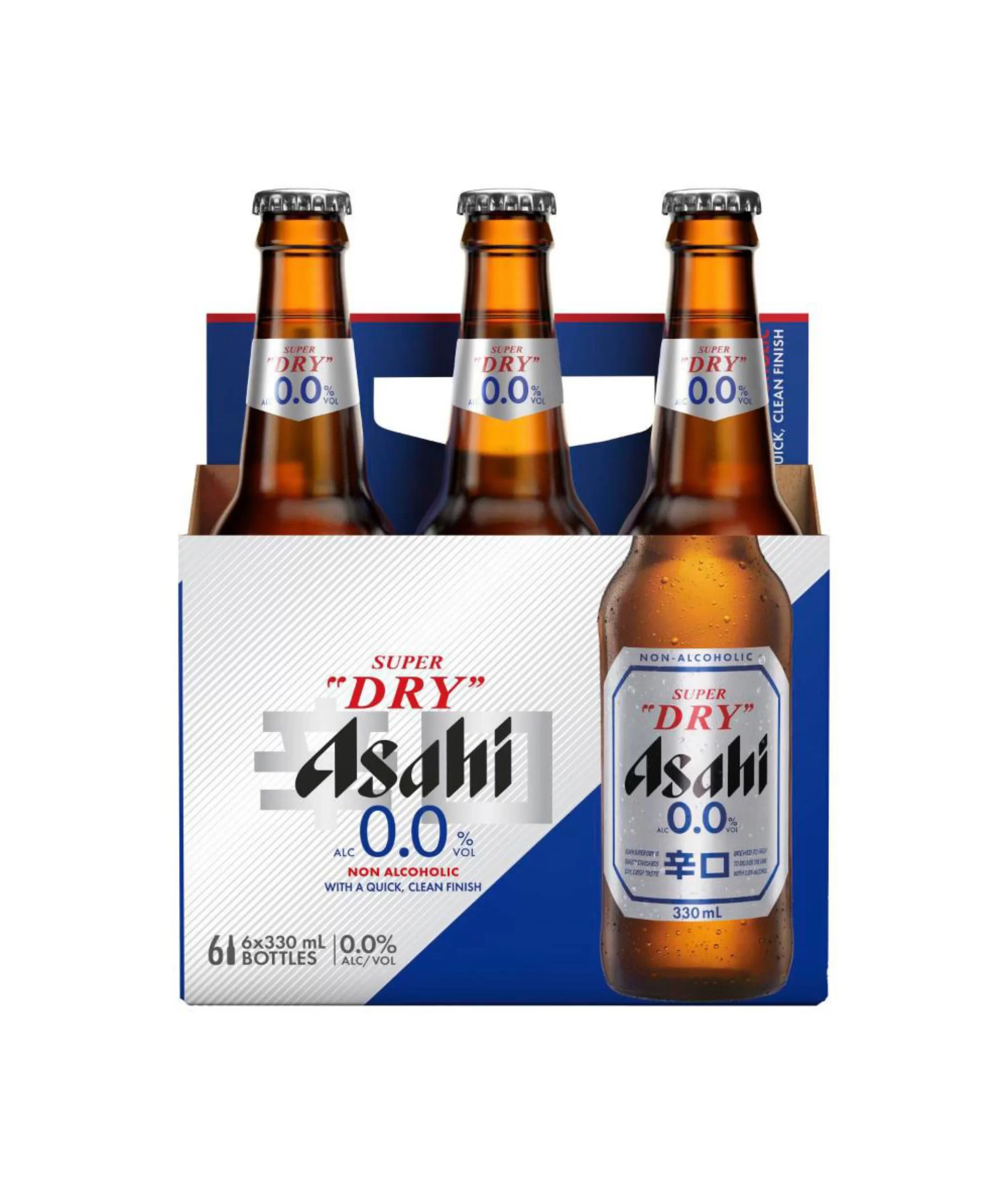
Multipacks and Cases: The System at Scale
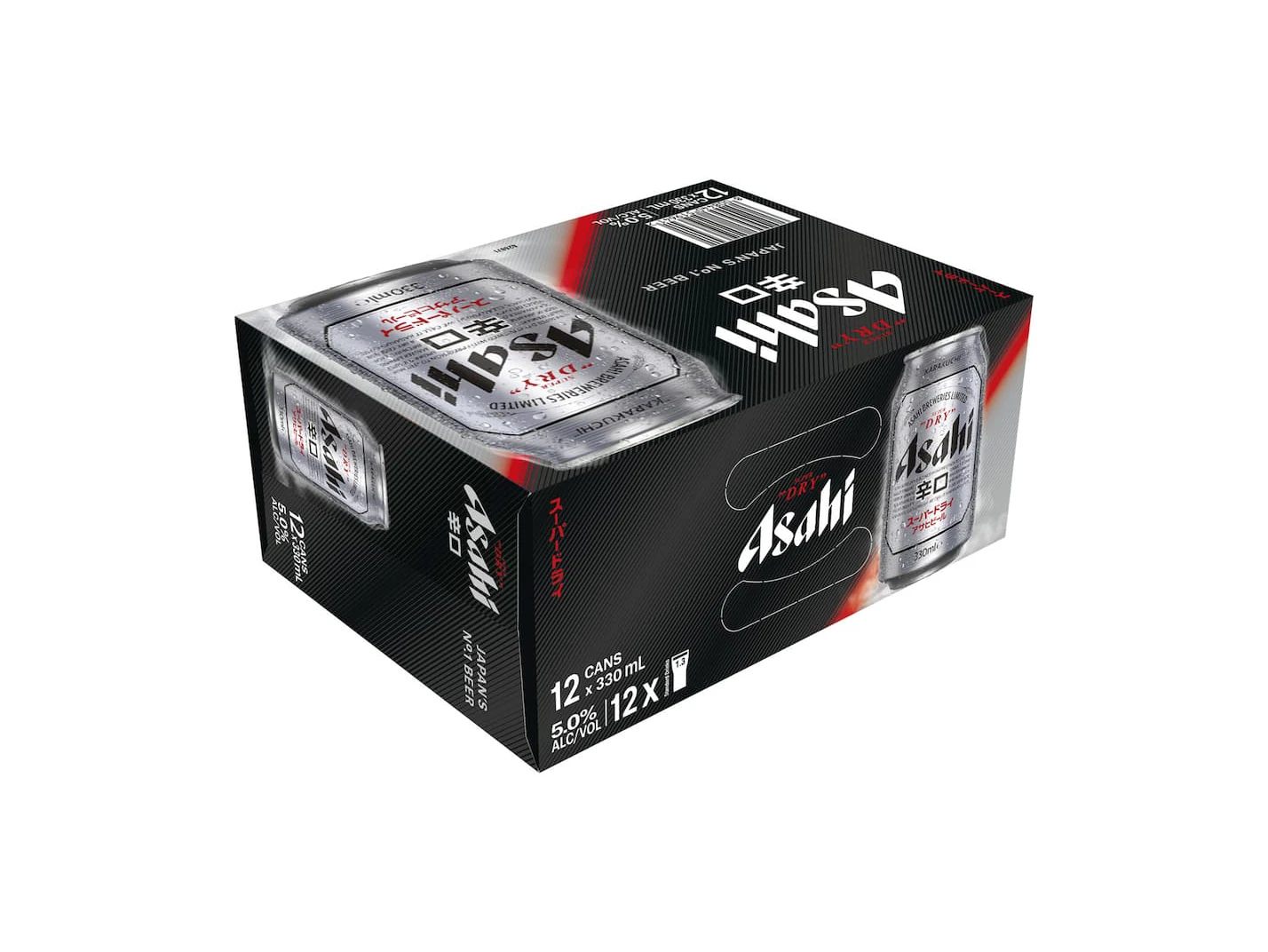
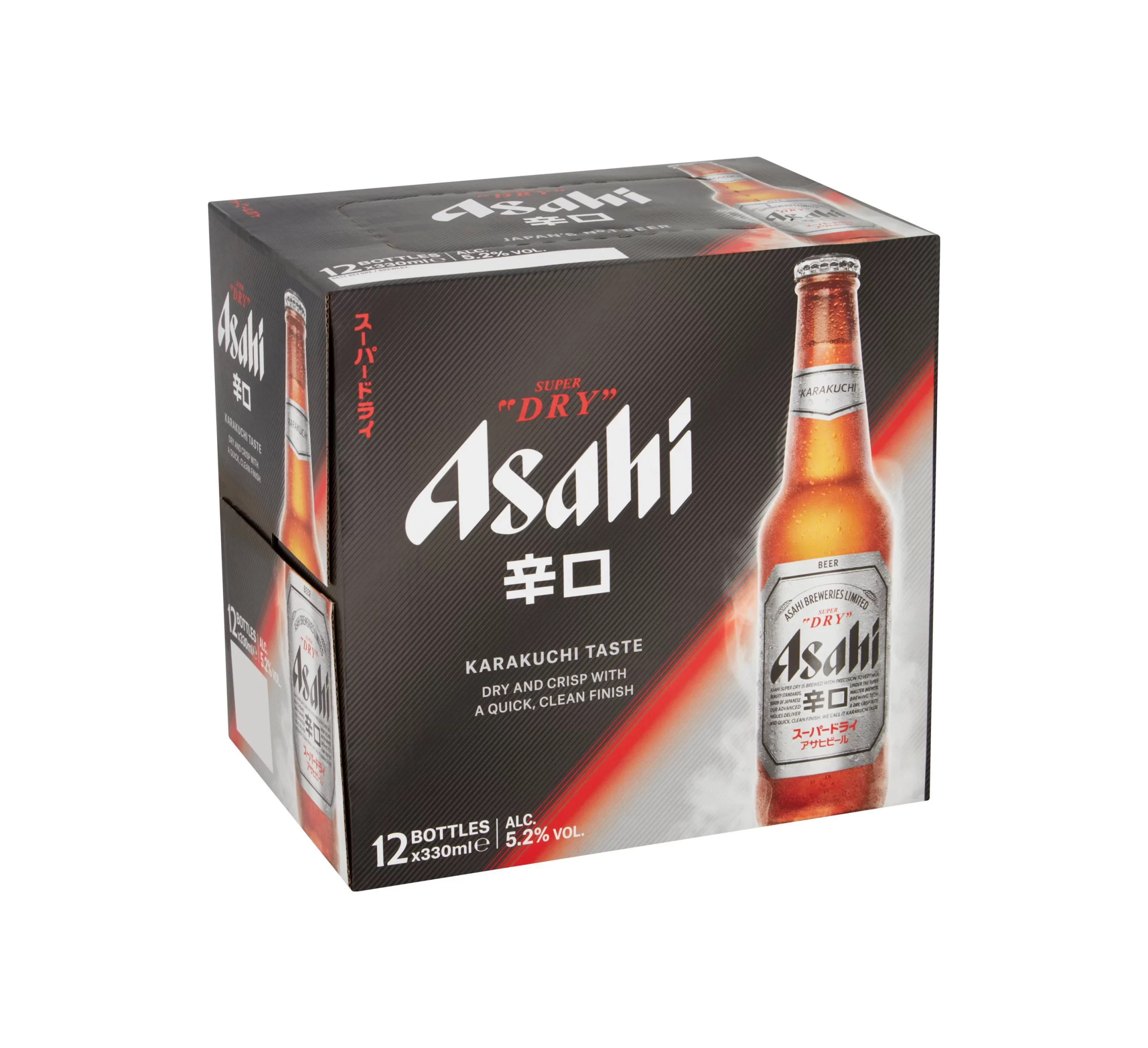
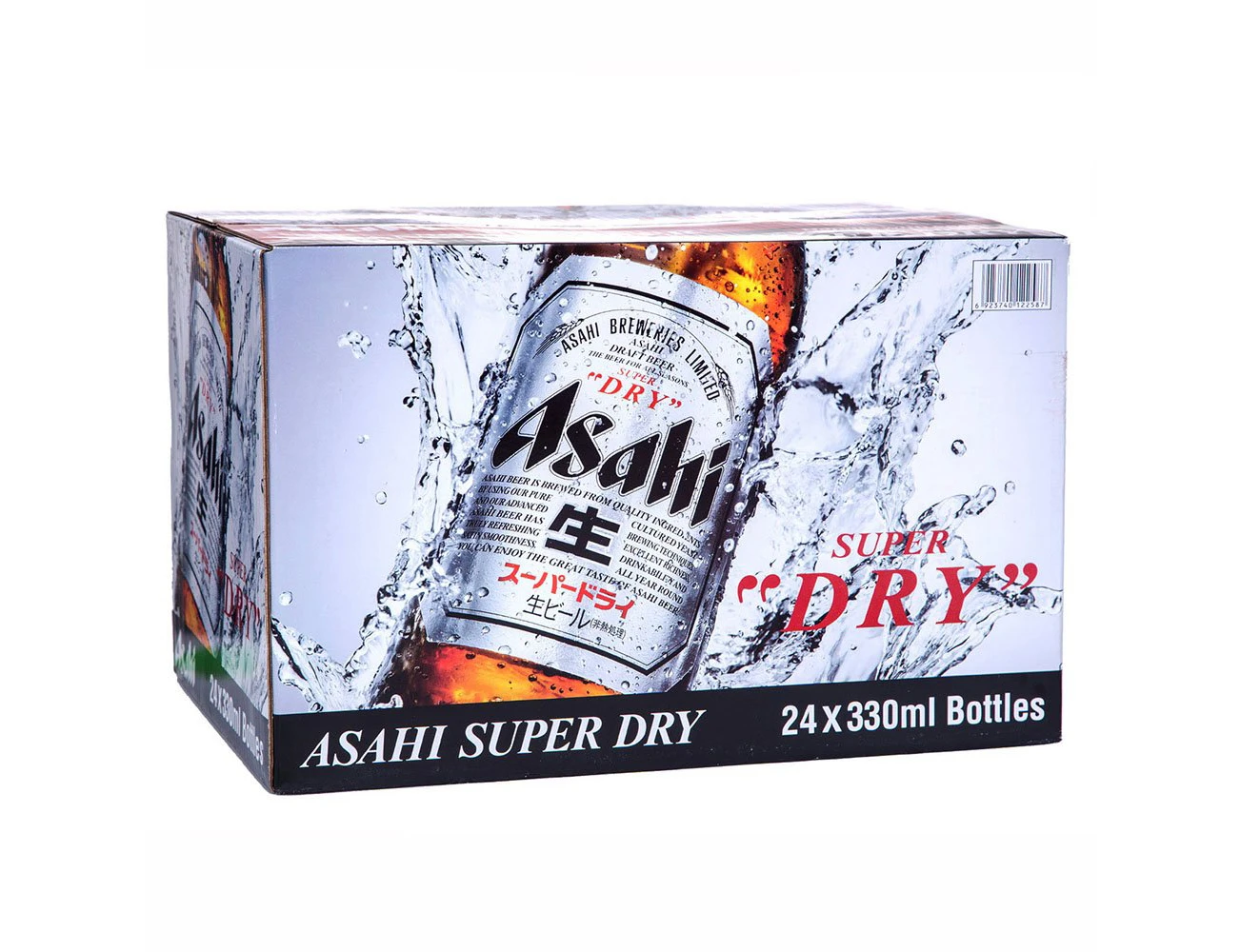
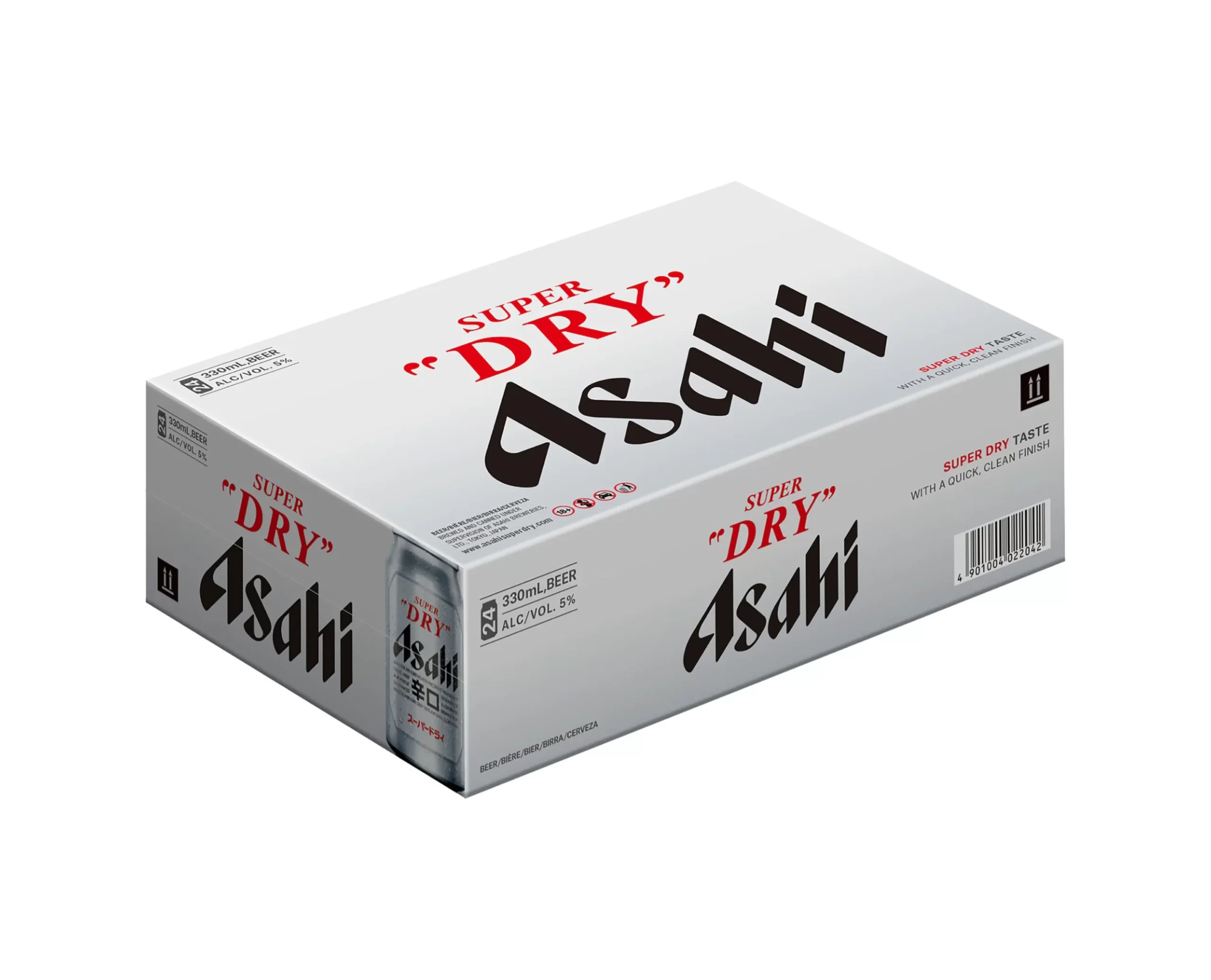
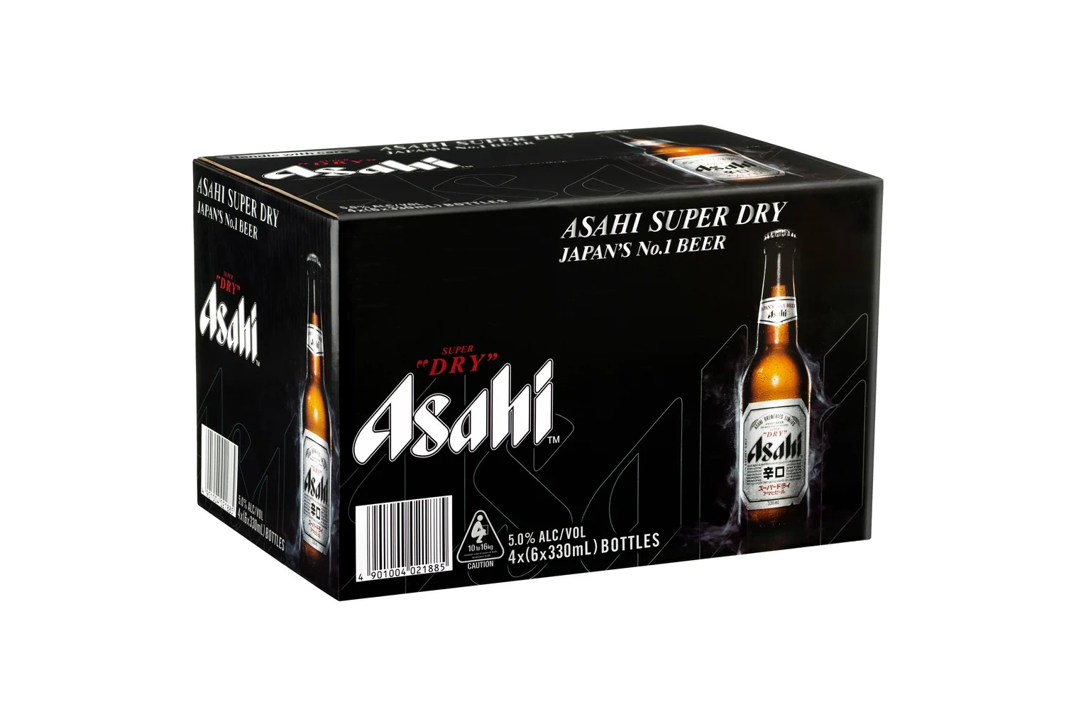
This is where Asahi’s discipline really pays off. A six-pack carrier, a 12-can case, a 24-bottle case and a shipping carton all repeat the same silver-and-black face at different magnifications — with just enough layout simplification that the brand still reads from across the store. The carrier-with-bottle shots also show how the brown glass and silver label work together as a two-tone system inside one package.
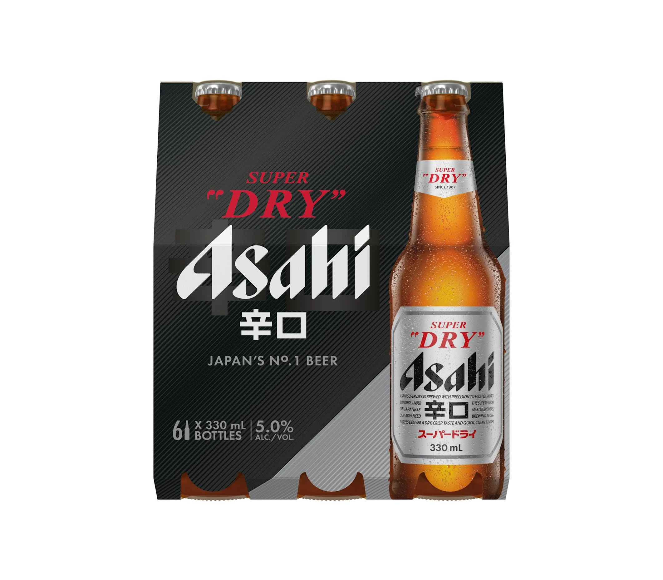
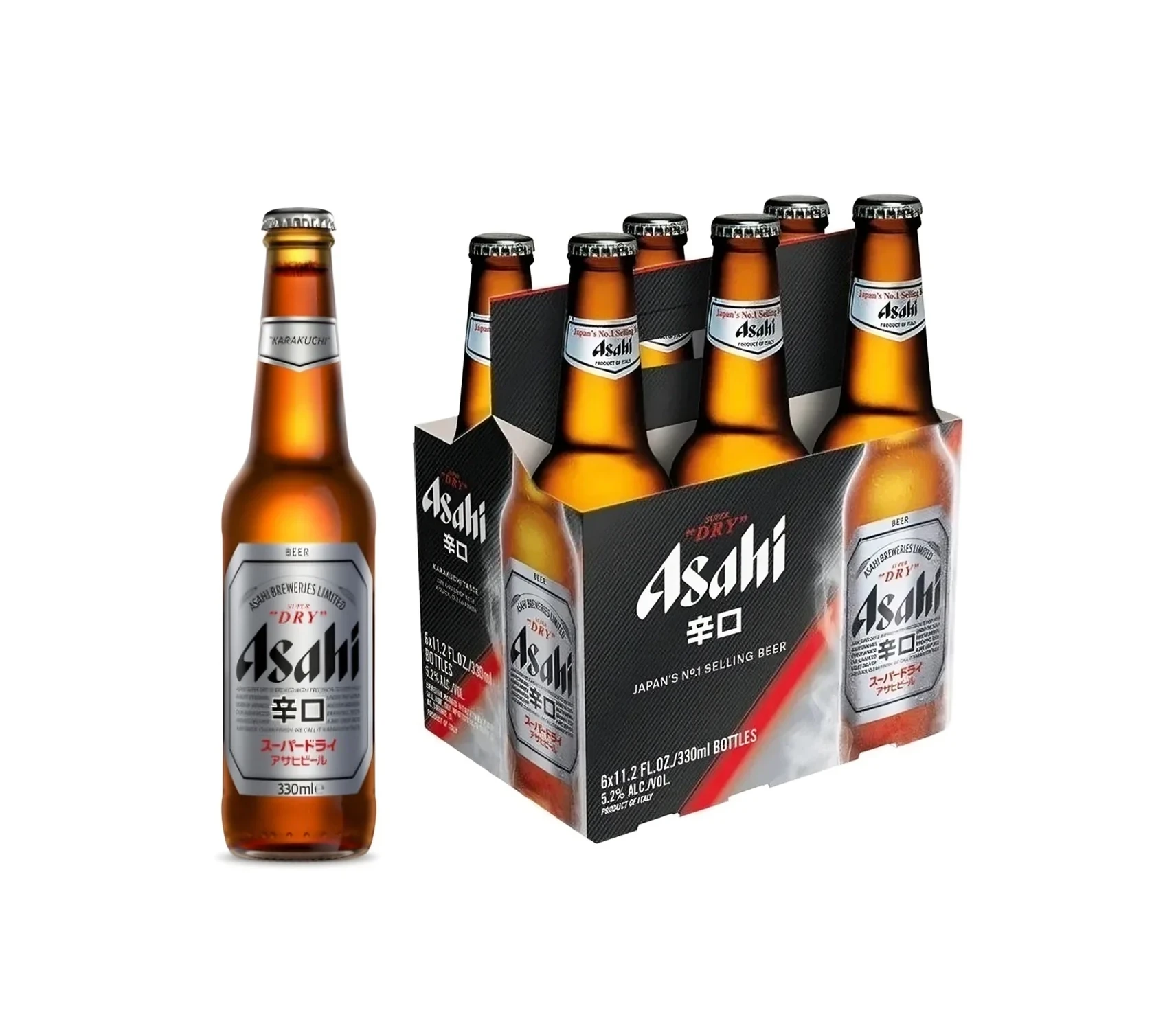
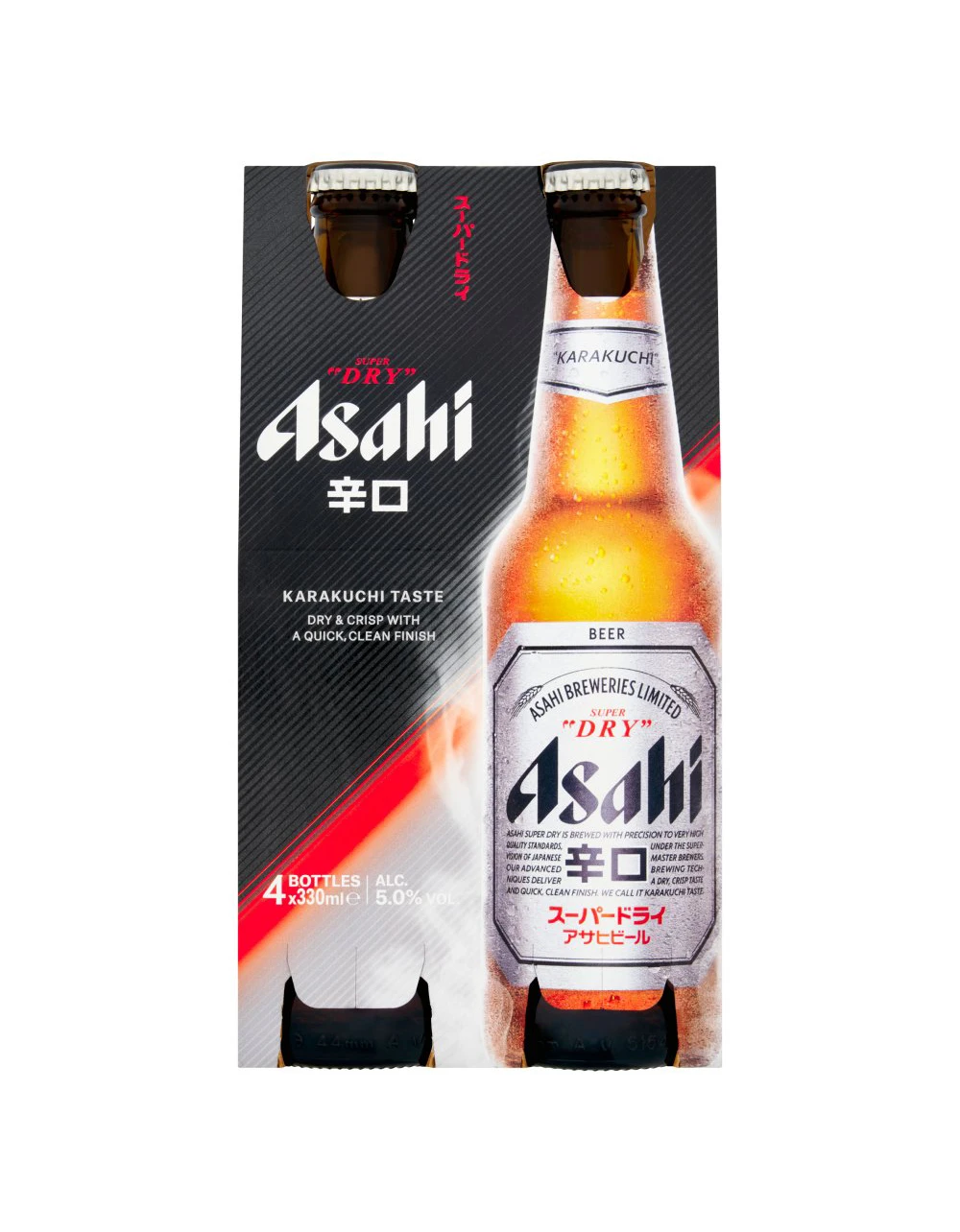
Limited Editions and Collaborations
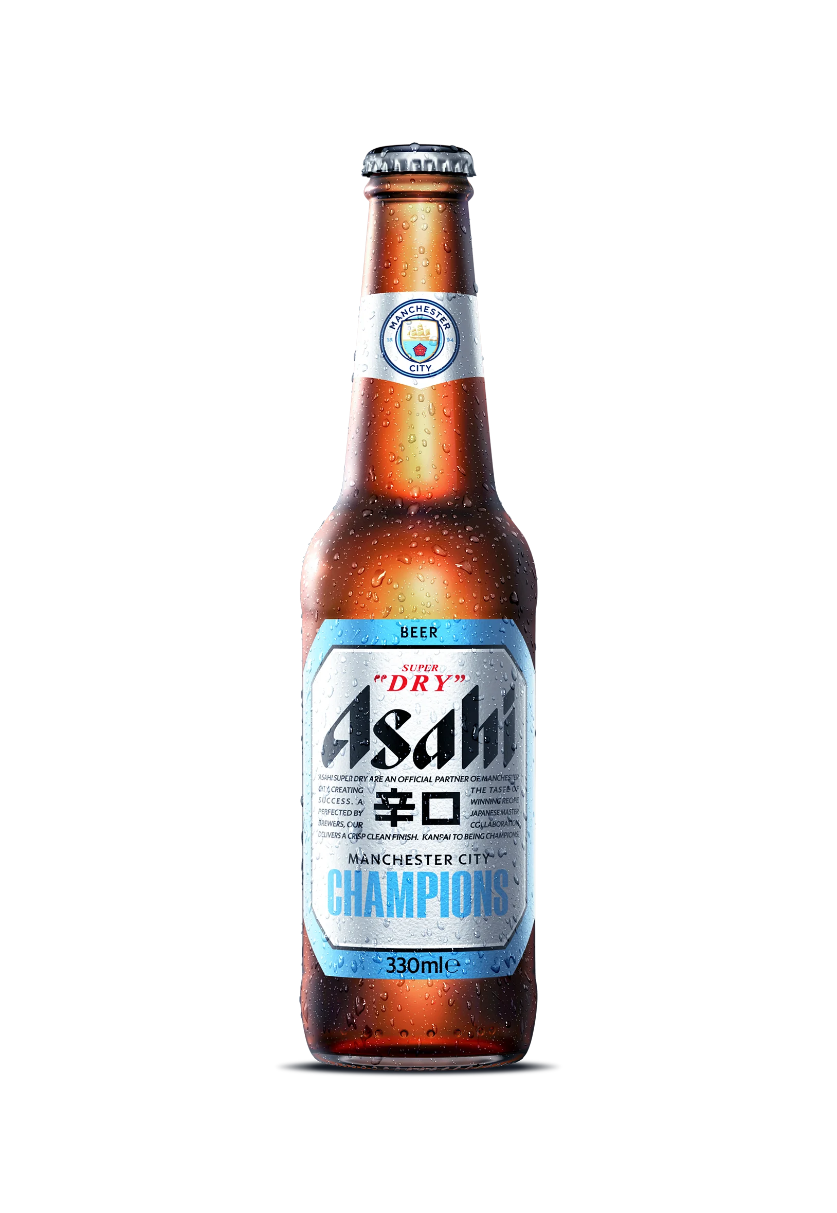
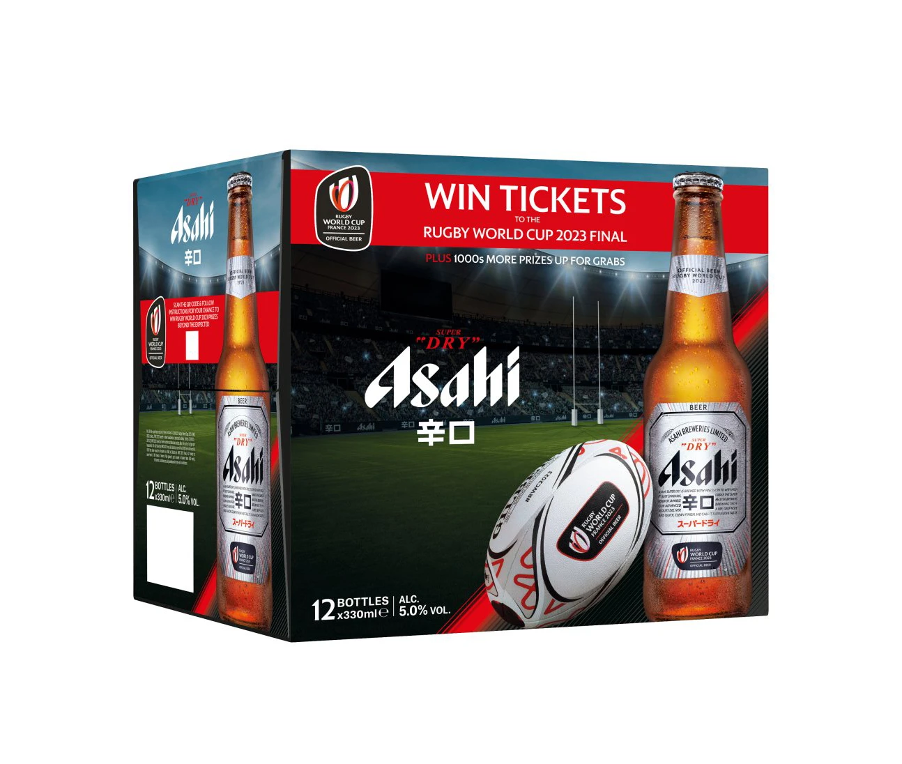
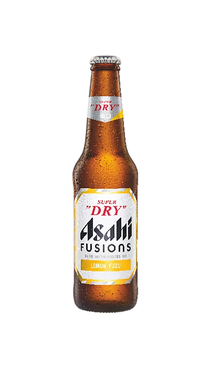
Asahi’s long-running sports sponsorships give the design system its most public stress tests. The Manchester City collaboration bottle keeps the Super Dry skeleton but wraps it in City blue, and the Rugby World Cup carton brings match-day energy to the case format — proof that a sponsorship badge can be absorbed without a full redesign. The Fusions Lemon Yuzu bottle shows the same flexibility on the flavor side: a citrus spin on the beer that still reads unmistakably Asahi.
Beyond the Bottle: The Keg and the Jokki
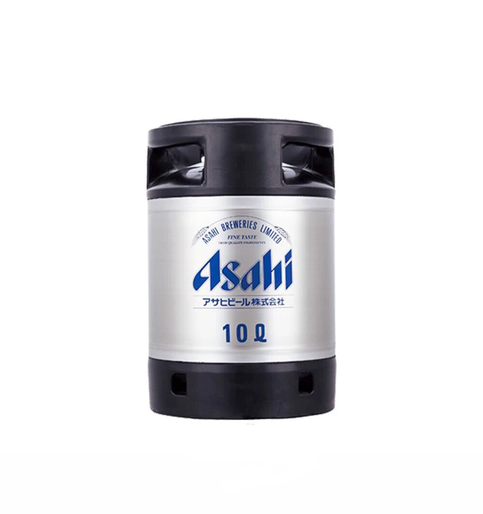
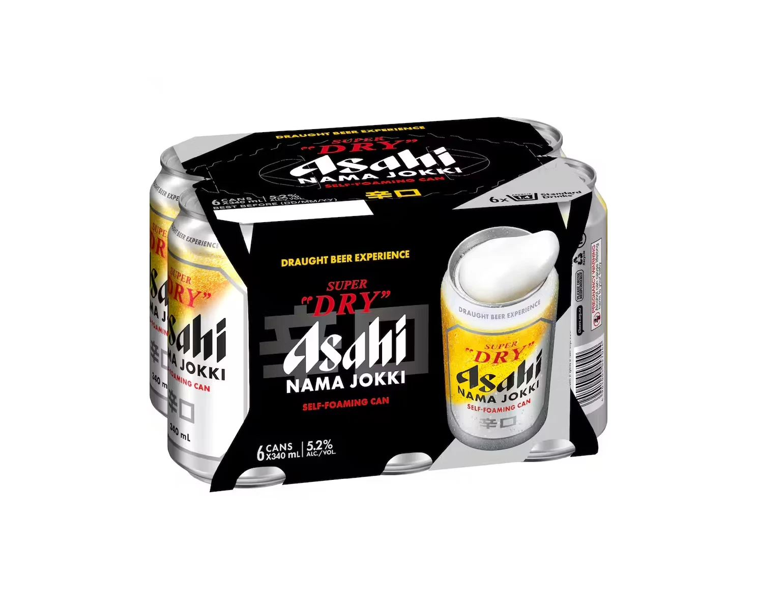
At the format extremes, the system still holds. The silver beer keg carries the Super Dry face onto a draft format for parties and events, while the Nama Jokki can — named after the beer mug (jokki) it imitates — brings the draft-glass experience into a single can. Two very different containers, one visual language.
What Asahi Teaches Us About Beer Packaging Design
1. The Material Is Part of the Design
Asahi uses bare aluminum silver as a design element rather than covering it with color. The bare can communicates modernity, coldness, and honesty about the product. Few brands have the confidence to let the substrate shine through — it’s a lesson in restraint.
2. Own Your Color Palette
Silver, black, red, and cool blue: the entire Super Dry universe is built from four colors. Every variant, multipack and collaboration uses the same palette. When your palette is this tight, even a Manchester City blue still feels like Asahi.
3. Use Color Shifts to Signal Product Differences
Black and gold for Dry Black. Blue tones for 0.0. Silver for the original. Each variant gets a clear code, and the codes never collide — shoppers can find their drink without reading a single word.
4. Repeat the Face at Every Scale
From a 350ml can to a 24-bottle case, the layout logic survives magnification. The hierarchy is simplified for distance viewing on cases, but the elements — silver field, black type, red accent — never change.
5. Negative Space Is Premium
The Super Dry label is mostly empty silver. That emptiness communicates confidence — the brand doesn’t need to shout. Premium packaging always uses more empty space than budget packaging.
Explore the Full Asahi Packaging Collection
Browse more Asahi beer packaging design references:
- Asahi Beer Packaging Collection
- Packaging Design — broader packaging collection