
Packaging Picks — Chobani: How One Brand Redefined Yogurt Packaging Design
Chobani didn’t just popularize Greek yogurt in America — it transformed the entire yogurt aisle. Before Chobani, yogurt packaging was functional and forgettable: thin plastic cups, generic fruit photos, clinical typography. Chobani brought farmstand aesthetics, bold fruit photography, and a color system so distinctive that you can spot a Chobani product from across the supermarket.
Today, Chobani is no longer just yogurt. The brand spans Greek yogurt, Flip snacks, Zero Sugar cups, Complete protein shakes, Kids pouches, oat milk, dairy milk, protein drinks, coffee creamers, and meze dips. In this article we tour the full Chobani packaging system as a design reference — a case study in how one brand designs packaging across an entire product empire.
The Chobani Design DNA: Fruit-Forward and Farm-Fresh
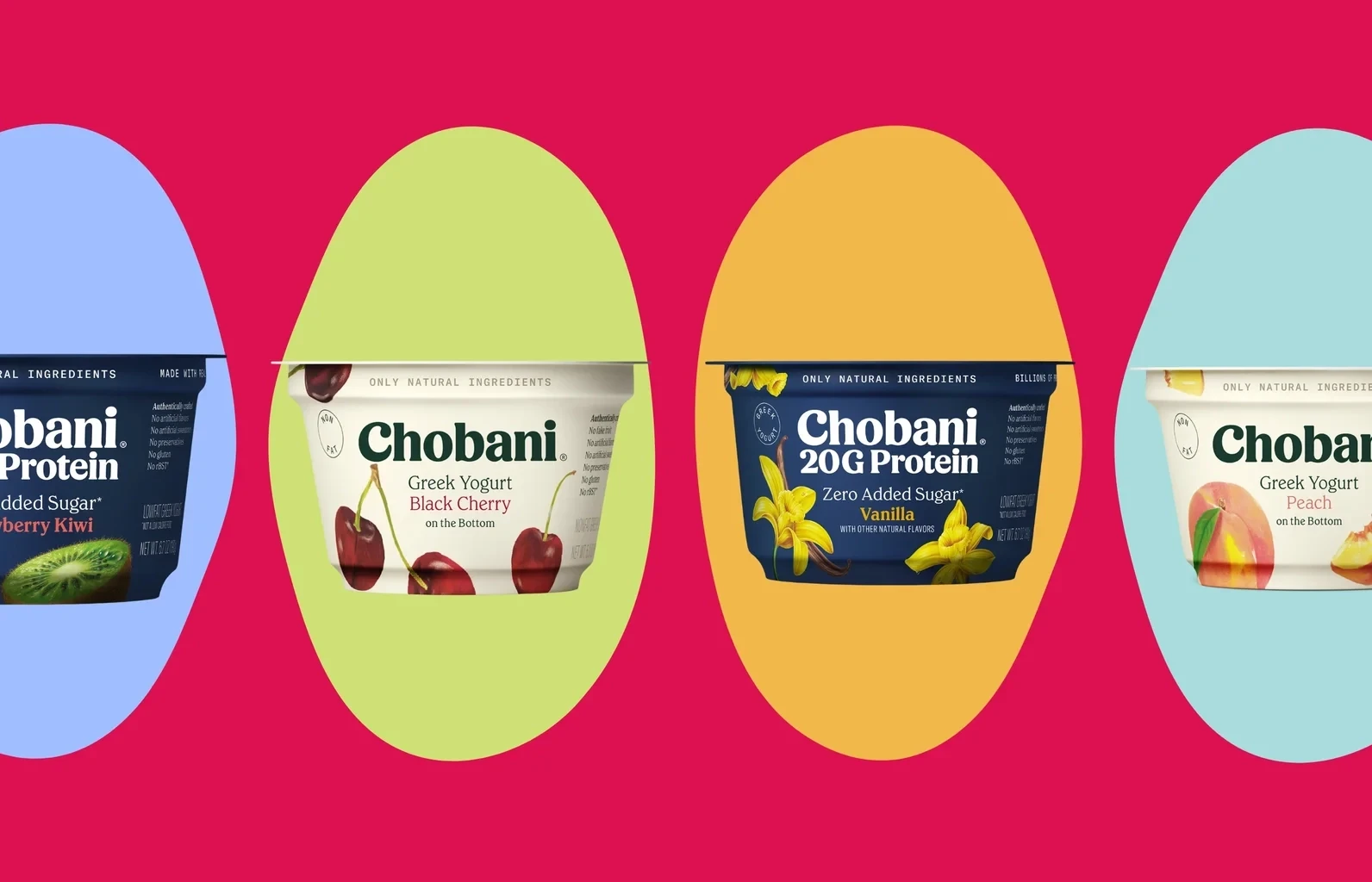
Every Chobani product shares a common visual language: bold fruit imagery, clean typography, and a white base that lets the product’s color do the talking. This approach is deceptively simple. The white cup acts as a blank canvas. The fruit photography provides the appetite appeal. The minimal typography — usually just “Chobani” and the flavor name — keeps the design uncluttered.
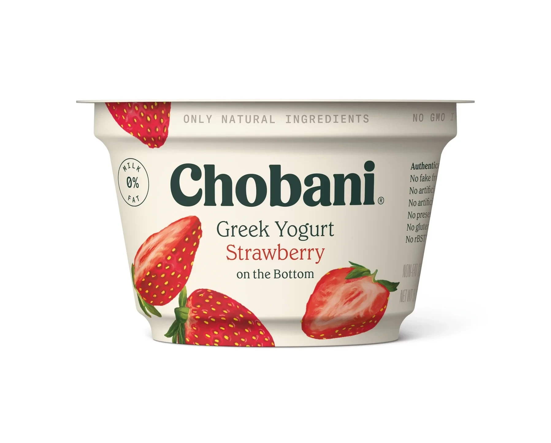
Compare this to competitors whose packaging often feels cluttered with health claims, badges, and nutritional callouts. Chobani’s restraint is its strength. The design says: the product is good enough to speak for itself.
The Product Line System: One Brand, Many Formats
Chobani’s genius lies in how it adapts its core visual identity across radically different product categories — from spoonable yogurt to liquid shakes to coffee creamer. Each sub-brand maintains the Chobani feel while clearly communicating its unique function.
Chobani Greek Yogurt: The Flagship
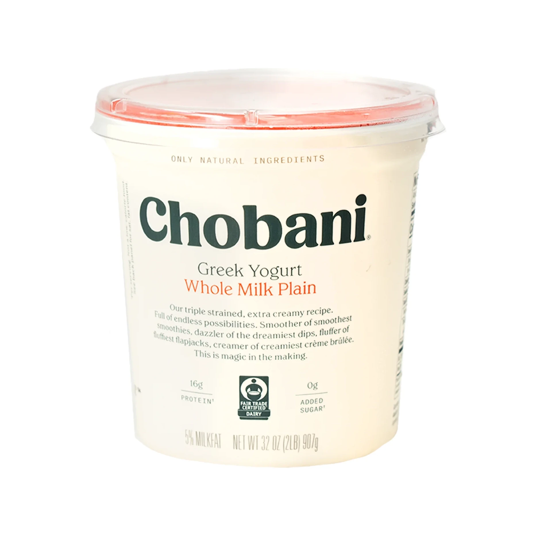
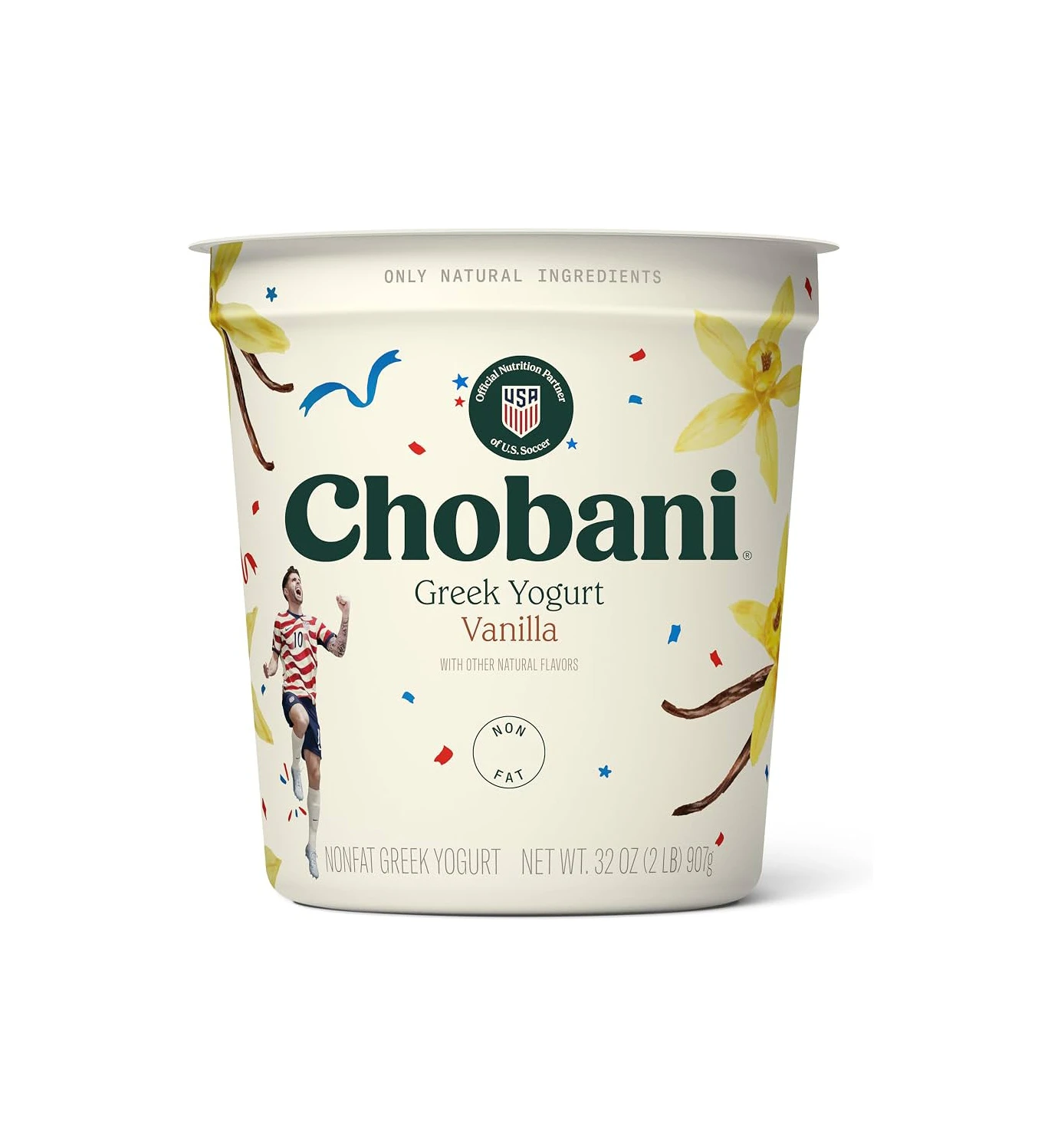
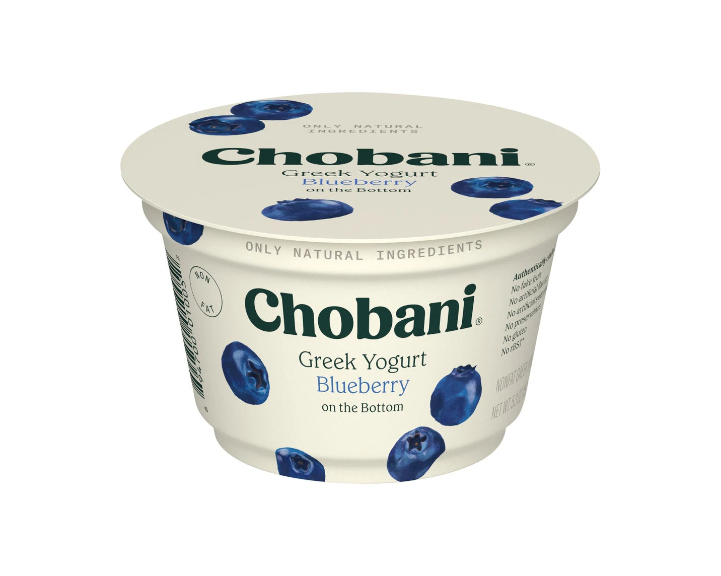
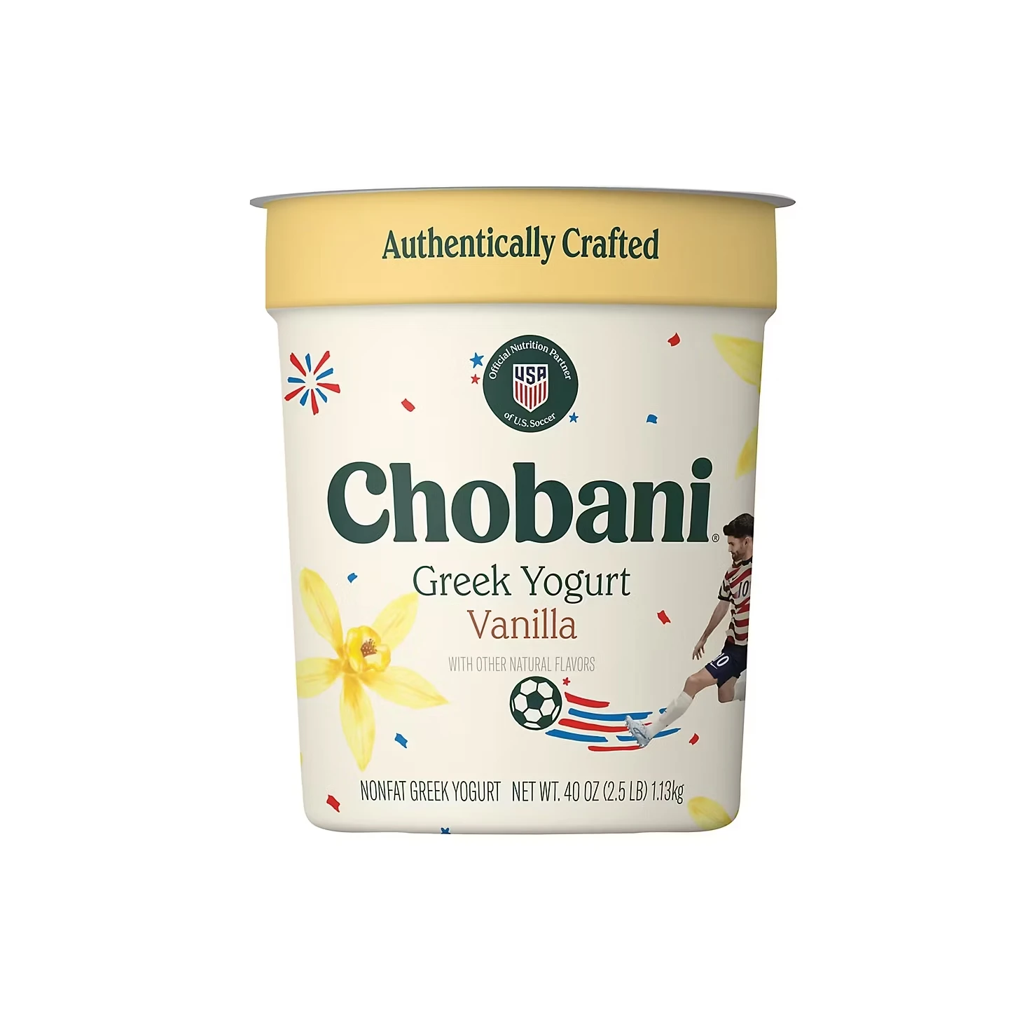
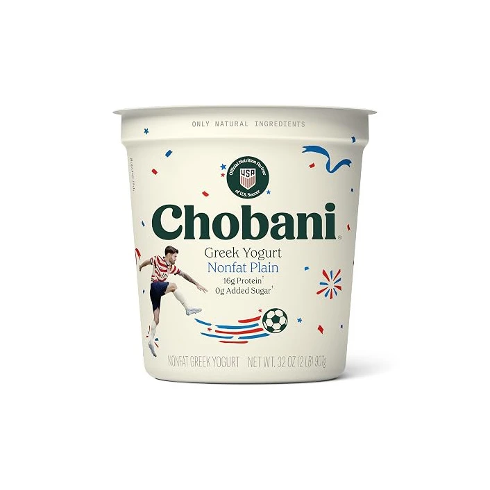
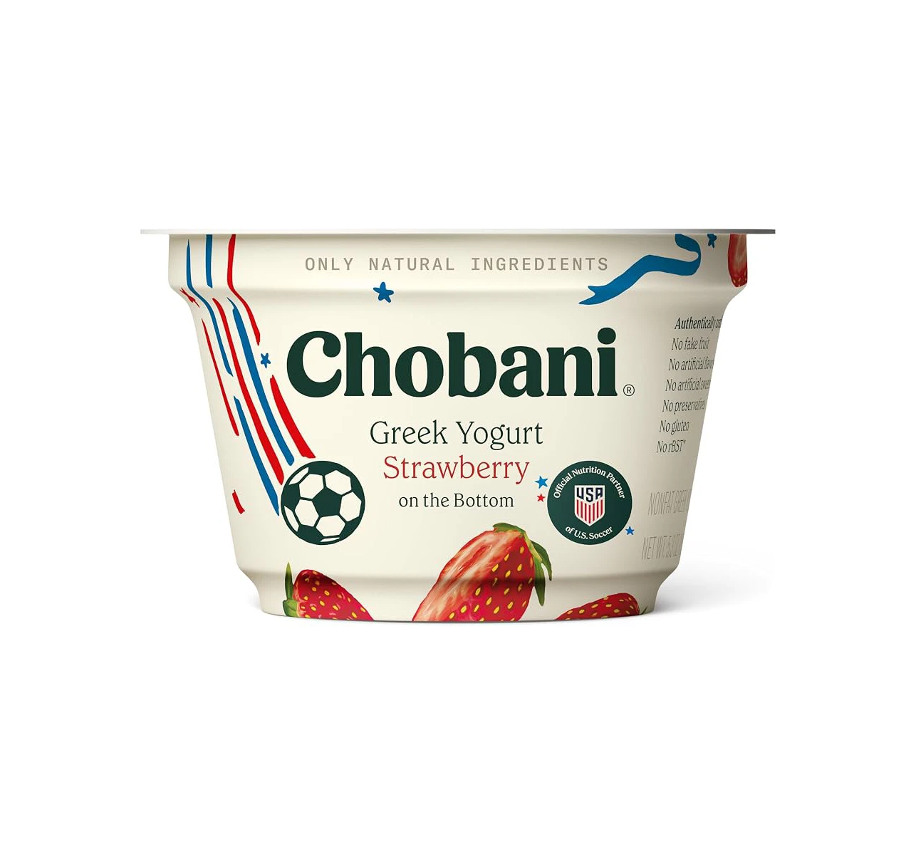
The original Chobani Greek Yogurt cup remains the brand’s design anchor. White base, vivid fruit photography, and the signature Chobani wordmark in its friendly, rounded typeface. Each flavor uses its fruit as the primary color identifier — pink-red for strawberry, deep blue for blueberry, warm gold for vanilla — making flavor recognition instant at the shelf. The same system scales from single cups up to the family-size 32 oz and 40 oz tubs, and limited editions like the US Soccer strawberry cup show how far the template can flex without breaking.
Chobani Flip: The Snack Experience
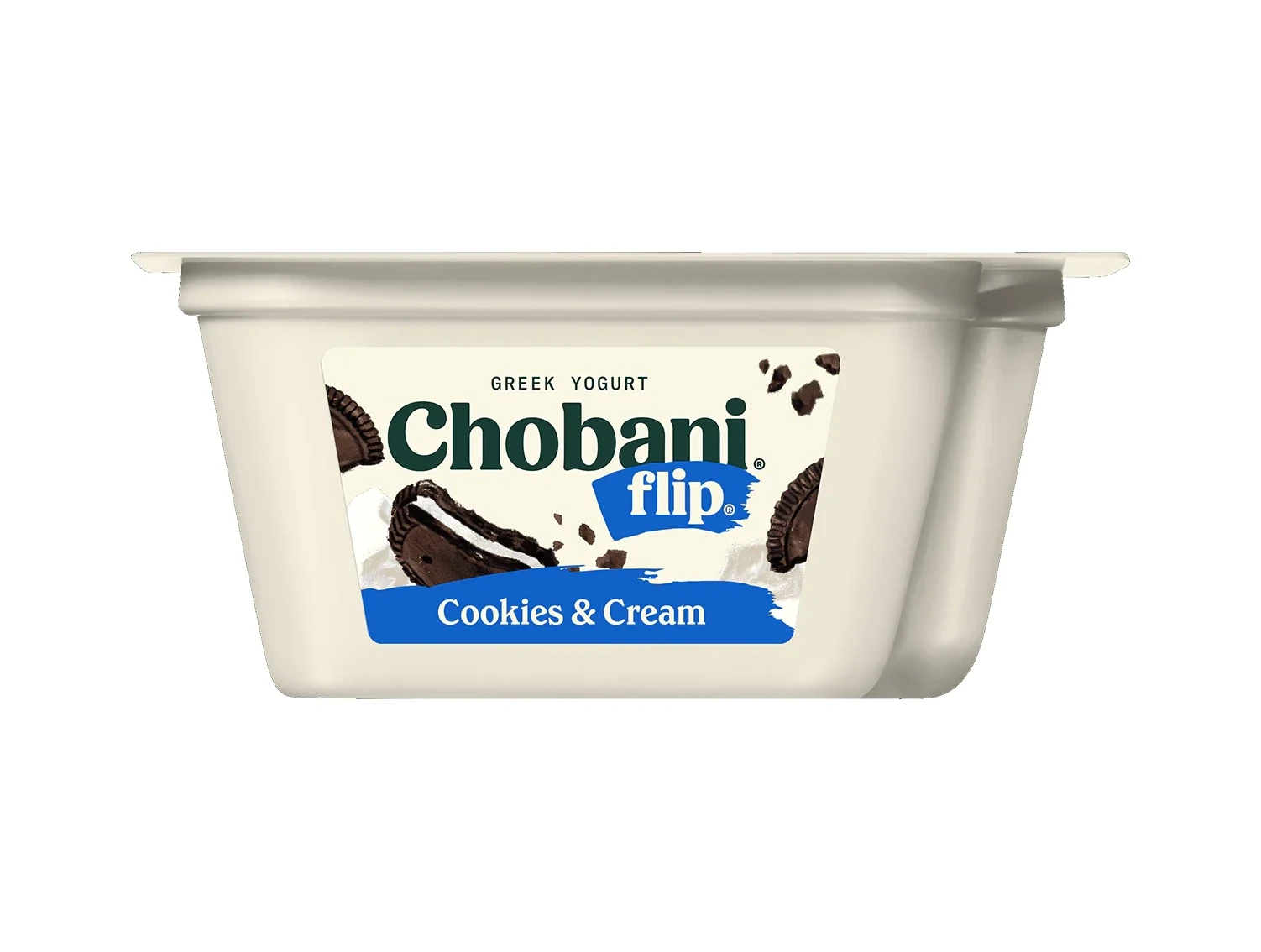
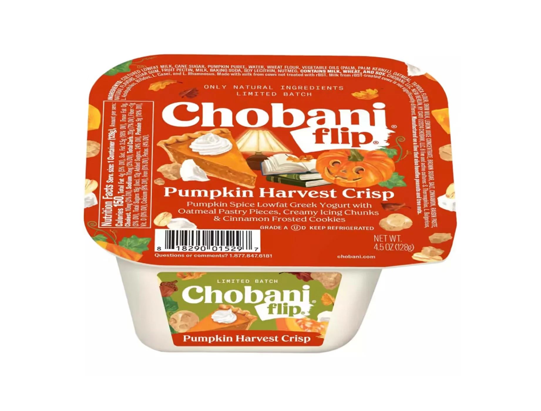
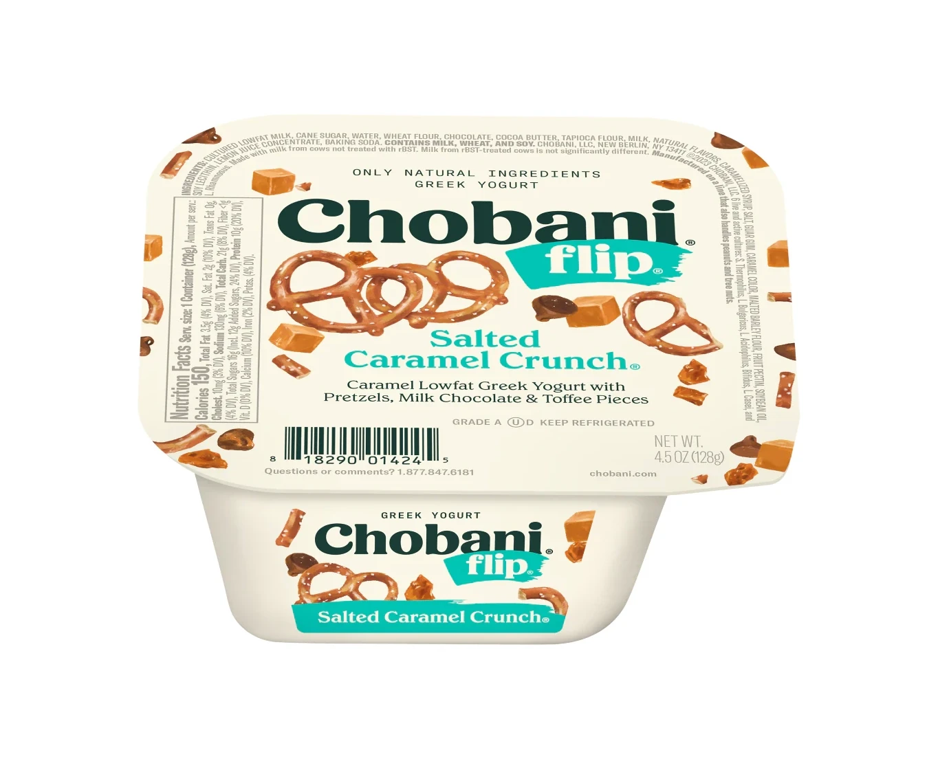
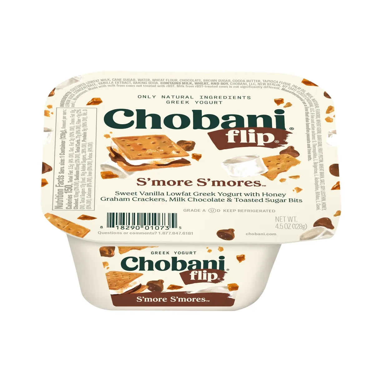
The Flip line — yogurt on one side, mix-in toppings on the other — introduced a completely new packaging format. The design emphasizes the “flip” action and the two-component experience, with dessert photography that leans indulgent rather than healthy. Seasonal flavors like Pumpkin Harvest Crisp get warm autumn color treatments that make them feel like limited-time treats, while core flavors like Cookies & Cream and Salted Caramel Crunch keep the same split-cup grammar year-round.
Chobani Zero Sugar: Indulgence Without the Sugar
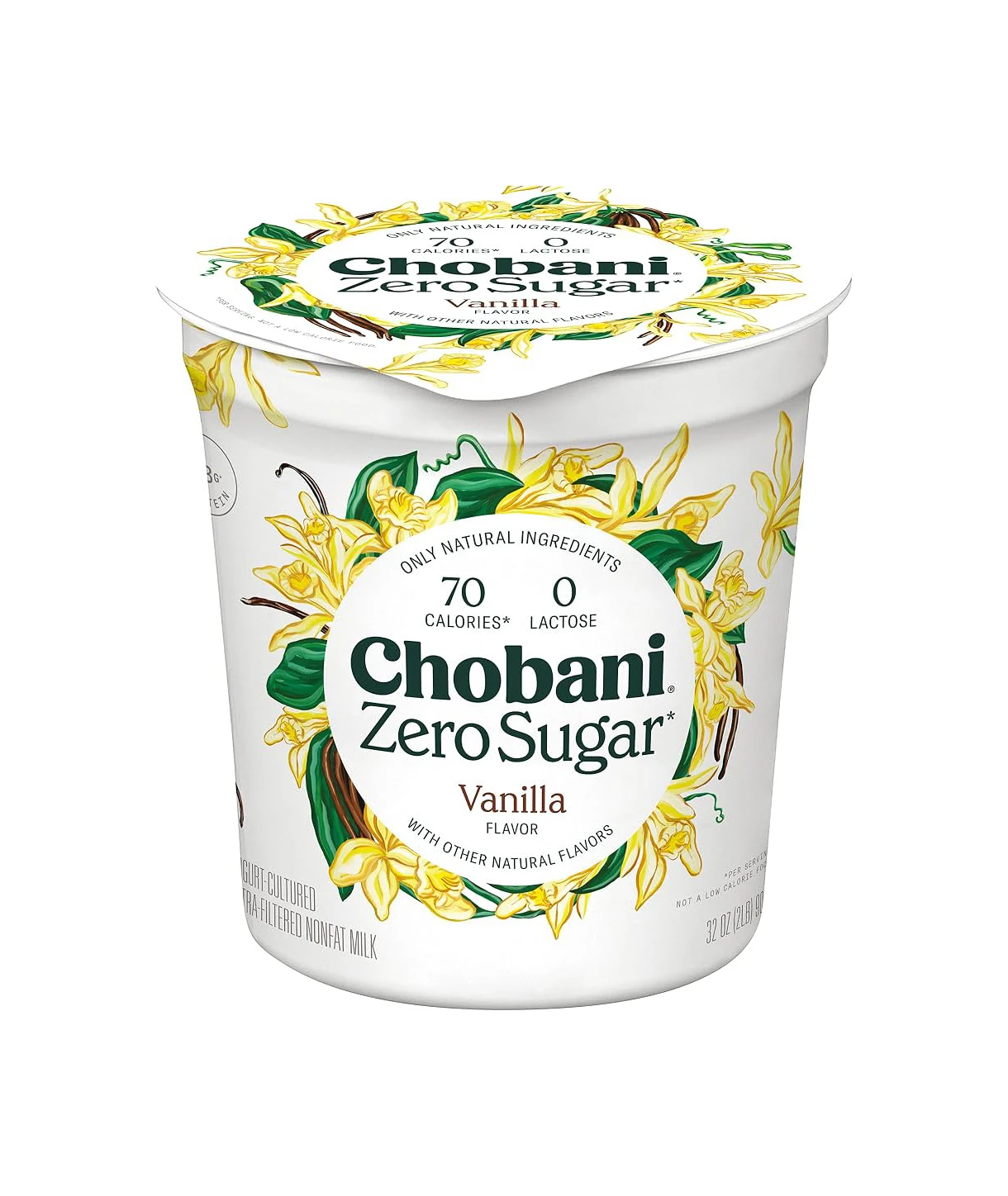
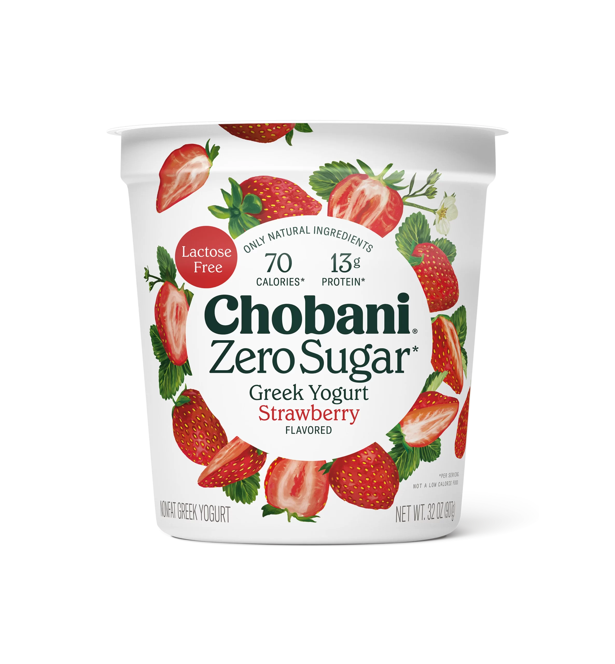
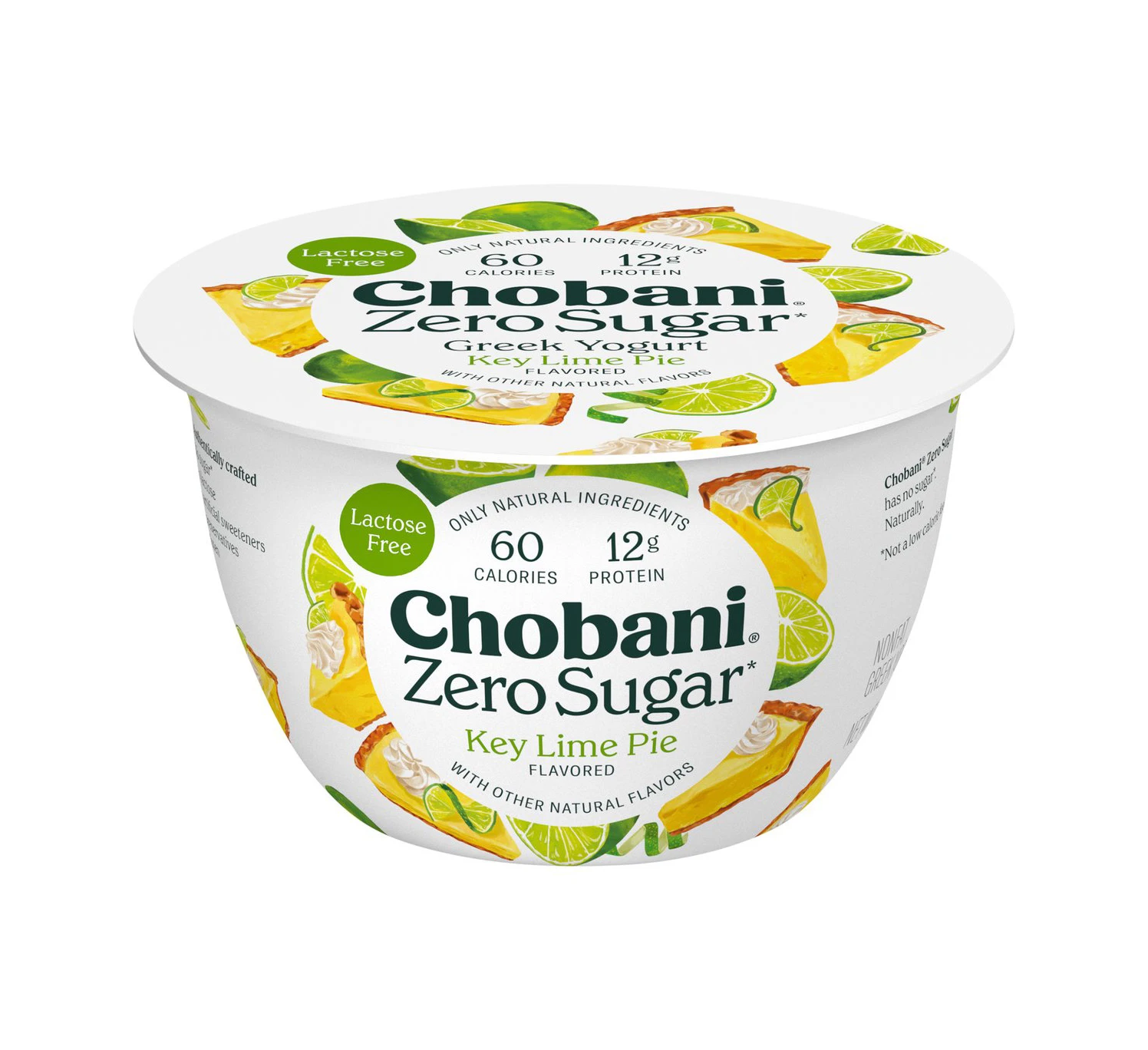
The Zero Sugar line solves a tricky design problem: how to say “no sugar” without looking like a diet product. Chobani’s answer is to keep the fruit-forward photography at full intensity and let a restrained “zero sugar” callout do the nutritional talking. Flavors like Key Lime Pie and Strawberry look like dessert cups first, functional food second.
Complete and Protein: The Performance Line
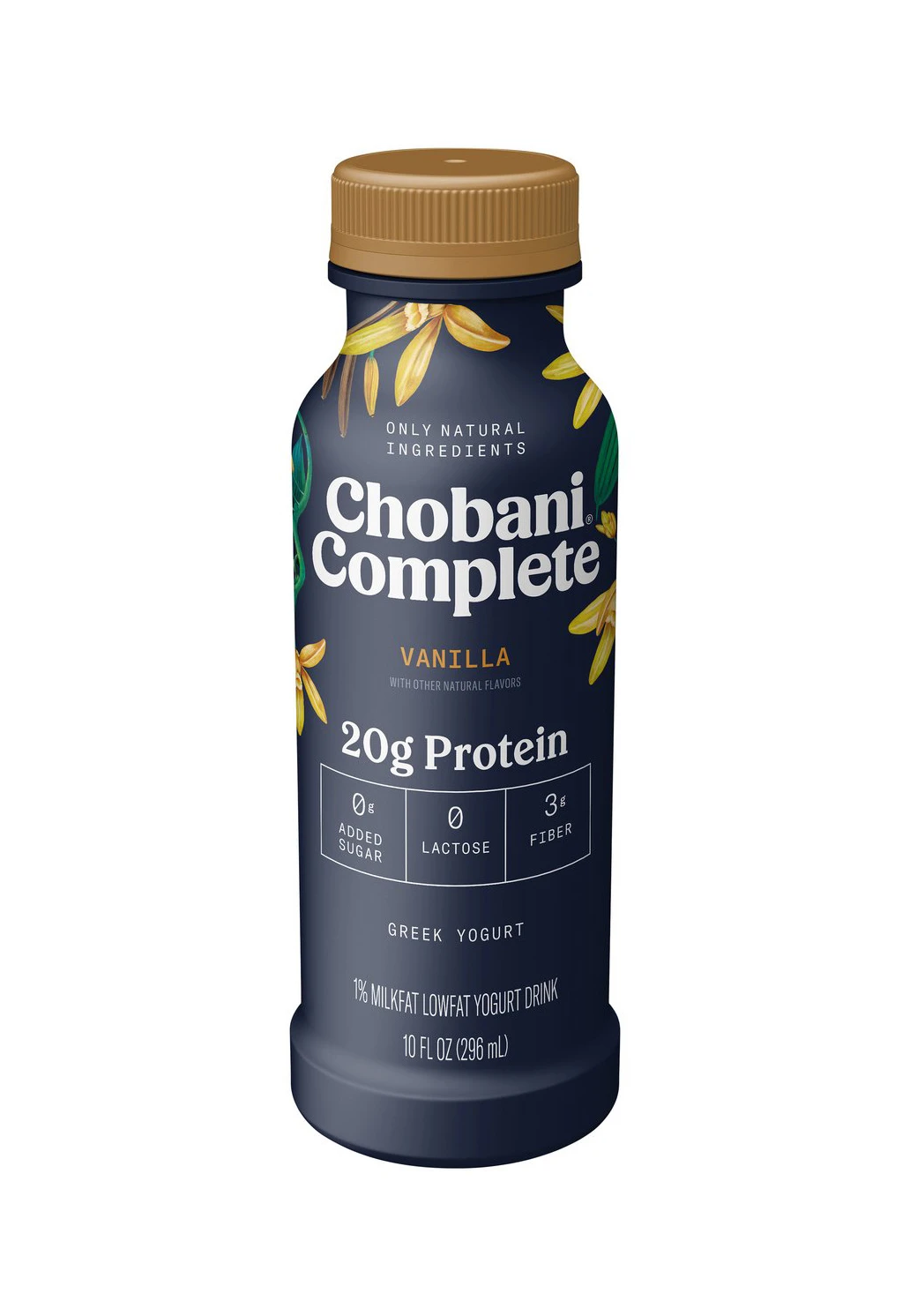
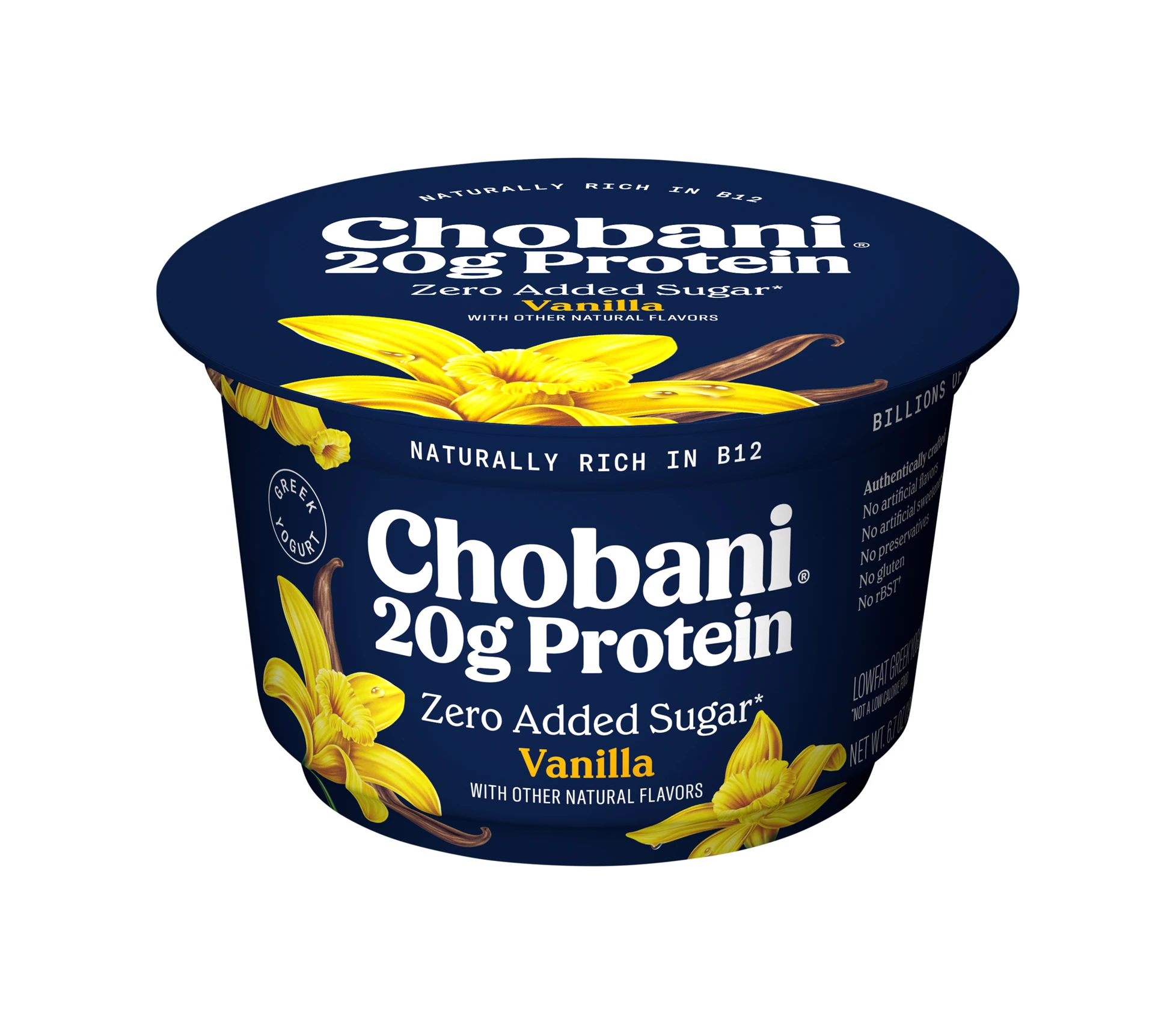
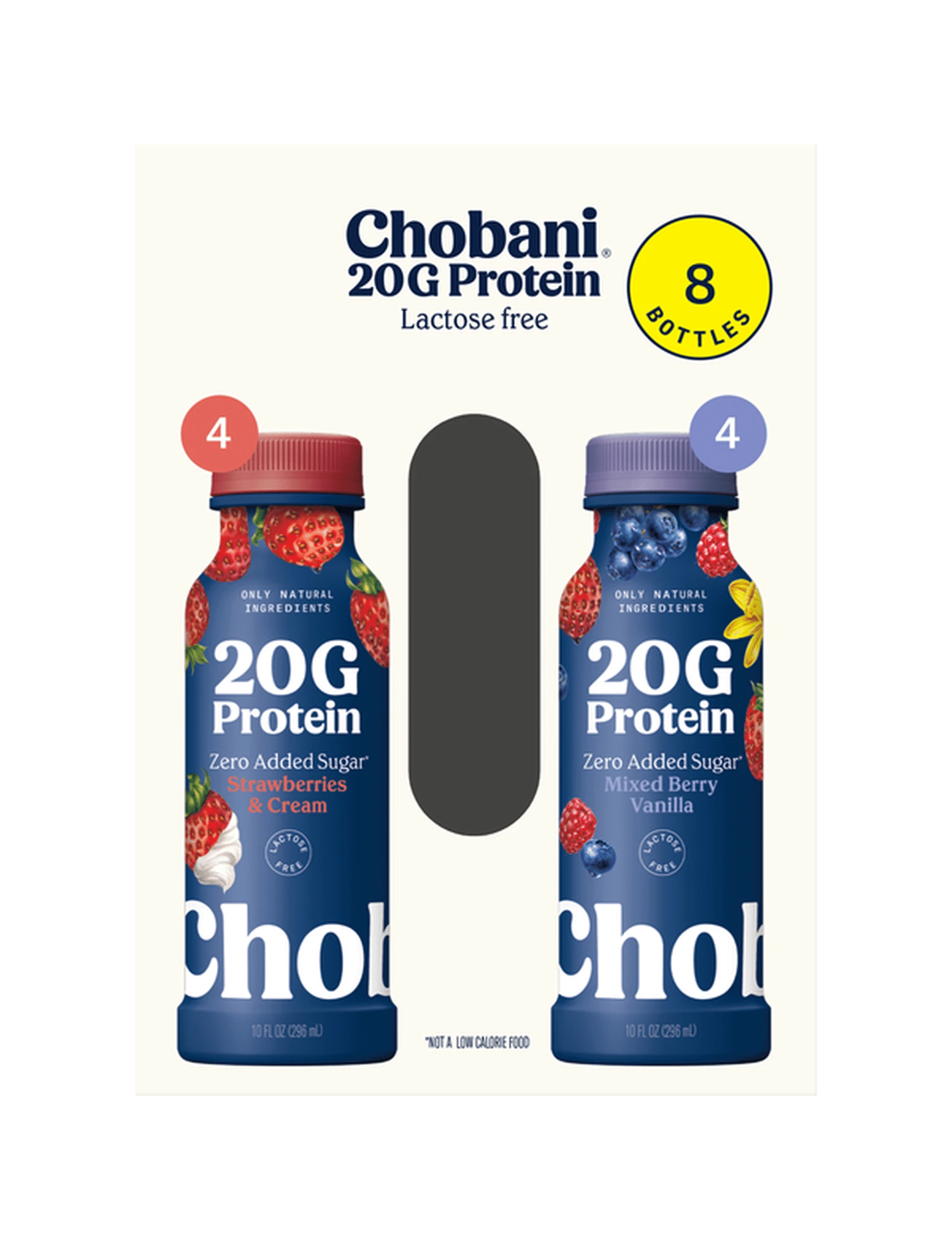
The Complete line — Chobani’s high-protein, no-sugar-added range — and the 20g Protein Drink bottles move furthest from the brand’s yogurt origins. Dark blue dominates, communicating energy and athletic performance. This is a crucial packaging strategy lesson: color shifts within a brand system communicate functional differences. Light and white for everyday yogurt. Dark blue for performance nutrition. The bottle format also demands a different design approach than a cup — less surface area, vertical orientation, and the need to stand out in a refrigerator case full of competing protein drinks.
Coffee Creamer and Creations: Crossing Categories
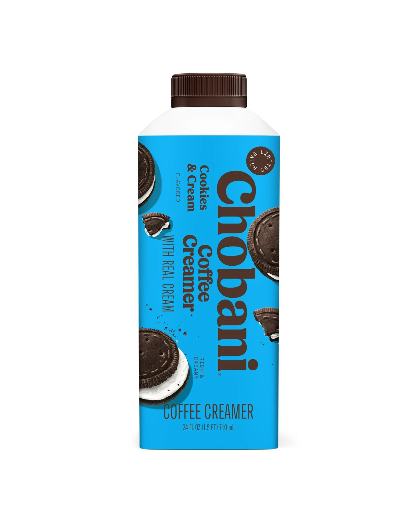
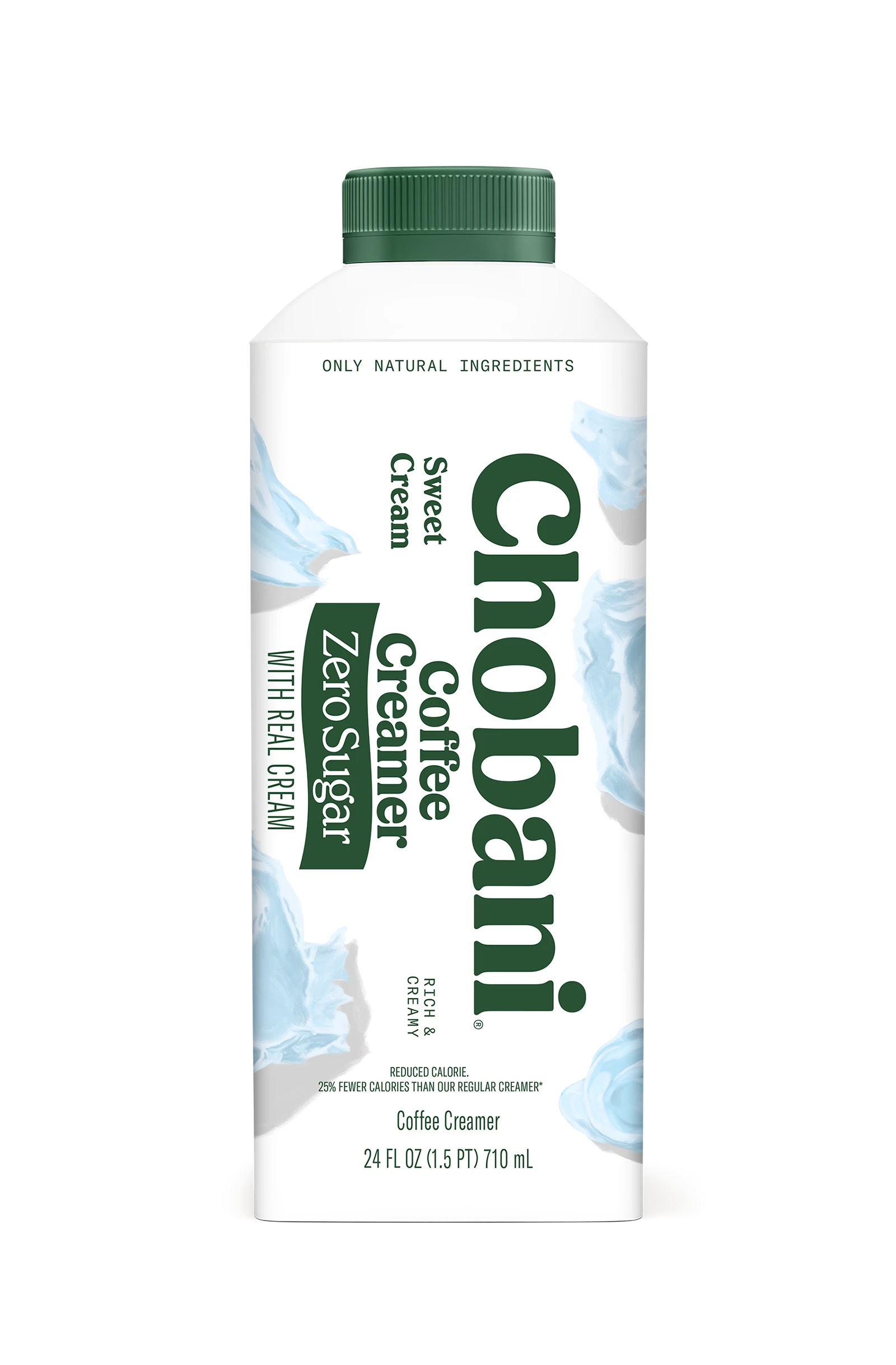
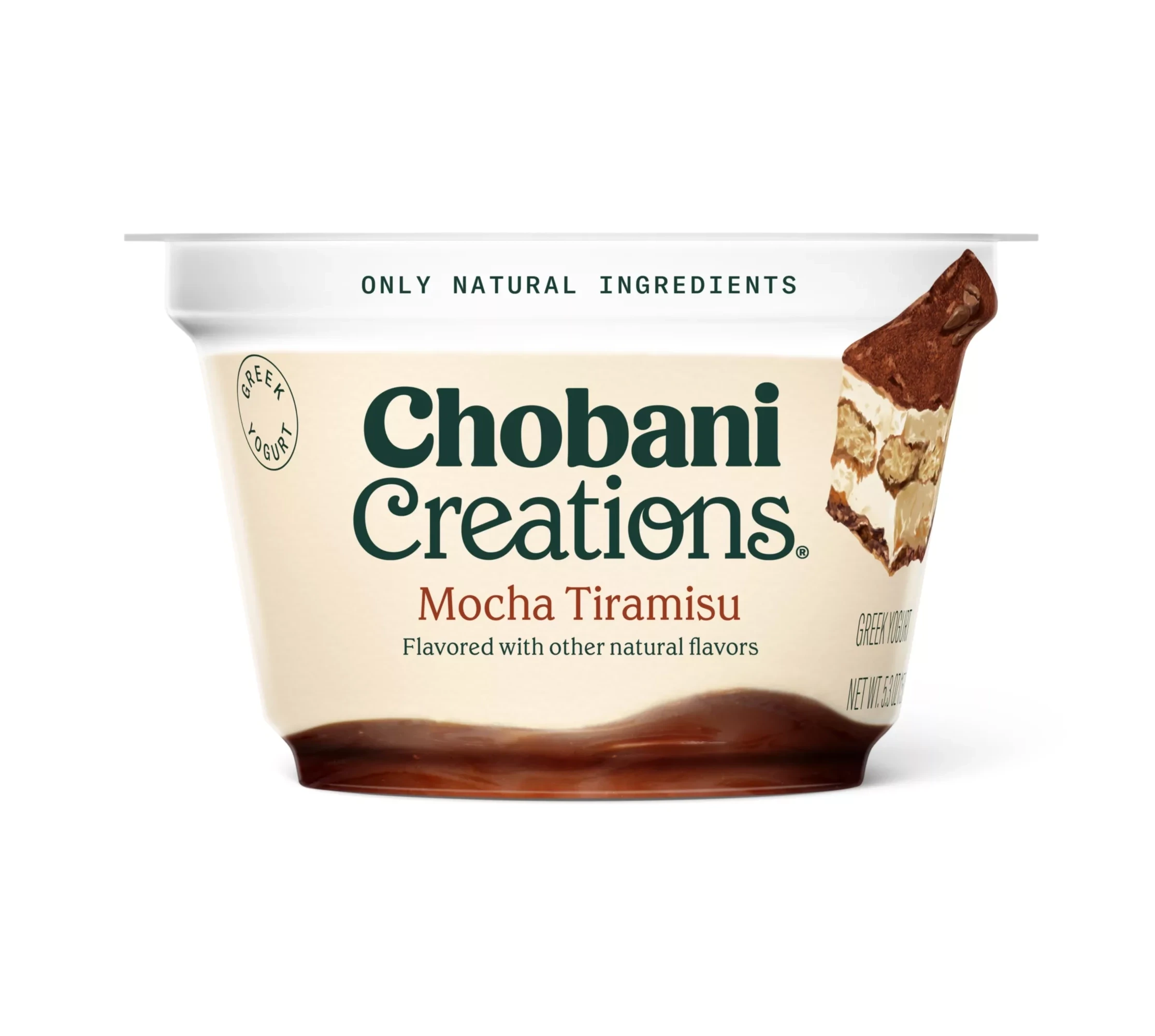
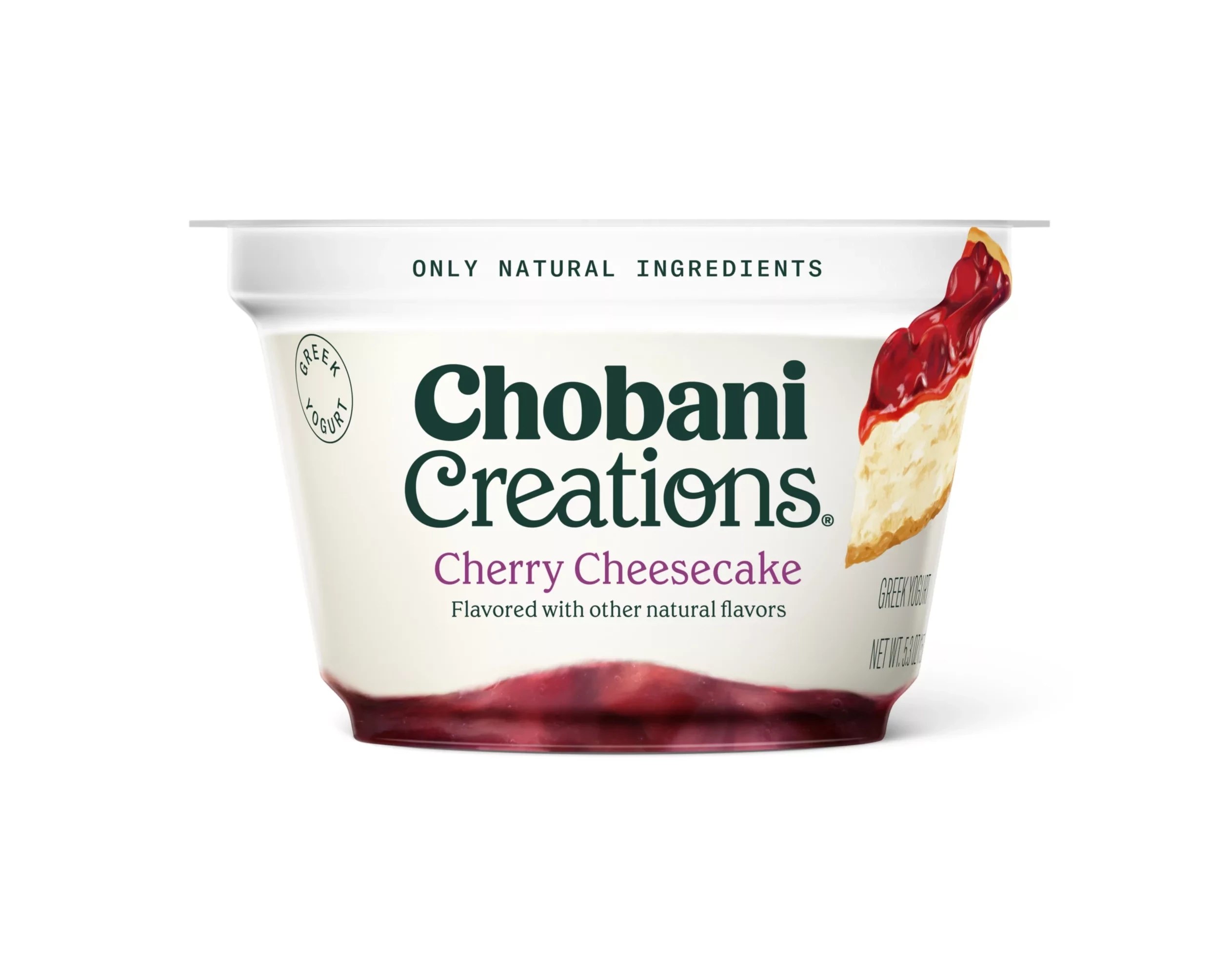
Perhaps the boldest moves in Chobani’s design history: entering the coffee creamer aisle and the indulgent dessert cup category. The creamer bottles must bridge two worlds — yogurt brand heritage and coffee accessory aesthetics — and do it with warm, dessert-like treatments. The Creations line (Mocha Tiramisu, Cherry Cheesecake) goes further, dressing premium glass-cup desserts with photography that reads straight from a patisserie counter.
Kids and Champions: Designing for the Next Generation
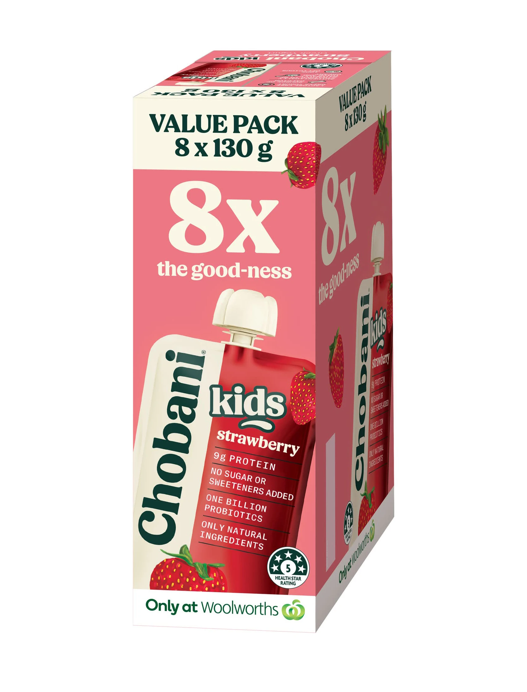
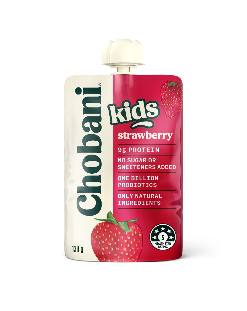
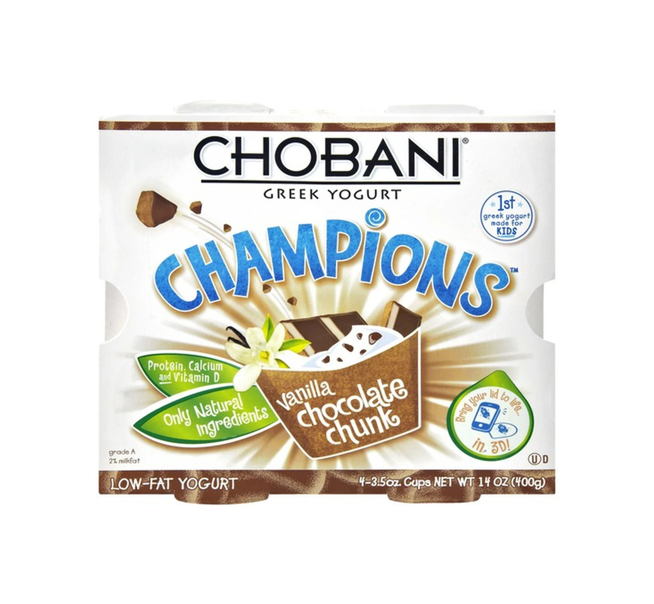
The Kids and Champions lines prove the system works for the youngest consumers too. Squeezable pouches replace cups, cartoon-friendly fruit graphics replace restraint, and the Champions multipacks borrow just enough of the parent brand’s white-and-fruit language to stay recognizably Chobani — while reading as lunchbox-friendly fun.
Milk, Oat and Meze: The Outer Edge of the Empire
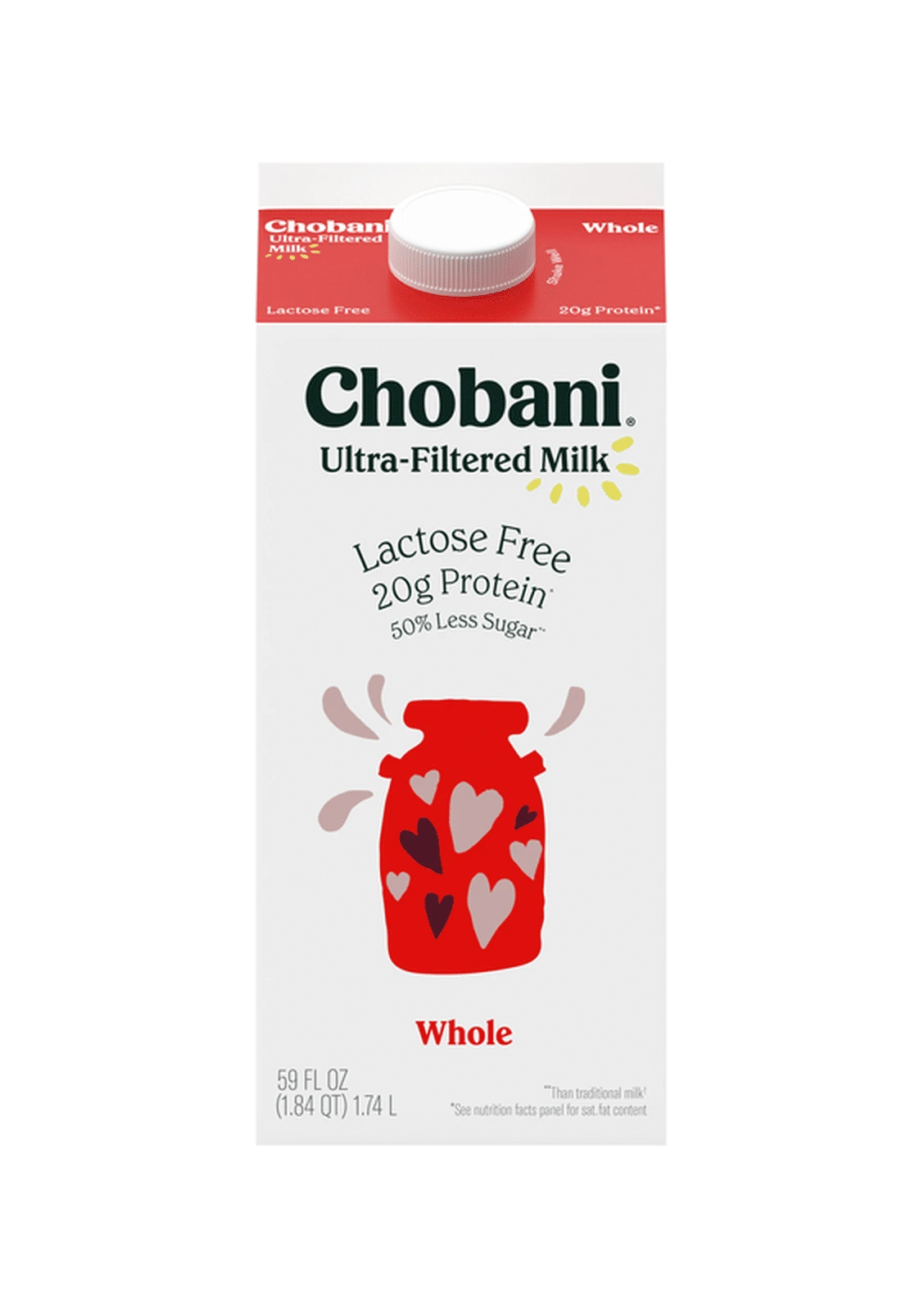
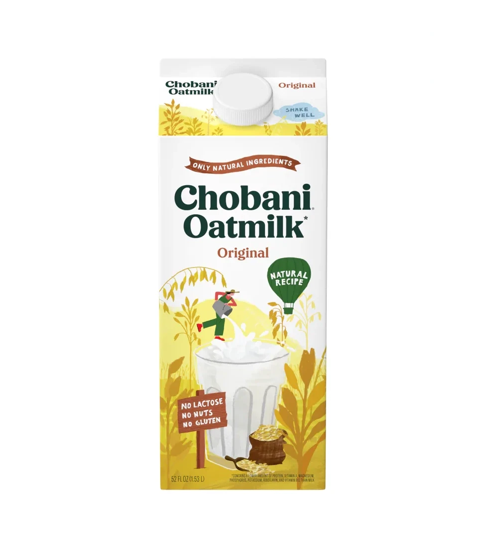
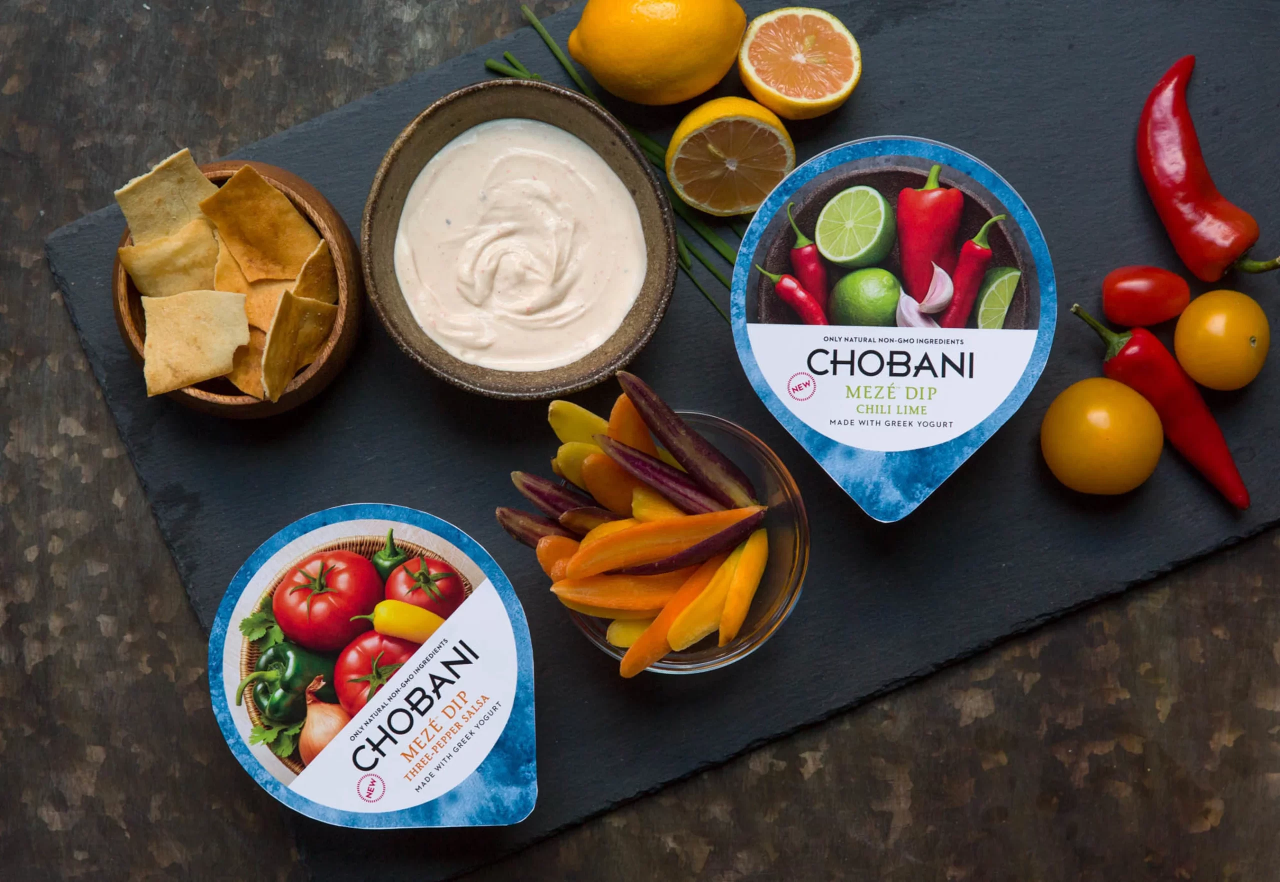
At the edges of the portfolio, Chobani’s design language stretches across three more categories. The lactose-free milk cartons use red and white on a familiar gable-top format that feels trustworthy and classic. The oat line keeps things clean and grain-warm, letting oat imagery signal plant-based without leaning on category clichés. And the meze dip tubs — the most unexpected extension — carry the same typography and appetizing photography logic into the refrigerated savory aisle.
The Color Logic: How Chobani Organizes a Complex Line
With dozens of product lines across multiple categories, Chobani needs a clear color system to help consumers navigate. The logic is remarkably consistent:
- White base + fruit color — standard Greek Yogurt. The fruit determines the accent color.
- Dark blue base — Complete and protein lines. Signals high-protein, performance-focused.
- Red base — Kids and Champions line, plus milk. Signals energy, familiarity, and accessibility.
- Warm tones (brown, gold, orange) — Flip, Creations and seasonal flavors. Says “treat yourself.”
5 Packaging Design Lessons from Chobani
1. Let the Product Be the Hero
Chobani’s packaging doesn’t try to be clever. The fruit is the star. The typography is quiet. The brand name is confident but not overwhelming. This restraint is what makes the packaging feel premium rather than mass-market. When in doubt, remove elements rather than adding them.
2. Color Categorization Aids Shopping
Consumers don’t read packaging in a store — they scan. Chobani’s color system lets shoppers identify the category (yogurt, protein, kids, dessert) in milliseconds. This is packaging design as wayfinding: your colors should help people find what they want fast.
3. Format Dictates Design
A yogurt cup, a milk carton, a protein bottle, and a coffee creamer container each have radically different surfaces. Chobani adapts its design language to each format rather than forcing one template everywhere. The brand feel is consistent; the execution is format-specific.
4. Seasonal Variations Create Excitement
Chobani’s seasonal Flip flavors — Pumpkin Harvest Crisp and friends — get special color treatments that signal “limited time.” This creates urgency and social media buzz. Seasonal packaging is one of the most cost-effective marketing tools available to a food brand.
5. Brand Extensions Need Visual Connection
When Chobani launched coffee creamers, oat milk and meze dips, the packaging could have looked like completely different brands. Instead, every extension maintains visual DNA connections to the original yogurt cups. This builds cumulative brand equity — every product reinforces every other product.
Explore the Full Chobani Collection
Browse more Chobani packaging design references:
- Chobani Packaging Collection
- Packaging Design — broader packaging collection