
Packaging Picks — Guinness: 260 Years of Brand Consistency in Packaging Design
Few brands on earth have maintained visual consistency for as long as Guinness. Since 1759 — over 260 years — the harp, the gold accent, and the bold “GUINNESS” wordmark have appeared on every product the company has ever made. This isn’t just longevity. It’s a masterclass in how to build, protect, and extend a brand identity across centuries, formats, and even food categories.
At Gropicture, we have Guinness packaging images available for free download — covering Draught Stout cans, Extra Stout bottles, Cold Brew Coffee Beer, non-alcoholic variants, chocolates, condiments, and even ice cream collaborations. Together, they tell a story of a brand that knows exactly who it is.
The Visual Anchor: Harp, Gold, and Black
Every Guinness product shares three visual elements: the harp symbol, the gold accent color, and a dark base — usually black or deep brown. This trio is the brand’s visual anchor. It has remained essentially unchanged since the 19th century, and it appears on everything from beer cans to onion marmalade jars.
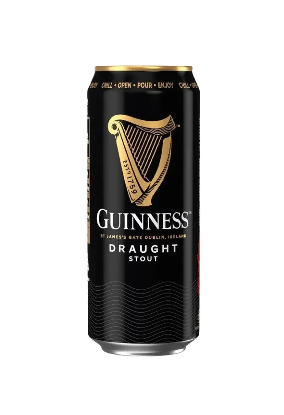
The Guinness harp — based on the Brian Boru Harp at Trinity College Dublin — is one of the most recognized brand symbols in the world. It’s also one of the oldest. Guinness registered it as a trademark in 1876, decades before most companies even understood the concept of brand identity. The Irish government later adopted a left-facing version as the national emblem, while Guinness’s version faces right — a detail only brand historians notice, but it shows how carefully this company guards its visual assets.
The Core Beer Line: Consistency Across Variants
Guinness sells multiple beer variants: Draught Stout, Extra Stout, Foreign Extra Stout, Blonde American Lager, Cold Brew Coffee Beer, and Nitro Surge. Each is a different product with a different taste profile — yet every can and bottle is unmistakably Guinness. How?
Draught Stout: The Reference Design
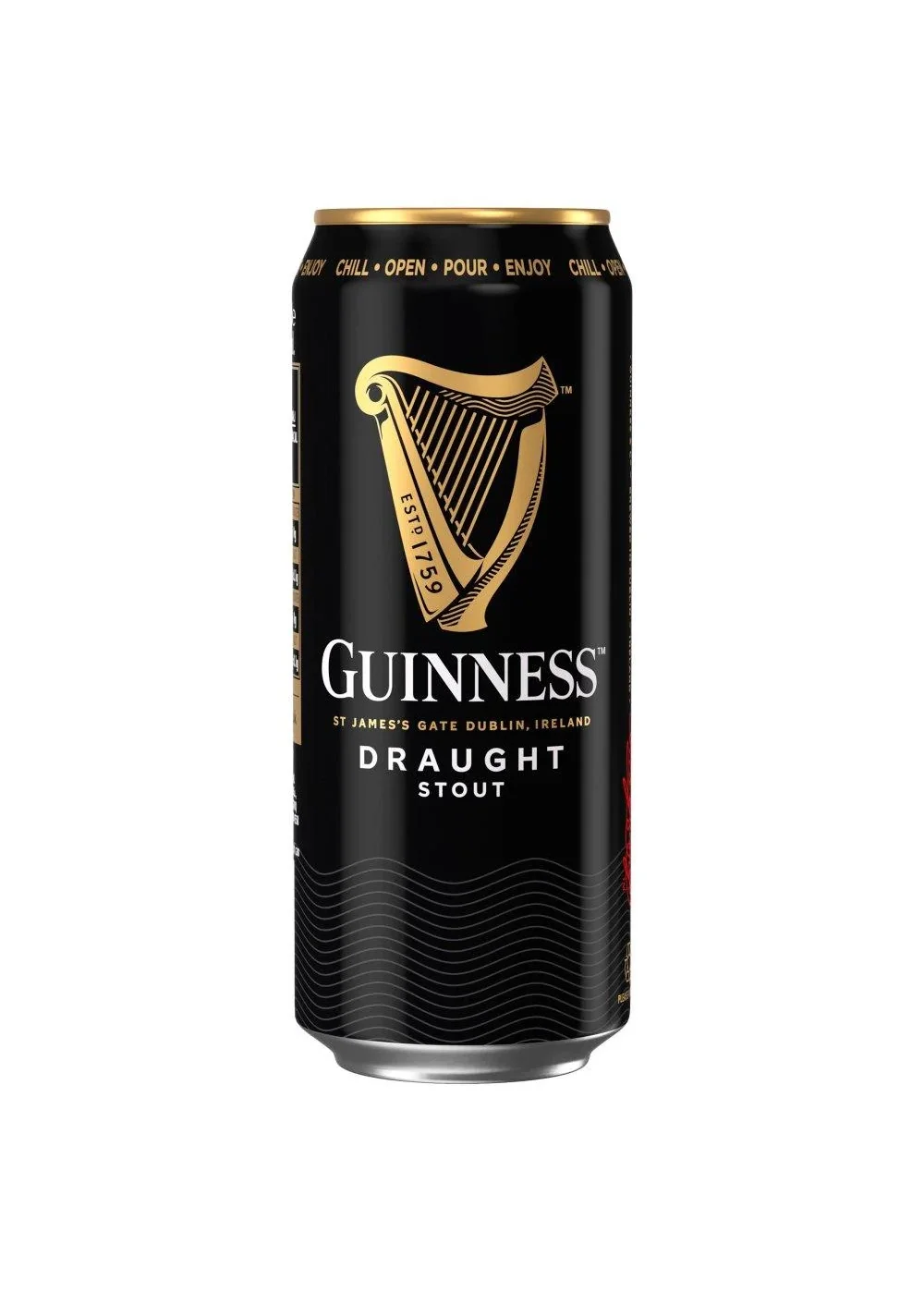
The Draught Stout can is the brand’s visual benchmark. Black base, gold harp, white typography, red accent on the widget explainer. Every other Guinness product references this design. If you removed the harp and the gold, it wouldn’t be Guinness — no matter what the can said.
Foreign Extra Stout: Darker, Bolder
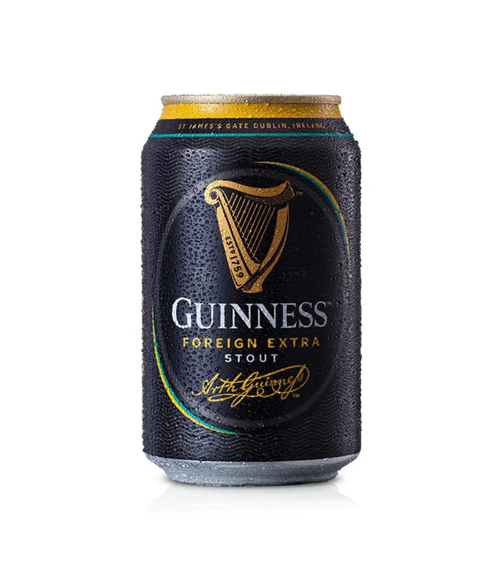
The Foreign Extra Stout can uses the same harp and gold system, but pushes the design to feel more intense. The black base is deeper, the typography heavier. This communicates a stronger, more full-bodied brew — while never abandoning the core identity. It’s the same brand vocabulary, spoken with more emphasis.
Cold Brew Coffee Beer: A Modern Departure
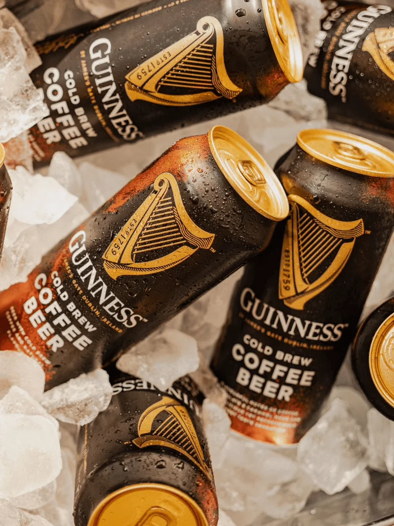
The Cold Brew Coffee Beer variant takes Guinness’s visual language in a new direction — brown and gold tones that reference coffee rather than stout. But look closely: the harp is still there. The wordmark is still there. The gold accent still frames the design. This is brand extension done right: the new product feels fresh and different without losing its DNA.
Nitro Surge: Technology Meets Heritage
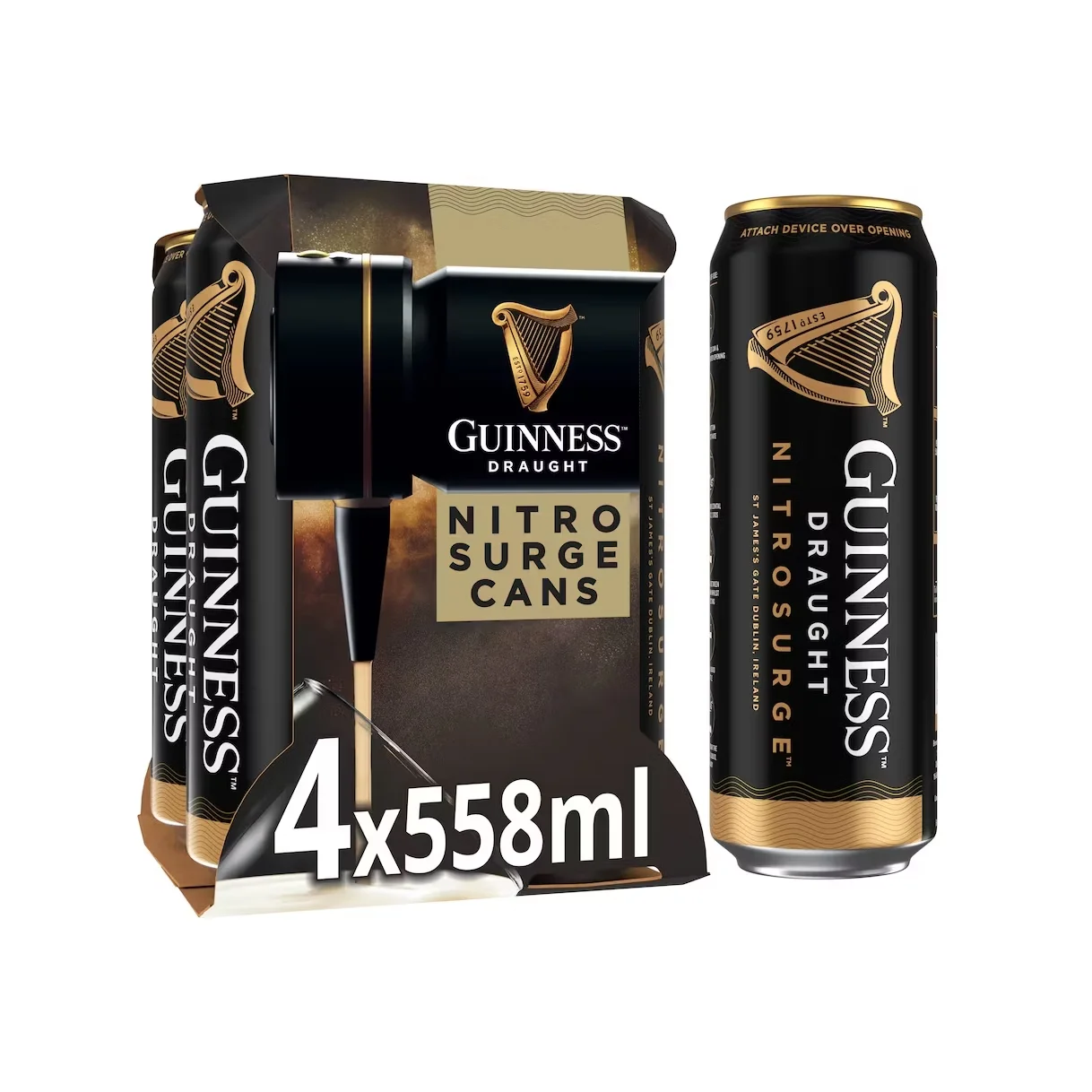
The Nitro Surge system — a special can and nitro-activation device — represents Guinness’s most technology-forward packaging. Yet the design doesn’t try to look like a tech product. It uses the same harp, the same gold, the same black base. The lesson: innovation doesn’t require abandoning your visual heritage. You can be cutting-edge and timeless simultaneously.
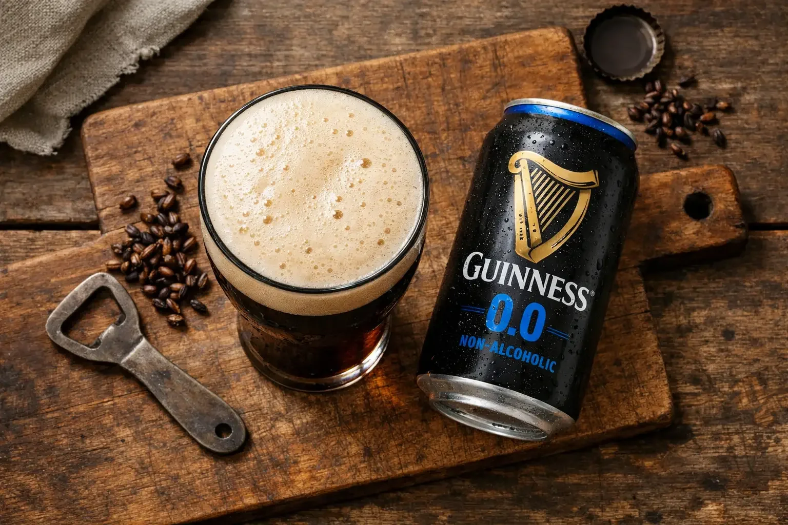
0.0 Non-Alcoholic: The Same Brand, New Message
When Guinness launched its 0.0 non-alcoholic variant, the design challenge was significant: how do you signal “no alcohol” while maintaining the brand’s premium, heritage feel? The answer: keep everything identical, then add a subtle “0.0” marker. The harp stays. The gold stays. The black base is unchanged. This communicates a critical message: the non-alcoholic version is not a lesser product — it’s a Guinness.
Beyond Beer: The Guinness Food Empire
What happens when a beer brand extends into completely different food categories? Guinness’s answer is remarkable: it applies the same visual system to chocolate, condiments, and even ice cream — and it works.
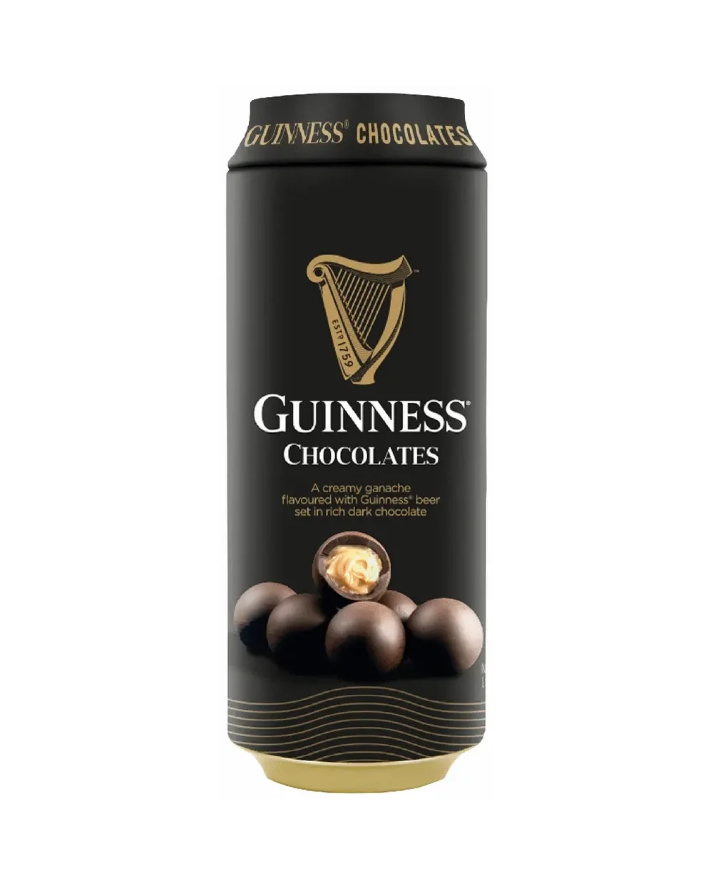
Guinness Chocolates
The Guinness chocolate packaging uses the identical harp-and-gold system on a cylindrical can format. The result feels like a premium gift product — not a novelty tie-in. The brand’s heritage lends instant credibility to the chocolate, while the packaging format (round tin) distinguishes it from the beer cans without breaking visual continuity.
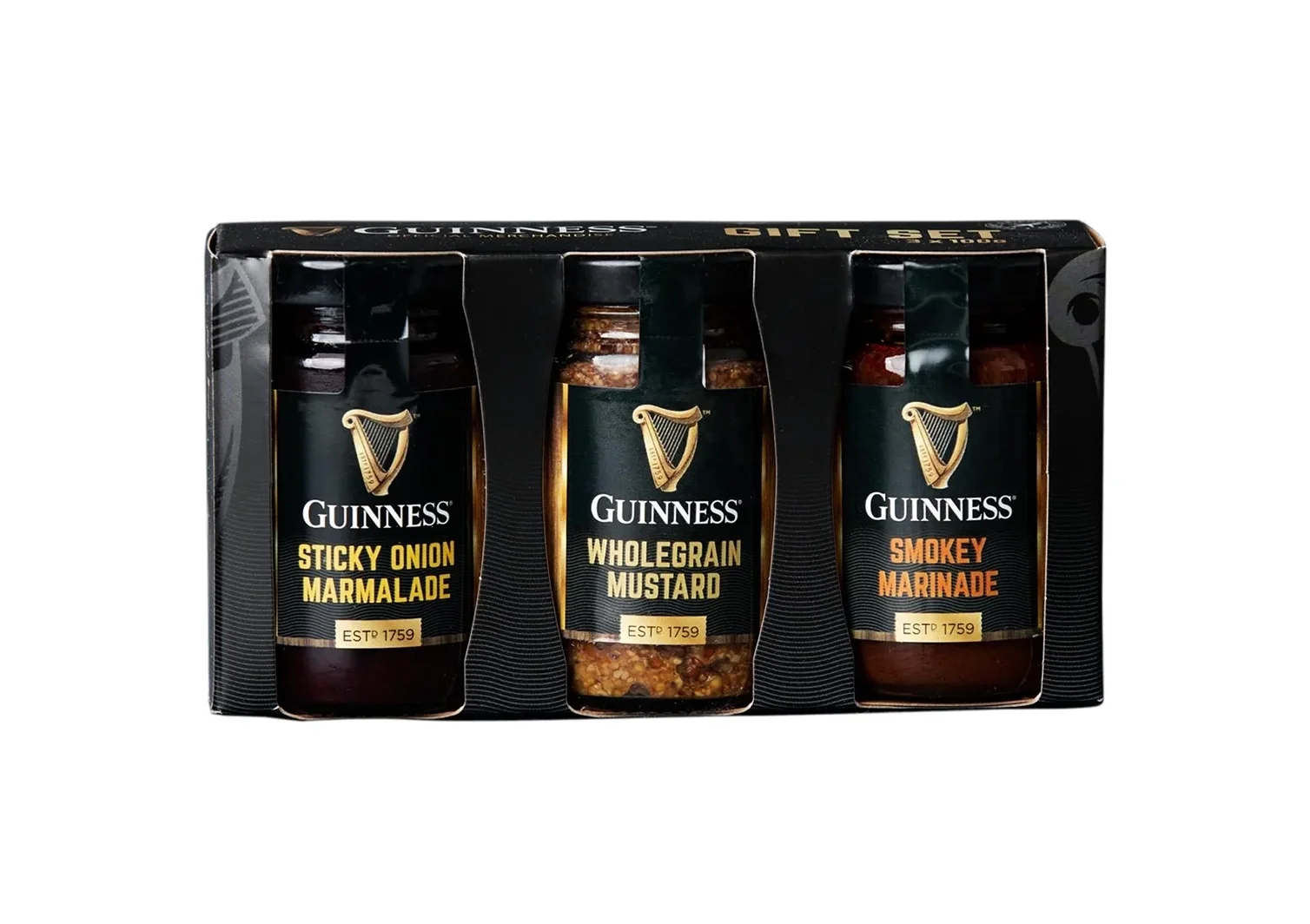
Guinness Condiments: Marmalade, Mustard, Marinade
The Guinness food line extends to sticky onion marmalade, wholegrain mustard, and smokey marinade. These products use the same harp logo and gold-on-black system, applied to jar formats. The consistency is remarkable — you’d know these were Guinness products even without reading the label.
Van Leeuwen Collaboration: Guinness Ice Cream
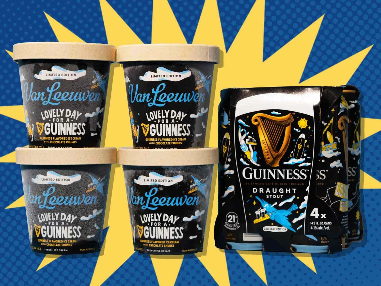
The Van Leeuwen “Lovely Day for a Guinness” ice cream collaboration demonstrates how the Guinness brand works with external partners. The packaging uses Guinness’s black and gold system merged with Van Leeuwen’s distinctive illustration style. Both brands are recognizable — neither overshadows the other. This is collaborative packaging at its best.
What Guinness Teaches About Brand Consistency
1. A Single Symbol Can Carry Centuries
The Guinness harp has been in continuous use for over 150 years. No redesign, no “modernization,” no rebrand. The lesson: if your symbol is strong enough, never change it. Every year of consistency adds equity. Brands that redesign their logos every decade never accumulate this kind of visual authority.
2. Color Is Identity
Black + gold = Guinness. This color combination is so deeply associated with the brand that seeing it on a non-Guinness product feels wrong. Guinness achieved this through relentless consistency — every product, every ad, every storefront uses the same palette. Color consistency over time is how you build color ownership.
3. Extend Without Diluting
Guinness has extended into chocolate, condiments, and ice cream without diluting its brand. The secret: the visual system stays identical. The harp, the gold, the wordmark — they transfer perfectly to any product category. If your brand identity is strong enough, it works on anything.
4. Innovation Within Tradition
Nitro Surge, Cold Brew Coffee Beer, 0.0 non-alcoholic — these are genuinely innovative products. But their packaging doesn’t look “innovative.” It looks like Guinness. This is the highest form of brand maturity: you can launch new products with confidence because your heritage protects you.
5. Collaborations Should Respect Both Brands
The Van Leeuwen collaboration works because both brands retain their visual identity. Guinness doesn’t force Van Leeuwen to use harp and gold. Van Leeuwen doesn’t force Guinness to adopt quirky illustrations. The packaging shows both brands’ strengths.
The Blonde Lager Exception
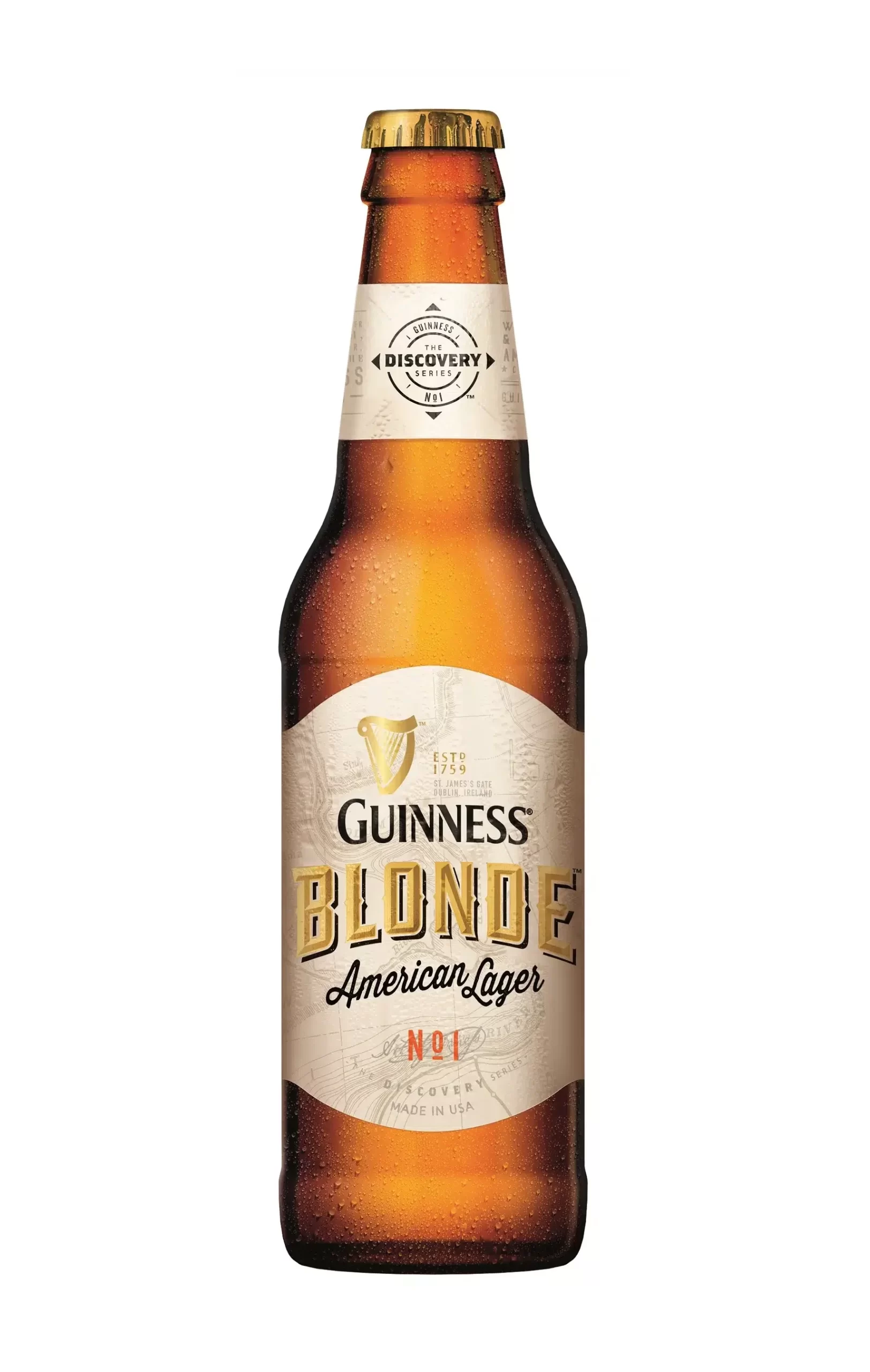
One product breaks the mold: Guinness Blonde American Lager. As a lager, it can’t use the dark, heavy visual language of stout. The packaging is lighter, brighter, and more golden — matching the product inside. But the harp is still present. The wordmark is still there. This teaches a final lesson: your brand system must be flexible enough to accommodate products that don’t fit your core. Even when the formula changes, the DNA persists.
Explore the Full Guinness Collection
Browse all 100+ Guinness packaging images and download them for free:
- Guinness Packaging Collection
- Packaging Design — broader packaging collection
- Food & Beverage Photography — product photography