
Packaging Picks — Quaker Oats: The Face That Built a 145-Year Brand
The Quaker Oats man is one of the oldest brand mascots in the world. Since 1877 — nearly 150 years — this friendly figure in a Quaker hat has appeared on every Quaker product, from traditional oat canisters to modern protein drinks and rice cakes. He has been refreshed and refined over the decades, but never replaced. That kind of brand consistency is almost unheard of in the food industry.
At Gropicture, we have Quaker packaging images available as design reference — covering instant oatmeal, overnight oats, protein oatmeal, oat drinks, cereal squares, rice cakes, and historical packaging. Together, they tell a story of how a single visual idea can carry a brand for nearly a century and a half.
The Quaker Man: Mascot as Brand Anchor
Unlike most food mascots — which tend to be cartoon animals or exaggerated characters — the Quaker man is a portrait of dignity. He represents trust, honesty, and quality: the values associated with the Quaker religious community. Whether this was a deliberate branding strategy or a happy accident of the 19th century is debated, but the effect is undeniable. The Quaker man makes the brand feel established, reliable, and wholesome.
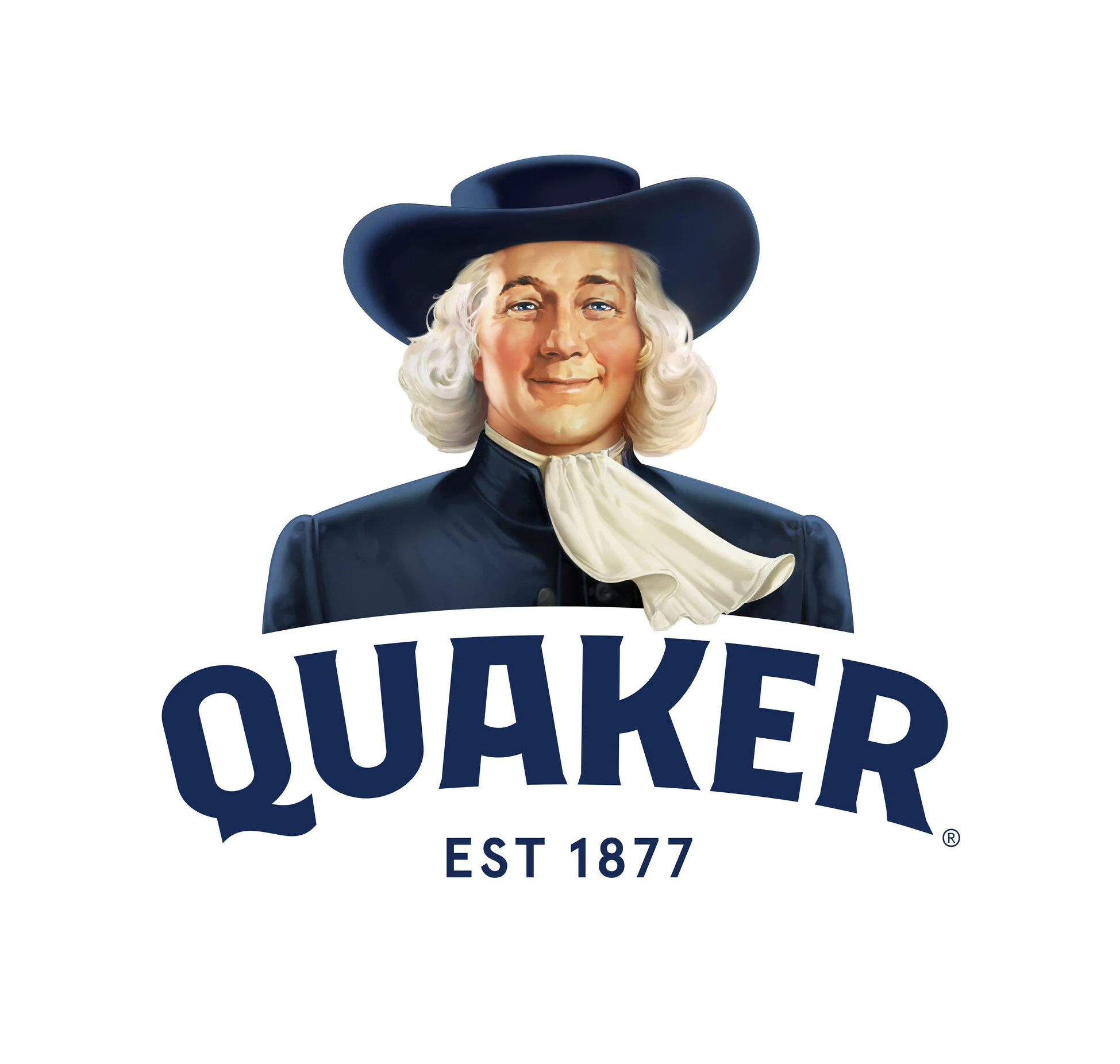
Over the decades, the Quaker man has been subtly updated — his hairstyle modernized, his expression softened, his rendering style simplified. But the core identity has never changed. This teaches a crucial lesson in mascot design: evolution, not revolution. Consumers form emotional bonds with mascots. Radically changing one feels like meeting a stranger wearing a friend’s clothes.
The Classic Oatmeal Canister: Red, Blue, White
The traditional Quaker Oats canister is one of the most recognized packages in American grocery stores. The color combination — red, blue, and white — is deeply embedded in the brand’s identity. These colors do double duty: they communicate patriotism and trust (important for a heritage American brand), while also creating a strong visual signature that stands out on the cereal aisle.
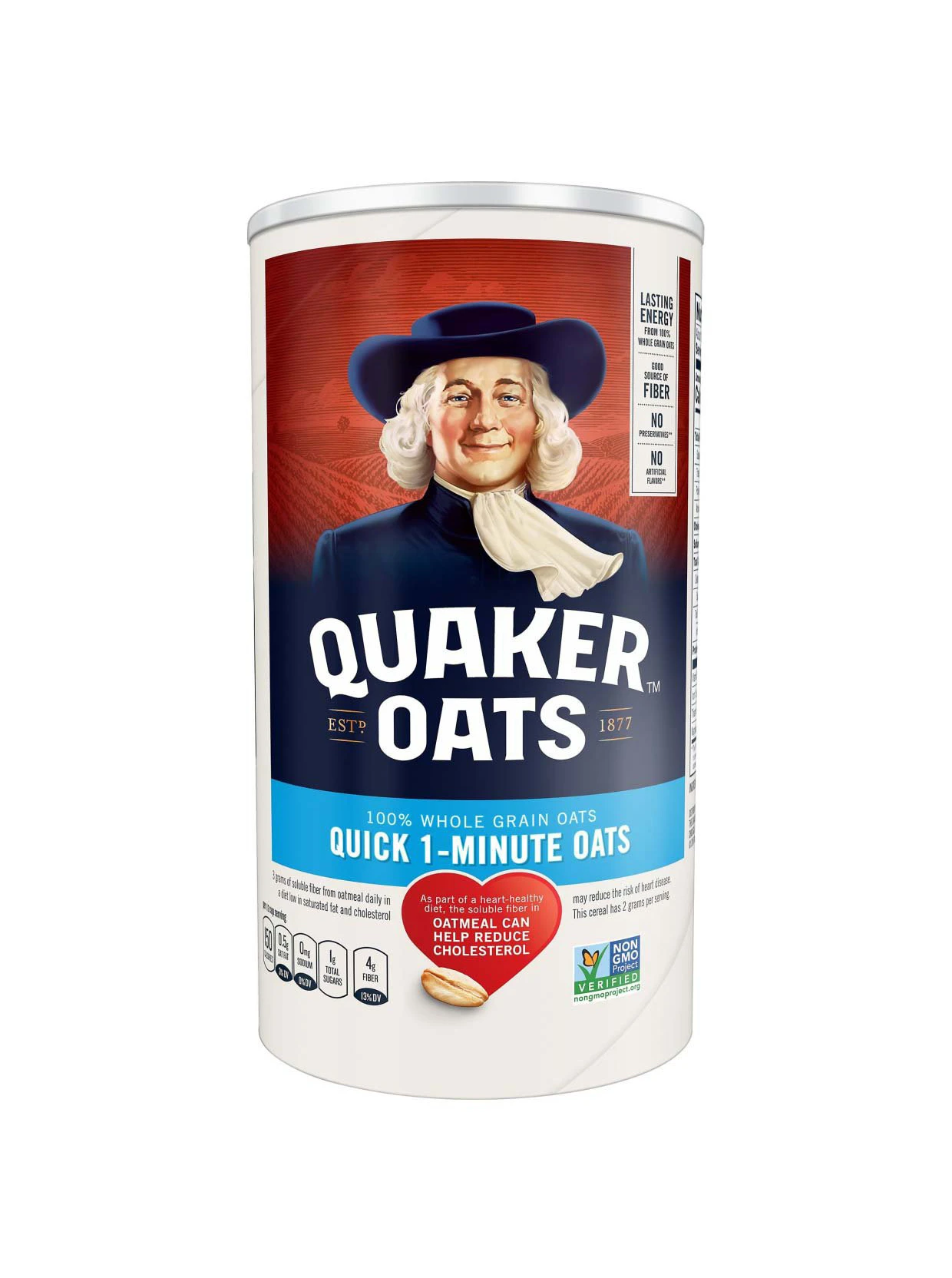
Notice how the canister design works: the Quaker man is always the largest element, positioned at the top. The brand name “QUAKER” appears in bold beneath him. Product information — oat type, nutritional claims — sits below. This hierarchy has been maintained for generations. Consumers know exactly where to look for what information.
The Product Line Expansion: One Mascot, Many Formats
Quaker has expanded far beyond traditional rolled oats. Today the brand includes instant oatmeal packets, overnight oats, protein oatmeal, oat drinks, cereal squares, rice cakes, and breakfast cookies. Each format requires different packaging, but the Quaker man anchors every one of them.
Instant Oatmeal: Flavor as Color
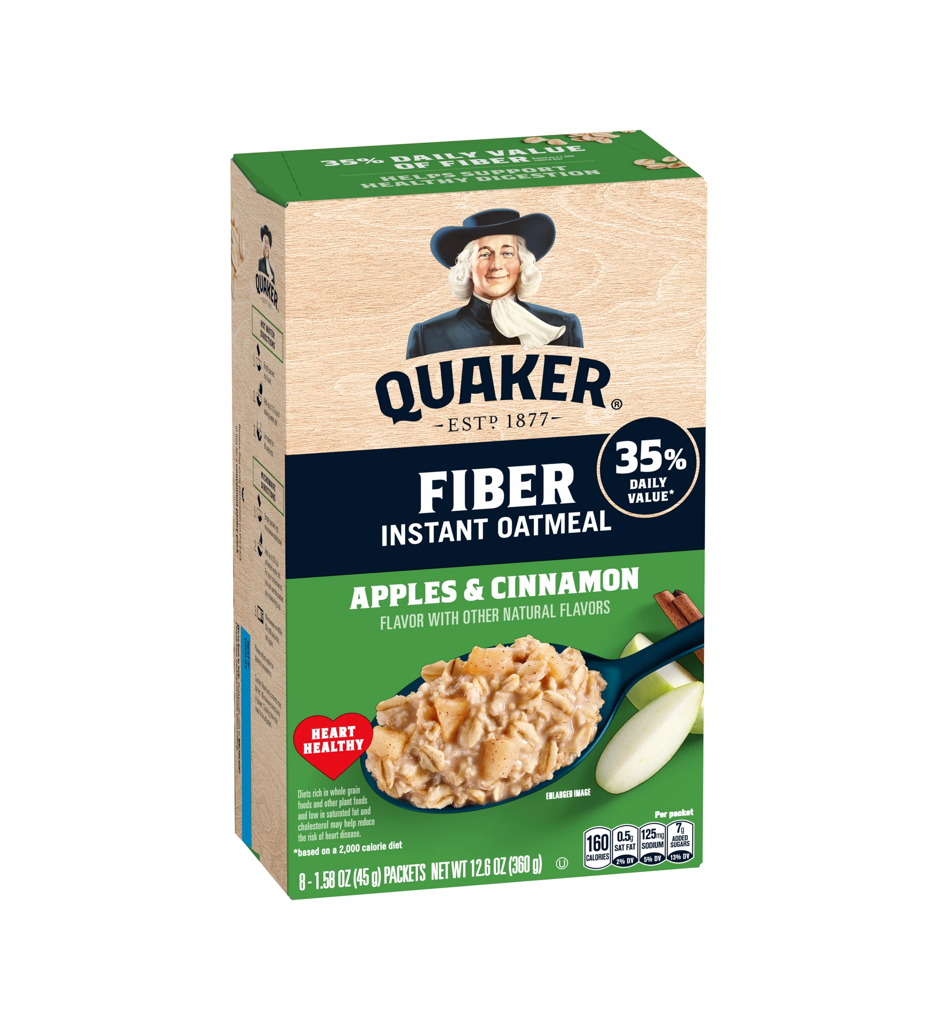
Quaker’s instant oatmeal line uses the same Quaker man logo but introduces flavor-based color coding. Maple Brown Sugar gets warm brown and gold tones. Apples & Cinnamon uses red and green. Strawberry is pink. Chocolate is deep brown. The Quaker man appears on every packet, but the background color changes to match the flavor — an efficient system for helping shoppers find their favorite in a variety pack.
Fruit & Summer Fruits: Premium Flavor Variations
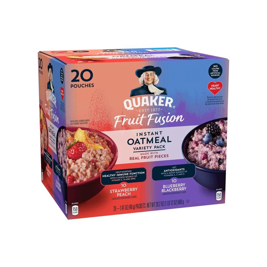
Quaker’s Fruit and Summer Fruits line showcases how the brand elevates standard oatmeal into a premium experience. The packaging uses rich fruit photography — vibrant berries, exotic fruits, dried fruits — against the classic blue and red template. These products target consumers willing to pay more for gourmet flavors while still trusting the Quaker name. The packaging design balances indulgence with wholesomeness: the fruit imagery says “treat yourself,” while the Quaker man says “it’s still good for you.”
Protein Oatmeal: Functional Positioning
The Protein line shifts to blue and orange — colors associated with energy and athletic performance. The Quaker man is still present, but the “PROTEIN” label takes dominant position. This communicates a clear message: the brand promise is still Quaker quality, but the functional benefit is protein. The packaging design manages to be both heritage and health-focused simultaneously.
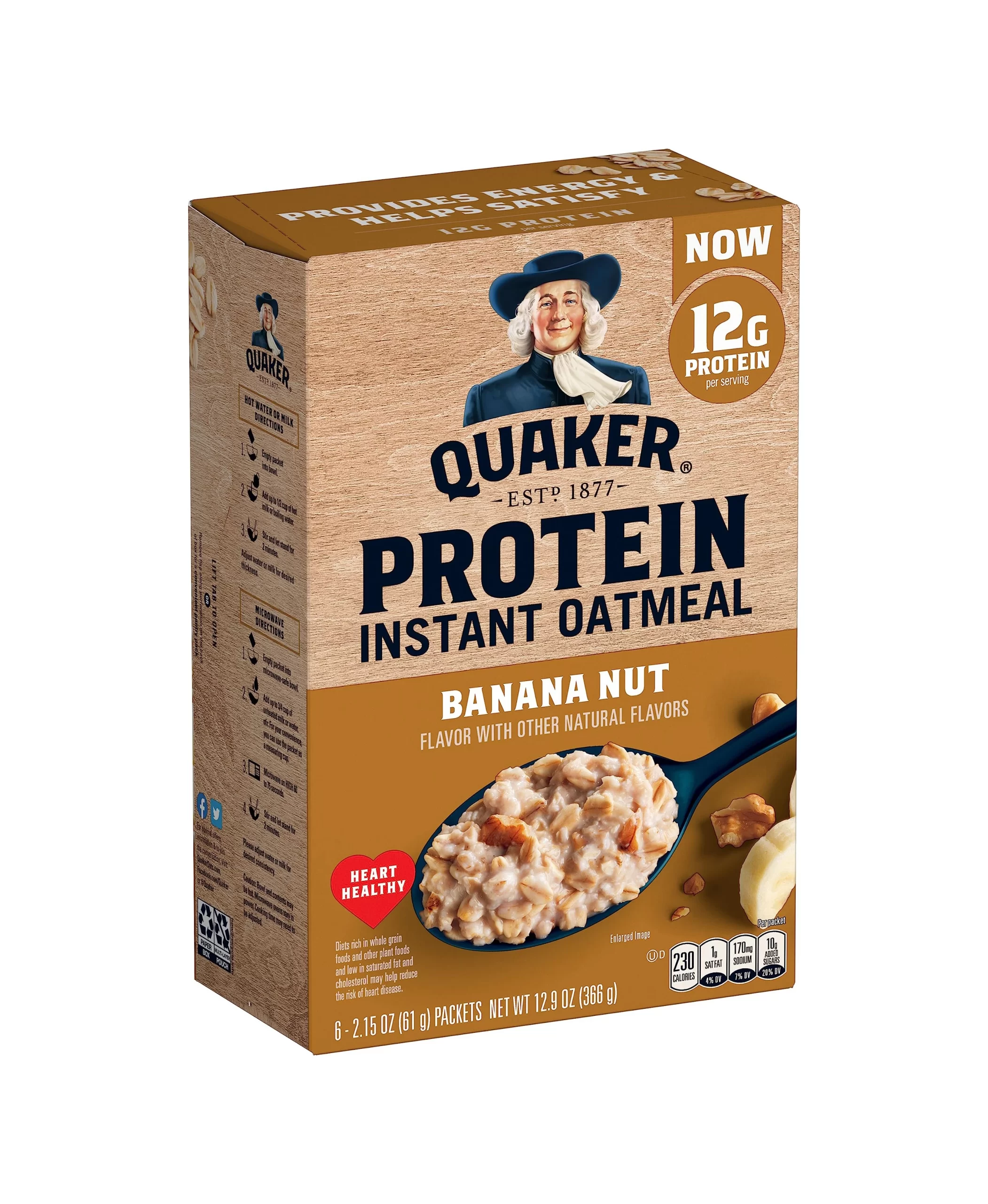
Oat Drinks: Crossing Into Beverages
Quaker’s oat-based cereal drinks move into the beverage category — a completely different retail environment. Bottle and carton formats require different design approaches than boxes and canisters. The packaging uses blue and white with food photography, while the Quaker man provides the trust signal that connects the product back to the mother brand.
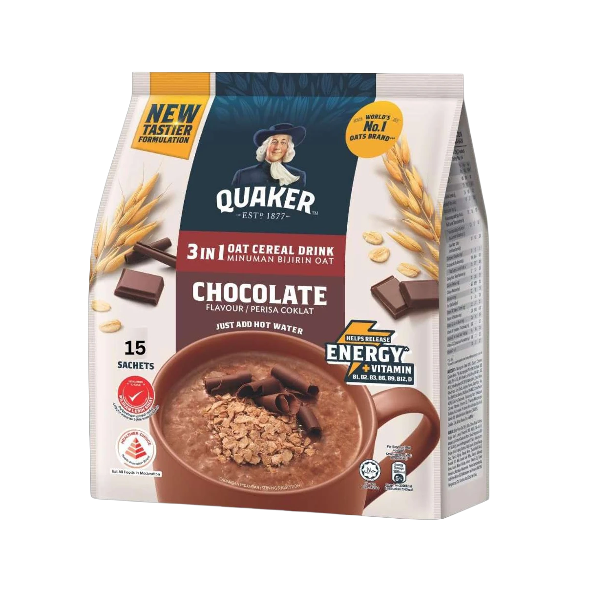
Rice Cakes: The Snack Aisle
Quaker Rice Cakes sit in a different aisle entirely from oatmeal. The packaging must work in the snack section, competing with chips and crackers rather than cereal. The chocolate-flavored rice cakes use brown tones that feel appropriate for a snack product, while the Quaker man maintains brand continuity.
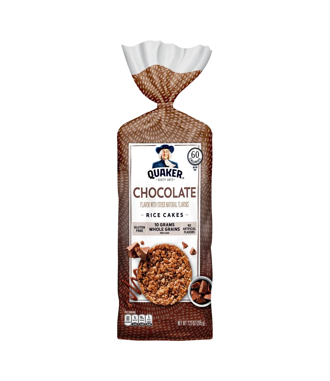
Gluten Free: Health Without Compromise
The Gluten Free line addresses a specific dietary need. The packaging uses cleaner, simpler design with prominent “Gluten Free” labeling. The Quaker man provides reassurance: this isn’t a trendy startup’s gluten-free product — it’s Quaker, a brand you’ve trusted your whole life. For health-conscious consumers, that heritage is a powerful trust signal.
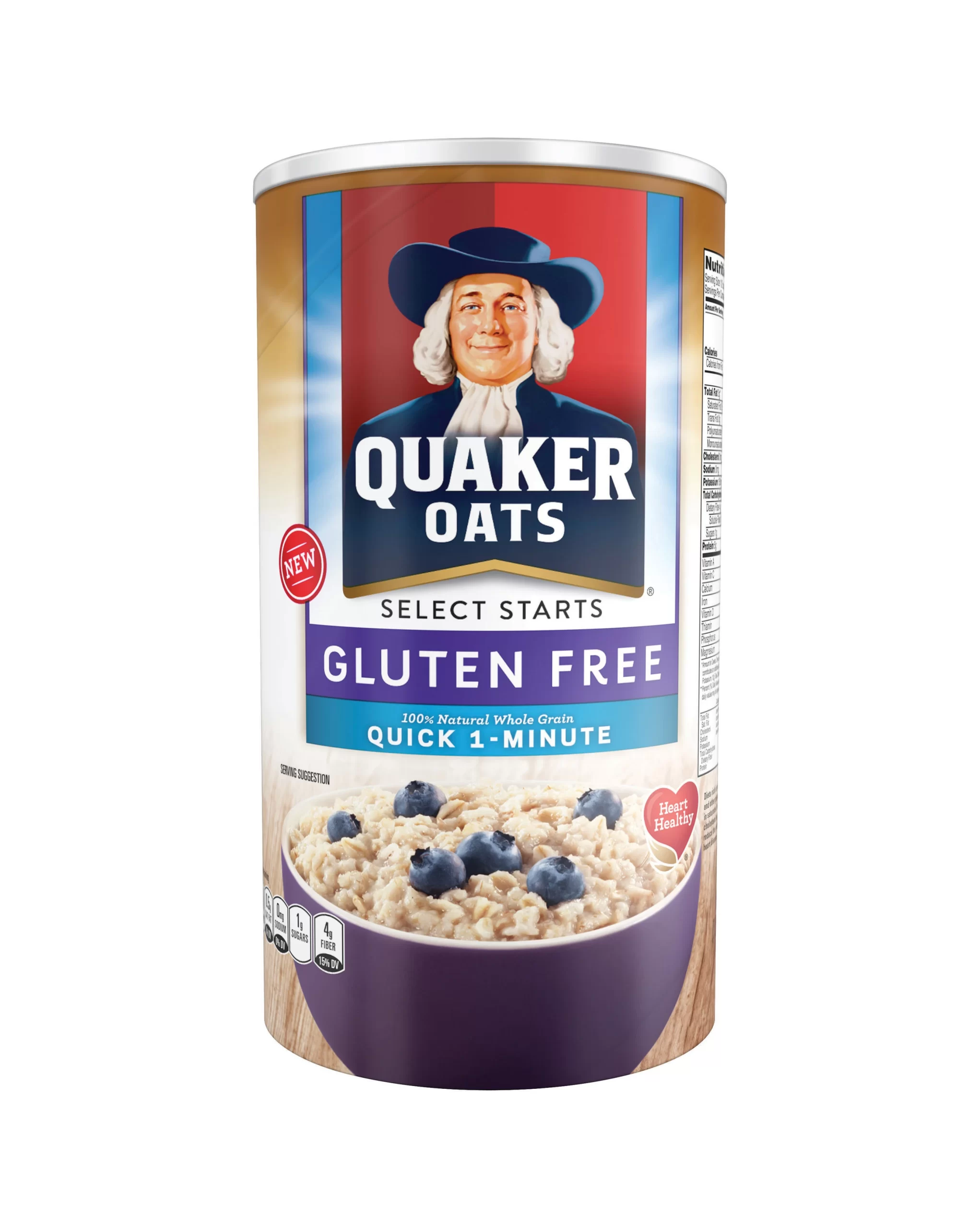
Brand Collaborations: The Quaker Man Meets Sports
Quaker has partnered with sports organizations, creating special-edition packaging that merges the brand’s wholesome identity with athletic energy. These collaborations demonstrate how a 145-year-old brand can participate in contemporary culture without losing its core character.
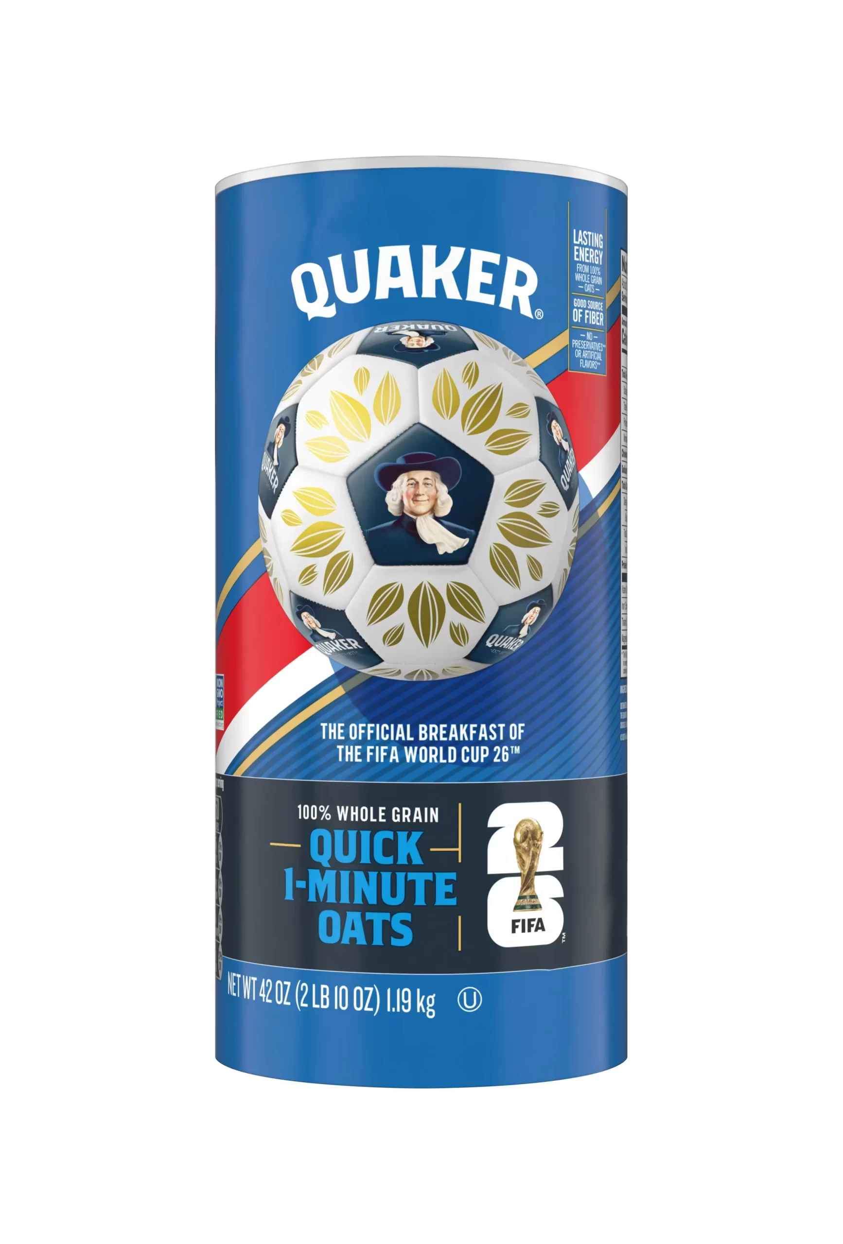
5 Brand Consistency Lessons from Quaker
1. A Mascot Is Forever
The Quaker man has outlasted every design trend of the past 145 years. Art Nouveau, Art Deco, Mid-Century Modern, Minimalism — he survived them all. Why? Because he represents values (trust, honesty, quality) rather than aesthetics. A mascot built on values is timeless. A mascot built on a visual trend has an expiration date.
2. Color Systems Aid Navigation
Quaker uses flavor-based color coding across its instant oatmeal line: brown for maple, red for apple, pink for strawberry. This system lets shoppers find their preferred flavor in seconds without reading a single word. Color coding is one of the most user-friendly packaging strategies available.
3. Heritage Builds Trust in New Categories
When Quaker enters a new category — oat drinks, rice cakes, overnight oats — the Quaker man’s presence immediately communicates “you can trust this.” Heritage brands have a massive advantage in new categories: they bring decades of accumulated trust that startups can’t replicate.
4. Subtle Evolution Beats Radical Change
The Quaker man has been updated many times — his face has been redrawn, his hat adjusted, his colors refreshed. But each change is subtle enough that consumers barely notice. This is the art of brand evolution: change just enough to stay current, never enough to feel like a different brand.
5. One Identity Works Across Every Aisle
Quaker products appear in the cereal aisle, the snack aisle, the beverage aisle, and the health food aisle. The packaging changes format for each context, but the brand identity stays constant. This proves that a strong visual anchor — the Quaker man — can work in any retail environment.
Explore the Full Quaker Collection
Browse all Quaker packaging images for design reference:
- Quaker Packaging Collection —
- Packaging Design — broader packaging collection
- Food & Beverage Photography — product photography