
Packaging Picks — Rachael Ray Nutrish: Home-Cooked Shelf Appeal
Pet food aisles are loud. Bags scream with cartoon bones, giant mascots and neon claims — and then there is Rachael Ray Nutrish, the pet food brand built by a television chef, which does something quieter: it photographs dog and cat food the way food magazines photograph dinner. Wooden counters, raw ingredients on cutting boards, recipe names set in script. For packaging designers, Nutrish is a reference study in transplanting human-food credibility onto a pet shelf — home-cooked warmth engineered into shelf appeal.
This design reference breaks the system into four parts: the kitchen photography that sets the mood, the color coding that makes an aisle-spanning range navigable, the playful recipe naming that carries the brand voice, and the variety-pack boxes that turn assortment into a menu.
A Kitchen, Not a Factory
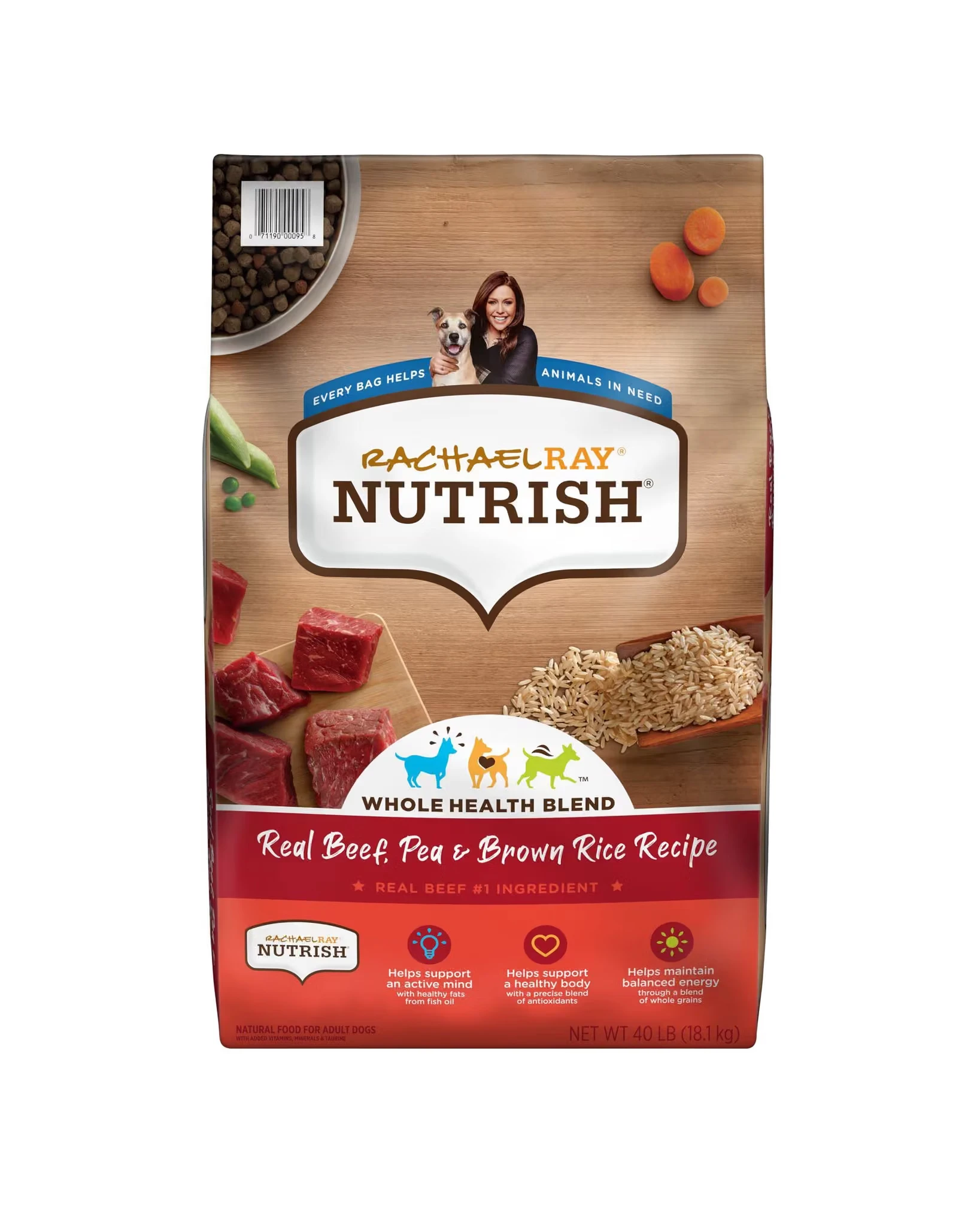
The signature Nutrish move is the background: a light wood-grain texture that reads as a kitchen counter, not a factory. On the Real Beef, Pea & Brown Rice Recipe bag, raw beef chunks sit on a wooden board beside scoops of rice, peas and carrots, with a bowl of the actual kibble completing the still life — ingredients staged like mise en place. The recipe name runs in white script across a red band, echoing a menu board, and the “#1 ingredient” claim sits right where a cookbook would put the headline.
The same stage dressing holds across proteins. The Real Chicken & Veggies bag swaps the red band for green and re-casts the still life — chicken, peas, rice, carrots — while keeping the layout untouched: brand oval up top, ingredient spread in the middle, benefits at the base. Consistency of structure plus variation of content is exactly how a range stays recognizable at three meters.

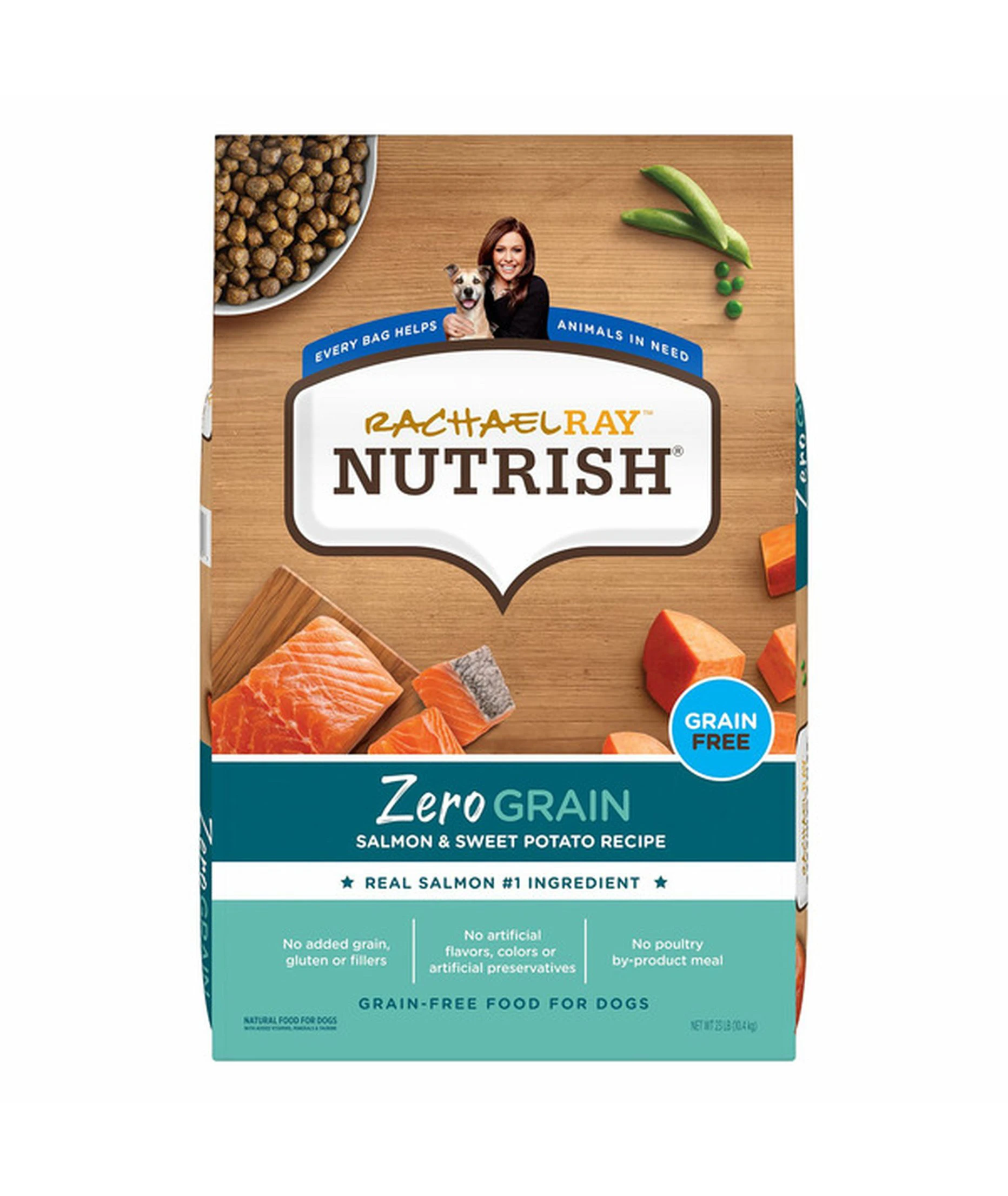
When the claim gets more technical, the mood cools instead of warming. Zero Grain Salmon & Sweet Potato dresses its wooden counter in a deep teal band with a grain-free badge — appetite colors for the fish, pharmacy clarity for the “no grain, gluten or fillers” checklist. Same kitchen, stricter recipe.
Color Codes the Aisle
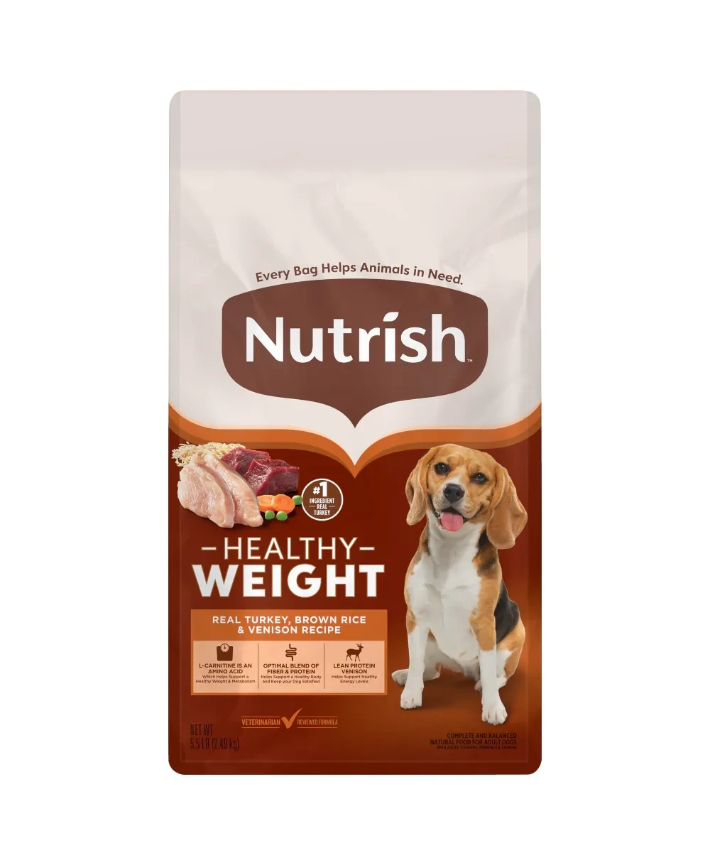
Across dozens of SKUs, color is Nutrish’s wayfinding system. The Healthy Weight bag splits a soft beige top from a warm brown base with a thin orange band — leaner appetite signals for a leaner formula, with turkey and venison photographed in place of beef. A fit beagle replaces the romping dog on the front: the lifestyle change is written into the palette before you read a word.
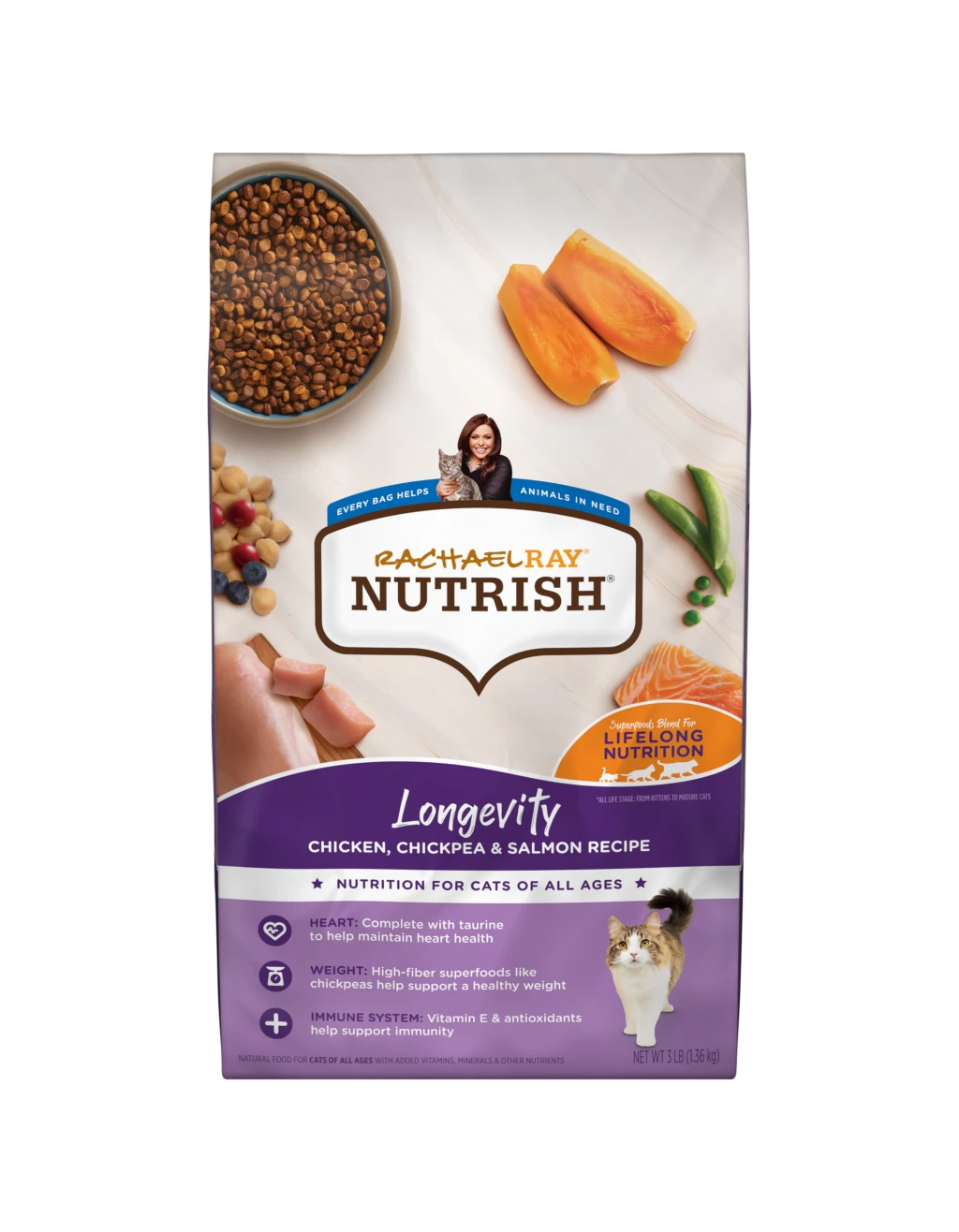
The cat line runs its own color logic. Indoor Complete uses a forest-green band for its indoor-cat formula, while Longevity — the superfoods blend for all ages — claims purple, with salmon, chickpeas and berries arranged like a farmers-market tray. Same template, different postcode: shoppers learn the map once and navigate the whole wall of bags with it.

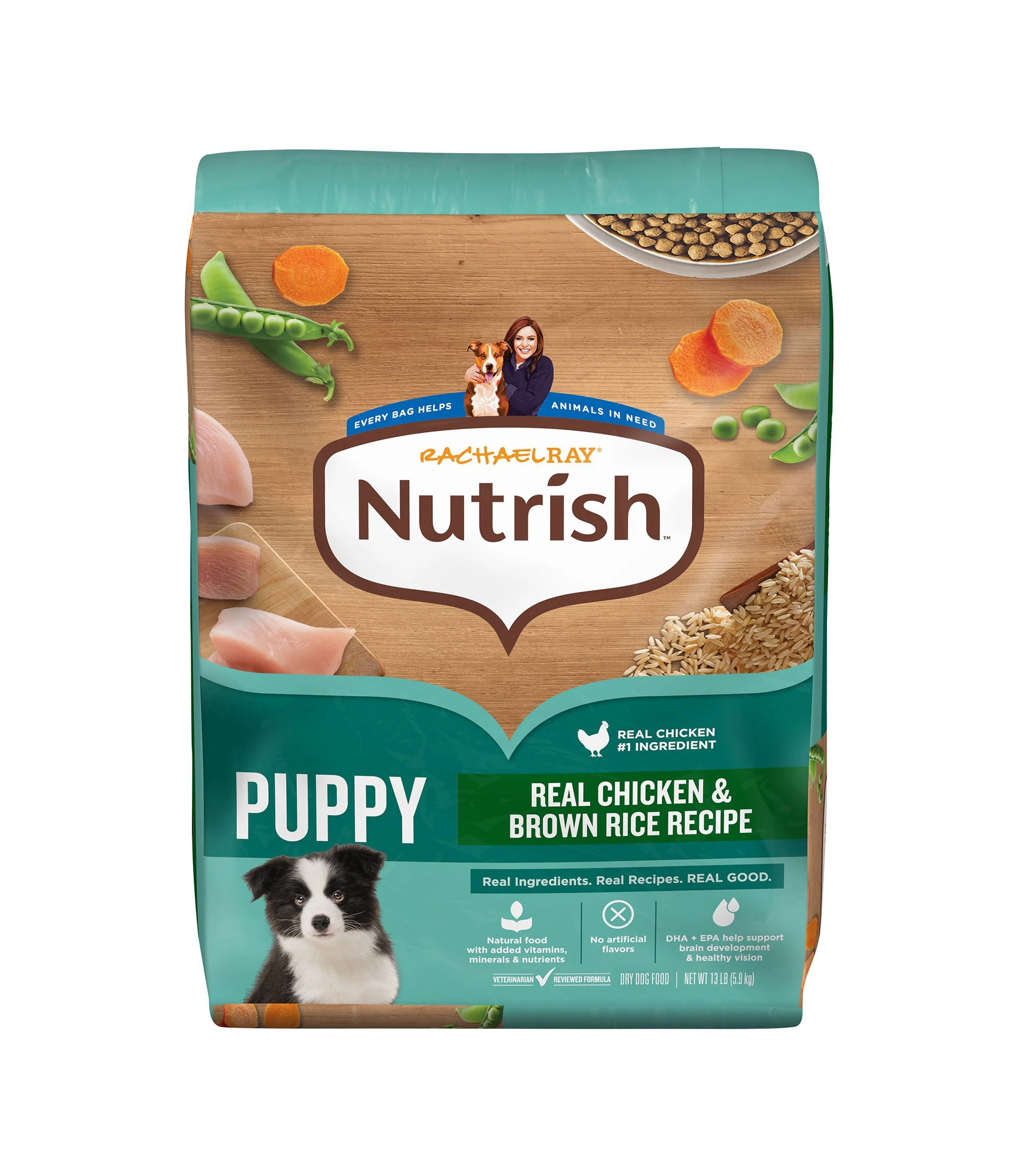
Even the puppy bag keeps the system: teal returns for the youngest eaters, a black-and-white puppy takes the portrait slot, and the “Real Chicken & Brown Rice Recipe” band stays exactly where adults wear it — small dogs, same design discipline.
The Names Do the Marketing
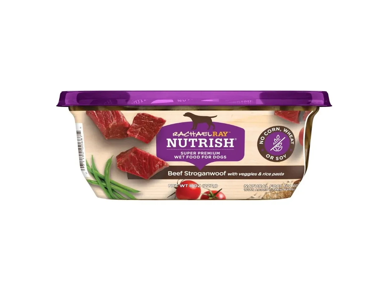
Nutrish’s most distinctive packaging element costs nothing to print: the recipe names. Beef Stroganwoof — stroganoff with the bark built in — arrives in a single-serving cup with a purple lid, beef, green beans and tomatoes photographed like a family dinner. The pun does the positioning work of a paragraph: this is people food, made for dogs, by people who cook.
The wet-food can applies the same discipline at scale: a green Chunks in Gravy label built around a bowl shot — chunks, gravy, carrots and peas — with a “new look” badge, a veterinarian-reviewed check, and the brand’s brown shield logo. Cans, cups and bags all speak one dialect of the same language.

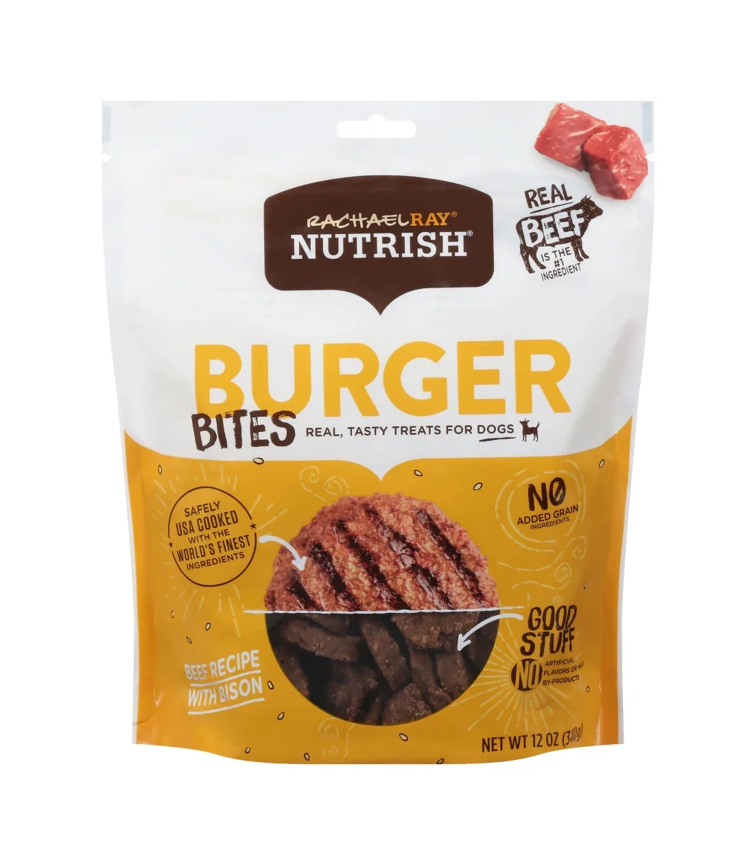
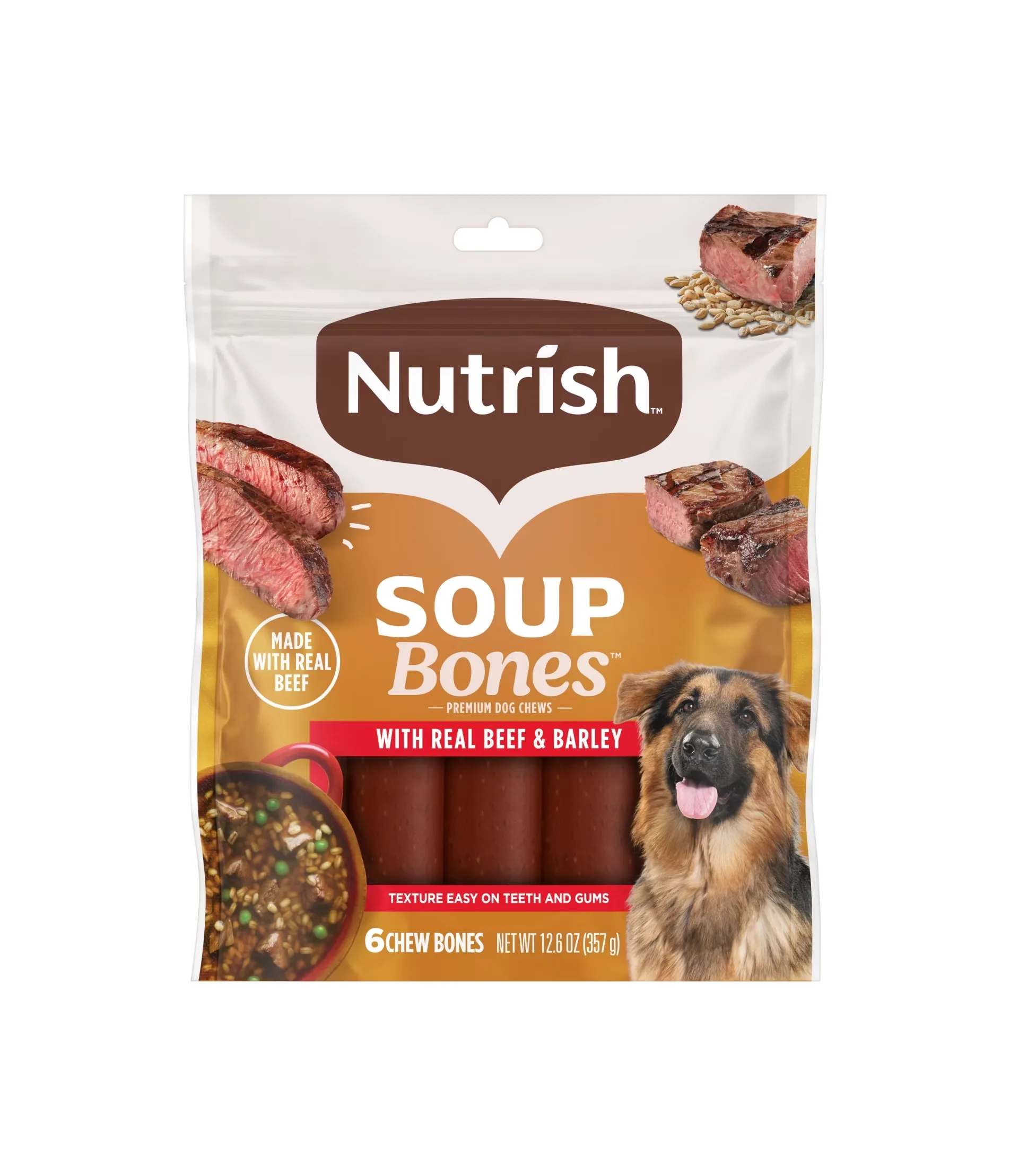
Treats turn the volume up. Burger Bites puts a grill-marked, burger-shaped treat on a sunny yellow band with a transparent window showing the real bites inside — the one place the packaging winks instead of simmers. Soup Bones chews go the other way, back to the tan-and-red comfort palette, with a broth bowl, barley and a German Shepherd selling “soup” as a flavor memory.
Variety Packs as Menu Cards
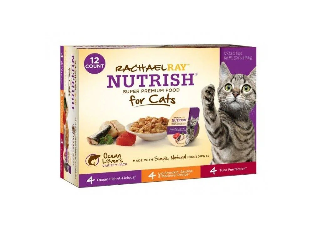
The Ocean Lovers variety pack solves the hardest packaging problem — showing assortment without chaos — with a row of color-coded flavor bars: purple Ocean Fish-A-Licious, orange Lip Smackin’ Sardine & Mackerel, red Tuna Purrfection, four cans each, labeled right on the bars. The puns keep coming, the purple cat-line color anchors the box, and a raised paw on the tabby portrait gives the front its charm. The box behaves like a menu card for a twelve-course seafood dinner.
What Designers Can Take From Nutrish
- Photograph it like people food. Wooden counters, raw ingredients, a bowl of the finished dish — appetite is the argument, and the camera makes it before any claim is read.
- Let color do wayfinding. Red beef, green chicken, teal grain-free, brown weight care, purple cat superfoods: one learned map covers the whole range.
- Names are free real estate. Stroganwoof, Fish-A-Licious, Tuna Purrfection — puns carry brand voice at zero printing cost and outlast any campaign.
- Keep one template, vary the still life. Same oval, same bands, same benefit icons on every SKU; only the ingredients and the color change. That is how a big range stays a family.
Explore the full Rachael Ray Nutrish collection on Gropicture for more bags, cans, cups, treat pouches and variety-pack design references.