
The Odyssey Poster Collection: Design Inspiration for Epic Visual Storytelling
Christopher Nolan’s The Odyssey (2026) is one of the most anticipated films of the decade — and its promotional poster art has become a design phenomenon in its own right. This collection gathers over 60 poster variations inspired by the film, each interpreting Homer’s epic through a completely different visual lens. From classical Greek vase painting and painterly battle scenes to typographic countdowns and atmospheric minimalism, these posters demonstrate how a single story can generate an extraordinary range of design solutions.
For designers, this collection is a masterclass in visual variation — how to communicate the same narrative through radically different design languages. Whether you work in film marketing, brand identity, or editorial illustration, studying how different artists approach the same subject reveals the techniques that make poster design so powerful.
Why One Film Inspires So Many Poster Approaches
Movie poster design is unique because it operates under strict constraints: a fixed title, known characters, an established mood, and a specific audience. Yet within those constraints, designers find enormous creative freedom. The Odyssey’s rich visual vocabulary — Trojan horses, Corinthian helmets, stormy seas, mythical giants, lone heroes — gives designers a deep well of symbols to draw from. Each poster in this collection selects different symbols and renders them in different styles.
This is exactly the creative challenge designers face in every branding project: how to express a fixed message through original visual language. The Odyssey poster collection is, in effect, 60+ answers to the same design brief.
Design Approach 1: The Photographic Composite
The most mainstream poster style uses photographic imagery — star headshots, scene stills, and emotional moments — arranged in a hierarchical layout. This approach prioritizes star power and human connection over artistic experimentation.
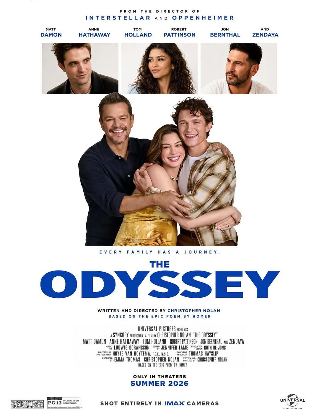
The poster above uses the classic formula: cast headshots at the top, emotional central image (a family embrace), director credit, and release date at the bottom. The white background and blue typography create a clean, accessible look. The tagline “Every Family Has a Journey” reframes the epic as an intimate human story. This is design as accessibility — making a 3,000-year-old epic feel personal and relatable.
What designers can learn: hierarchy is everything. The eye moves from director credit to cast to image to title to release date in a precise sequence. Nothing competes. Every element serves the information chain.
Design Approach 2: The Greek Vase Painting
One of the most distinctive approaches in the collection draws directly from ancient Greek art — specifically, the red-figure and black-figure vase painting tradition. These posters frame the hero within the aesthetic vocabulary of classical pottery, using sepia tones, painted figures, and bordered compositions.
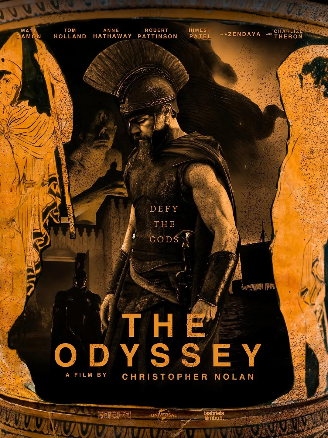
This poster renders Odysseus as a central warrior figure surrounded by painted figures on the edges — mimicking the composition of an ancient amphora. The warm sepia and gold palette evokes aged pottery, while the bold serif typography anchors the design in modernity. The genius of this approach is historical authenticity as branding: by visually referencing the art of Homer’s era, the poster communicates that this film takes its source material seriously.
Design Approach 3: The Silhouette Container
One of the most sophisticated techniques uses a recognizable shape — typically a Corinthian helmet — as a container for layered imagery inside. The outer silhouette is instantly readable, while the inner content reveals narrative depth on closer inspection.
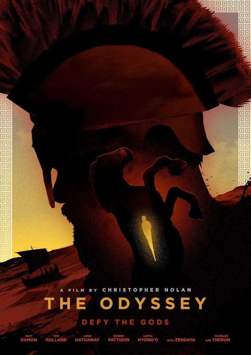
The massive Corinthian helmet dominates the composition, its dark interior revealing a smaller figure in a pose of struggle or defiance. A warm sunset gradient and distant trireme ship provide context, while a Greek key border frames the edges. The tagline “Defy the Gods” adds thematic weight. This technique — using a recognizable outline as a frame for complex internal imagery — is directly applicable to logo design, editorial illustration, and brand storytelling.
Design Approach 4: The Moody Abstract Portrait
Some of the most intense posters strip away all narrative context and focus on a single abstract figure, shrouded in color and atmosphere. These designs communicate raw emotion above all else.
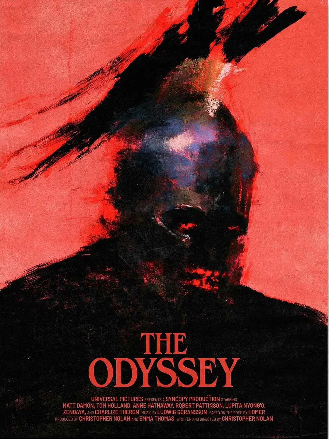
This poster saturates the entire frame in crimson, with a dark figure emerging from painterly brushstrokes. Glowing red eyes pierce through the abstraction — possibly referencing the Cyclops, divine surveillance, or the inner fire of defiance. The limited palette of red and black creates maximum emotional intensity with minimal elements. Designers can learn from this how color dominance becomes the message: when one color fills 90% of the canvas, the mood is undeniable.
Design Approach 5: The Cinematic Scale Contrast
Several posters depict key narrative moments — the Cyclops encounter, the clash with mythical giants — using dramatic scale contrast between a tiny hero and an enormous threat. These are the most cinematic designs in the collection.
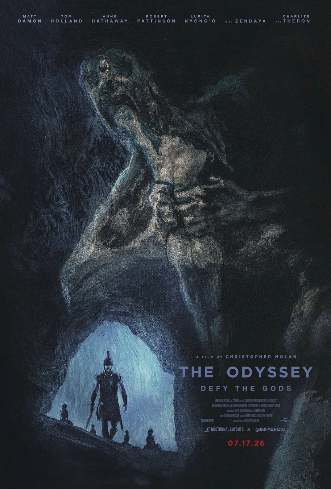
This poster shows a lone armored warrior standing at a cave entrance, illuminated by icy blue light, while a massive grotesque figure looms above in darkness. The scale contrast is the entire design strategy: the hero is small but lit, the monster is enormous but in shadow. The painterly rendering gives the scene a classical, mythic quality. This is composition through scale, lighting, and chiaroscuro — techniques that translate directly to illustration, concept art, and visual branding.
Design Approach 6: The Typographic Countdown
Nolan’s marketing team has perfected the art of typographic countdowns — using massive numbers and time units as the primary visual element. The Odyssey collection continues this tradition with striking results.
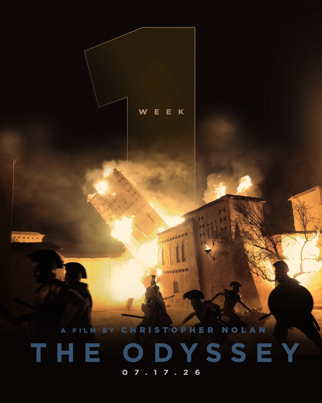
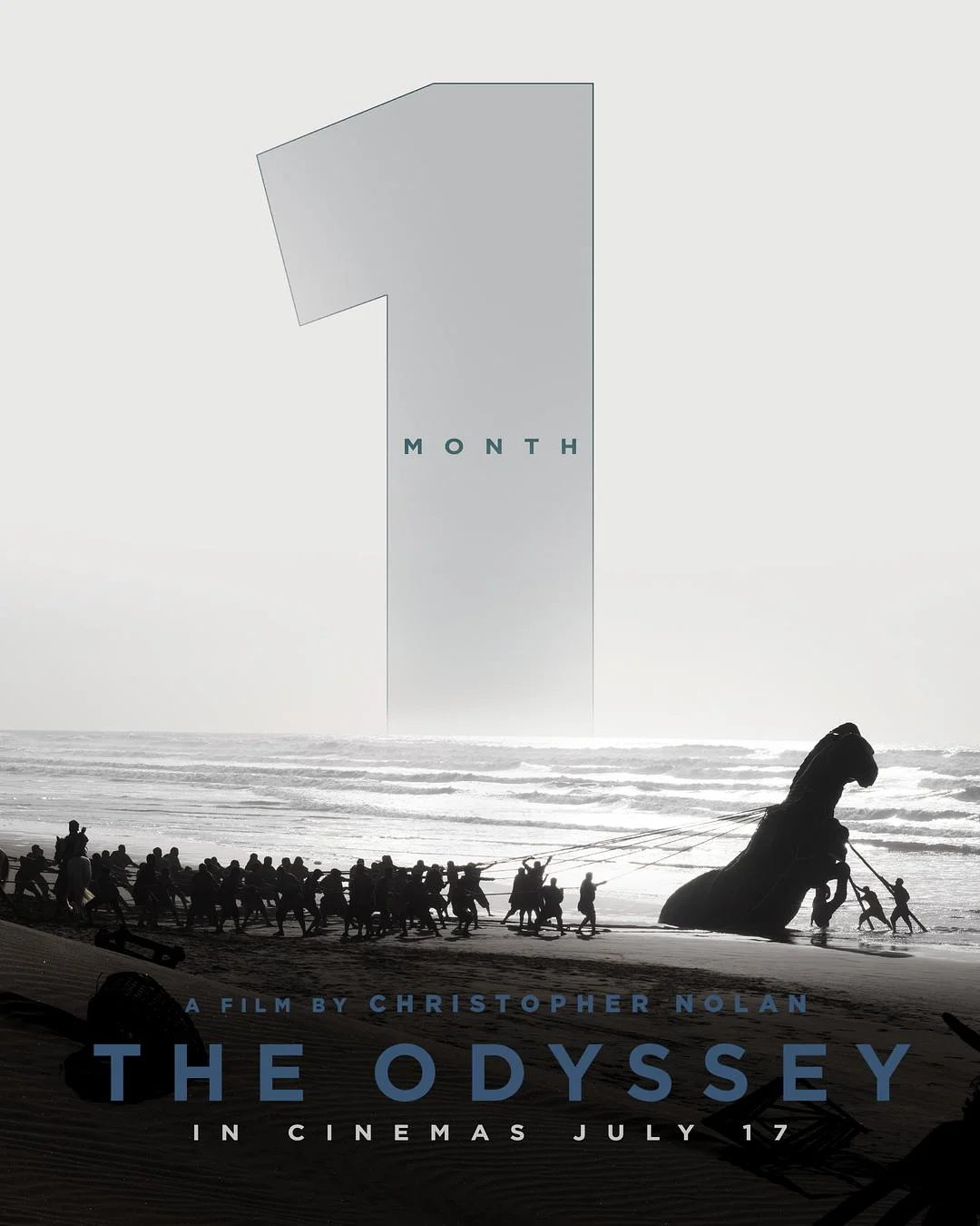
The “1 WEEK” poster overlays a giant geometric numeral on a scene of a burning building and silhouetted soldiers — the typography becomes architecture, structuring the chaos beneath it. The “1 MONTH” poster takes the opposite approach: a grayscale beach scene where a crowd pulls the Trojan Horse ashore, with the countdown number as a quiet, ghostly presence in the sky. Together, they show two sides of the same technique — typography as dominant structure versus typography as atmospheric overlay.
Design Approach 7: The Heroic Storm Landscape
Some of the most painterly posters in the collection depict Odysseus not in battle but in confrontation with nature itself — facing stormy seas, lightning, and the vast unknown. These designs communicate resilience through landscape.
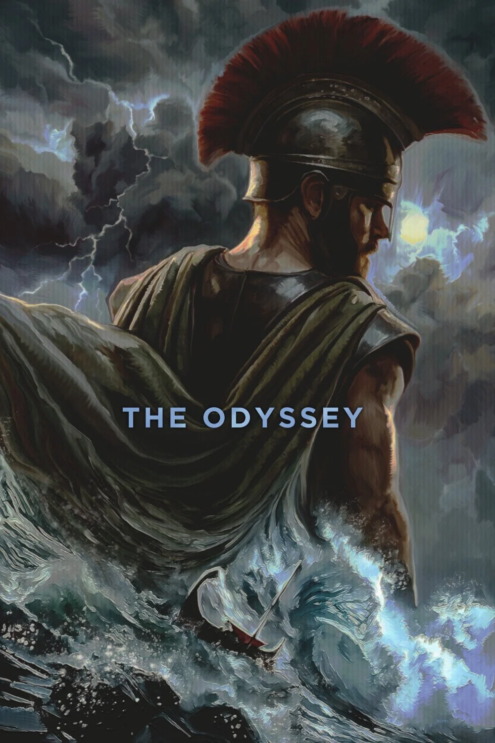
The warrior stands with his back turned, facing a violent storm at sea. His red-crested helmet is the single warm accent in a palette of grays, deep blues, and blacks. A tiny ship with a red sail battles the waves below. The lightning-filled sky dominates two-thirds of the composition, emphasizing the hero’s smallness against divine forces. This is the Romantic painting tradition — think Turner or Caspar David Friedrich — applied to modern film marketing. The lesson: landscape is character. The environment tells the story as much as the figure within it.
Design Approach 8: Atmospheric Minimalism
The most understated posters in the collection reduce the Odyssey to its essence: a small boat, a vast sea, and a mysterious force below. These designs communicate through atmosphere and negative space rather than explicit imagery.
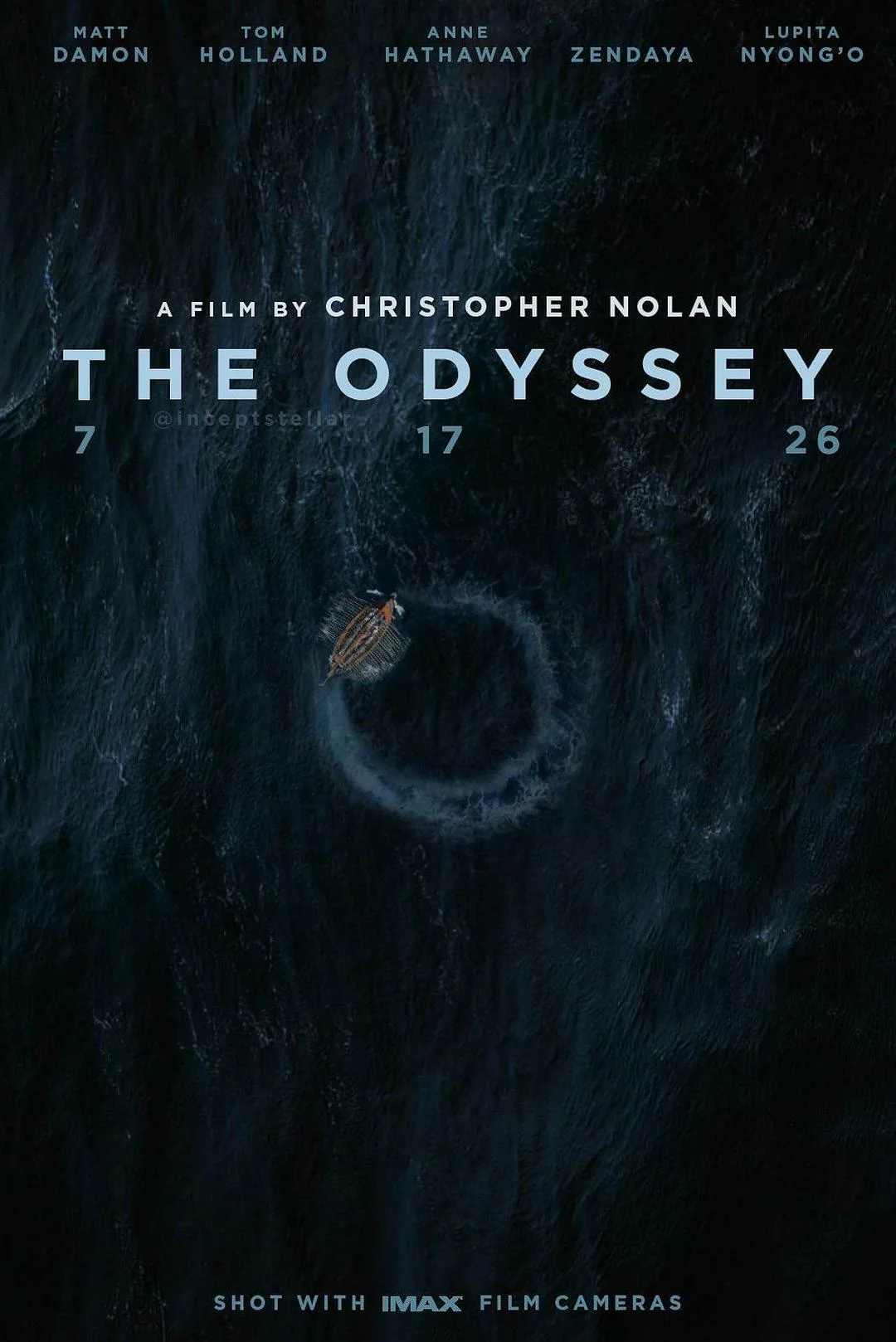
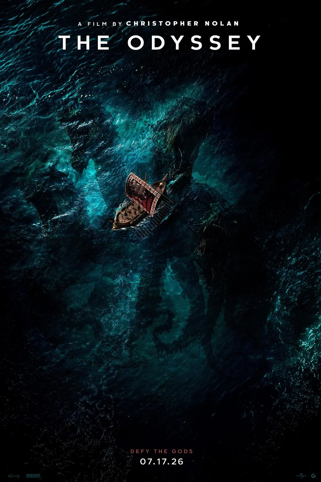
The first poster shows a tiny boat approaching a swirling vortex in pitch-dark water — the unknown rendered as a visual void. The second takes an aerial perspective, looking straight down at a trireme navigating impossibly turquoise, swirling currents. Both use deep blue and black palettes, minimal text, and maximum negative space. The “DEFY THE GODS” tagline appears in red, the only warm color in the composition. This is design through subtraction: remove every element until only the essential mystery remains. The result is more haunting and memorable than any complex composition.
What This Collection Teaches Designers
Looking at 60+ posters for the same film, the most valuable lesson is this: there is never only one right answer in design. The same story can be told through:
- Historical reference — borrow from the art of the era (the Greek vase painting poster)
- Layered silhouettes — use a recognizable shape as a frame for internal narrative (the helmet container)
- Color dominance — let one color carry the entire emotional message (the red abstract portrait)
- Scale contrast — make the hero tiny and the threat enormous (the warrior vs. giant)
- Typography as architecture — let numbers and letters structure the composition (the countdown posters)
- Landscape as character — let the environment tell the story (the storm seascape)
- Atmospheric subtraction — remove everything until only mystery remains (the vortex posters)
Each approach is valid. Each communicates effectively. The choice depends on audience, context, and the specific emotion you want to evoke. That’s the real design lesson of this collection: mastery isn’t about finding the one perfect solution — it’s about knowing which of many valid approaches best serves your particular challenge.
Explore The Odyssey Poster Collection
Browse The Odyssey movie poster designs for design reference:
- Odyssey Movie Poster — the full collection of poster designs and variations
- Movie Poster — broader movie poster design reference gallery