111SKIN Exosome Face Lift Skincare Packaging
Topics
Details
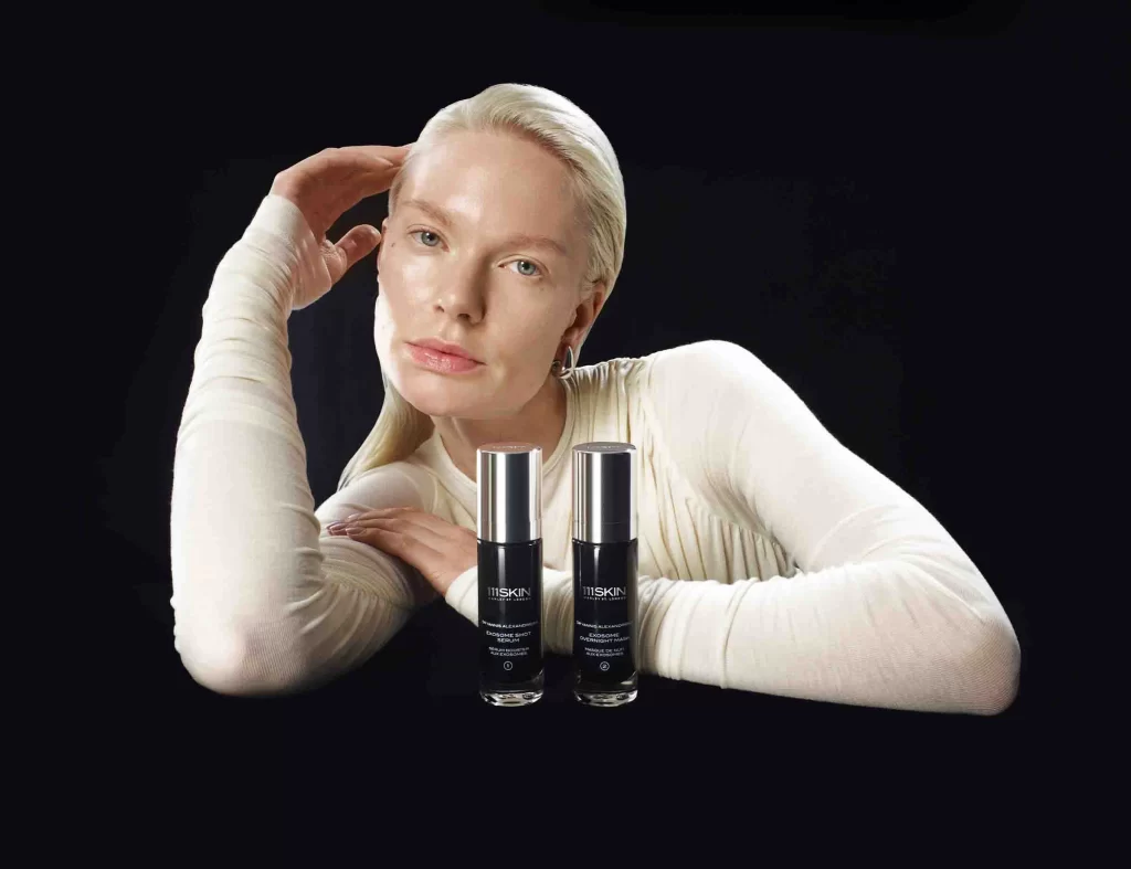
Platinum-blonde hair and an ivory long-sleeved garment frame the reclining figure, whose right hand rests near the temple while the left crosses the torso. Two cylindrical 111SKIN bottles with dark glass bodies and brushed silver caps stand in the foreground, displaying the brand's minimalist white typography. The scene unfolds on a deep black surface where sculptural lighting defines every contour.
Visual tension emerges from the juxtaposition of organic human form against the industrial geometry of the cosmetic containers. The monochromatic palette—ranging from deep obsidian through silver to cream—creates a sophisticated atmosphere that suggests clinical efficacy meets luxury aesthetics. This particular arrangement highlights how negative space can amplify product presence without visual clutter, making the packaging details immediately legible despite the intimate portrait composition.
Art directors developing beauty campaigns might study this layout for balancing model interaction with product visibility. Packaging designers could analyze the typographic hierarchy and material contrast between glass and metal finishes. Photographers working on cosmetics editorials would find value in examining how directional light defines both skin texture and container surfaces simultaneously.