4 Mile Wine Co Wine Label
Topics
Details
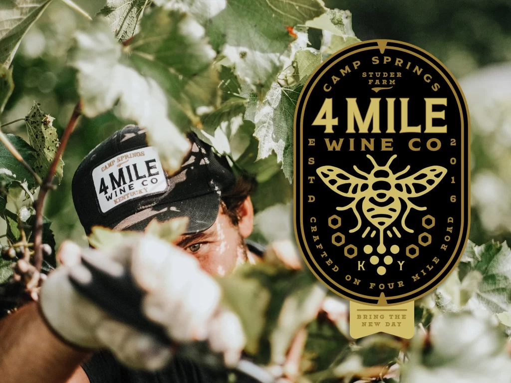
Rich gold lettering dominates a black oval badge positioned against a backdrop of sun-dappled grapevine leaves. The emblem features the text '4 MILE WINE CO' in bold serif typography, flanked by 'CAMP SPRINGS STUDER FARM' at the top and 'CRAFTED ON FOUR MILE ROAD KY' along the bottom curve. A stylized honeybee with geometric hexagonal patterns sits centrally, while the year 2016 appears vertically on either side. To the left, a worker in a black cap bearing a white rectangular patch with matching branding reaches into the foliage, their gloved hand partially obscuring the view. Natural daylight filters through the green canopy, creating high-contrast highlights and soft shadows across the composition.
Visual distinction emerges from the interplay between organic agricultural photography and rigid geometric logo elements. The monochromatic gold-on-black palette evokes premium craftsmanship, while the bee motif and hexagonal shapes introduce a modular, almost architectural quality that contrasts with the irregular leaf textures. Typography choices balance vintage farm aesthetics with modern clarity, particularly in how the circular text follows the badge's contour without sacrificing legibility. This juxtaposition of human labor and polished branding creates a narrative tension between artisanal production and professional presentation.
Brand developers studying regional winery identity systems could analyze the integration of location-specific typography with universal symbols like bees. Packaging designers might reference the oval badge proportions for similar beverage labeling projects requiring heritage positioning. Marketing teams crafting visual guidelines for agricultural businesses would find value in examining how workwear photography reinforces brand consistency across physical products and promotional materials.