5 Walla Chai Tea Cream Liqueur Bottle View
Topics
Details
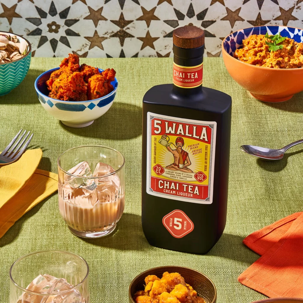
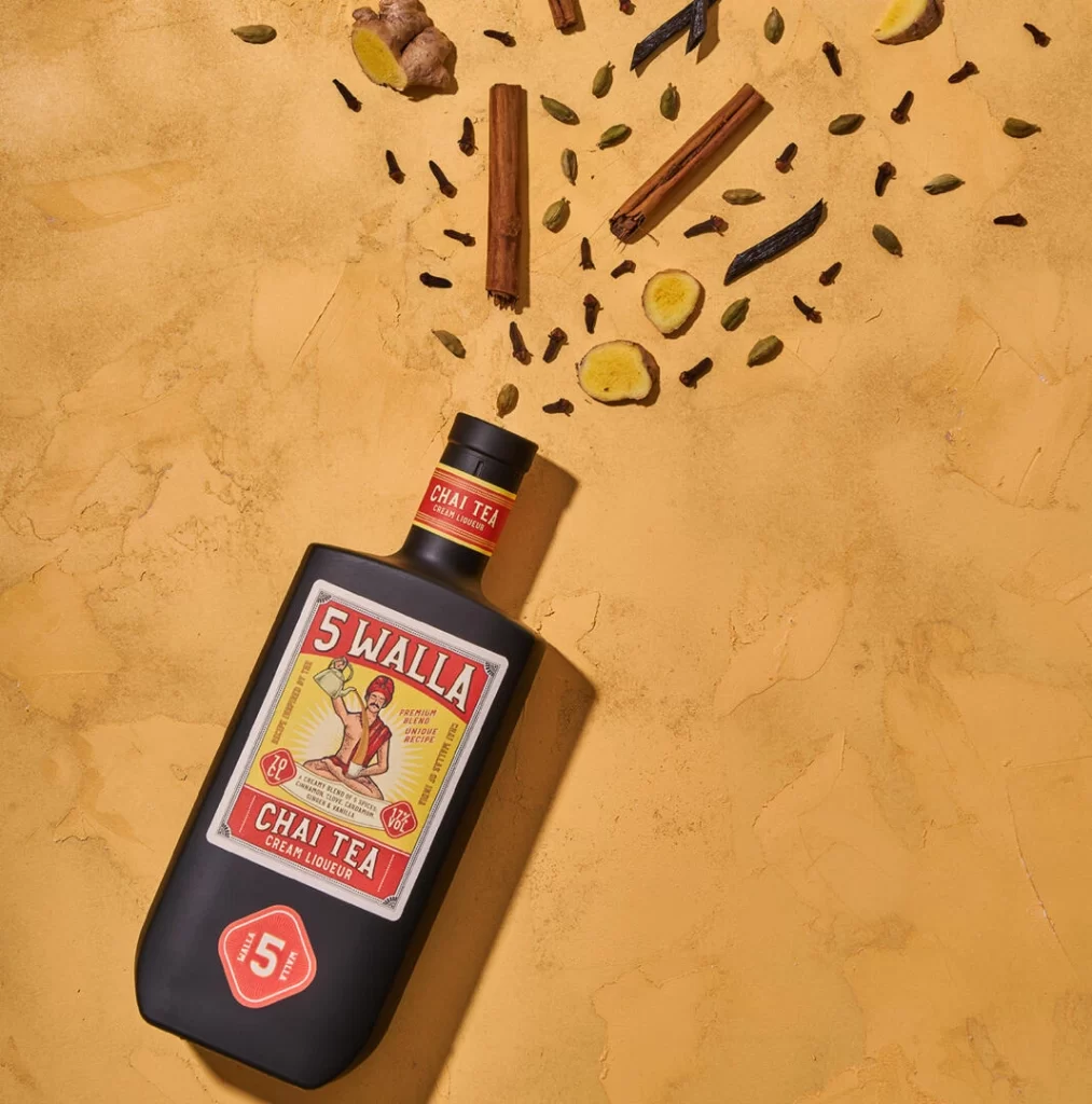
Against a warm, textured ochre backdrop, a matte black bottle of 5 Walla Chai Tea Cream Liqueur rests at a slight diagonal angle, its dark surface catching soft shadows that emphasize its rectangular form. The label bursts with vintage energy, featuring a bold red border and yellow interior where the brand name '5 WALLA' dominates the top in large white serif lettering, while 'CHAI TEA CREAM LIQUEUR' anchors the bottom in matching red. Scattered artfully above the bottle's neck are the drink's aromatic ingredients—cinnamon sticks, sliced ginger root, green cardamom pods, dark cloves, and curled vanilla beans—creating a visual trail that leads the eye from the product to its natural origins.
What sets this presentation apart is the deliberate contrast between the bottle's modern, minimalist silhouette and the nostalgic, almost circus-poster aesthetic of its labeling. The illustration of a turbaned figure holding a teapot adds a storytelling element that grounds the liqueur in cultural authenticity, while the scattered spices transform a simple product shot into an educational composition about flavor profiles. This specific arrangement cleverly uses negative space and earthy tones to make the vibrant reds and yellows of the packaging pop without feeling cluttered or commercial.
Packaging designers studying beverage branding will find this layout particularly useful for understanding how to balance typography with illustrative elements in a confined space. Food photographers can reference the way natural ingredients are positioned to suggest movement and aroma without overwhelming the main subject. Anyone working on spice-themed marketing materials or artisanal liquor campaigns might draw inspiration from how the color palette coordinates between the physical product and its botanical components.