52-60 Wine Bottle
Topics
Details
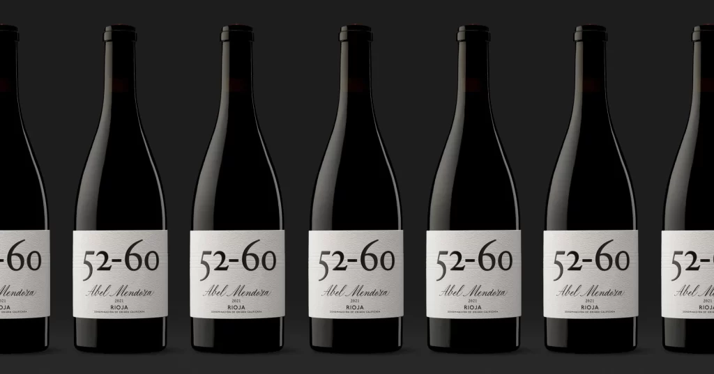
Seven identical dark glass wine bottles stand in a precise horizontal row, each bearing a crisp white rectangular label that displays the bold black numerals '52-60' above the elegant cursive script 'Abel Mendoza' and the smaller capitalized text 'RIOJA'. Soft directional lighting creates subtle highlights along the curved shoulders and necks of the bottles while casting gentle shadows beneath each base, all captured from a straight-on frontal perspective that emphasizes the rhythmic repetition of the minimalist labeling against a uniform dark gray background.
Visual distinction emerges from the deliberate typographic hierarchy that balances industrial numbering with artisanal script, creating a label system that feels both systematic and handcrafted. The high contrast between the obsidian glass, pristine white paper, and dark surroundings draws immediate attention to the textual information while the uniform spacing between vessels suggests careful product photography standards. Such minimalist labeling avoids decorative clutter, allowing the bottle silhouette and brand typography to carry the entire visual identity without supporting imagery or color variations beyond the essential black-white-red palette.
Packaging designers studying premium wine branding might analyze this arrangement to understand how limited color palettes and font pairings convey regional authenticity and contemporary elegance. 3D artists requiring accurate glass material references for beverage visualization could examine the specular highlights and liquid refraction patterns visible along the bottle contours. Marketing teams developing e-commerce product grids would benefit from observing how consistent alignment and lighting across multiple units creates a cohesive catalog presentation that maintains quality perception across inventory displays.