7 A.M. Coffee Bean Bag
Topics
Details
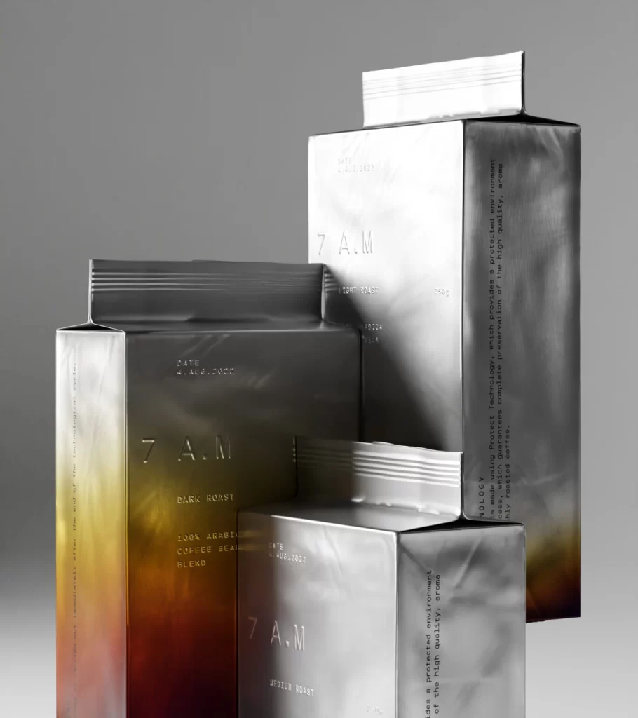
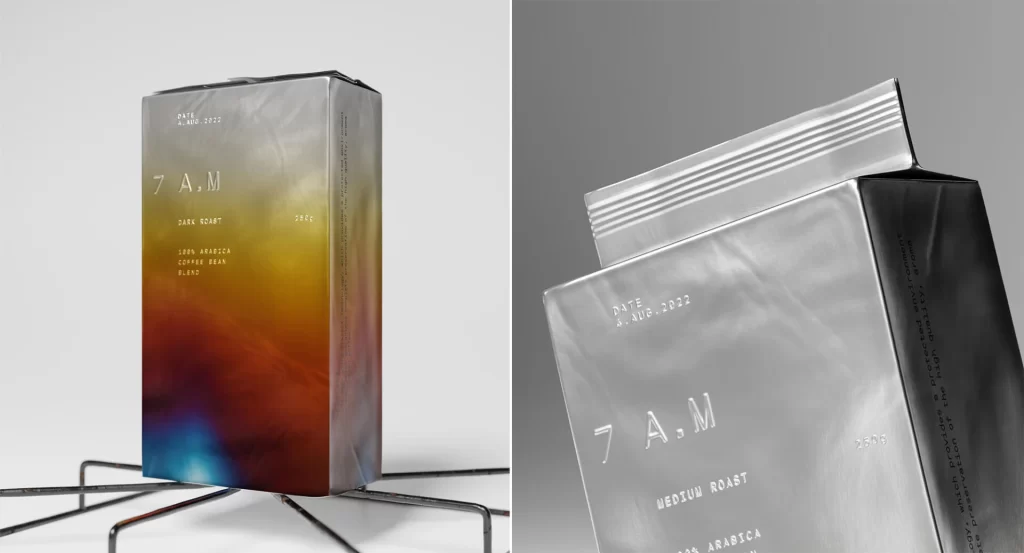
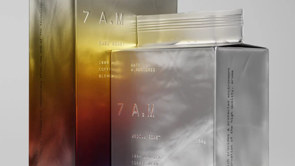
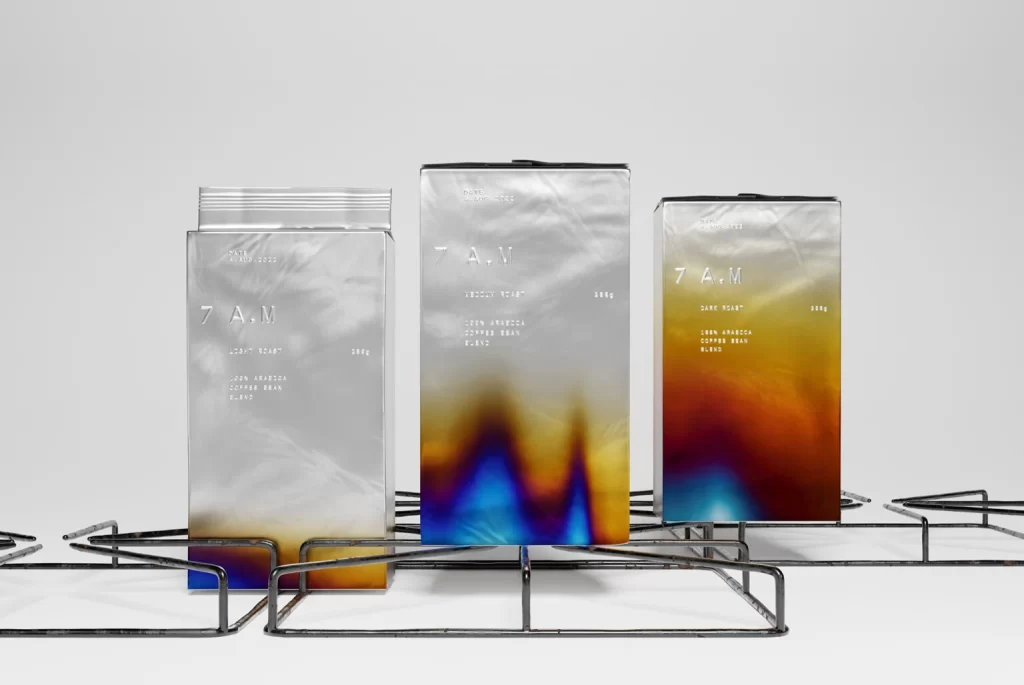
Three rectangular coffee bags stand upright on a black wire rack against a seamless white backdrop, illuminated by soft, even studio lighting that eliminates harsh shadows. Each package features a metallic silver upper section that transitions into a vibrant, heat-map-style gradient at the bottom—shifting from deep indigo and electric blue through amber to burnt orange. The central bag displays the boldest color saturation, while the leftmost version appears more subdued with silvery tones dominating the surface. Prominently embossed or printed in a clean sans-serif typeface is the '7 A.M.' branding, accompanied by smaller Japanese characters and weight indicators visible on the front panels.
Visual distinction arises from the thermal-imaging aesthetic applied to the lower half of each pouch, suggesting temperature variations or roast intensity through chromatic diffusion. The material appears to be a reflective, possibly foil-laminated substrate that catches light differently across its curved surfaces, creating subtle highlights and depth. This combination of industrial metallic finishes with organic, fluid color transitions creates a tension between technical precision and artisanal warmth uncommon in standard coffee packaging.
Product photographers studying reflective surface behavior under controlled lighting conditions would find this arrangement useful for understanding how gradients interact with curved packaging materials. Packaging designers evaluating contemporary coffee market aesthetics could reference the typographic hierarchy and color-blocking strategies employed here. Additionally, 3D artists requiring accurate material references for metallic foil textures with translucent overlay effects might study the specular highlights and color bleed patterns present on these specific forms.