Abel Mendoza Wine Bottle
Topics
Details
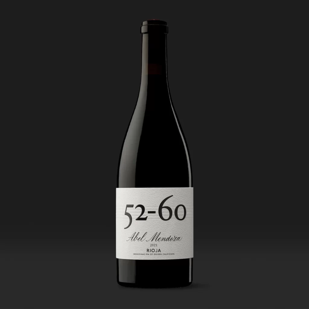
A sleek dark glass wine bottle stands upright, featuring a crisp white rectangular label with subtle textured detailing. Bold black typography displays '52-60' in large numerals above the elegant cursive script of 'Abel Mendoza', with smaller text indicating the 2021 vintage and Rioja designation below. Soft directional lighting creates gentle highlights along the bottle's curved shoulders while the charcoal background provides stark contrast to the luminous label surface.
Visual distinction emerges from the label’s restrained typographic hierarchy, where oversized numerical notation dominates the field while delicate handwriting provides organic counterpoint to the geometric weight above. The interplay between the matte paper texture and the glossy glass surface creates tactile contrast that draws the eye specifically to the branding elements. Such minimalism—stripping away ornate illustrations or crest imagery in favor of pure typographic expression—signals contemporary luxury positioning within traditional wine categorization.
Packaging designers studying premium beverage identity systems will find value in analyzing how scale relationships between numeric and script typography establish brand personality without illustrative clutter. Art directors composing product photography for e-commerce platforms can reference the lighting ratios and negative space utilization to achieve similar sophistication in their own liquid-product shoots. Typography enthusiasts examining modern serif applications within luxury contexts may also extract useful observations regarding letterform weight distribution and baseline alignment across mixed font families.