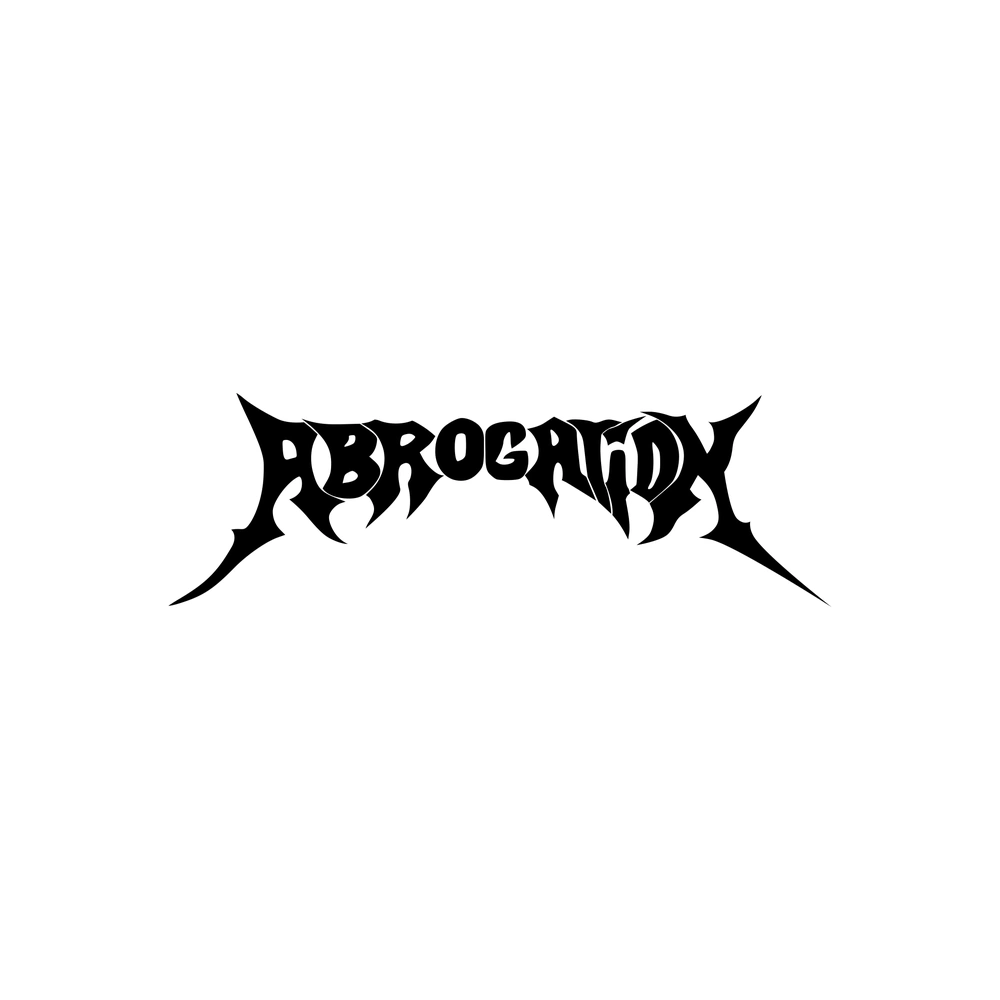
Abrogation logo
DownloadTopics
Details
Black ink forms the word ABROGATION in a jagged, aggressive metal band logo style, with sharp serifs and thorn-like extensions protruding from each letterform. The typography curves slightly upward at both ends while maintaining a heavy, solid weight throughout every character. A clean white field surrounds the graphic without any texture or gradient interference.
What distinguishes this particular wordmark is its balanced asymmetry—each letter carries unique angular cuts that suggest both organic growth and mechanical precision. The interlocking negative spaces between characters create a rhythm that draws the eye across the entire composition rather than focusing on individual glyphs. Designers can grab the full-resolution file for free to examine those intricate vector details up close.
Metal musicians seeking authentic branding for their projects will find this specimen particularly useful when studying how extreme music genres approach visual identity. Typography students analyzing the evolution of death metal aesthetics could compare this against historical examples to understand contemporary trends in underground scene graphics. Print shops producing merchandise for bands might also reference this when clients request that specific razor-sharp aesthetic for their own apparel or album art.