Actris logo
DownloadTopics
Details
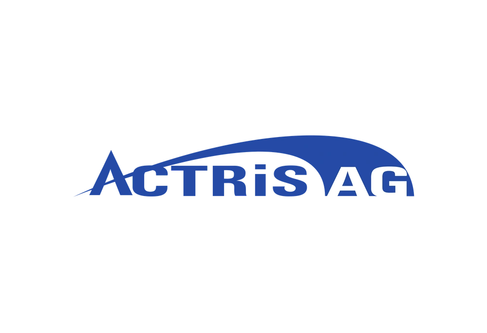
Deep blue lettering spells out "ACTRIS AG" in a bold, sans-serif typeface, with the uppercase characters anchored by a sweeping, curved graphic element that arcs from left to right above and behind the text. The composition sits on a clean white field, with the blue swoosh tapering to a fine point near the initial 'A' while thickening as it curves over toward the final 'G', creating a sense of forward momentum. A straight frontal perspective presents the mark without distortion or shadow, emphasizing the flat, two-dimensional nature of the corporate identity.
Visual interest derives from the interplay between the rigid typographic forms and the fluid, organic curve that partially encloses them, suggesting dynamism within a stable business framework. The choice of a single saturated blue hue conveys professionalism without resorting to gradients or secondary colors, while the swoosh's varying weight adds subtle tension to an otherwise straightforward wordmark. Designers studying this piece will note how the graphic element breaks the horizontal baseline, lifting the eye upward across the entire name.
Brand historians and logo analysts might reference this specific iteration when documenting corporate identity evolution in the technology or industrial sectors, particularly for comparative studies involving similar arc-based logotypes. Marketing teams evaluating rebranding options could examine the balance between text and abstract shape as a case study in minimal visual communication. The full-resolution source file is accessible at no cost for those requiring detailed inspection of vector paths and color values.