Amity Dog Food Eco Line Adult Red Packaging Illustration
Topics
Details
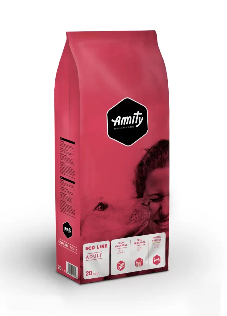
A vibrant crimson red bag of Amity Eco Line Adult dog food stands at a slight three-quarter angle, revealing both the front panel and left side seam. The packaging features a prominent black hexagonal logo with the brand name 'Amity' in white cursive script, positioned above a monochromatic photograph of a dog nuzzling against a smiling person's face. Three white rectangular boxes near the bottom highlight key product benefits—'Rico en Cárnicos', 'Pelo Brillante', and 'Huesos Fuertes'—each accompanied by a simple red icon, while the weight '20 kg' appears clearly in the lower corner.
What sets this particular design apart is its bold use of a single saturated red tone that unifies the entire surface, creating immediate shelf presence without relying on busy patterns or multiple color blocks. The emotional connection forged through the intimate human-animal photograph adds warmth that contrasts sharply with the clean geometric precision of the hexagonal branding element and structured information boxes. This balance between organic imagery and rigid typographic hierarchy demonstrates how pet food packaging can communicate both nutritional authority and affectionate companionship simultaneously.
Brand strategists developing sustainable product lines could study how the eco-conscious messaging integrates with premium visual cues without appearing austere or utilitarian. Packaging engineers might reference the structural proportions and panel layout when prototyping similar stand-up pouch formats for mammalian nutrition products. Marketing teams launching companion animal goods could adapt this color psychology approach for campaigns targeting environmentally aware pet owners who value both ecological responsibility and ingredient transparency.