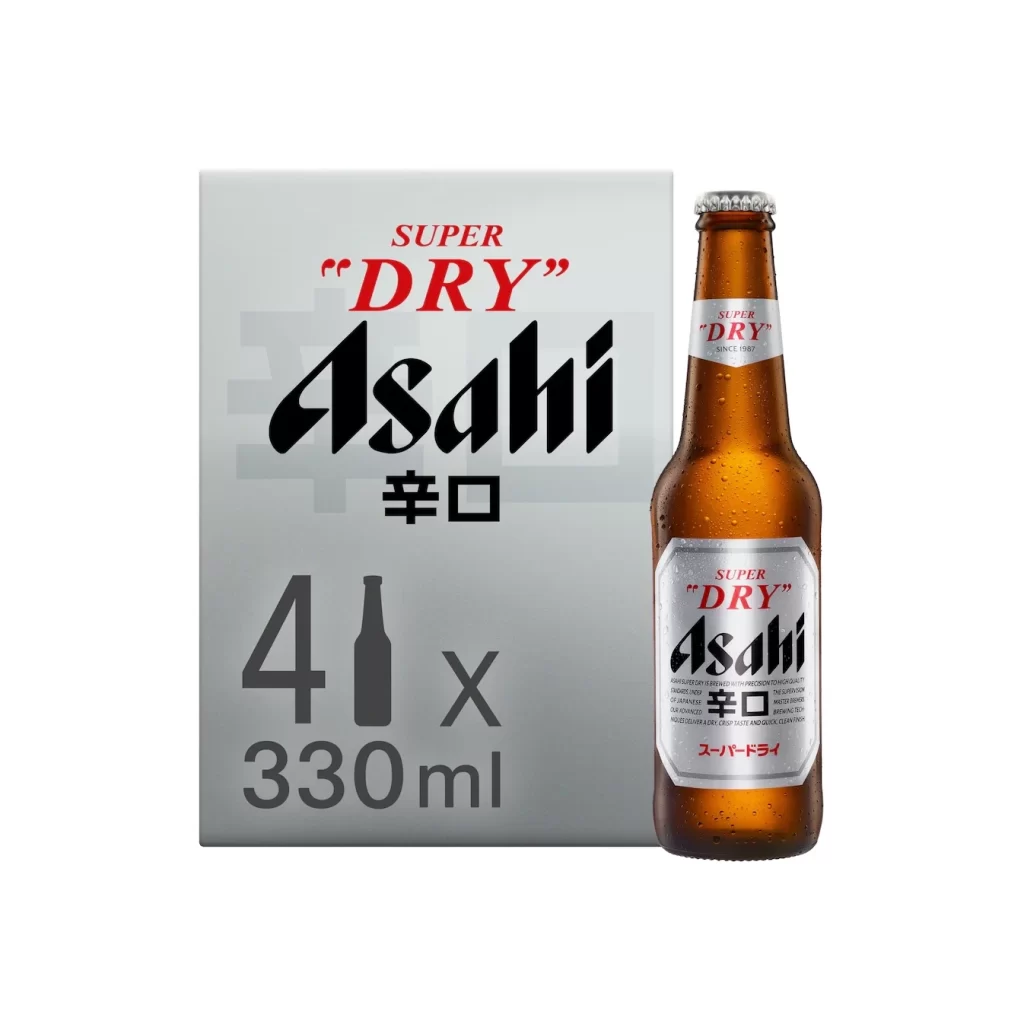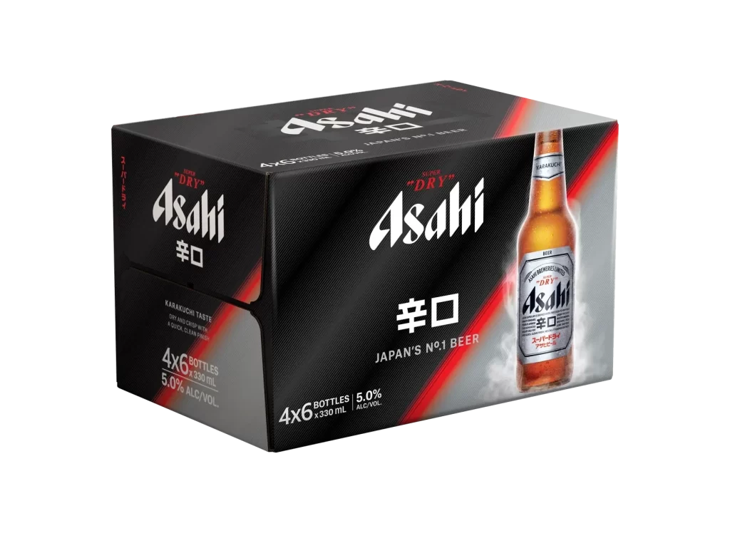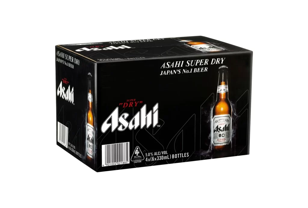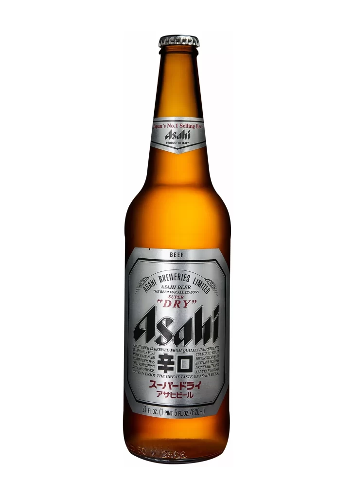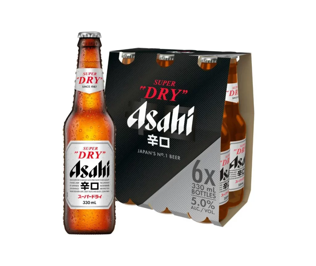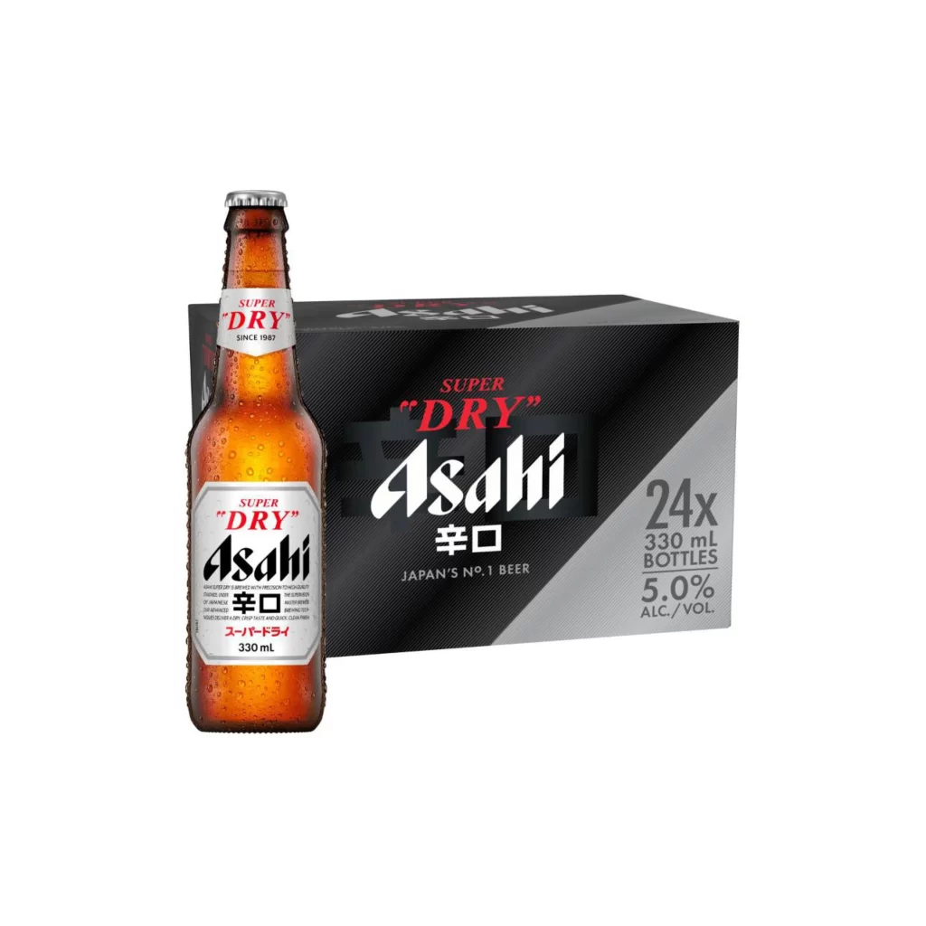
Asahi Super Dry Beer Bottle Carton Packaging
DownloadTopics
Details
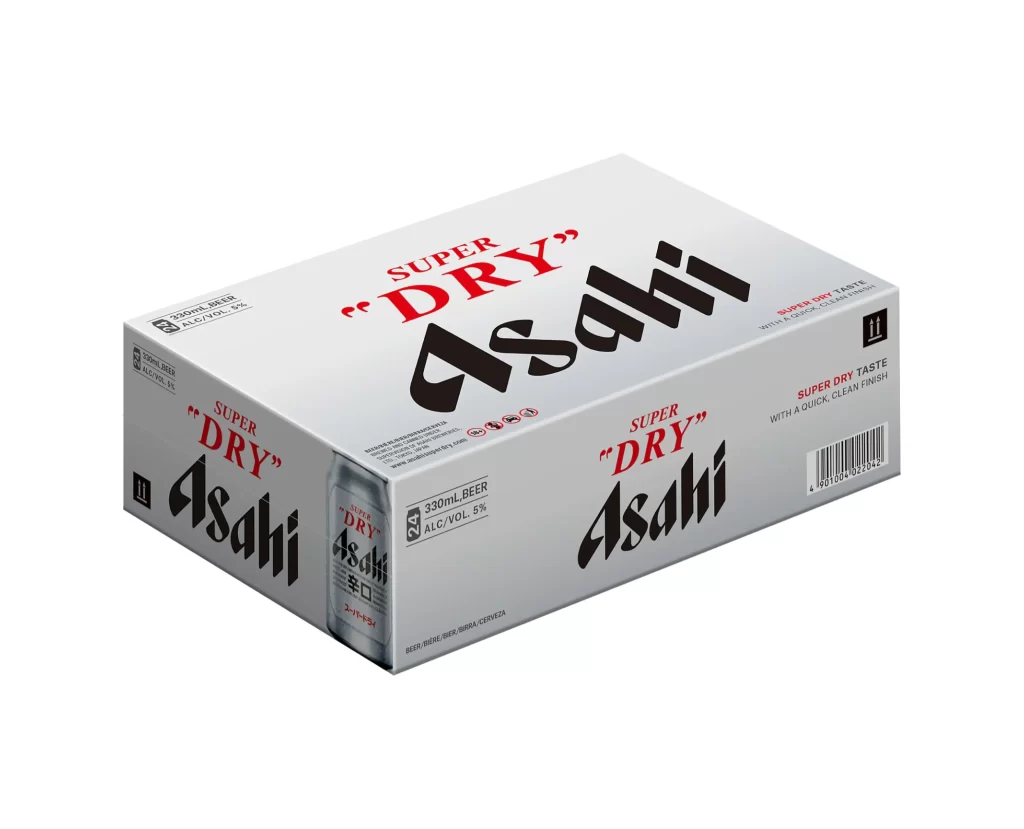
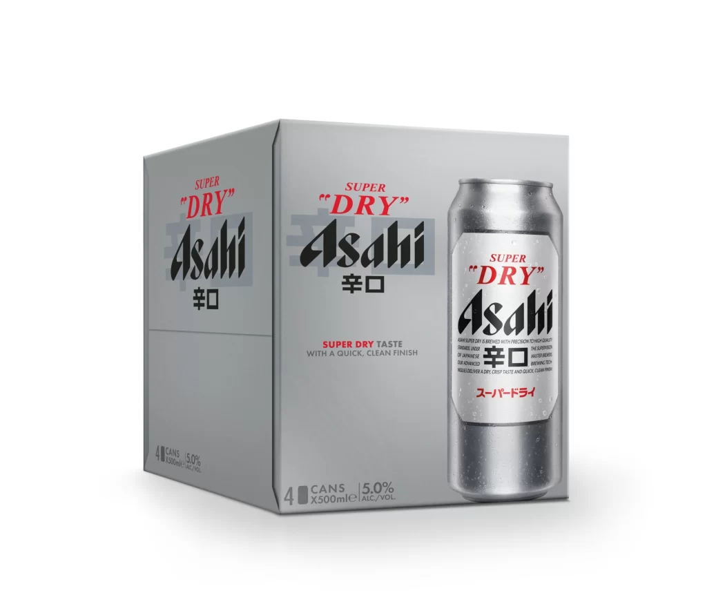
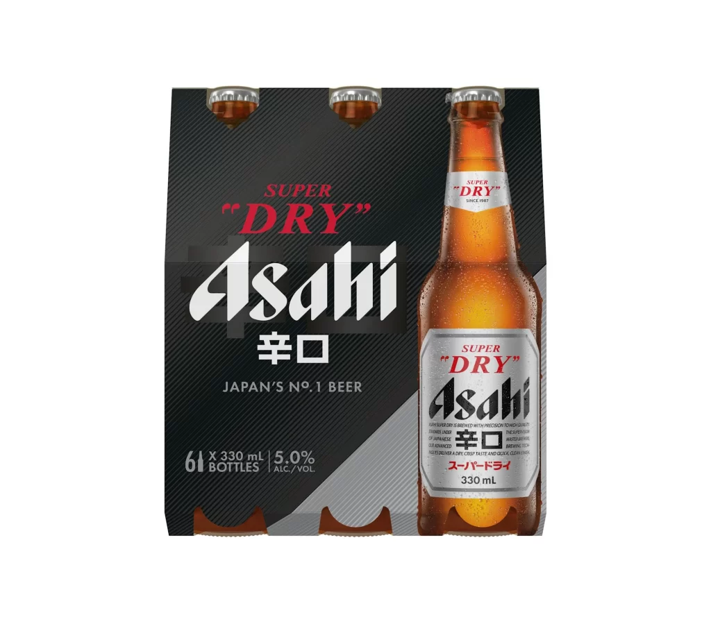
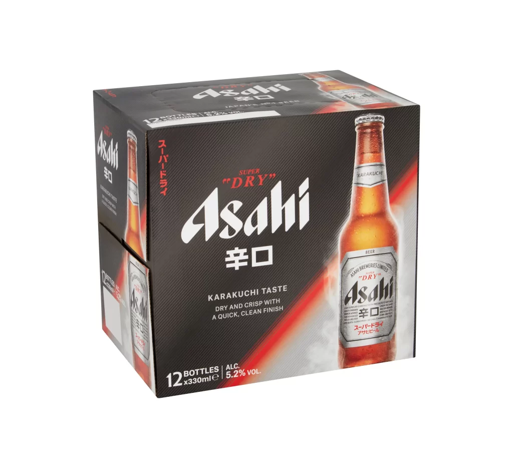
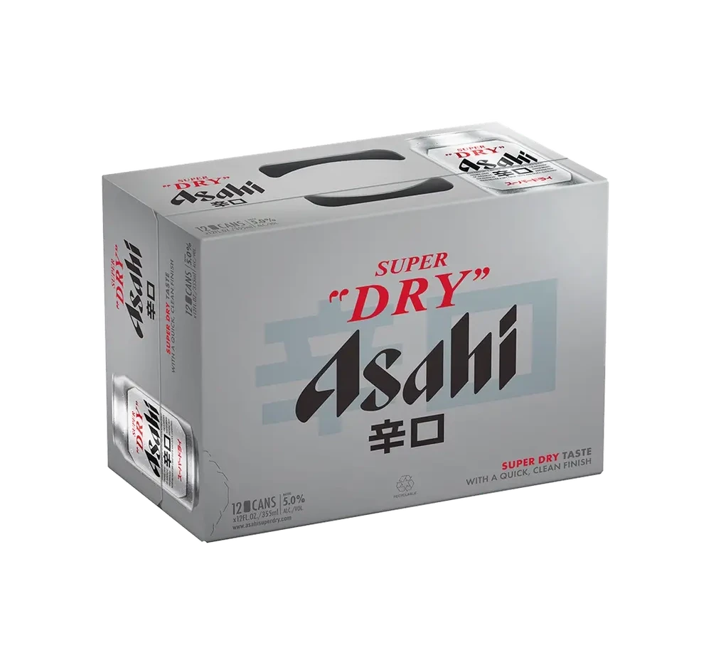
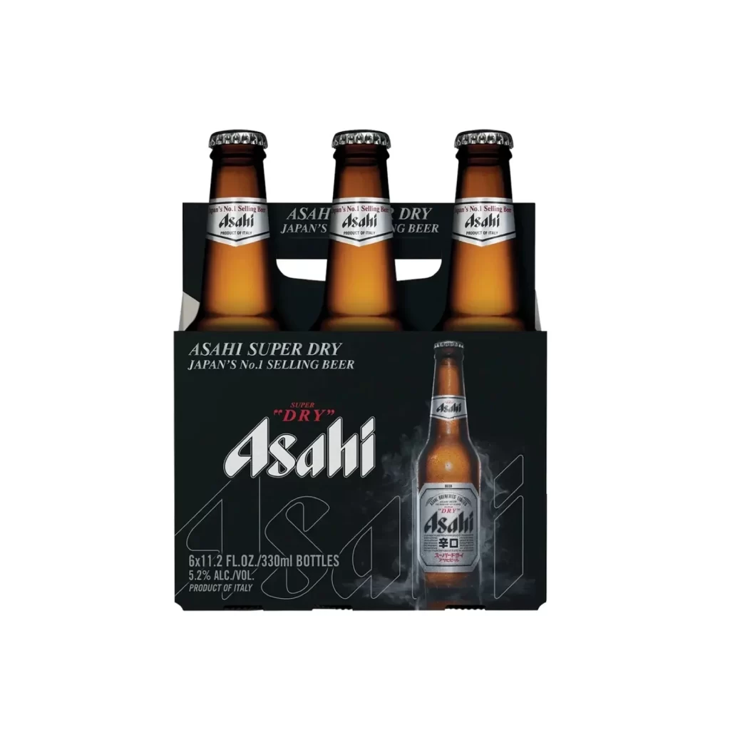
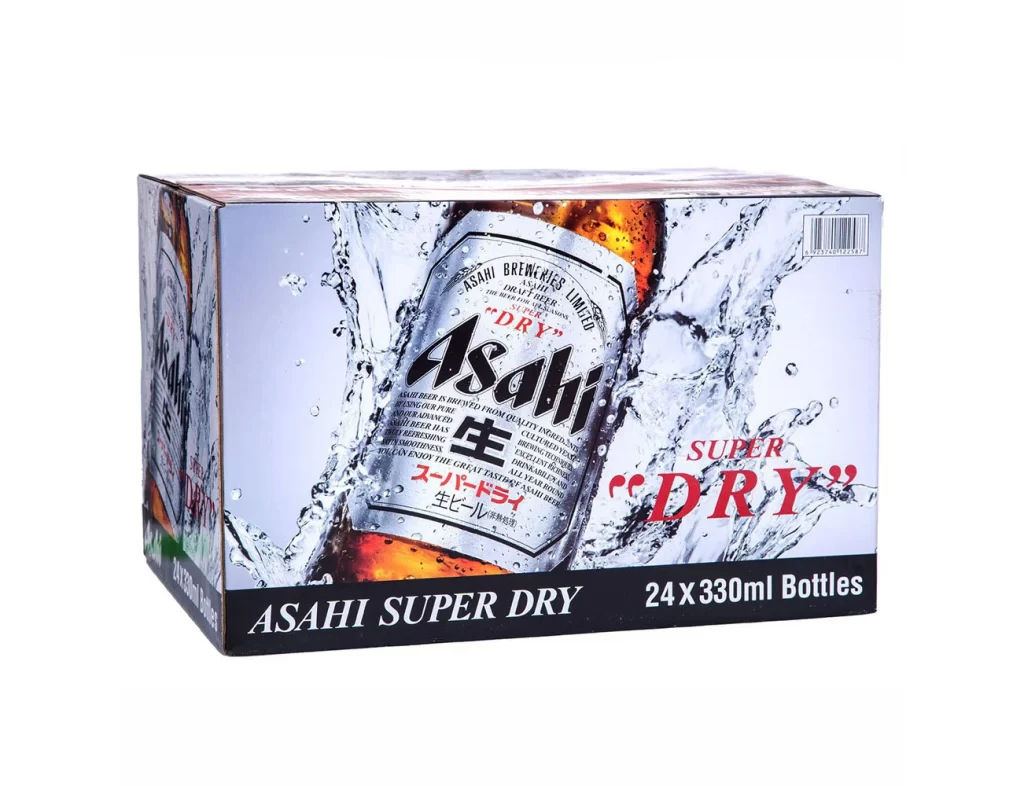
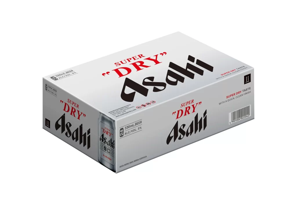
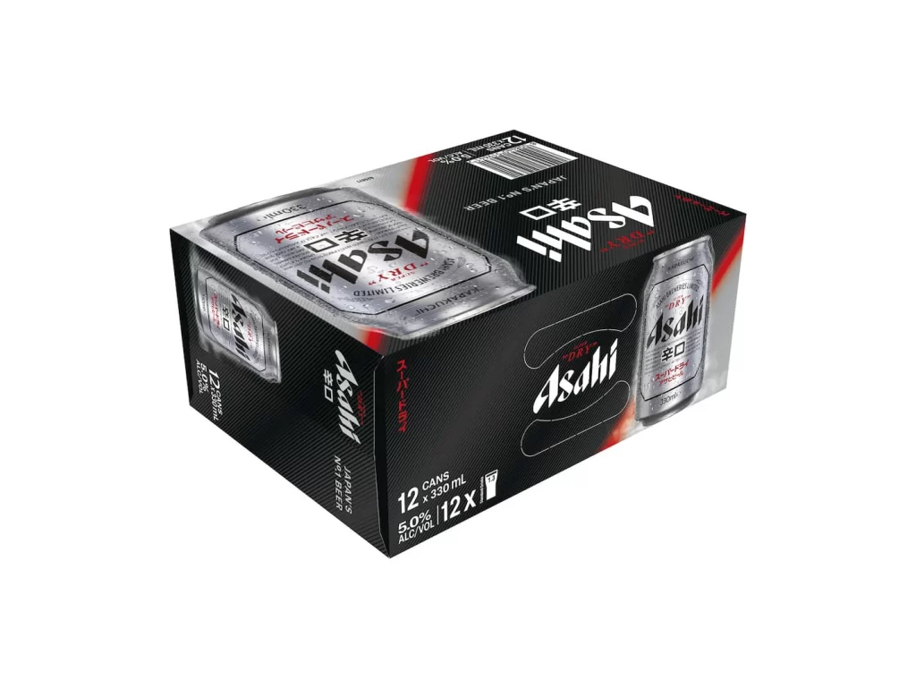
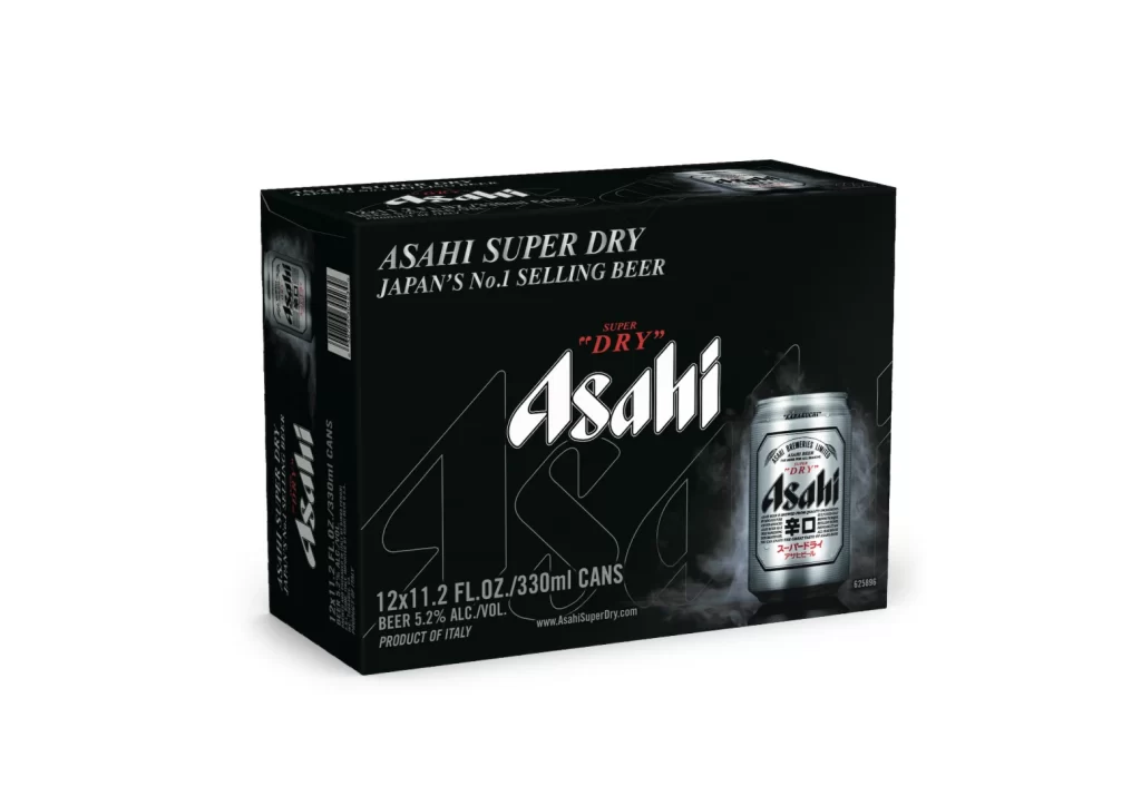
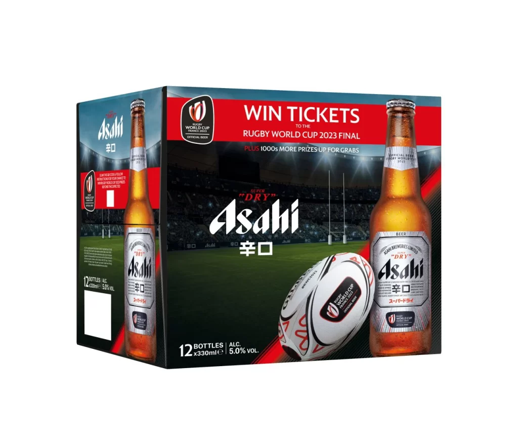
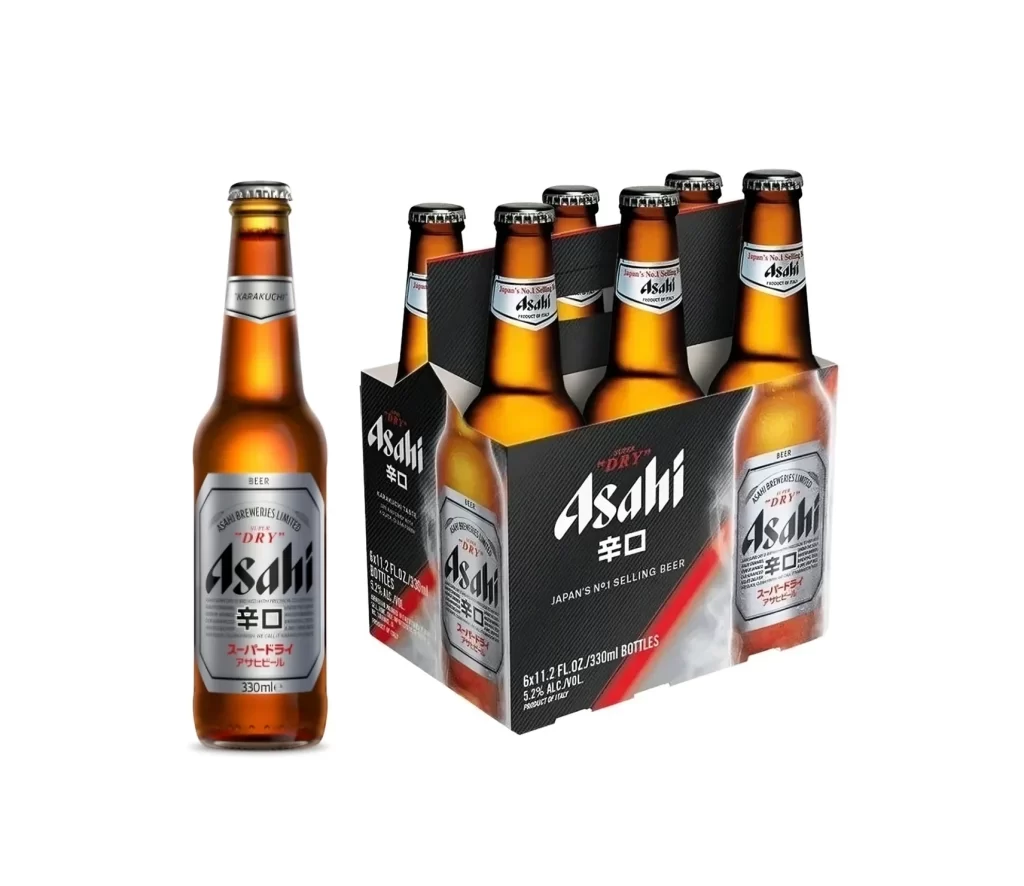
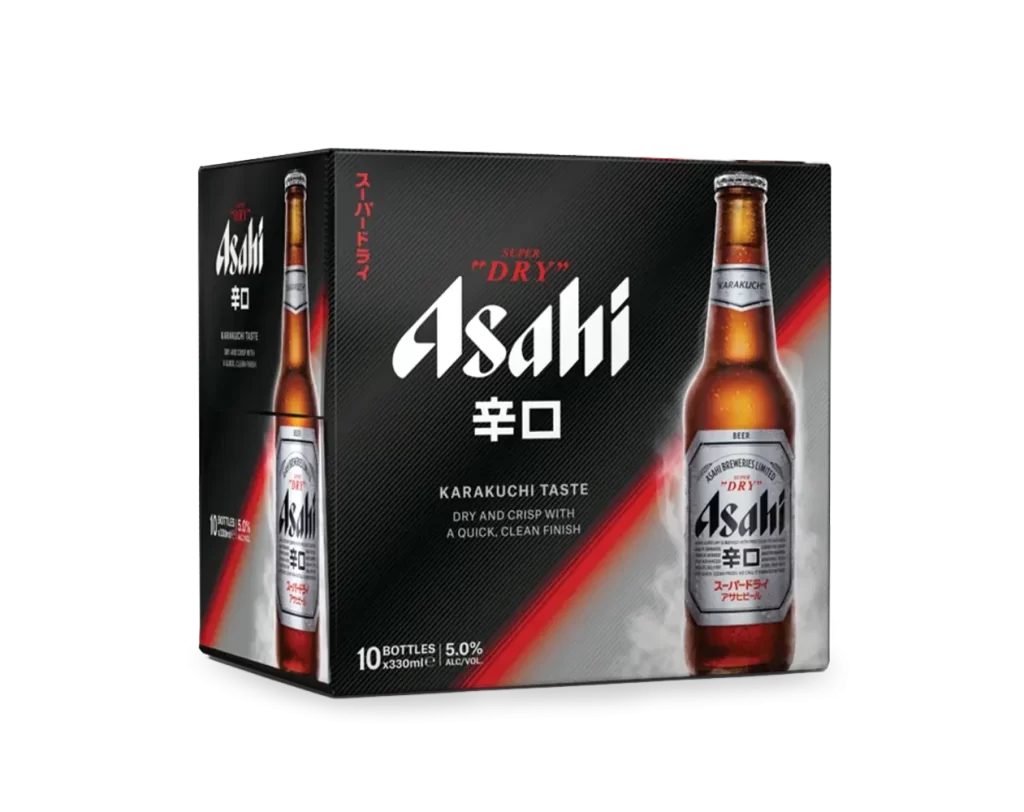
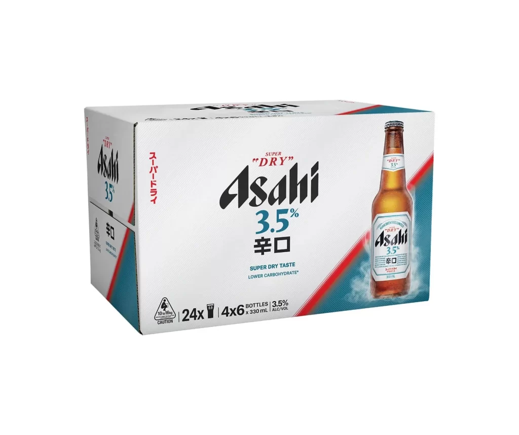
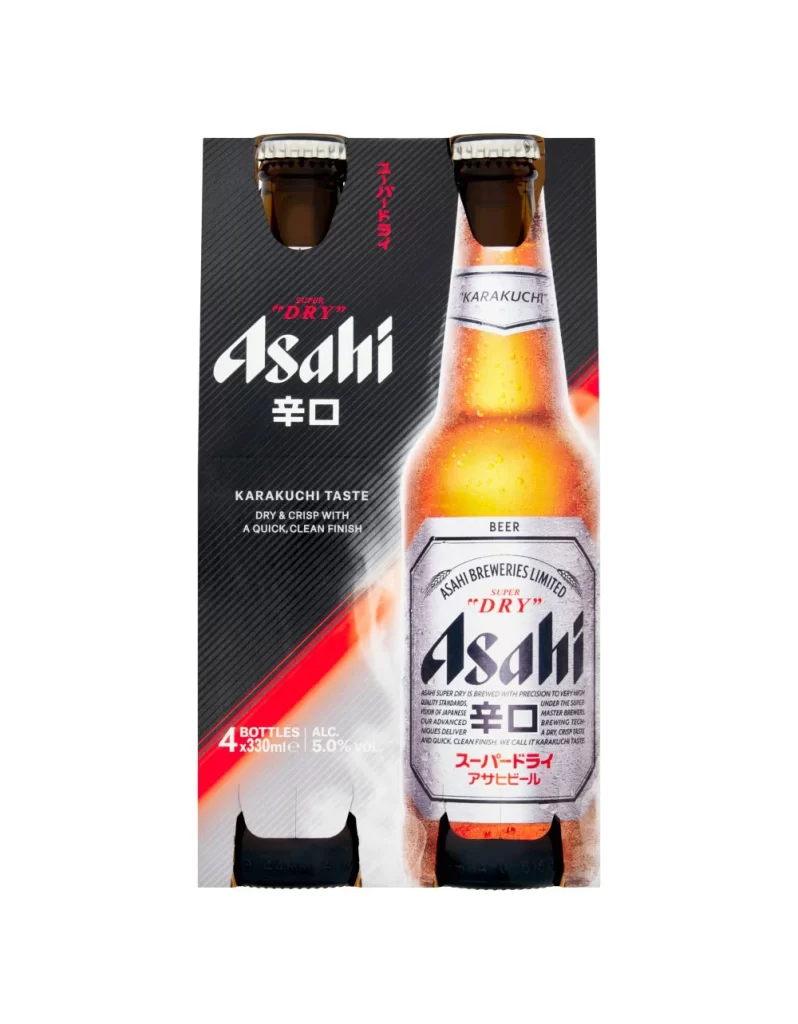
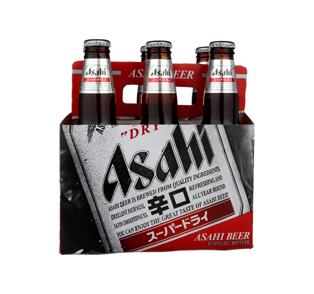
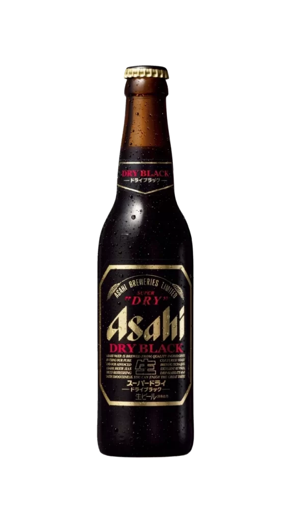
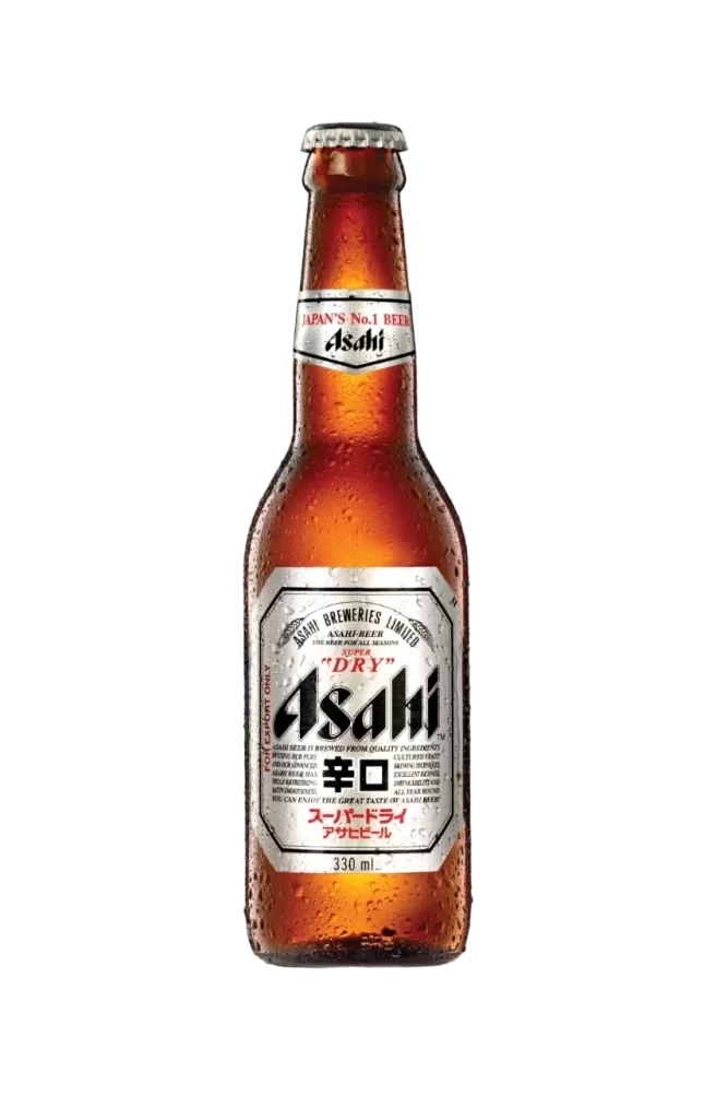
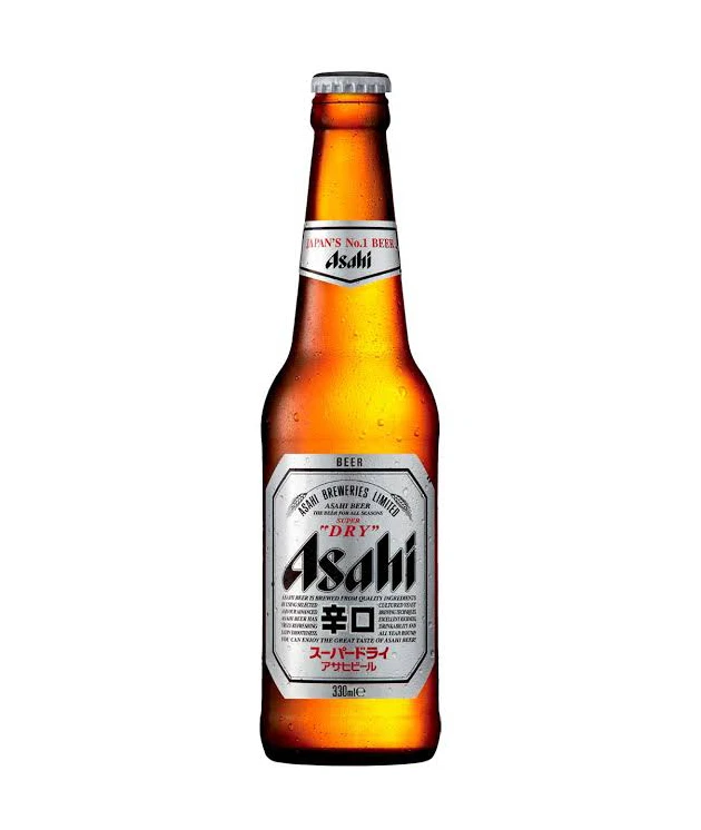
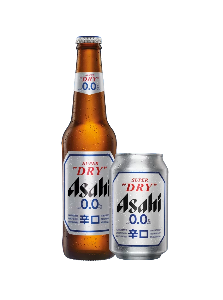
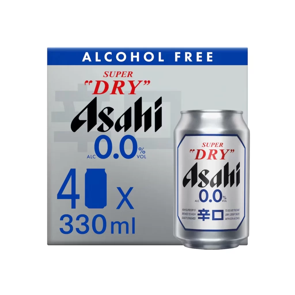
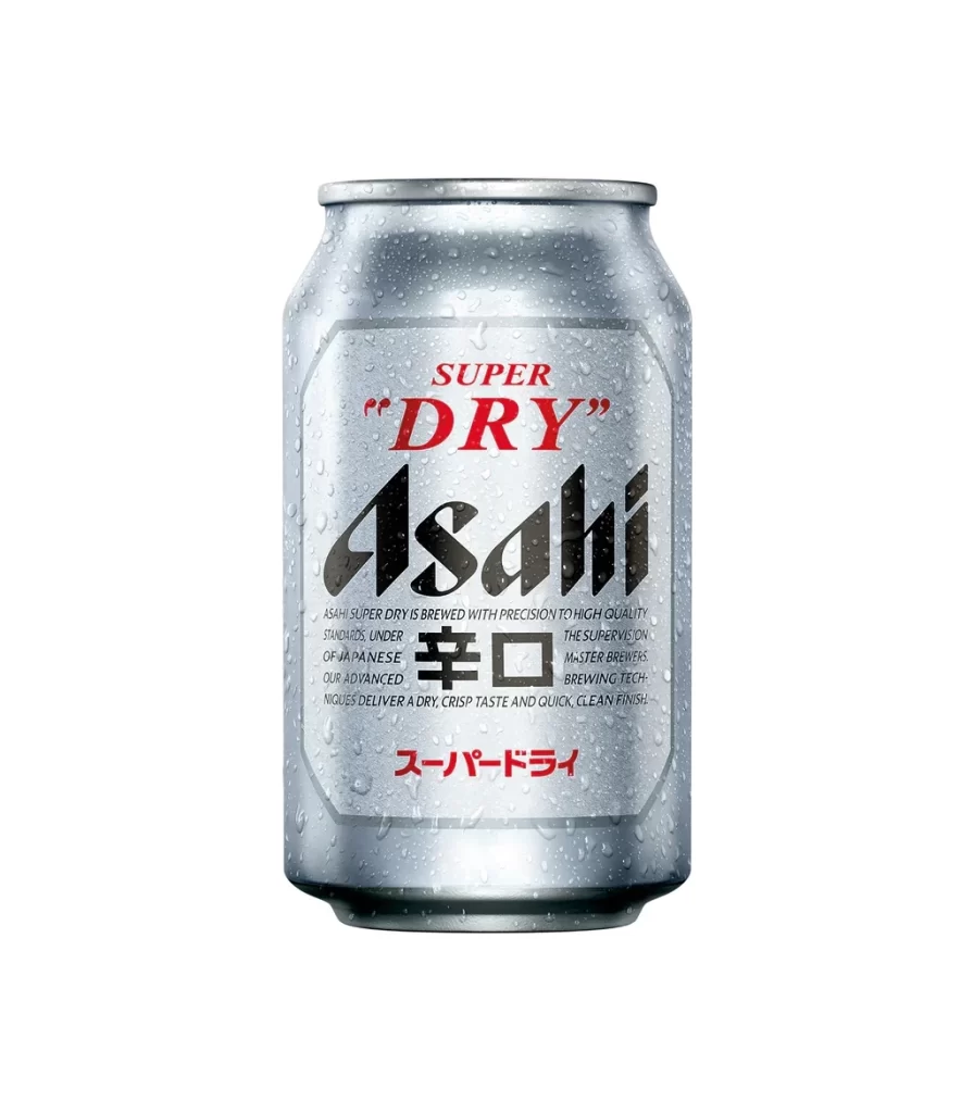
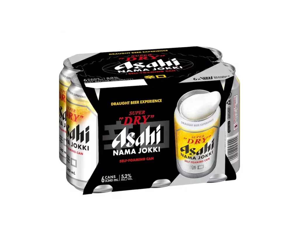
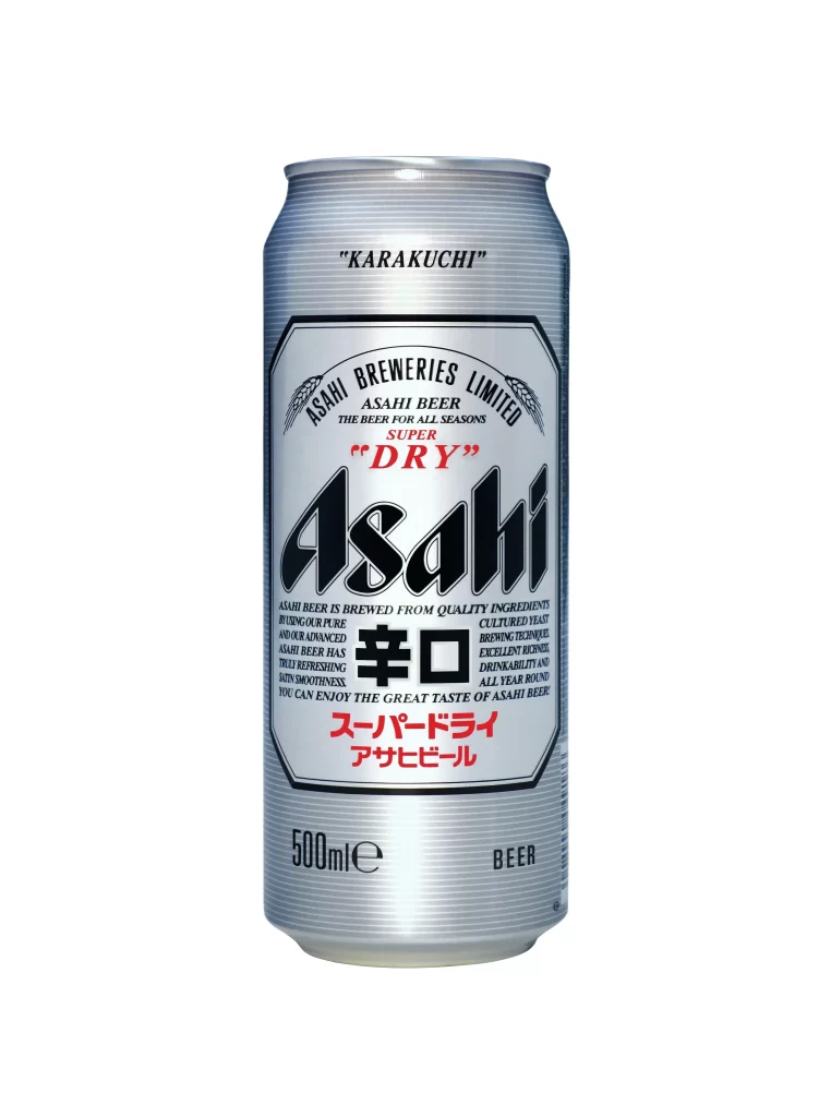
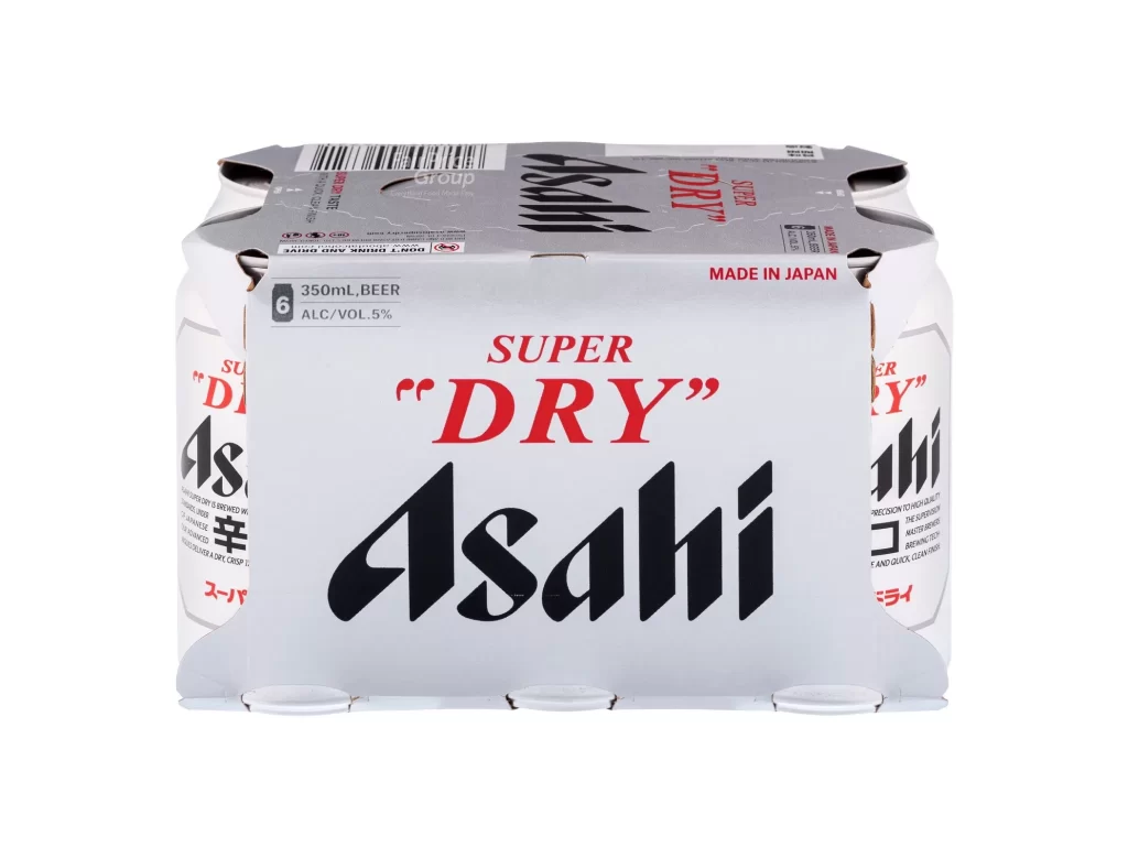
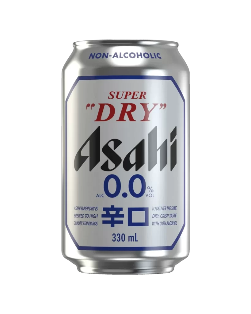
A chilled amber glass bottle stands beside a black cardboard carrier, both bearing the Asahi Super Dry branding in white and red typography. The bottle features a silver neck label with 'SINCE 1987' printed beneath the product name, while the main label displays Japanese characters 辛口 alongside the volume measurement of 330 mL. Condensation droplets cover the glass surface, indicating refrigeration, and the packaging box specifies a count of twenty-four bottles at 5.0% alcohol by volume against a clean white studio backdrop.
The diagonal split between matte black and metallic silver on the carrier creates strong visual contrast that draws attention to the bold, italicized Asahi logotype. Red accents on the 'DRY' text pop against the darker elements, establishing a recognizable color hierarchy that communicates the beer's crisp character through graphic means alone. Designers studying this composition will note how the condensation texture adds tactile realism that flat illustrations often lack.
Product photographers can study the lighting setup used to highlight glass transparency without creating distracting reflections, while packaging engineers might reference the structural layout for similar beverage carriers. Brand identity specialists examining Japanese market aesthetics will find the bilingual typographic treatment particularly instructive for cross-cultural applications. The complete high-resolution asset is accessible at no cost for immediate integration into professional mood boards or technical specifications.