BASF Packaging A
Topics
Details
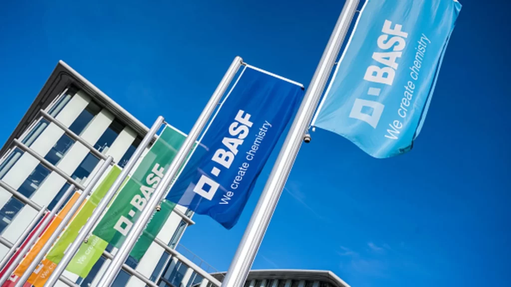
Vertical flagpoles display the BASF corporate identity in a rhythmic, receding sequence, with banners transitioning through a vibrant spectrum of red, orange, lime green, emerald, royal blue, and cyan. Each flag features the white 'D-BASF' logotype and the tagline 'We create chemistry' in a clean sans-serif typeface. A modernist building with glass-and-steel framing stands to the left beneath a cloudless azure sky.
Visual interest derives from the systematic color progression across the flags, demonstrating how a single brand mark maintains legibility and impact across varying chromatic backgrounds. The diagonal arrangement creates dynamic leading lines that draw the eye from the architectural structure toward the open sky, while the consistent typographic treatment ensures brand cohesion despite the shifting hues. Material textures of the woven synthetic fabric are visible where light catches the folds, adding tactile depth to the otherwise flat graphic elements.
Brand managers and environmental designers might study this composition to understand outdoor signage scalability and color theory applications in corporate wayfinding systems. Photographers documenting industrial architecture could reference the interplay between man-made structures and natural lighting conditions shown here. Marketing teams evaluating physical brand touchpoints would find value in analyzing how logo proportions and text hierarchy perform at distance and in motion.