Biscuit Packaging Black Red Yellow Green
Topics
Details
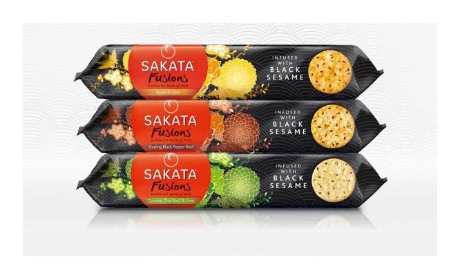
Three elongated flow-wrap packets of Sakata Fusions crackers stack vertically, each featuring a matte black base with a vibrant red oval logo containing white serif text. The top variant displays golden-yellow citrus imagery and star anise, the middle one shows deep brown roasted pepper motifs, while the bottom packet highlights bright green wasabi and lime graphics. Circular windows on the right side of each package reveal the actual seeded cracker inside, and all three carry the text "INFUSED WITH BLACK SESAME" in clean white sans-serif lettering against subtle grey wave patterns.
High-contrast color blocking between the dark packaging substrate and saturated accent hues creates immediate shelf presence across this product line. The consistent placement of the brand mark alongside rotating flavor-specific botanical illustrations establishes visual cohesion while allowing individual varieties to maintain distinct identities through their respective color paques. Photographic cutouts of the textured biscuits provide tactile authenticity that complements the stylized graphic elements surrounding them.
Brand managers developing snack-food identity systems could analyze how limited color shifts differentiate product variants without abandoning core recognition markers. Packaging engineers might study the window placement relative to fold lines for structural integrity assessments. Color theorists examining food-industry conventions would find useful data points in the specific hue selections paired with particular flavor profiles.