Biscuit Packaging Colorful Modern Typography
Topics
Details
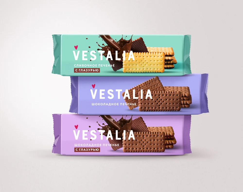
Three rectangular biscuit packages stack vertically in a centered composition, each wrapped in crinkled plastic film with serrated side edges. The top wrapper displays a mint-teal background with chocolate splash graphics and golden biscuits, the middle shows lavender with dark brown cookies, while the bottom features light purple with both chocolate imagery and cocoa-colored biscuits. Bold white sans-serif lettering spells 'VESTALIA' across all three, accompanied by smaller Cyrillic text identifying the flavors as plum and chocolate varieties with glazing, plus a tiny red heart icon above the brand name.
Visual distinction emerges from the strategic color-coding system that differentiates flavor variants through distinct pastel hues rather than relying solely on product photography. The typography employs heavy, modern weight that dominates the upper portion of each package, creating immediate brand recognition while the realistic food imagery provides tactile appetite appeal. Crinkled texture details on the packaging material add physical authenticity to the digital rendering, suggesting how light would interact with actual foil or plastic wrappers in retail environments.
Brand identity specialists developing snack-food visual systems could analyze this layout for balancing bold logotype against photographic elements. Packaging engineers might reference the specific proportions of text-to-imagery ratios when planning shelf-ready designs for similar baked goods. Marketing teams launching cookie or biscuit product lines could study the color psychology of these particular pastel choices to inform their own palette selections for differentiating flavor profiles within a unified family.