Biscuit Packaging Pastel Colorful Modern Typography
Topics
Details
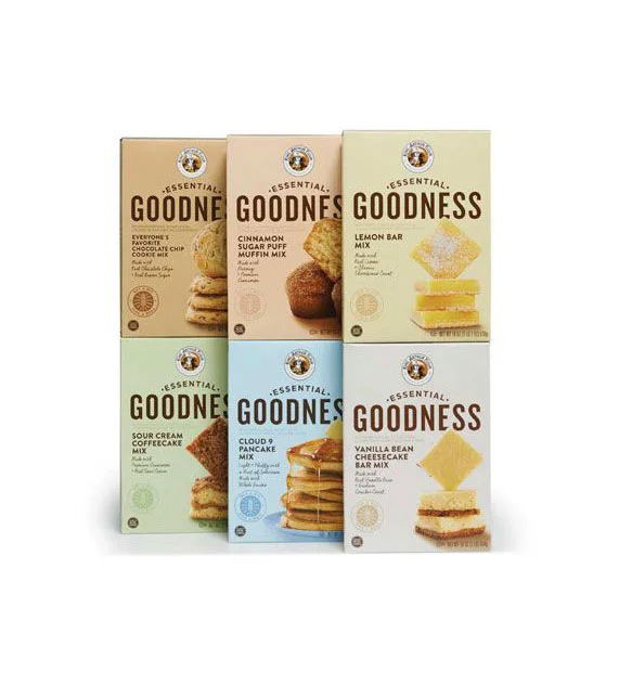
Six rectangular cardboard boxes stand in a two-by-three grid, each featuring a distinct pastel hue ranging from warm tan and pale peach to soft yellow, mint green, light blue, and off-white. The packaging displays the brand name 'ESSENTIAL GOODNESS' in bold, dark brown serif typography, accompanied by a circular logo at the top and specific product descriptions such as 'Everyone's Favorite Chocolate Chip Cookie Mix' and 'Cloud 9 Pancake Mix'. High-quality photographs of the finished baked goods—stacked cookies, muffins, lemon bars, coffee cake, pancakes, and shortbread—occupy the right side of each box, while the entire arrangement is photographed from a straight-on perspective under even studio lighting against a clean, bright backdrop.
Visual interest arises from the harmonious yet varied pastel palette that differentiates each flavor while maintaining a cohesive family look across the product line. The contrast between the earthy, traditional serif typeface and the soft, contemporary background colors creates a balanced aesthetic that feels both artisanal and approachable. Subtle textural details, including the matte finish of the cardboard and the realistic depiction of the food items, add depth to the otherwise minimalist layout.
Brand managers developing organic or health-conscious food lines might study this composition to understand how muted tones can convey natural ingredients without sacrificing shelf appeal. Packaging designers could analyze the typographic hierarchy and color-coding system to structure their own multi-product retail displays. Marketing teams planning e-commerce photography sessions might reference the lighting setup and product arrangement to ensure their own baked goods appear appetizing and clearly organized.