Black Lodge Typography
Topics
Details
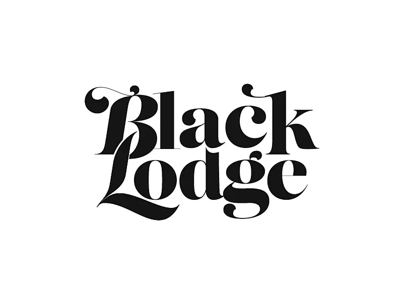
Rendered in stark black against a pure white void, the words 'Black Lodge' appear in a highly stylized, high-contrast serif typeface. The composition features tightly kerned letterforms where the capital 'B' and 'L' dominate the visual hierarchy with exaggerated swashes and ball terminals. Viewed from a direct, frontal perspective, the graphic relies on flat lighting to emphasize the sharp edges of the thick vertical stems and the delicate, sweeping curves of the lowercase characters.
Visual interest is generated through the dramatic modulation between the heavy weight of the primary strokes and the hairline-thin connectors. The interlocking nature of the ascenders and descenders creates a dense, almost architectural lock-up that feels both vintage and modern. Such extreme contrast in the letterforms demands attention, turning simple legibility into an expressive display of typographic tension.
Art directors seeking a moody aesthetic for editorial headlines or luxury branding would find this specimen particularly useful. It serves as a prime example of how custom lettering can evoke a specific atmosphere, such as mystery or noir, through form alone. Typographers might also study the specific way the swashes interact with adjacent letters to solve complex spacing issues in their own work.










![[No Readable Text] Typography](https://gropicture-1323946364.cos.na-siliconvalley.myqcloud.com/wp-content/uploads/2025/04/gropicture-typography-letter-K-1024x1024.webp)