Body Gloss Jar
Topics
Details
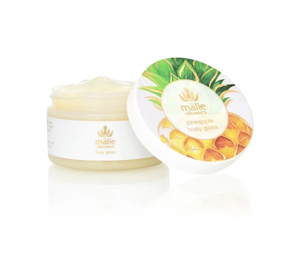
Centered within a pristine white void, a translucent jar of body gloss sits slightly left of frame, its creamy pale-yellow contents visible through the clear plastic. To the right, the circular lid leans casually against the container, revealing an illustration of ripe pineapple flesh and spiky green leaves surrounding the gold-foil brand name. Soft, diffused lighting eliminates harsh shadows, creating gentle reflections beneath the objects while keeping the focus entirely on the product's clean aesthetic and botanical motif.
Visual distinction emerges from the juxtaposition of minimalist labeling on the vessel itself against the vivid, almost painterly tropical imagery adorning the cap. The choice of metallic gold typography for both the 'mālie ORGANICS' logo and the 'pineapple body gloss' descriptor lends an air of luxury to the otherwise simple cylindrical form. Such deliberate contrast between understated packaging and vibrant flavor-specific artwork creates immediate shelf appeal while signaling premium organic positioning.
Brand strategists might examine this composition to understand how secondary packaging elements can carry thematic weight without cluttering the primary product silhouette. Packaging designers could study the balance between negative space and illustrative detail, particularly how the lid's artwork complements rather than competes with the jar's restrained elegance. Art directors planning beauty campaigns would find value in noting how lighting choices emphasize texture and material transparency for skincare photography.