Book
Topics
Details
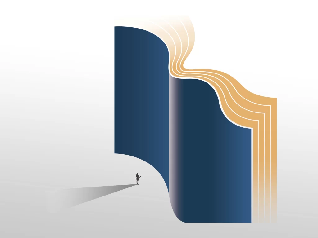
Deep navy blue covers curve into an impossible architecture of pages, their edges revealing alternating layers of warm amber and pale cream that ripple like frozen waves. A solitary human silhouette stands at the lower left, casting a long gray shadow across the light gray ground plane, while soft directional lighting from the upper right creates subtle gradients across the book's sculptural surfaces. The composition balances massive vertical forms against the tiny figure, emphasizing scale through the dramatic proportion between reader and text.
What distinguishes this visualization is its deliberate defiance of physical constraints—the pages bend and flow with liquid grace rather than obeying the rigid mechanics of actual binding. The color palette creates sophisticated tension between the somber, almost corporate blue of the outer surfaces and the inviting, honeyed warmth of the interior pages, suggesting hidden depth within formal structures. Such exaggerated curvature transforms a mundane object into a monument, making the act of reading appear as an encounter with something vast and elemental.
Editorial illustrators might reference this piece when conceptualizing metaphors about knowledge as landscape or literature as architecture. Art directors working on publishing house branding could adapt the wave-like page motif to suggest fluidity within traditional media. Educators developing materials about information literacy would find the scale contrast useful for visualizing how individual learners navigate overwhelming bodies of text.