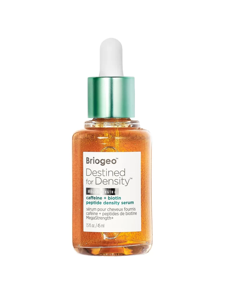
Briogeo Destined For Density Peptide Hair Serum Packaging
Topics
Details
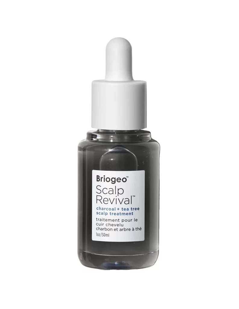
A transparent glass bottle filled with amber liquid stands as the sole subject of this studio photograph, featuring a white rectangular label with black and green typography that identifies the product as Briogeo Destined for Density MegaStrength+ peptide density serum. The container is topped by a metallic teal cap securing a white rubber dropper, with soft, even lighting eliminating harsh shadows while the camera maintains a straight-on perspective.
Visual distinction emerges through the deliberate contrast between the warm golden hue of the serum and the cool mint-green metallic finish of the cap. The label employs a clean typographic hierarchy, using bold lettering for ‘Briogeo’ and ‘Destined for Density’ while reserving green text for the key ingredients caffeine and biotin. This color-coded approach helps viewers immediately identify the product’s functional purpose while maintaining an upscale, clinical aesthetic typical of premium hair care lines.
Packaging designers studying cosmetic branding would examine this composition to understand how transparency conveys product purity and how dropper mechanisms suggest precise application. Marketing teams could reference the layout when developing their own density-focused hair care lines, noting how the bilingual text accommodates diverse markets without cluttering the design. Photographers specializing in product shoots might analyze the lighting setup that makes the amber liquid appear vibrant yet natural.