Bumble Bee Tuna Can
Topics
Details
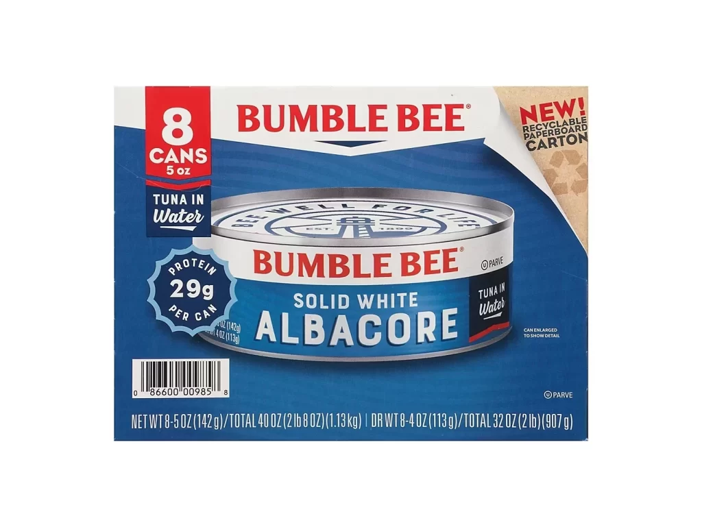
A deep blue background dominates the packaging, featuring a central photograph of a silver aluminum can with a white label. Bold red text spells out 'BUMBLE BEE' above the product name 'SOLID WHITE ALBACORE' in large white serif letters. The composition includes a red vertical badge on the left indicating '8 CANS 5 oz', a blue protein seal showing '29g PER CAN', and a tan corner flap announcing recyclable cardboard.
Visual hierarchy relies on the contrast between the vibrant blue field and the crisp white and red typography. The cylindrical can is rendered with realistic metallic highlights, creating a three-dimensional effect against the flat graphic elements of the carton. Layered information zones separate nutritional claims from branding, while the torn paper texture on the right edge adds tactile interest to the overall layout.
Product photographers can study the lighting setup used to emphasize the can's curvature without losing label legibility. Packaging designers might analyze how color blocking guides the eye from quantity indicators to brand identity. Illustrators requiring accurate depictions of commercial seafood tins will find the specific font choices and regulatory text placement particularly useful for realistic mockups.