Burush Label
Topics
Details
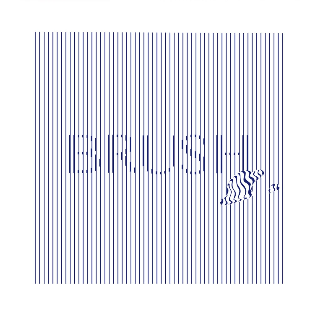
Deep navy vertical striations dominate the square composition, creating a rhythmic grid that spans the entire field. Centered within this linear matrix, fragmented typographic forms emerge through the strategic interruption of the parallel lines, spelling out obscured letterforms that demand closer inspection. Toward the lower right quadrant, an organic, shell-like motif disrupts the strict geometry with undulating wave patterns that contrast sharply against the rigid background structure.
Visual tension arises from the deliberate interplay between mechanical repetition and organic distortion, where the text appears to dissolve into the surrounding barcode-like environment. The selective warping of the striped pattern within the seashell element introduces a subtle kinetic quality that breaks the static uniformity of the overall field. Such a composition leverages negative space and line-weight variation to create legibility challenges that engage the viewer in active decoding.
Typography researchers might employ this specimen to study how extreme vertical constraints affect character recognition and readability thresholds. Brand identity developers working on maritime or luxury packaging concepts could reference the sophisticated balance between industrial patterning and naturalistic motifs. Print production specialists may find value in analyzing the precise calibration required to maintain visual coherence when integrating distorted graphical elements into systematic grid layouts.