Bush’s Best Brown Sugar Hickory Baked Beans Can Packaging
Topics
Details
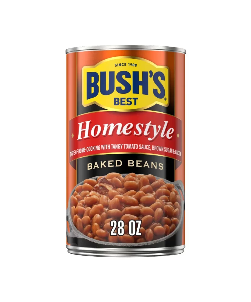
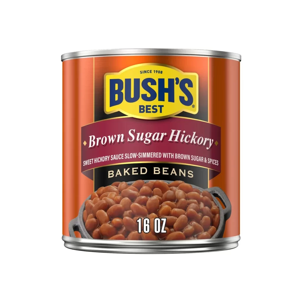
The packaging utilizes a clear visual hierarchy to communicate the product’s specific taste profile. A maroon banner prominently displays the ‘Brown Sugar Hickory’ flavor in white serif text, immediately signaling a sweet and smoky experience to the shopper. Below this, a solid black band features the words ‘Baked Beans’ in elegant gold lettering, firmly establishing the food category.
Bush’s Best leverages its long-standing heritage by placing the ‘Since 1908’ line atop the iconic yellow oval logo. This branding strategy positions the item as a authentic Southern US comfort food staple, further reinforced by the description of a slow-simmered sauce. The overall design evokes a sense of traditional home cooking and reliability.
Designers can learn from the effective use of color contrast and photography on this 16 oz steel can. The gradient orange background makes the central elements pop, while the cast iron skillet imagery on the lower half adds appetizing texture and context. Such layouts demonstrate how to balance brand identity with flavor-specific cues in a crowded retail environment.