calafont Anchovie Box
Topics
Details
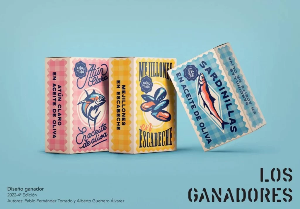
Three rectangular tins of preserved seafood stand in a staggered arrangement, each wrapped in vintage-inspired packaging featuring distinct color schemes and bold typography. The leftmost tin displays a pink gingham pattern with an illustration of tuna and the text 'Atún Claro en Aceite de Oliva,' while the center tin showcases a yellow checkered background with mussels labeled 'Mejillones en Escabeche,' and the rightmost tin leans at an angle revealing a blue plaid design with a sardine graphic reading 'Sardinillas en Aceite de Oliva.' Soft studio lighting casts gentle shadows beneath the containers, highlighting their metallic edges and retro printed details against a uniform light cyan backdrop.
Retro illustration styles dominate these designs, blending 1950s commercial aesthetics with modern color blocking techniques that make each variety instantly recognizable on a shelf. The deliberate use of contrasting gingham patterns against solid backgrounds creates visual rhythm, while hand-lettered script elements add an artisanal touch that distinguishes these from typical mass-market conservas. Such careful attention to typographic hierarchy ensures product names remain legible even when viewed from oblique angles, proving that functional packaging can simultaneously serve as collectible graphic art.
Brand strategists developing premium canned goods lines might study this composition to understand how vintage motifs communicate quality and tradition without appearing dated. Packaging engineers could analyze the structural layout to optimize how side-panel information integrates with front-facing artwork during the manufacturing process. Illustrators seeking to master food rendering techniques will find valuable lessons in how metallic fish scales and glossy shell textures are simplified into bold, print-friendly shapes that retain their appetizing appeal.