Candy Packaging Pastel Colorful Geometric Modern
Topics
Details
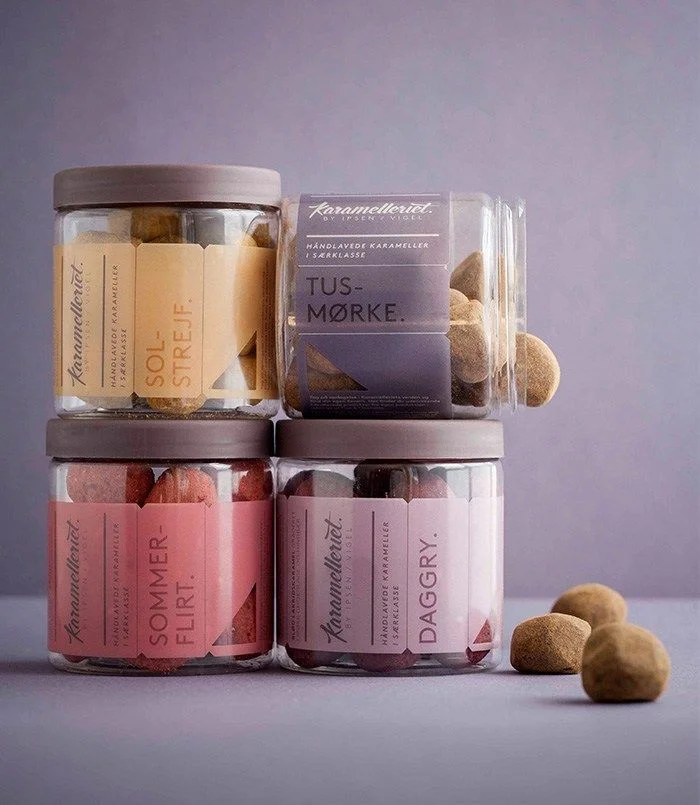
Four cylindrical glass jars with matte grey lids are arranged in a two-by-two grid, each containing handcrafted caramels visible through the transparent walls. The packaging features distinct pastel labels in mustard yellow, dusty lavender, coral pink, and pale mauve, all bearing the brand name 'Karamellieriet' and Danish flavor names like 'SOL-STREJF', 'TUS-MØRKE', 'SOMMER-FLIRT', and 'DAGGRY'. Soft directional lighting from the left casts gentle shadows across a muted purple-grey surface, while three loose caramel spheres rest in the lower right foreground, adding depth to the slightly elevated camera perspective.
Geometric triangular accents punctuate each label's typography, creating a rhythmic visual language that balances Scandinavian minimalism with playful color blocking. The deliberate contrast between the organic, irregular shapes of the caramels and the rigid cylindrical containers establishes a compelling textural dialogue. Subtle variations in label opacity and the strategic use of negative space around the bold sans-serif lettering demonstrate sophisticated hierarchy without overwhelming the product itself.
Brand strategists developing premium confectionery identities could analyze this composition to understand how muted palettes convey artisanal quality while maintaining shelf presence. Packaging engineers might study the structural relationship between the wide-mouth jars and the wraparound labels to optimize similar container designs. Color theorists examining Nordic design trends would find this arrangement particularly useful for documenting how desaturated tones can differentiate luxury food products in competitive retail environments.