Canidae Pure Farm To Bowl white and blue dog food Packaging
Topics
Details
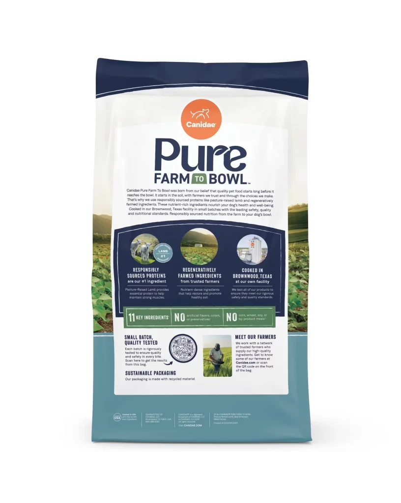
Deep navy blue shoulders cap the top of the Canidae Pure Farm To Bowl bag, tapering into a white central panel that hosts a bold orange circular logo above large dark blue 'Pure' typography. Muted teal anchors the bottom third, while photographic strips of lush green farmland wrap around the lower left and right edges, framing three circular icons that highlight responsibly sourced proteins and regeneratively farmed ingredients. The packaging displays '11 KEY Ingredients' in a green banner alongside quality testing details and sustainable material information on a clean white surface.
Visual hierarchy is masterfully controlled through a mix of serif and sans-serif typefaces, guiding the eye from the brand promise down to specific product claims like ‘Responsibly Sourced Proteins’ and ‘Regeneratively Farmed Ingredients.’ The design balances technical information with lifestyle imagery, using circular photo insets to break up text blocks while maintaining a cohesive agricultural narrative. Such a layout effectively communicates transparency and quality assurance without cluttering the visual field.
Brand strategists and packaging designers might study this example to understand how to organize complex nutritional data into a digestible format for consumers. Marketing teams could analyze the color psychology of the teal and navy combination to evoke trust and natural freshness in their own product lines. Furthermore, art directors looking to bridge the gap between rustic farm imagery and modern minimalist aesthetics will find this a compelling case study in contemporary pet food branding.