Canned Squid Ligo Brand Red Natural Ink
Topics
Details
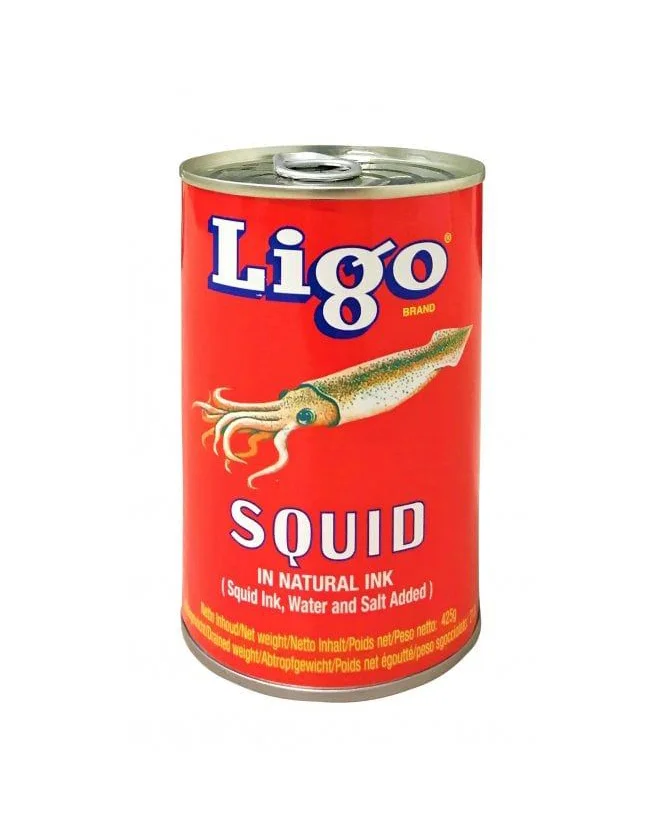
A cylindrical metal can with a silver pull-tab lid dominates the frame, wrapped in a vibrant red label that immediately draws the eye. The brand name "Ligo" appears in bold white serif lettering with a dark blue drop shadow, positioned above an anatomically detailed illustration of a squid rendered in naturalistic green and tan tones. Below the marine creature, the word "SQUID" commands attention in large white capitals, followed by the smaller declaration "IN NATURAL INK" and a parenthetical note about added water and salt, all set against the saturated crimson background.
Visual impact derives from the aggressive contrast between the warning-sign red field and the biological realism of the cephalopod illustration, creating an almost jarring juxtaposition of industrial packaging and natural history. Typography plays a crucial role here, with the heavy weight of the brand name and product title establishing clear hierarchy while the smaller descriptive text grounds the item in culinary specificity. The metallic sheen of the can's rim catches light subtly, adding textural variety to the otherwise flat graphic surface.
Food photographers studying color theory in commercial packaging would find this specimen particularly useful for analyzing how primary reds influence appetite perception in preserved seafood marketing. Cultural historians documenting Filipino pantry staples could reference the specific typographic choices and ingredient disclosures typical of mid-century canned goods branding. Illustrators working on vintage-style food labels might examine the rendering technique of the squid's mottled skin texture as a masterclass in combining scientific accuracy with commercial appeal.