Cardboard Box Colorful Stickers Expressive Minimalist Design
Topics
Details
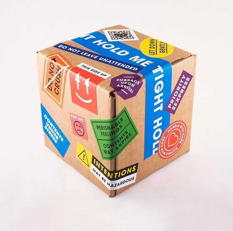
A standard brown corrugated cardboard cube sits at a three-quarter angle, its surface densely populated with overlapping adhesive labels in a vibrant palette of cyan, crimson, emerald, amber, violet, and scarlet. Bold sans-serif typography dominates each sticker, featuring phrases like 'DO NOT CRUSH,' 'PERISHABLE FEELINGS,' and the prominent blue banner wrapping around the top edge that reads 'HOLD ME TIGHT.' Soft, diffused studio lighting eliminates harsh shadows while highlighting the fibrous texture of the cardboard and the slight sheen of the vinyl stickers against a neutral, light-toned backdrop.
Visual tension arises from the juxtaposition of industrial shipping aesthetics with emotionally charged, anthropomorphic messaging that transforms utilitarian packaging into a commentary on vulnerability. The deliberate variation in sticker geometry—ranging from rectangular warning labels to circular seals and hexagonal badges—creates a dynamic, layered composition that mimics the chaotic accumulation of transit markings. This specific iteration stands out through its witty subversion of logistics language, where standard handling instructions become metaphors for human connection and care.
Art directors developing campaigns for mental health awareness or relationship-focused brands might reference this composition to explore visual metaphors for emotional fragility. Packaging designers tasked with creating unboxing experiences could study the hierarchy of these labels to understand how playful typography alters user perception of product value. Conceptual illustrators seeking to depict themes of intimacy or protection in commercial work would find the color-coded warning system particularly useful for communicating nuanced emotional states through graphic symbols.