Caswell Massey HAND CREME Tube Design
Topics
Details
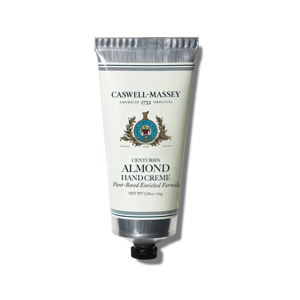
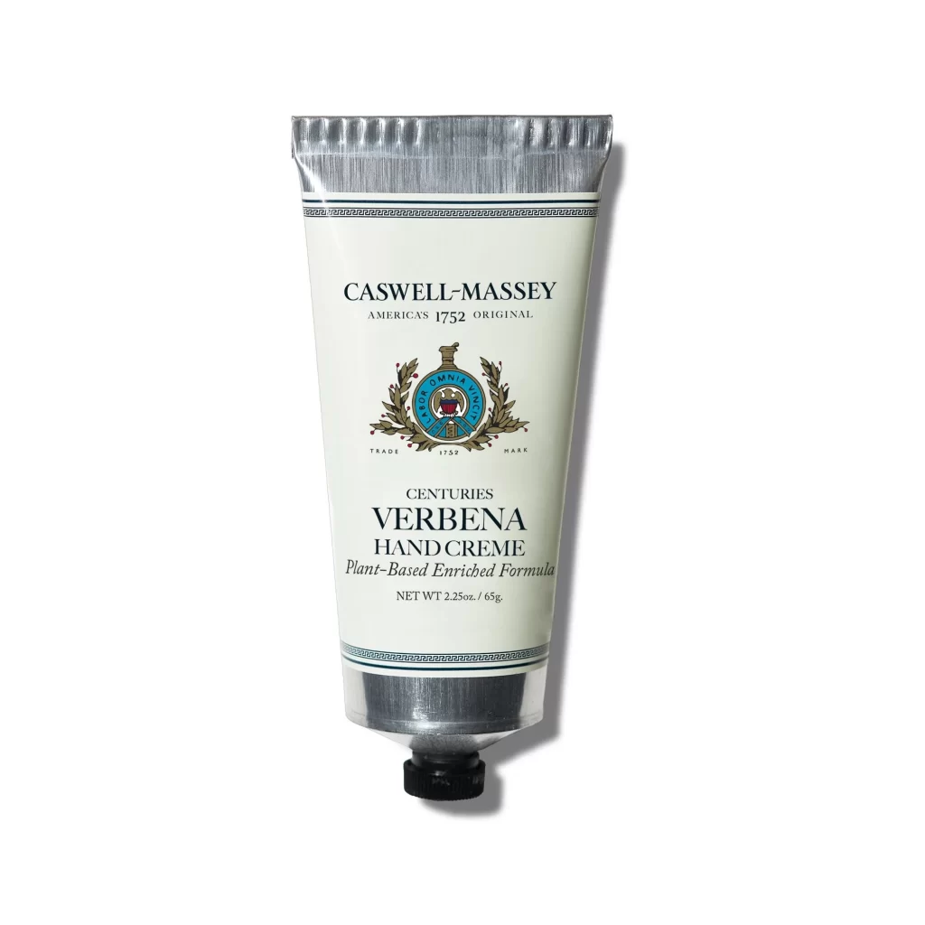
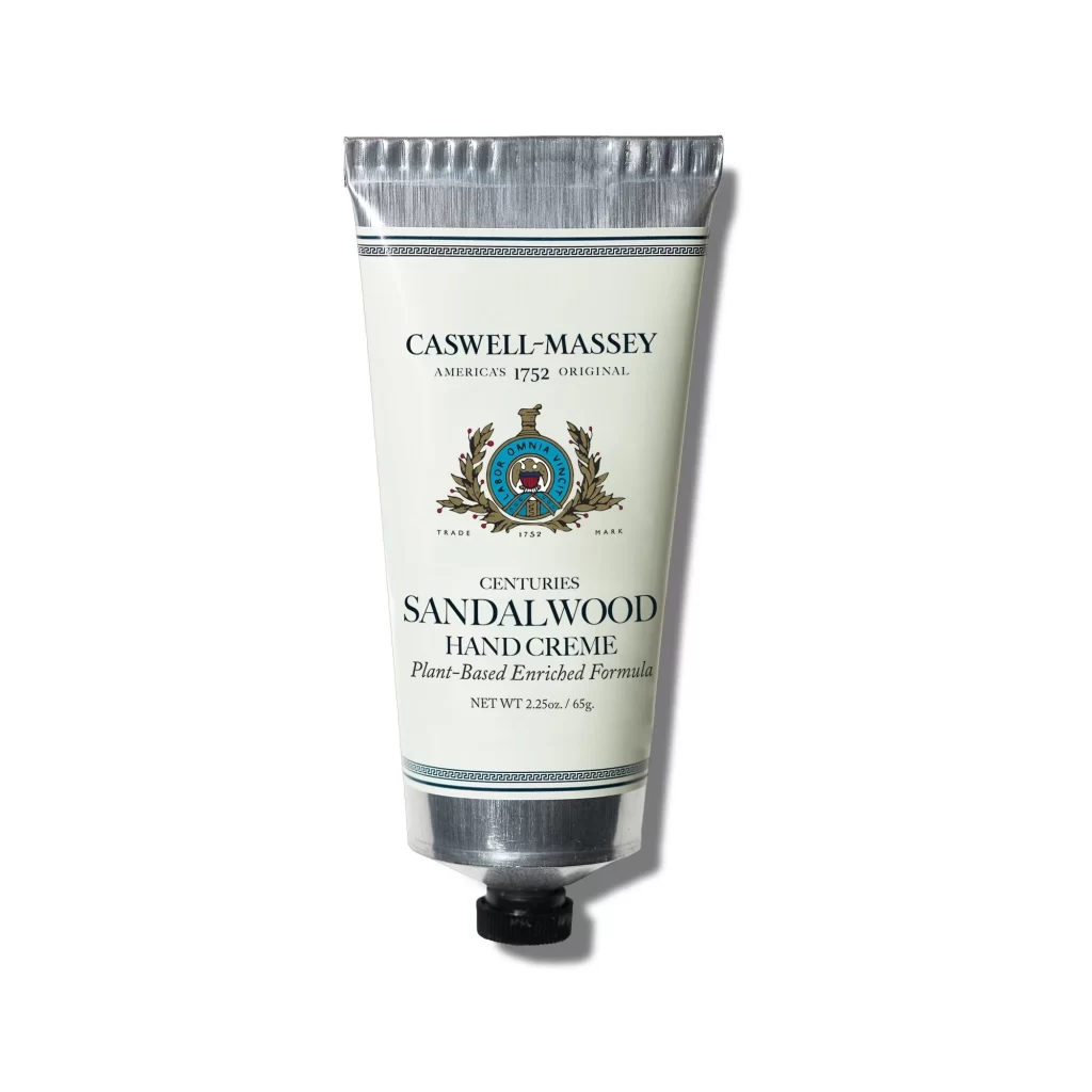
Centered within a clean white void, a metallic silver tube stands upright, its crimped top edge catching soft light that creates subtle shadows along the right side. The main body features an off-white label bordered by thin teal Greek key patterns at both ends, displaying bold black serif typography for 'CASWELL-MASSEY' and 'SANDALWOOD HAND CREME.' Between these text blocks sits a detailed crest with laurel wreaths and a blue circular emblem containing a red shield, while smaller print notes the plant-based formula and 2.25oz weight above the black screw cap base.
Visual distinction emerges from the deliberate contrast between industrial aluminum textures and classical cosmetic branding elements. The crest illustration introduces organic complexity against the geometric tube form, while the restrained color palette of silver, cream, and deep teal signals heritage luxury without overwhelming the composition. Typography hierarchy guides the eye from brand heritage claims through product specifics, creating a balanced information architecture that feels both authoritative and approachable.
Packaging designers studying premium skincare aesthetics will find valuable material here for analyzing how traditional motifs translate to modern tube formats. Brand identity teams developing heritage-inspired visual systems can examine the interplay between crest symbolism and contemporary layout principles. Students of commercial photography might also reference the lighting setup that emphasizes metallic reflections while maintaining legibility across all printed elements.