Chorizo de Leon Extra Sausage Red Packaging Garlic
Topics
Details
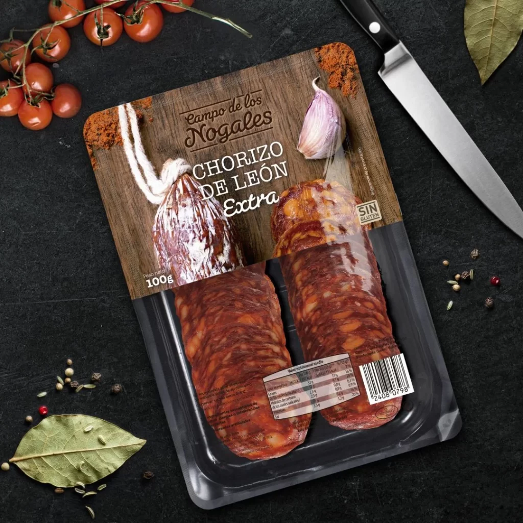
A clear plastic tray holds two reddish-brown chorizo sausages beneath a cardboard sleeve featuring a wood-grain texture and the brand name 'Campo de los Nogales' in elegant script. The packaging displays 'CHORIZO DE LEÓN Extra' in bold white lettering alongside a 100g weight indicator, a whole garlic bulb, and a tied sausage illustration dusted with paprika. Surrounding the product on a dark slate surface are cherry tomatoes on the vine, scattered peppercorns, bay leaves, and a chef's knife with a black handle, all illuminated by soft overhead lighting that highlights the glossy casing of the meat.
Visual distinction emerges from the clever split-design approach that merges photographic realism with graphic elements, creating immediate appetite appeal while maintaining brand sophistication. The warm terracotta tones of the spice-dusted cardboard contrast sharply against the cool black background, drawing the eye directly to the product's rich marbling and texture. Typography choices balance rustic charm with modern clarity, ensuring nutritional information and gluten-free labeling remain legible without disrupting the artisanal aesthetic.
Food photographers studying prop arrangement will appreciate how fresh ingredients frame the main subject to suggest recipe possibilities without overwhelming the focal point. Packaging designers examining this composition can note effective strategies for combining transparent windows with printed graphics to showcase texture while conveying premium quality. Art directors planning supermarket advertising campaigns might reference the color palette and spatial relationships when conceptualizing similar meat-product layouts for print or digital catalogs.