Coca-Cola Bottle Beverage Packaging Drink Branding
Topics
Details
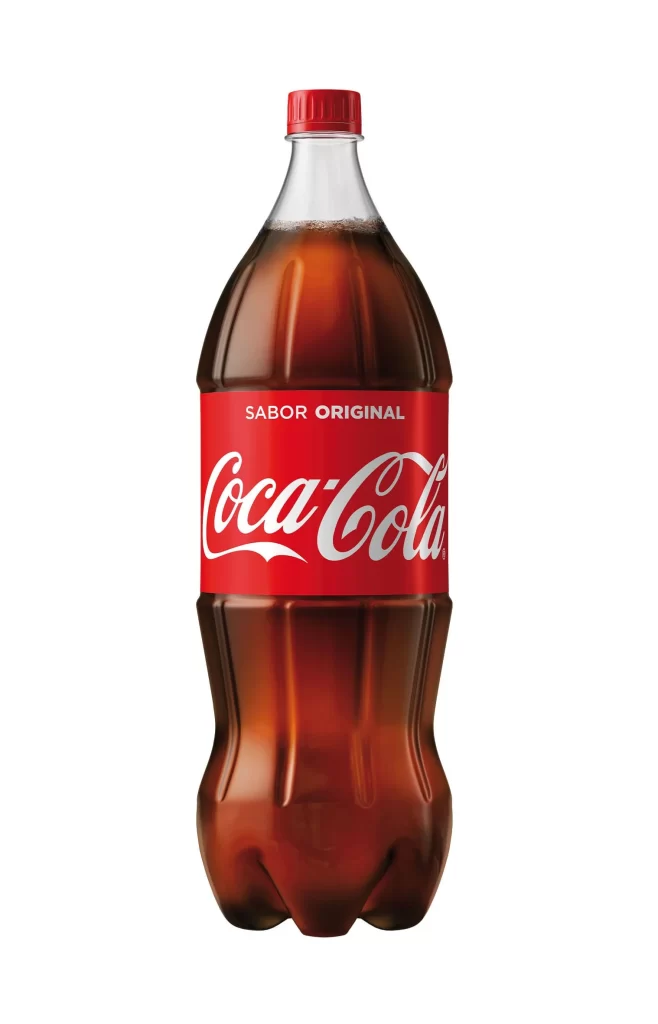
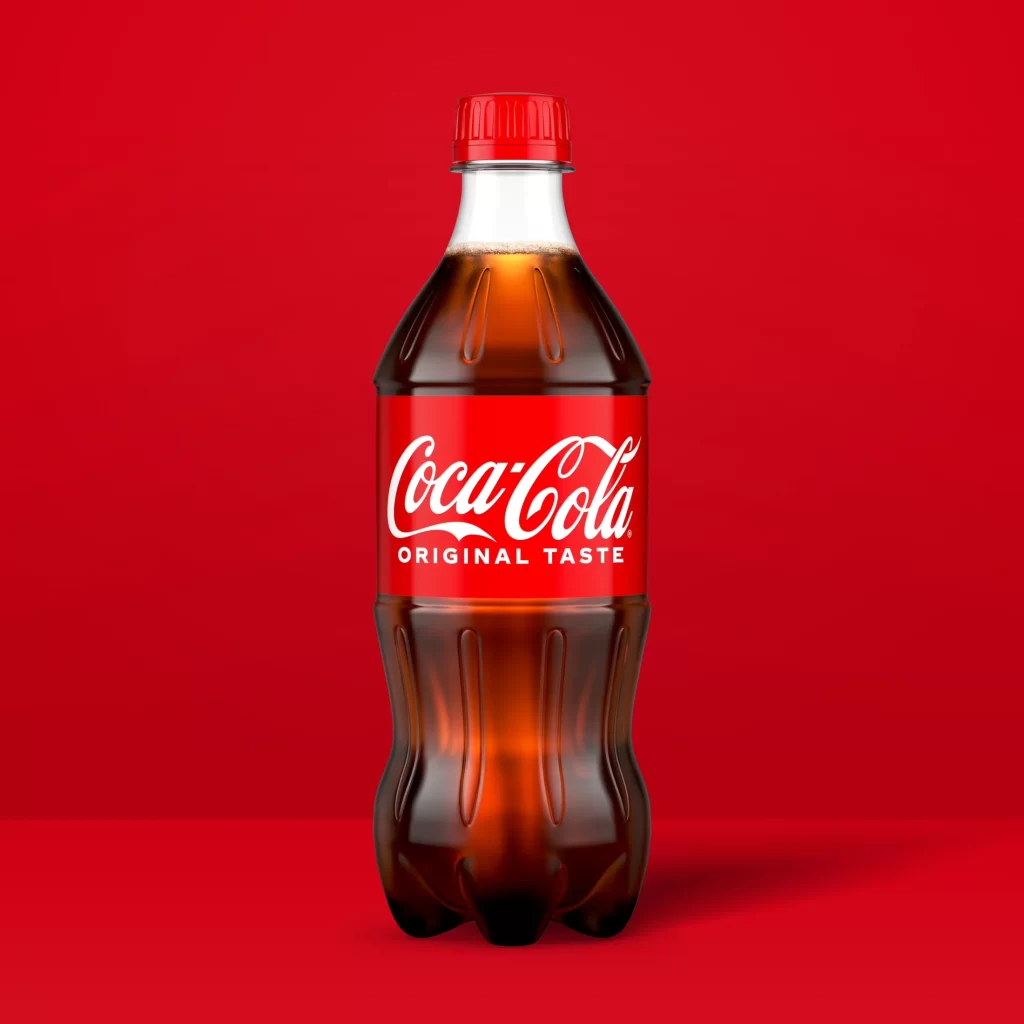
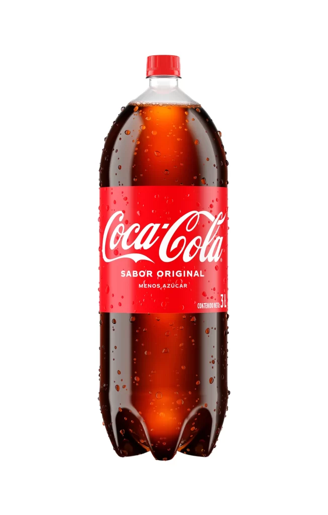
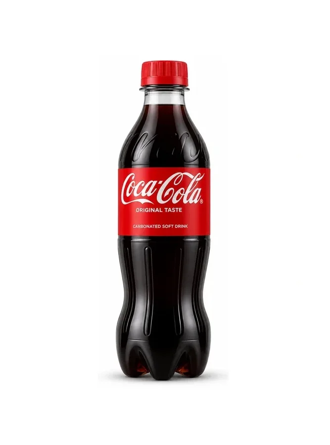
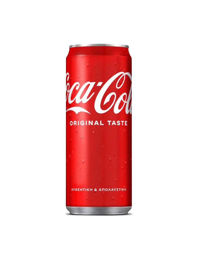
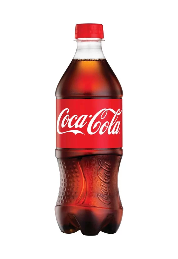
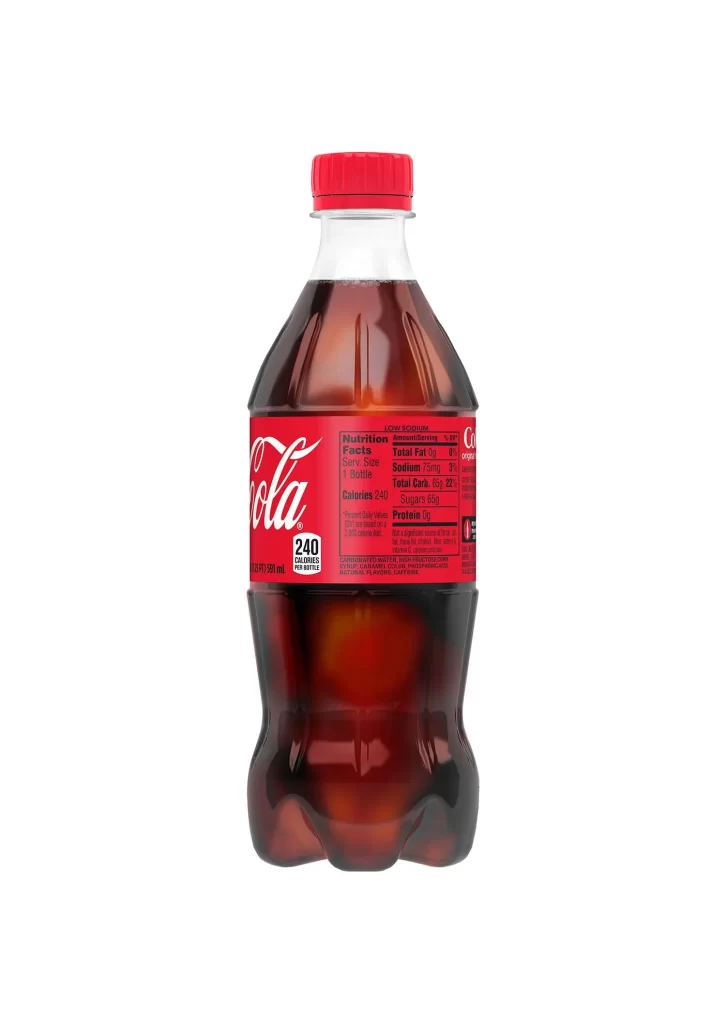
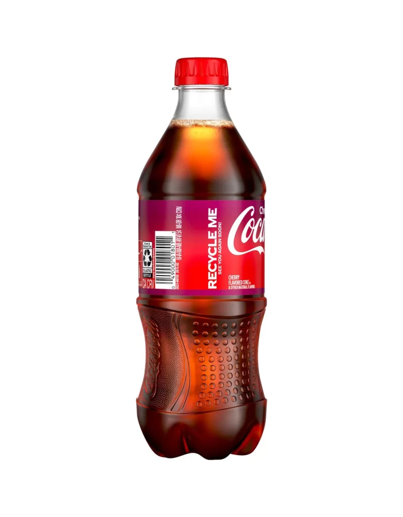
A 1-liter PET vessel showcases the iconic contoured silhouette with pronounced vertical ribbing that catches the studio lighting, revealing the dark caramel liquid within. The vibrant crimson label wrapping the midsection bears the white Spencerian script of 'Coca-Cola' above the sans-serif 'ORIGINAL TASTE' and 'Delicious & Refreshing' descriptors. A red screw cap seals the clear neck of the bottle, which stands on a white surface.
Visual hierarchy relies on the stark contrast between the saturated red field and the fluid white typography, creating immediate brand recognition even at distance. The bottle’s ergonomic curvature serves dual purposes: it reinforces tactile memory through form while the glossy plastic surface produces specular highlights that emphasize volume and materiality. Nutritional data positioned at the label’s right edge balances commercial messaging with regulatory transparency without disrupting the primary graphic flow.
Product photographers might study the gradient transitions across the curved surfaces to replicate similar beverage presentations in advertising campaigns. Packaging engineers could analyze how the ribbed structure maintains structural integrity while allowing for grip ergonomics. Brand strategists examining this composition will note how minimal background distraction focuses attention entirely on the proprietary shape and color palette that define market identity.