Coffee Company Logo Night Shift Typography
Topics
Details
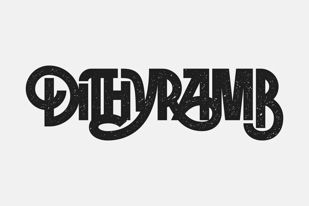
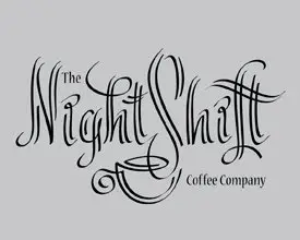
Rendered in solid black against a flat, neutral gray background, the logo presents the words "The Night Shift" in an elaborate, flowing script. The typography features dramatic flourishes and varying stroke widths, with the capital letters "N" and "S" displaying particularly ornate swashes. Below this main text sits the smaller phrase "Coffee Company," while a stylized coffee cup silhouette cleverly integrates into the bottom loops of the lettering.
Visual interest stems from the seamless fusion of text and iconography, where the cup shape emerges naturally from the descenders of the script. The hand-drawn quality of the lines suggests a custom lettering approach rather than a standard typeface, giving the brand mark a distinct artisanal feel. High contrast between the dark ink and light backdrop ensures legibility despite the decorative complexity of the strokes.
Brand identity developers working on café or late-night service concepts could analyze the spacing and weight distribution for similar projects. Illustrators studying vintage signage might reference the specific way the curves interact with negative space. Marketing teams evaluating mood boards would find this useful for establishing visual tone in nighttime beverage campaigns.