Coffee On Stand Bag
Topics
Details
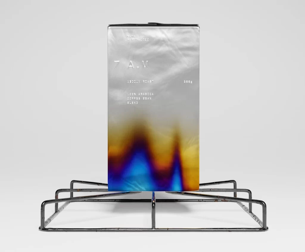
Standing upright on a minimalist black wire rack, a tall rectangular coffee bag dominates the frame with its metallic silver finish. The upper half of the packaging features embossed or foil-stamped typography, including the prominent '7 A.M' logo and smaller text indicating '250g' weight and 'SOUTH AMERICA COFFEE BEAN BLEND' origin details. A striking gradient bleeds upward from the base, transitioning from deep indigo and electric blue through fiery orange to golden yellow, creating an abstract, almost liquid appearance against the seamless white studio background.
What sets this particular packaging apart is the sophisticated interplay between industrial materials and ethereal color treatment. The crinkled texture of the metallic surface catches light unevenly, giving the bag a tactile, premium quality that contrasts sharply with the smooth, vaporwave-inspired spectrum at the bottom. This juxtaposition of rigid geometric form with fluid, iridescent hues creates a visual tension that feels both contemporary and artisanal, elevating a standard commodity into a design object.
Brand strategists and packaging designers might study this composition to understand how gradient treatments can transform utilitarian containers into lifestyle products. Photographers specializing in product visualization could analyze the lighting setup that emphasizes the bag's reflective qualities while maintaining legibility of the subtle typography. Additionally, color theorists may find value in examining how the specific blue-to-amber transition creates depth without overwhelming the essential product information displayed above it.