Coffee Packaging And Cup Bag
Topics
Details
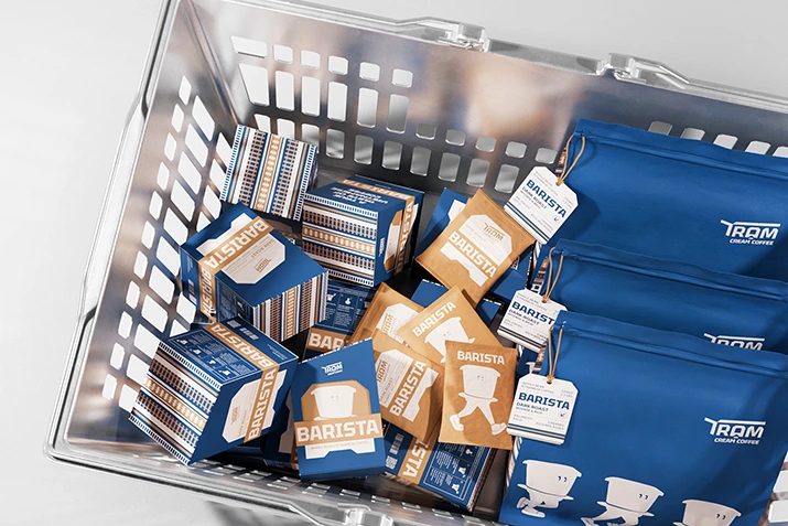
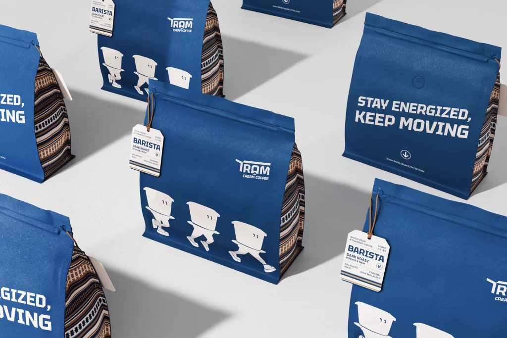
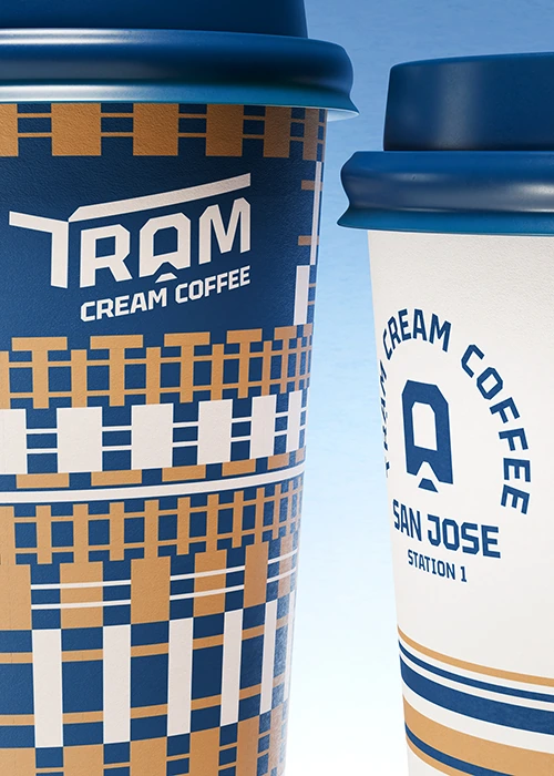
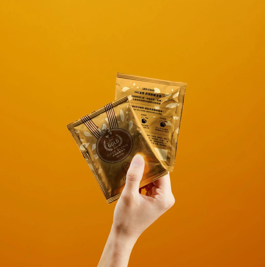
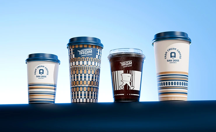
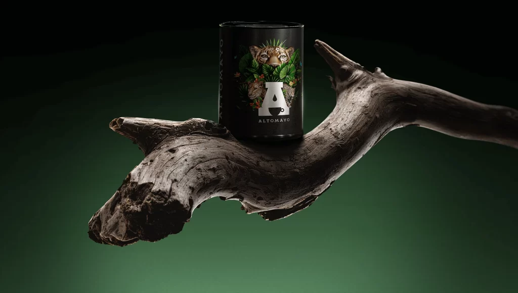
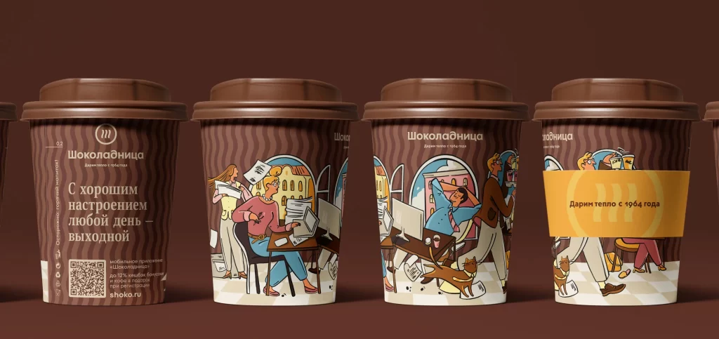
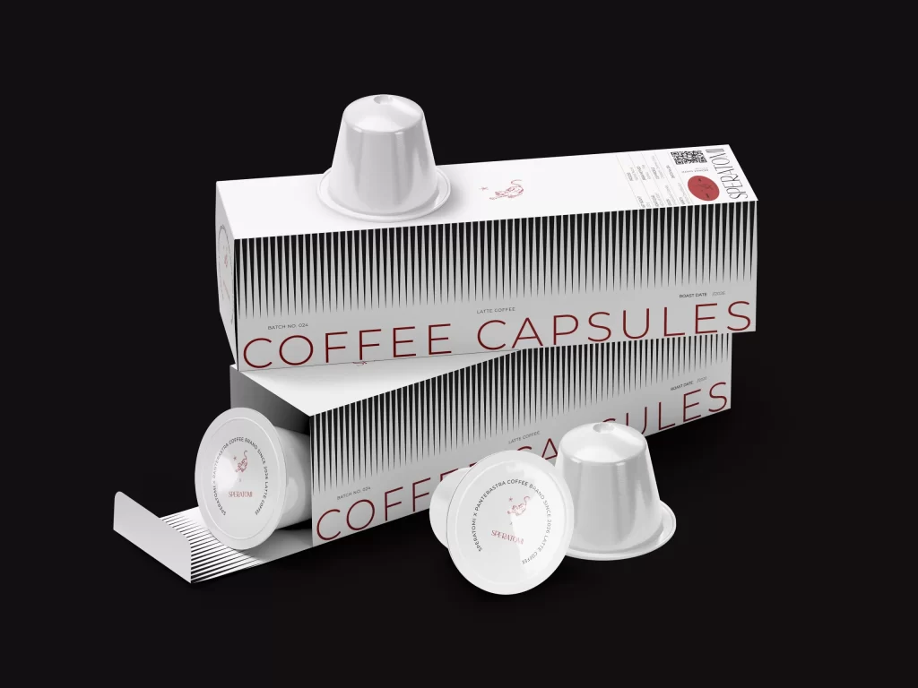
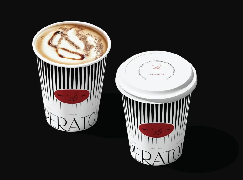
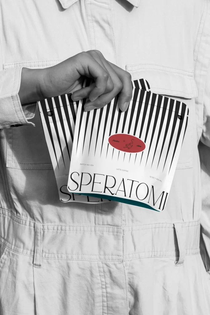
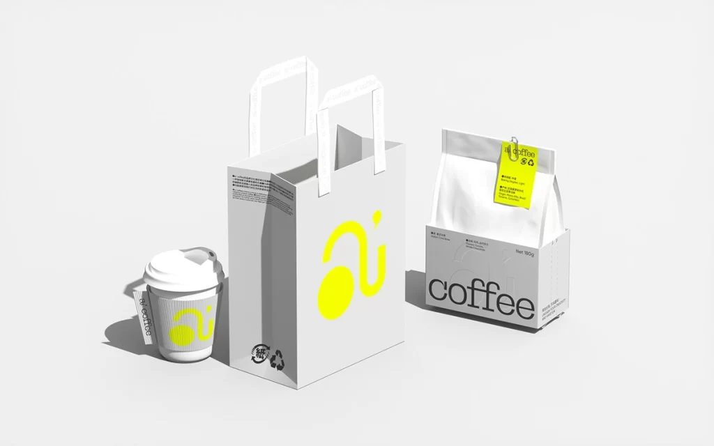
A minimalist coffee brand identity unfolds across three packaging formats, unified by a vibrant yellow logo that resembles a stylized lowercase 'a' with a circular counter. The collection includes a white paper cup with a gray sleeve, a tall white shopping bag featuring the oversized yellow mark, and a rectangular box labeled 'coffee' in bold black typography. Soft studio lighting casts gentle shadows beneath each item, highlighting the matte paper textures and clean geometric forms arranged at a slight three-quarter angle.
Visual interest stems from the bold contrast between the minimalist monochrome palette and the singular pop of neon yellow. The custom logotype cleverly integrates geometric shapes with negative space, creating a memorable brand mark that feels both modern and playful. Furthermore, the consistent application of this iconography across different materials—from the textured paper bag to the glossy finish of the coffee packet—demonstrates a cohesive system design.
Brand strategists might utilize this composition to pitch identity systems that rely on limited color palettes for maximum impact. Packaging engineers could study the structural layout of the gusseted bag and the reinforced handles of the carrier for their own retail concepts. Additionally, art directors seeking examples of clean, Scandinavian-inspired aesthetics will find the spatial balance between the three objects particularly instructive for mood board creation.