Coffee Packaging Bag
Topics
Details
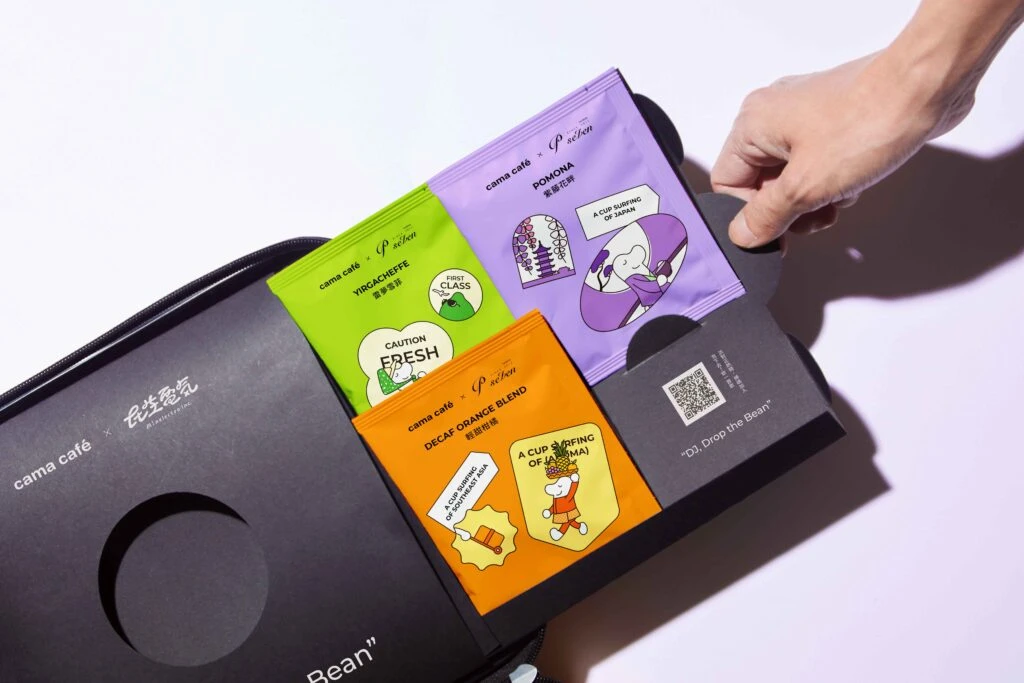
Shot from a high-angle perspective, the composition features a matte black rectangular sleeve with scalloped edges holding three vibrant coffee sachets in lime green, bright orange, and lavender. A human hand enters from the right to lift the purple packet, which displays an illustration of a character in a yukata alongside text reading 'cama café × Pison' and 'POMONA.' The packaging utilizes playful, hand-drawn graphic elements including speech bubbles with phrases like 'CAUTION FRESH' and 'A CUP SURFING OF [HAWAII],' all set against a clean, brightly lit white background that emphasizes the saturated hues of the materials.
Visual distinction emerges from the strategic collision of corporate branding with whimsical, zine-style illustration aesthetics that subvert typical premium coffee conventions. The color-coded system creates immediate product differentiation while the mix of typography—ranging from clean sans-serifs to casual handwritten scripts—establishes a youthful, approachable personality. Furthermore, the integration of cultural motifs, such as the Japanese pagoda and tropical surfing imagery, transforms standard commodity packaging into a collectible, narrative-driven object that invites tactile interaction.
Brand strategists and packaging engineers might analyze this case study to understand how limited-edition collaborations can refresh established identities through bold chromatic choices and illustrative storytelling. Art directors developing retail experiences could reference the structural interplay between the rigid outer carrier and the soft, flexible inner pouches when designing unboxing sequences. Additionally, illustrators seeking commercial applications might examine how anthropomorphic characters and environmental cues are balanced within tight label constraints to maintain readability while maximizing visual charm.