Coffee Packaging With Illustrations Box
Topics
Details
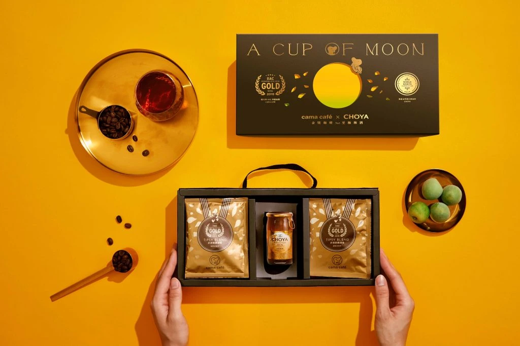
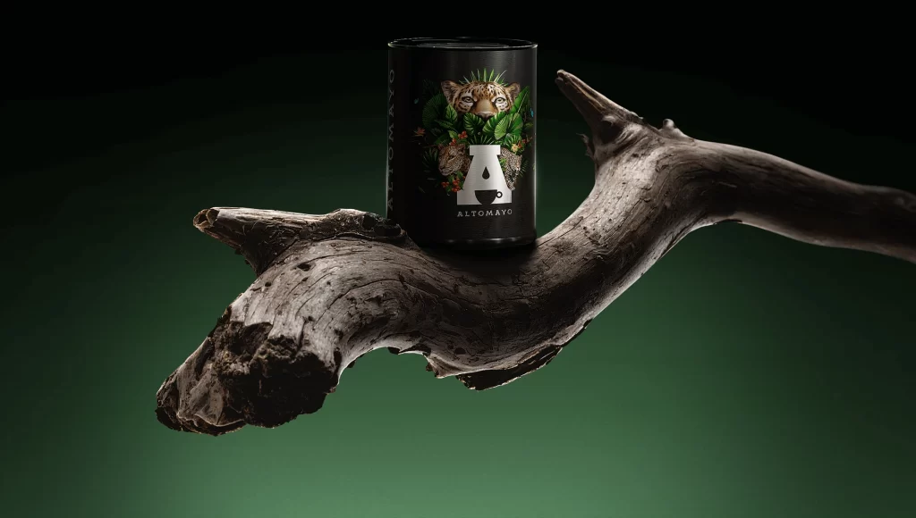
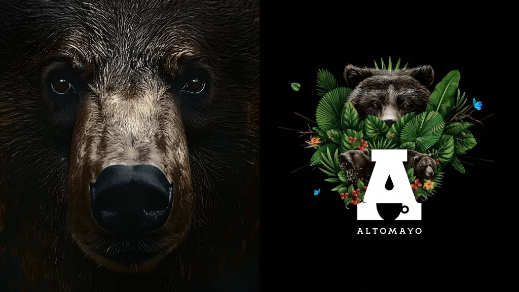
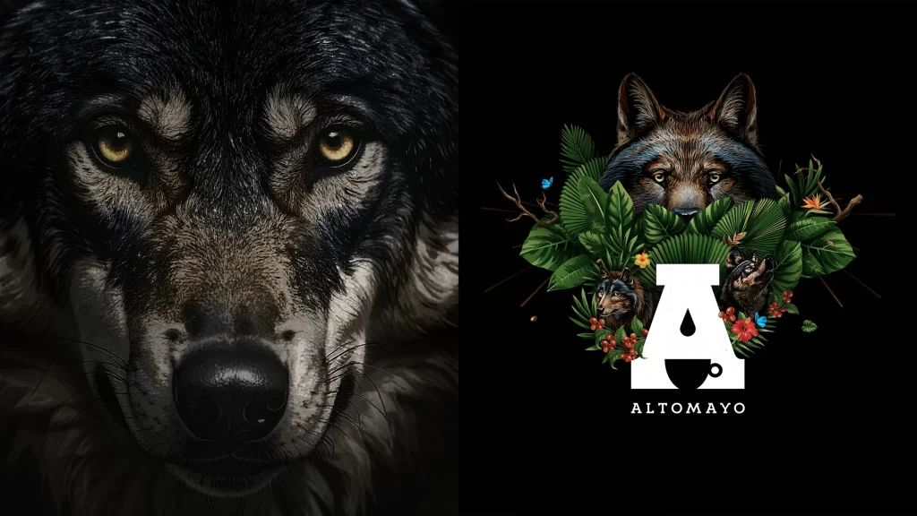
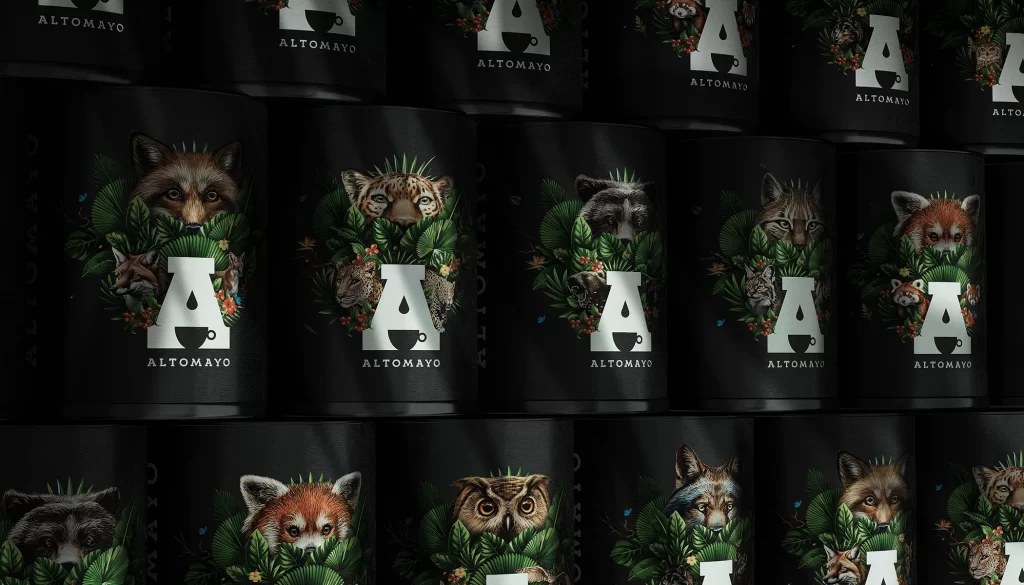
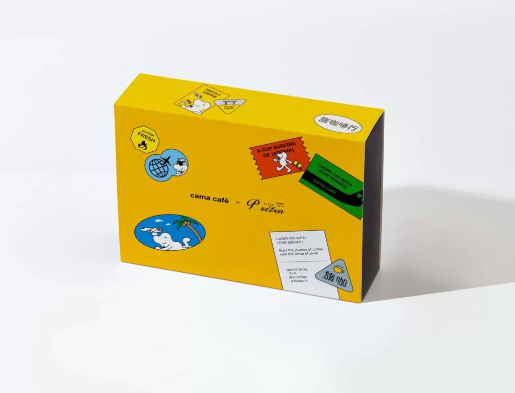
A vibrant canary-yellow rectangular box sits at a three-quarter angle against a seamless white backdrop, revealing its dark charcoal side panel and top surface. The packaging is adorned with a scattered collage of graphic elements, including a red stamp reading 'A CUP SURFING OF VANMAI', a green boarding pass labeled 'CARRY-ON WITH FIVE SENSES', and circular emblems featuring cartoon polar bears in tropical and aviation settings. Central to the composition, the text 'cana café × P. seten' anchors the layout, while additional details like the '旋咖啡行' oval badge and a yellow hexagonal 'FRESH' icon complete the busy yet balanced visual field under soft studio lighting.
Visual interest stems from the playful juxtaposition of travel-themed iconography with coffee branding, creating a narrative of global exploration through flavor. The high-contrast palette of saturated yellow against black and multicolored stickers ensures immediate shelf presence, while the illustrative style—featuring anthropomorphic animals in vacation scenarios—adds a whimsical, approachable personality that distinguishes it from minimalist or luxury coffee aesthetics. Each sticker mimics authentic luggage tags or passport stamps, lending the design a tactile, collectible quality that invites closer inspection.
Brand strategists developing limited-edition product lines could analyze this example to understand how thematic storytelling enhances perceived value without sacrificing clarity. Packaging engineers might study the spatial distribution of disparate graphic elements to optimize their own layouts for maximum visual impact across multiple box faces. Marketing teams launching travel-related collaborations would find this particularly useful for brainstorming ways to integrate partner logos seamlessly into existing visual systems while maintaining brand coherence.