Coffee UCC Japanese Drip Beans
DownloadTopics
Details
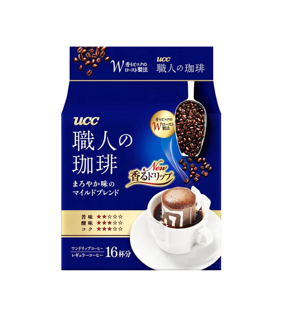
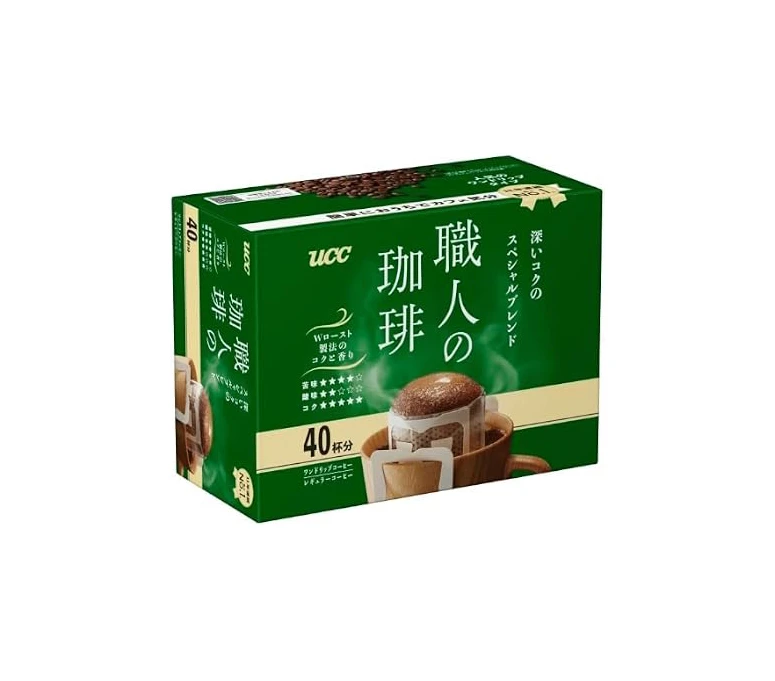
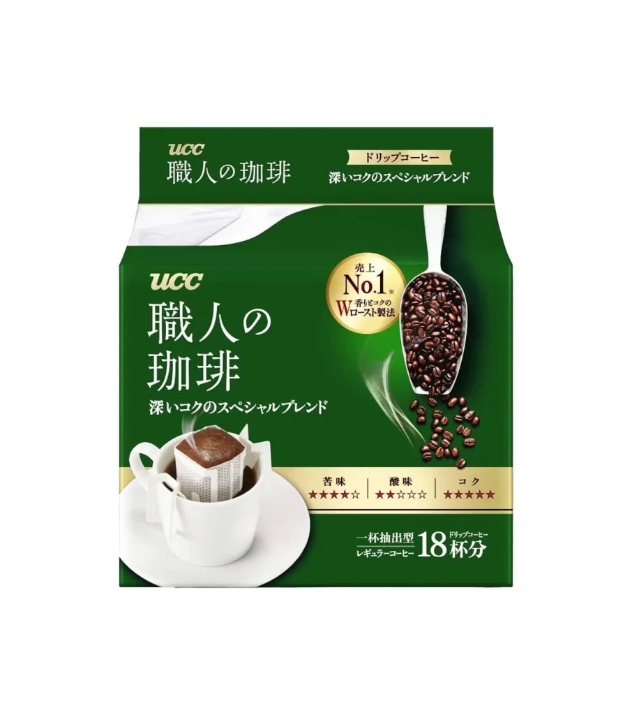
Deep forest green packaging dominates the visual field, featuring the UCC brand name in gold serif lettering above large white Japanese characters reading "職人の珈琲" (Artisan's Coffee). A white ceramic cup containing a steeping drip bag sits on a matching saucer at the lower left, while a metal scoop filled with dark roasted beans angles down from the upper right, scattering loose beans across the surface. Gold circular badges proclaim "No.1" sales rankings and display five-star ratings for bitterness, acidity, and body along a horizontal band near the bottom edge.
The composition balances photographic realism with graphic precision, using the diagonal line of the coffee scoop to create dynamic tension against the static horizontal text blocks. Rich color contrasts between the emerald background, metallic gold accents, and the organic browns of the coffee elements establish a premium market positioning that feels both traditional and contemporary. Designers studying Japanese consumer packaging will appreciate how the typographic hierarchy guides the eye from brand identity through product claims to usage imagery without visual clutter.
Packaging professionals analyzing Asian retail aesthetics can examine the specific interplay between photography and flat graphics, while branding specialists might reference the color palette for luxury food product development. E-commerce teams listing imported goods could utilize this as a template for accurate category representation. The complete high-resolution asset is accessible at no cost for immediate integration into professional workflows.