Crackers Packaging Black Orange Vintage Typography
Topics
Details
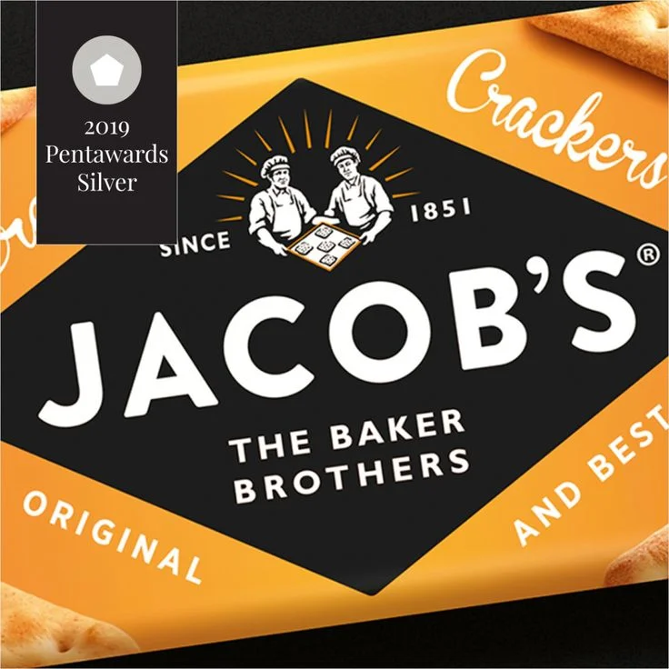
A bold black diamond dominates the composition, set against a vibrant orange field that frames the packaging with sharp geometric precision. The brand name 'JACOB'S' appears in massive white sans-serif capitals, anchored by the smaller subtitle 'THE BAKER BROTHERS' and the founding date '1851' flanking a line-art illustration of two bakers holding a tray. Curved white script reading 'Crackers' occupies the upper right quadrant, while 'ORIGINAL AND BEST' stretches along the lower perimeter in clean uppercase lettering, with photographic fragments of actual crackers peeking from the corners.
The visual tension between the authoritative black central panel and the energetic orange surround creates immediate shelf presence through high-contrast color blocking. Vintage typography choices—mixing heavy modernist letterforms with flowing cursive and traditional serif elements—establish a heritage aesthetic that bridges 19th-century craftsmanship with contemporary graphic sensibilities. The diamond shape acts as both a structural container and a directional force, drawing the eye inward toward the baker illustration while the radiating lines behind them suggest warmth and artisanal quality.
Brand strategists analyzing retro-modern packaging trends would examine this layout to understand how historical signifiers can reinforce product authenticity without appearing dated. Typography students could deconstruct the hierarchy of mixed typefaces to learn how contrasting weights and styles guide visual flow across complex label systems. Packaging engineers might reference the geometric framing technique when developing identity systems for premium snack categories requiring balance between tradition and bold retail visibility.